Overall Style and Aesthetic
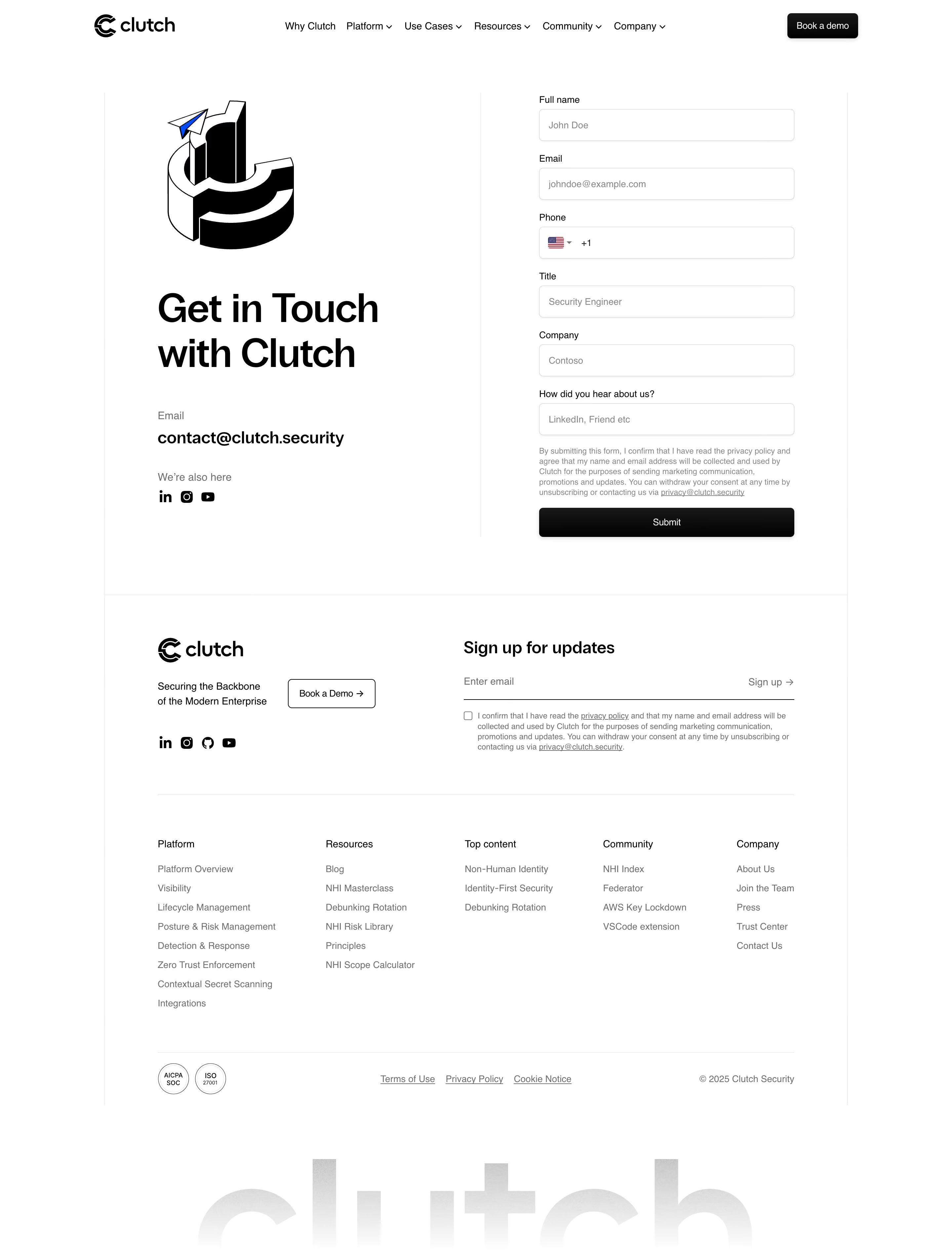
Clutch Security’s Contact Us page embraces a clean, modern, and highly professional aesthetic. Generous use of whitespace creates a breathable layout that feels confident and user-centric. The mood is trustworthy and approachable, well-suited to the cybersecurity space, with subtly bold accents that convey authority without ever feeling cold or intimidating. Layout and Structure
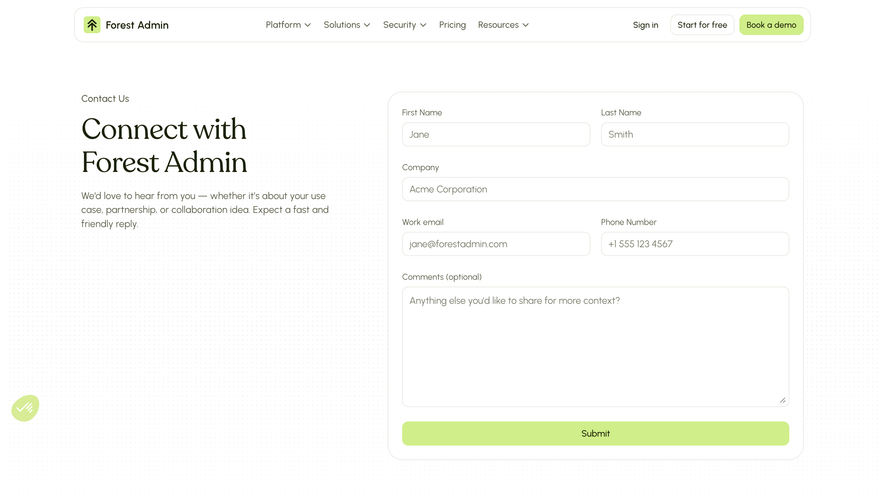
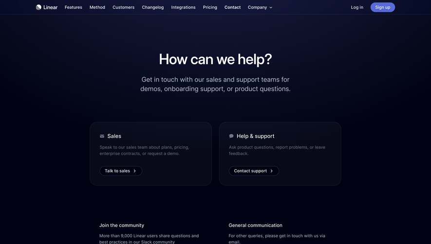
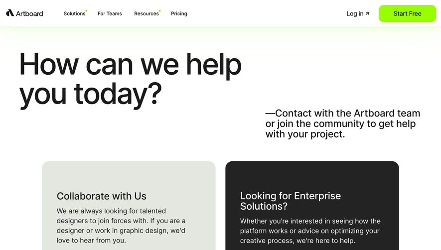
The page structure is refreshingly simple, driving focus toward action without distraction. A concise hero section welcomes visitors with a clear headline and brief supporting text, immediately reinforcing the brand’s commitment to responsive customer engagement. The primary focus is the sleek, centered contact form, which is minimal and easy to scan. The absence of excessive sections (testimonials, pricing, etc.) channels the user’s intent directly toward making contact. The footer extends the brand’s color theme and offers succinct navigation with links to social channels and critical legal information. Visual Elements
Visuals are understated—icons and soft geometric shapes complement the text, enhancing clarity. Subtle boundary lines and field highlights provide gentle guidance. The lack of photography or heavy graphic elements maintains speed and directs attention to form completion, reflecting the product’s no-nonsense approach. Color Palette and Typography
A sophisticated deep blue grounds the design, paired with vibrant cyan accents and crisp white backgrounds for contrast. Headings are set in a bold, modern sans-serif font for clarity and brand consistency, while body text remains highly legible and evenly spaced, signaling structure and hierarchy. User Experience Patterns and Unique Design Choices
Navigation is sticky, minimal, and always within reach, ensuring effortless movement through the site. The contact form is carefully optimized—streamlined fields reduce friction, powerful CTA buttons stand out, and microinteractions offer timely feedback. It’s a study in directness, trustworthiness, and conversion-centric design—ideal for SaaS teams aiming for clarity and professionalism.