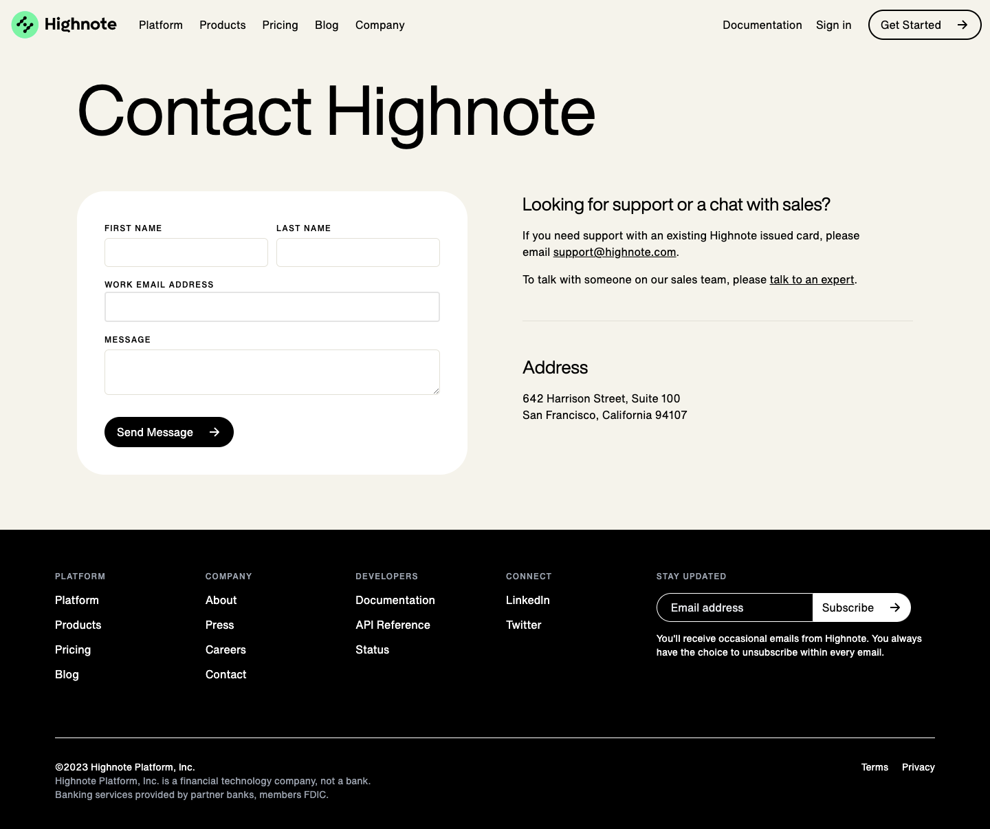
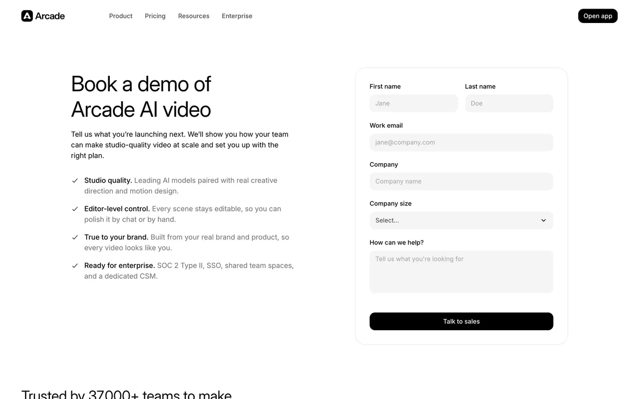
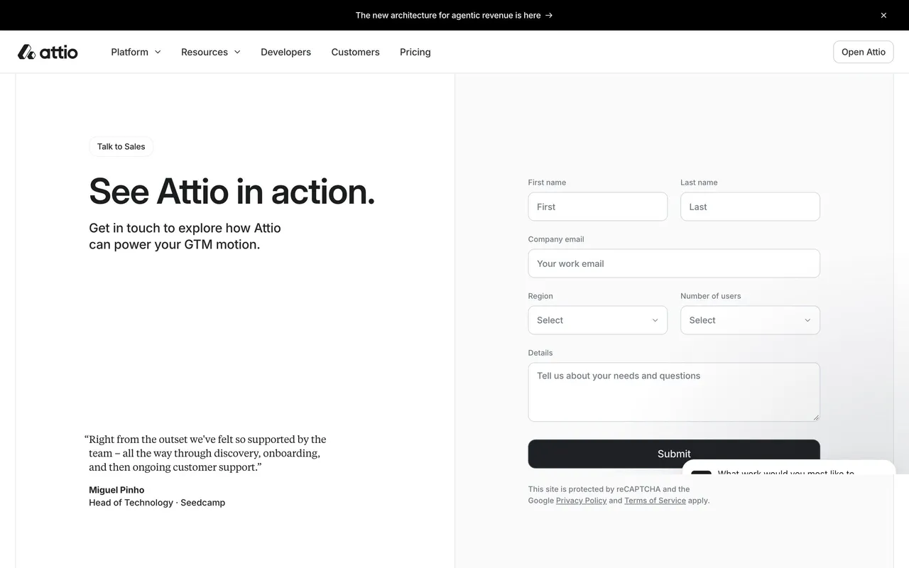
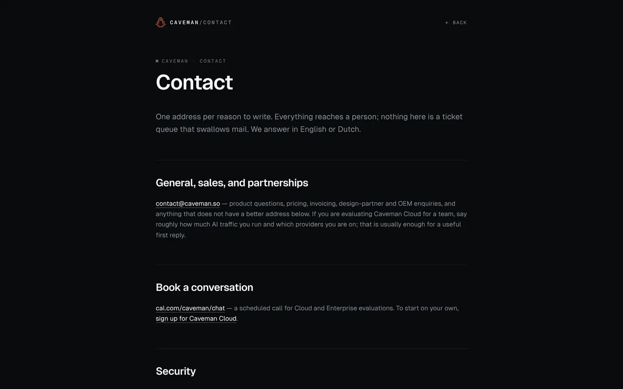
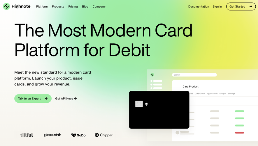
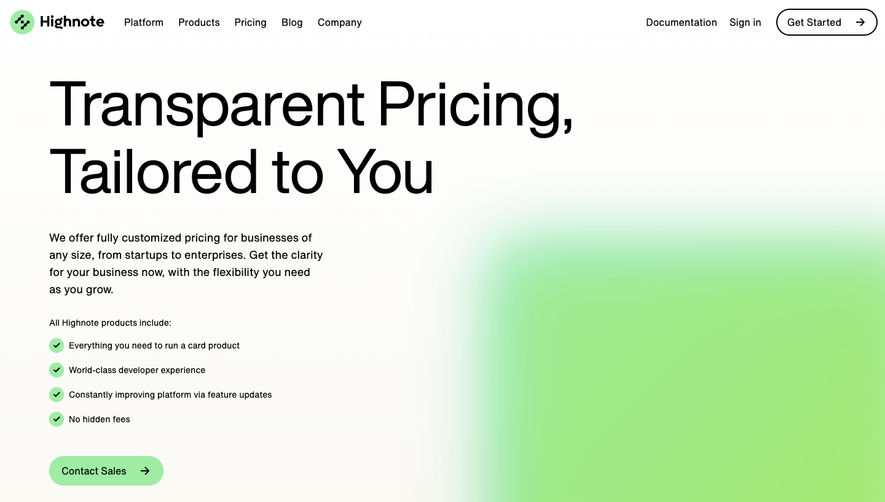
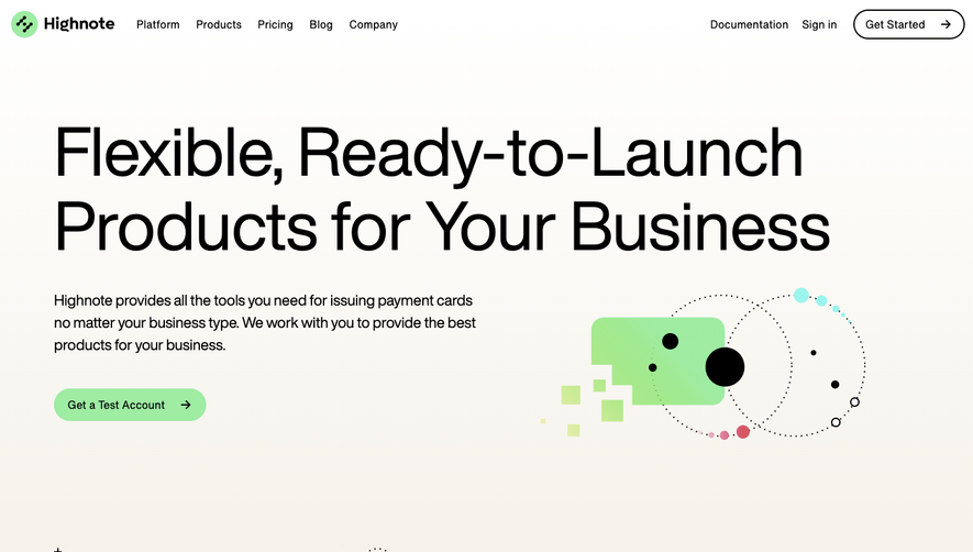
Highnote’s contact page channels a refined, minimalist sensibility with a distinctly modern polish. The white, open background amplifies clarity while subtle gradients and gentle shadows bring depth without distraction. Playaful, rounded corners on form fields and buttons soften the interface, creating a welcoming feel while maintaining an unmistakably professional look.
Layout and Structure
The page structure prioritizes user flow: a concise headline and supporting message encourage action, rapidly followed by a streamlined contact form. Supplementing the form, clear information for reaching out directly appears below, further reducing friction. Footer navigation is lean, offering quick jumps to critical policy and platform pages without overwhelming busy users.
Visual Elements
A charming, abstract illustration anchors the hero section, introducing visual character without upstaging the content. Animated gradients subtly highlight focal areas, guiding the eye toward the main CTA and creating a sense of movement. Minimal icons clarify form fields, while imagery is restrained to ensure focus on conversion.
Color Palette and Typography
A fresh palette featuring deep navy, soft purple, and bright accents adds vibrancy while exuding tech-forward confidence. Highly readable, modern serif and sans-serif fonts structure the content: bold headlines capture attention, cascading to lighter body copy for effortless scanning.
User Experience Patterns
Navigation stays sticky atop the viewport, maintaining access to key sections. The single-column layout keeps users centered on the page’s purpose, with large touch-friendly buttons driving action. The contact form is succinct and mobile-optimized, while optimistic microcopy at each stage fosters trust.
Unique or Notable Design Choices
Notable: the precise balance of personality and restraint—the playful illustration feels fresh yet unobtrusive. Subtle, animated feedback on form submission delivers a delightfully human moment, elevating an otherwise routine interaction. The overall tone is approachable and innovative, radiating assurance to SaaS audiences who value thoughtful, user-first design.
 SaaSFrame