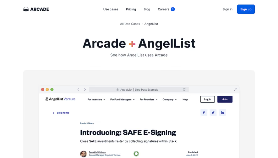
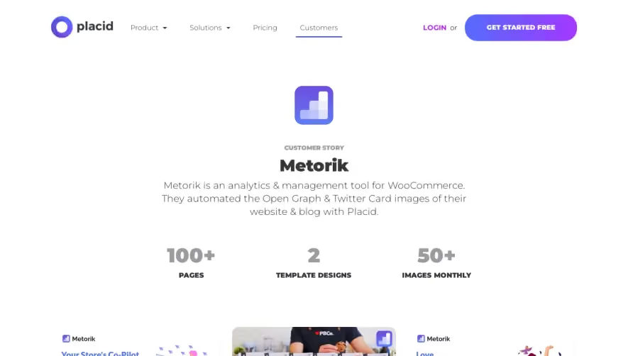
Generate a new design based on this screen using your own content.
Thank you! Your submission has been received!
Oops! Something went wrong while submitting the form.
# Design from Reference: Clearbit Customer Story
Create an original, high-fidelity visual design inspired by the reference. Prioritize composition, typography, colors, spacing, and component styling over technical implementation.
## Reference
- **Product:** Clearbit
- **Category:** Customer Stories
- **Screenshot:** https://cdn.prod.website-files.com/5e9dc792e1210c5325f7ebbc/62ec9c8117fa632f3080d5ae_1659624781287-screenshot-device-e71d3a62a7815db0cb09ddd8069fc535-1659604584174.webp
Analyze the screenshot first. If inaccessible, request it rather than guessing.
## Content
{{content.instructions}}
{{content.data}}
Preserve essential messaging and factual accuracy. Adapt structure and copy length for visual balance; never invent product claims.
## Visual Design
Use this context to reproduce the reference's visual language: layout, typography, colors, spacing, borders, radii, and distinctive elements. The screenshot takes priority if descriptions conflict.
## Direction
{{preferences.fidelityInstructions}}
## Output
{{output.instructions}}
Deliver a polished, cohesive design with precise alignment, hierarchy, and spacing. Produce the requested visual artifact, not just a description. If unsupported, explain the limitation.
Clearbit’s Frame.io customer page embodies a modern, minimalist approach that feels clean yet dynamic. The visual atmosphere is unmistakably professional but approachable—with ample white space, restrained splashes of color, and sharply rendered UI elements. The design skews towards a sense of clarity and confidence, exuding trustworthiness without feeling sterile or cold.
Layout and Structure
The page structure follows a compelling narrative flow: it opens with a striking hero section featuring bold customer imagery and a succinct value statement, draws viewers into the story with prominent logos and quotes, then leads into in-depth testimonial segments and contextually embedded CTAs. Content sections are well-divided, guiding users smoothly from overview to case details and back toward conversion pathways.
Visual Elements
Photography takes center stage—high-resolution images of real people and branded interfaces foster authenticity. Subtle iconography breaks up text and adds visual cues, while animated logo carousels provide motion without overwhelming the page. Screenshots and UI mockups are tastefully presented inside device frames, reinforcing the product’s real-world impact.
Color Palette and Typography
The color scheme is anchored in blue accents that highlight CTAs and draw the eye while maintaining a largely monochrome backdrop. Fonts are clean, sans-serif, and carefully layered: bold headlines, medium-weight subheads, and lighter body text construct a clear visual hierarchy that supports skimmability and focus.
User Experience Patterns
Navigation is streamlined, with persistent headers and sticky CTAs that invite action. Scroll-driven storytelling uses concise copy and vivid visuals for high engagement. Primary CTAs are bright and well-placed, and testimonial blocks offer social proof in digestible, scroll-friendly chunks—balancing persuasion with ease of use.
Unique or Notable Design Choices
What sets the page apart is its focus on customer narrative, blending human imagery with product context, and presenting logos as living endorsements. It strips away excess, allowing authentic stories and sleek UI visuals to shine—a thoughtful intersection of function and inspiration that’s both innovative and inviting.