
Thank you! Your submission has been received!
Oops! Something went wrong while submitting the form.
Get SaaSFrame Pro
Monthly
$18
Quarterly
$48
Yearly
$180
Upgrade to access this feature
Browse all screens & flows
Filter and search screens & flows
Access Figma files
Access mobile versions
Bookmark screens & flows
Join now
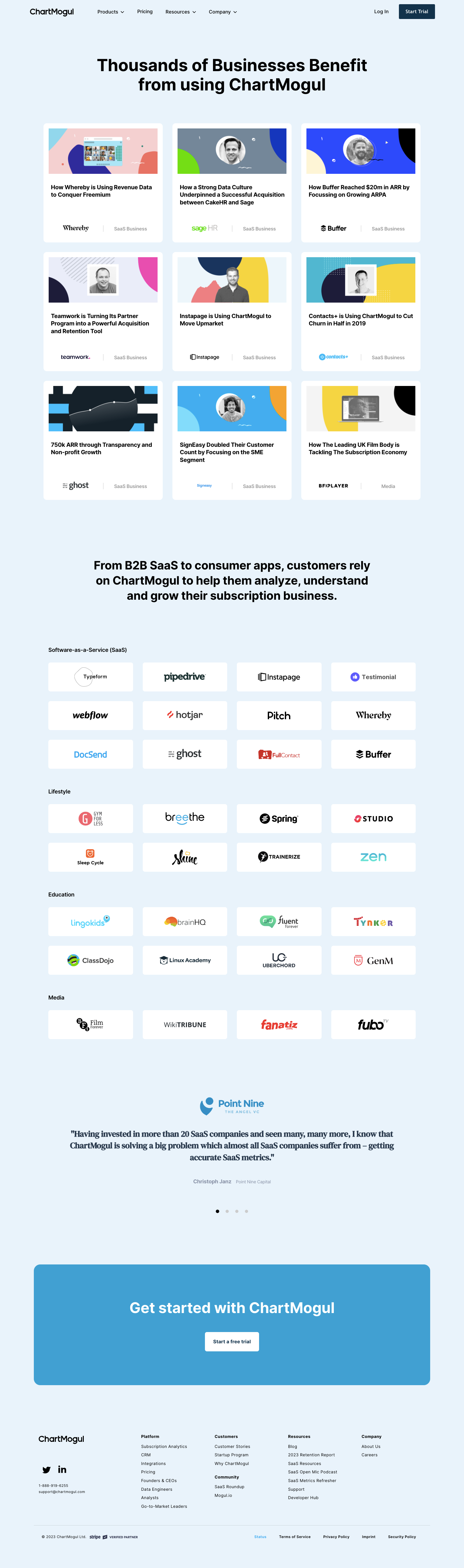

ChartMogul Customers Page

ChartMogul
Subscription Analytics Platform for growing SaaS businesses
Designed by
No items found.

Bookmark
Bookmark

Design with AI
Thank you! Your submission has been received!
Oops! Something went wrong while submitting the form.
# Design from Reference: ChartMogul Customers Page
Create an original, high-fidelity visual design inspired by the reference. Prioritize composition, typography, colors, spacing, and component styling over technical implementation.
## Reference
- **Product:** ChartMogul
- **Category:** Customers Page
- **Screenshot:** https://cdn.prod.website-files.com/5e9dc792e1210c5325f7ebbc/6acb6af1bf2e69a0c03b6ccb_6acb6a28ecc5bd4d930a381e_cms-b363652ac5d86ee5989e3a6c.webp
Analyze the screenshot first. If inaccessible, request it rather than guessing.
## Content
{{content.instructions}}
{{content.data}}
Preserve essential messaging and factual accuracy. Adapt structure and copy length for visual balance; never invent product claims.
## Visual Design
### Overall aesthetic
- **Character:** A customer-proof page uses a continuous pale-blue canvas, white story cards and colorful geometric portrait banners.
- **Tone:** Bold black sans-serif headings and orderly grids give the page a straightforward, evidence-led presentation.
### Page composition
- **Capture:** The original is 1440 × 4871 image pixels, inspected throughout. Dimensions approximate image pixels; CSS scale is unverified.
- **Opening:** A corporate navigation row precedes a large centered two-line headline.
- **Stories:** Nine customer-story cards form a three-column, three-row grid.
- **Customer catalog:** A centered explanatory statement introduces four logo categories: SaaS, Lifestyle, Education and Media. Their white tiles form a four-column grid.
- **Closing:** A centered investor testimonial with pagination dots precedes a large blue trial banner and a multi-column footer on the same pale background.
### Information hierarchy
- **Stories first:** Large image banners and bold article titles establish individual examples before the broader customer-logo catalog.
- **Categories:** Small bold headings divide the logo grid into industry groups.
- **Trust and action:** A serif quotation adds a distinct testimonial voice; the blue banner then becomes the strongest final conversion element.
### Typography
- **Family:** Most content uses sans serif, with a contrasting serif testimonial; exact font identities are unverified.
- **Main heading:** Approximately 52 pixels, bold with about 60-pixel leading.
- **Section statement:** Around 38 pixels, bold, centered over three lines.
- **Cards:** Titles are approximately 18 pixels and bold with 24-pixel leading; category labels are smaller and gray.
- **Testimonial:** Roughly 28-pixel bold serif text is centered above small attribution; footer links use around 13–14 pixels.
### Colors & surfaces
- **Measured canvas:** Pale blue #EBF3FA forms the page background.
- **Measured cards:** White #FFFFFF provides story and logo surfaces.
- **Measured action:** Medium blue #58A1CF appears in the trial banner.
- **Measured contrast:** Black #000000 supplies strong headings; gray-blue #778798 supports secondary text.
- **Artwork accent:** Yellow #F2D151 is one sampled banner color among blue, coral, mint and neutral geometric compositions.
### Components
- **Story cards:** Approximately 370 × 370 pixels, with roughly 12-pixel radii and about 16-pixel image insets; no heavy shadow is visible.
- **Card structure:** Wide banner artwork sits above a title, with customer logo and category aligned near the bottom and separated by a thin vertical rule.
- **Logo tiles:** Approximately 263 × 90 pixels, white with small radii, center brand marks without descriptions.
- **Testimonial controls:** Four small dots sit below attribution, with the first dark and the rest gray.
- **Trial banner:** A broad blue rounded panel contains a large centered white heading and compact white button.
- **Footer:** Brand/contact/social details occupy the left, with four grouped navigation areas and a separated legal/status row.
### Visual rhythm
- **Container:** Most content spans about 1170–1230 pixels with broad side margins.
- **Grid gaps:** Story cards use approximately 30-pixel gutters; logo tiles use consistent wider spacing within each category.
- **Section pauses:** Large gaps separate stories, category grids, testimonial and CTA, keeping repeated logos from becoming visually dense.
### Responsive
- **Observed state:** Only desktop layout is supplied; mobile behavior is unverified.
- **Recommended grids:** Reduce story and logo grids progressively to two and then one column.
- **Recommended text:** Scale centered headlines and quotation width fluidly, preserving comfortable reading lengths.
- **Recommended footer:** Stack link groups and retain sufficient spacing around legal and social links.
### Adaptation guidance
- **Preserve proof layers:** Maintain the sequence of detailed stories, categorized customers, testimonial and trial action.
- **Card consistency:** Keep equal story-card heights and bottom-aligned identity rows despite variable title lengths.
- **Content fidelity:** Treat business claims, quotation and customer relationships as captured content rather than current verified facts.
- **Accessibility:** Provide useful image alternatives, descriptive story links and labeled carousel controls.
Use this context to reproduce the reference's visual language: layout, typography, colors, spacing, borders, radii, and distinctive elements. The screenshot takes priority if descriptions conflict.
## Direction
{{preferences.fidelityInstructions}}
## Output
{{output.instructions}}
Deliver a polished, cohesive design with precise alignment, hierarchy, and spacing. Produce the requested visual artifact, not just a description. If unsupported, explain the limitation.


Category
Patterns
No items found.
Tech Stack

Added on
April 5, 2023
Similar screens
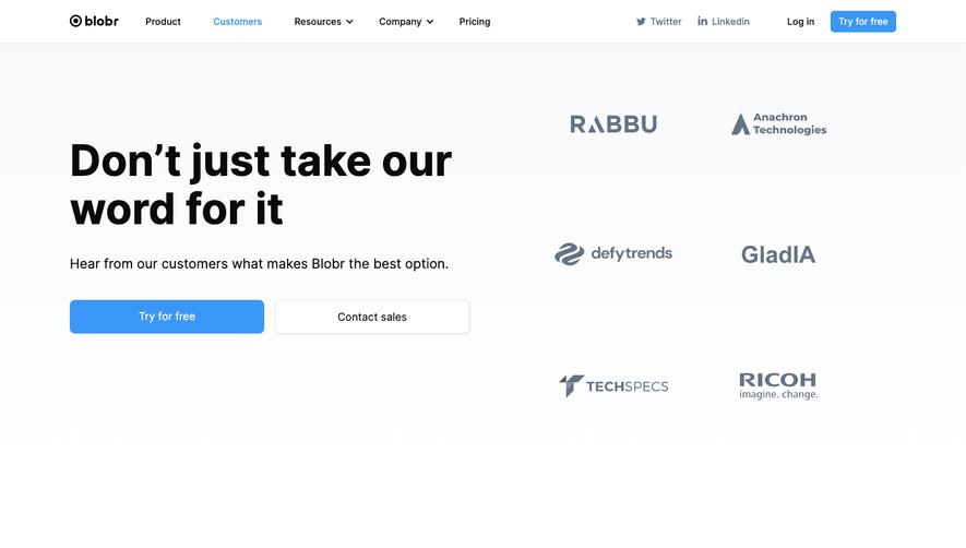


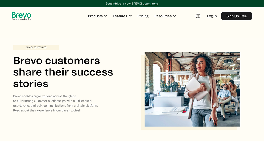

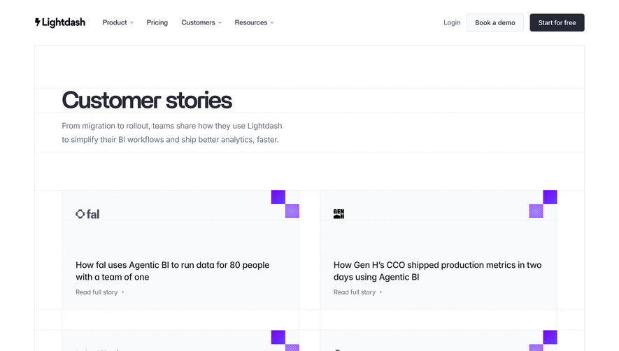

Upgrade to SaaSFrame Pro now to see similar examples.
Monthly
$18 /month
Billed $18 monthly
Browse all screens & flows
Filter and search screens & flows
Search text in screenshots
Access Figma files
Access mobile versions
Join now
Quarterly
$16 /month
Billed $48 quarterly
Browse all screens & flows
Filter and search screens & flows
Search text in screenshots
Access Figma files
Access mobile versions
Join now
Yearly
$15 /month
Billed $180 yearly
Browse all screens & flows
Filter and search screens & flows
Search text in screenshots
Access Figma files
Access mobile versions
Join now