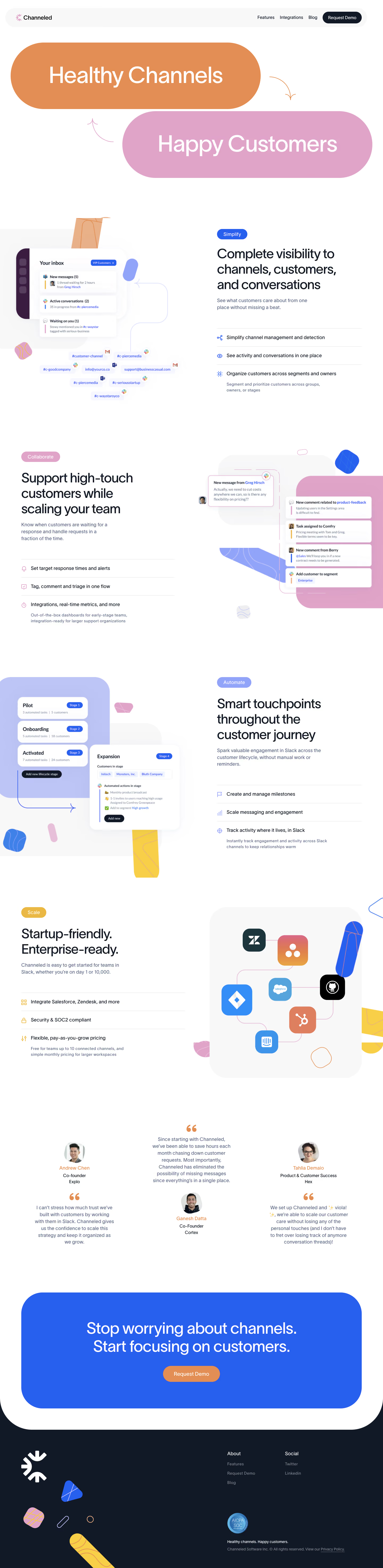



1. Hero Section: The header section of the page has a full-width image slider that displays the different features of the product. A "Get Started" button is placed on the slider for users to sign up. 2. Product Section: This section is divided into three columns, each containing an image and a feature. Each feature's image is representative of the functionality and purpose of the tool. 3. How We Work Section: It is a four-sectioned area that contains a video player for users to learn about the product. Additionally, it highlights the benefits of the product by listing the objectives and advantages of using the tool. 4. Collaborate Section: This section explains the product's ability to collaborate well through text messages, emails, or calls smoothly. It contains a video and more details on others who have experienced the benefit of teamwork through this tool. 5. Share News Section: It is a two-column section highlighting the tool's ability to share news through social media. The left column has a brief about the tool while the right column showcases images of the various platforms that users can share. 6. Testimonials Section: A five-sectioned feedback area where users can discuss their experience using the tool. It contains written feedback and videos of users sharing their thoughts. 7. Press Section: It is a section for the media, and it displays media outlets such as Forbes, TechCrunch, and more that have featured Channeled. 8. Partner Section: This section has three parts; it displays the partners of Channeled, which includes Open Table, Hilton, and other renowned brands. 9. Call to Action Section: The final section has a video player, that invites users to know more and scroll back to the hero section for "Get Started" button.

Thank you! Your submission has been received!
Oops! Something went wrong while submitting the form.
Get SaaSFrame Pro
Monthly
$18
Quarterly
$48
Yearly
$180
Upgrade to access this feature
Browse all screens & flows
Filter and search screens & flows
Access Figma files
Access mobile versions
Bookmark screens & flows
Join now
Channeled Features Page

Channeled
Turn customer success into company success
Designed by
No items found.

Bookmark
Bookmark
Design with AI
Thank you! Your submission has been received!
Oops! Something went wrong while submitting the form.
# Design from Reference: Channeled Features Page
Create an original, high-fidelity visual design inspired by the reference. Prioritize composition, typography, colors, spacing, and component styling over technical implementation.
## Reference
- **Product:** Channeled
- **Category:** Features Page
- **Screenshot:** https://cdn.prod.website-files.com/5e9dc792e1210c5325f7ebbc/6acb6c175391d62536b67232_6acb6aa5666ef5239d936186_cms-0d7e0e8086a2e3af3cb06504.webp
Analyze the screenshot first. If inaccessible, request it rather than guessing.
## Content
{{content.instructions}}
{{content.data}}
Preserve essential messaging and factual accuracy. Adapt structure and copy length for visual balance; never invent product claims.
## Visual Design
### Overall aesthetic
- **Character:** A playful feature-marketing page with oversized pill-shaped statements, colorful abstract shapes and layered product illustrations.
- **Identity:** White space, dark navy text, bright blue, dusty pink and orange create a friendly but structured customer-support narrative.
### Page composition
- **Capture:** The source measures 1440 × 5896 image pixels; all five readable portions were inspected. A 1× CSS scale is plausible but unverified.
- **Header:** A pale rounded navigation capsule spans almost the full width with brand at left and three links plus dark Request Demo at right.
- **Hero:** Two huge offset pills carry “Healthy Channels” and “Happy Customers,” connected by small curved arrows.
- **Feature sequence:** Four alternating two-column sections pair large product illustrations with category pill, multiline heading, paragraph and three ruled feature rows.
- **Closing:** Three testimonial columns precede a large blue rounded CTA panel, then a dark navy footer with brand art, link groups and trust badge.
### Information hierarchy
- **Hero statements:** Large white lettering establishes the benefit before detailed product explanation.
- **Feature groups:** Simplify, Collaborate, Automate and Scale use colored category pills and distinct supporting artwork.
- **Text hierarchy:** Large section headings lead into muted copy; icon-led rows provide concise capability summaries, with smaller explanatory text under selected rows.
- **Evidence:** Portraits, quotation marks and centered testimonials supply social proof before the final demo action.
- **Conversion:** The closing blue panel repeats the channel/customer proposition and uses an orange Request Demo pill.
### Typography
- **Family:** A clean sans serif is used; exact identity is unverified.
- **Hero scale:** Statement lettering is roughly 84–90 image pixels, regular weight, on very large pill surfaces.
- **Section headings:** Approximately 48–52 pixels with 56–60-pixel line height and tight tracking.
- **Body:** Supporting copy is around 18 pixels with 26-pixel line height; feature rows are around 18 pixels with smaller 15–16-pixel subcopy.
- **Testimonials/footer:** Quotes are approximately 18 pixels with comfortable line spacing; footer links are smaller and muted.
### Colors & surfaces
- **Measured palette:** ICC-aware sRGB sampling yields white #FFFFFF, navy #111927, blue #2760EF, pale gray #F8F8F8, dusty pink #E0A4C8, orange #E28E54 and lavender #BDC5F6.
- **Semantic accents:** Blue identifies simplification and key tags, pink collaboration, lavender automation and warm yellow scaling.
- **Surface treatment:** Product snippets are white rounded cards with soft shadows; large illustration backdrops have oversized rounded corners.
- **Closing contrast:** A saturated blue CTA sits within a white region whose rounded lower corners overlap the dark footer.
### Components
- **Hero pills:** Two roughly 940 × 250-pixel capsules are offset horizontally, using orange and pink fills with centered white text.
- **Simplify illustration:** An inbox panel, message/status cards and channel chips combine email, Slack and Teams symbols.
- **Collaborate illustration:** A message bubble and stack of comment/task/segment cards float over pink and pale gray shapes.
- **Automation illustration:** Lifecycle-stage cards and an expanded actions panel show progression and automated tasks.
- **Scale illustration:** Rounded partner-logo tiles connect by thin pink paths inside a large pale panel.
- **Feature lists:** Three horizontal rows per section use colored line icons and fine gray dividers.
- **CTA/footer:** A broad blue rounded panel contains a large two-line heading and orange pill button; the navy footer includes large white brand mark, decorative shapes and compact About/Social columns.
### Visual rhythm
- **Alternation:** Illustration-left/text-right sections alternate with the reverse arrangement, preventing the long page from becoming monotonous.
- **Whitespace:** Broad 120–160-pixel vertical gaps separate major feature groups.
- **Recurring shapes:** Pills, rounded panels, thin arrows and small patterned capsules connect the hero, feature artwork and footer.
- **Alignment:** Text sections share constrained widths near 550 pixels, while illustrations extend toward page edges.
### Responsive
- **Recommendation:** Stack each feature's heading/copy before its illustration and reduce hero pill size so text wraps legibly.
- **Recommendation:** Convert testimonials to one column and simplify decorative shapes at narrow widths.
- **Recommendation:** Collapse header links and keep demo actions prominent. Only desktop is captured.
### Adaptation guidance
- **Preserve:** Retain the four-part feature narrative, alternating composition and blue/pink/orange visual system.
- **Build:** Use shared feature-introduction/list components while allowing each illustration to communicate a distinct workflow.
- **Accessibility:** Keep essential capabilities in readable text rather than embedded UI labels and verify contrast for white text on pastel pills.
- **Content integrity:** Treat testimonial and compliance statements as captured marketing content rather than independently verified current claims.
Use this context to reproduce the reference's visual language: layout, typography, colors, spacing, borders, radii, and distinctive elements. The screenshot takes priority if descriptions conflict.
## Direction
{{preferences.fidelityInstructions}}
## Output
{{output.instructions}}
Deliver a polished, cohesive design with precise alignment, hierarchy, and spacing. Produce the requested visual artifact, not just a description. If unsupported, explain the limitation.
Category
Patterns
No items found.
Tech Stack
Added on
April 4, 2023
Similar screens






Upgrade to SaaSFrame Pro now to see similar examples.
Monthly
$18 /month
Billed $18 monthly
Browse all screens & flows
Filter and search screens & flows
Search text in screenshots
Access Figma files
Access mobile versions
Join now
Quarterly
$16 /month
Billed $48 quarterly
Browse all screens & flows
Filter and search screens & flows
Search text in screenshots
Access Figma files
Access mobile versions
Join now
Yearly
$15 /month
Billed $180 yearly
Browse all screens & flows
Filter and search screens & flows
Search text in screenshots
Access Figma files
Access mobile versions
Join now