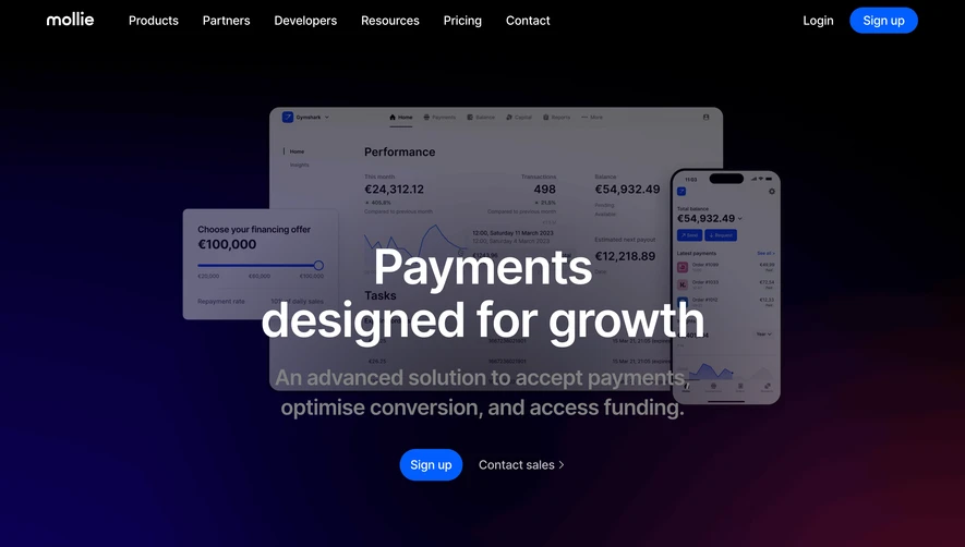
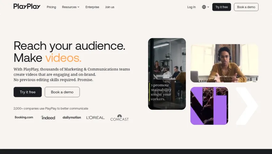
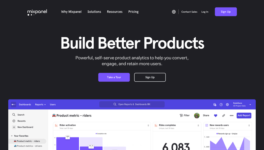
Generate a new design based on this screen using your own content.
Thank you! Your submission has been received!
Oops! Something went wrong while submitting the form.
# Design from Reference: Campsite Landing Page
Create an original, high-fidelity visual design inspired by the reference. Prioritize composition, typography, colors, spacing, and component styling over technical implementation.
## Reference
- **Product:** Campsite
- **Category:** Landing Page
- **Screenshot:** https://cdn.prod.website-files.com/5e9dc792e1210c5325f7ebbc/6acbc5492488d2f8f7d36781_6acbbb3db7ca13cf70092181_cms-344a21748d1da34b2cb46d05.webp
Analyze the screenshot first. If inaccessible, request it rather than guessing.
## Content
{{content.instructions}}
{{content.data}}
Preserve essential messaging and factual accuracy. Adapt structure and copy length for visual balance; never invent product claims.
## Visual Design
Use this context to reproduce the reference's visual language: layout, typography, colors, spacing, borders, radii, and distinctive elements. The screenshot takes priority if descriptions conflict.
## Direction
{{preferences.fidelityInstructions}}
## Output
{{output.instructions}}
Deliver a polished, cohesive design with precise alignment, hierarchy, and spacing. Produce the requested visual artifact, not just a description. If unsupported, explain the limitation.
Campsite Design presents a distinctly modern and minimalist aesthetic, characterized by generous white space and a carefully curated color palette that exudes approachability. The visual tone strikes a friendly yet professional balance, supporting the brand's ethos as an inspiring resource hub for modern design.
Layout and Structure
The homepage layout is clean and logical, led by a vibrant hero section featuring bold, centered headlines and a succinct value proposition. Below, modular sections showcase curated inspiration galleries, testimonials, and practical resources. Each section flows with ample breathing room, guiding users seamlessly down the page toward targeted CTAs.
Visual Elements
Campsite leans into engaging micro-animations, crisp vector illustrations, and a scattering of playful icons that punctuate the interface. Thumbnails and interactive previews bring the site's collection of design inspiration to life, while gentle hover effects invite exploration without overwhelming the senses.
Color Palette and Typography
A sophisticated mix of soft neutrals, bright accent hues (notably, a signature green), and purposeful pops of color creates visual hierarchy. The typography is typified by a bold geometric sans-serif for headlines, paired with legible body text, establishing clarity and thoughtful emphasis throughout.
User Experience Patterns
Navigation is intuitive: a sticky header with concise links and a standout CTA ensures effortless access. Scroll interactions reveal subtle transitions, while simple forms and interactive search facilitate immediate discovery. In every interaction, the site prioritizes usability and delight.
Unique or Notable Design Choices
Standout elements include dynamic, card-based galleries showcasing top designs and an inviting curation flow that feels both innovative and accessible. The tone is welcoming and energetic, leaving visitors excited to explore—and inspired to emulate—Campsite’s thoughtful approach to SaaS design.