Design with AI
Generate a new design based on this screen using your own content.
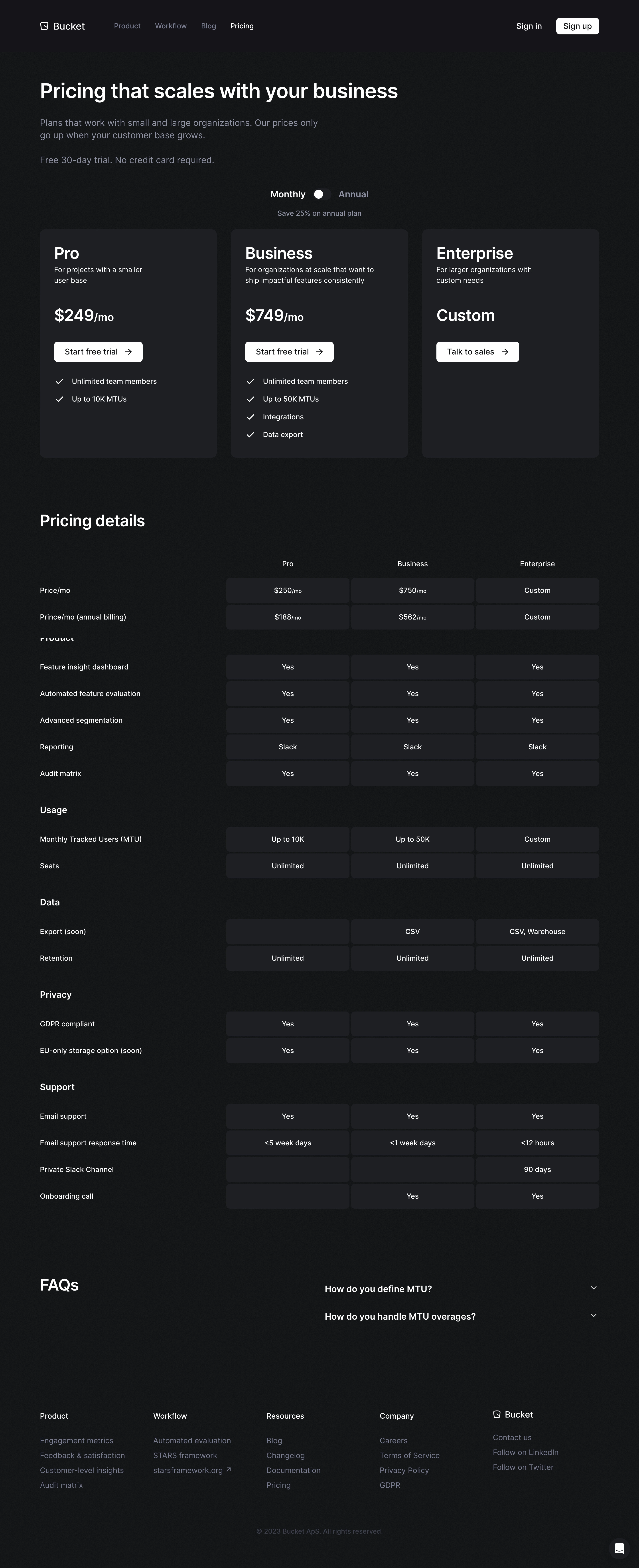
# Design from Reference: Bucket Pricing Page
Create an original, high-fidelity visual design inspired by the reference. Prioritize composition, typography, colors, spacing, and component styling over technical implementation.
## Reference
- **Product:** Bucket
- **Category:** Pricing Page
- **Screenshot:** https://cdn.prod.website-files.com/5e9dc792e1210c5325f7ebbc/6acb67f8c08cd859ff869358_6acb66d65a8f98ddabbe2773_cms-3850f09f004f98b93b2eea65.webp
Analyze the screenshot first. If inaccessible, request it rather than guessing.
## Content
{{content.instructions}}
{{content.data}}
Preserve essential messaging and factual accuracy. Adapt structure and copy length for visual balance; never invent product claims.
## Visual Design
### Overall aesthetic
- **Character:** Restrained dark pricing page with white conversion controls and a detailed comparison table.
### Page composition
- **Canvas:** 2880 × 7064 screenshot pixels. Navigation leads into a left-aligned pricing introduction, centered billing selector, three plan columns, grouped comparison rows, compact FAQ, and five-column footer.
### Information hierarchy
- **Sequence:** Introductory promise precedes billing period, plan price and action, feature summaries, then granular comparison. FAQ resolves remaining objections near the footer.
### Typography
- **Scale:** Estimated CSS at an assumed 2× capture: headline 48 px, plan names and prices about 36 px, section headings 36 px, body 18–20 px, comparison text 16 px. Sans serif family unverified.
### Colors & surfaces
- **Palette:** Sampled sRGB charcoal #1E1F24, #151619, #16171A, #131417, #141518, and #17181B form subtle dark surface variation. White headings/actions contrast with muted blue-gray secondary copy.
### Components
- **Plans:** Three equal Pro, Business, and Enterprise panels with approximately 32 CSS px padding and 12 px corners; white buttons around 46 px high have arrows and 6 px corners.
- **Comparison:** Left-hand row labels align with three rounded dark cells per row; groups include product, usage, data, privacy, and support.
### Visual rhythm
- **Spacing:** Estimated content width 1260 CSS px and 32 px column gaps. Broad introductory whitespace gives way to a tightly aligned comparison grid.
### Responsive
- **Adaptation:** Mobile is not shown. Stack plan cards, keep billing controls easy to reach, and provide a horizontally scrollable comparison with persistent row labels.
### Adaptation guidance
- **Transfer:** Retain the monochrome emphasis, consistent three-column alignment, and grouped comparison structure. Populate prices, savings, limits, and plan names from authoritative product data.
Use this context to reproduce the reference's visual language: layout, typography, colors, spacing, borders, radii, and distinctive elements. The screenshot takes priority if descriptions conflict.
## Direction
{{preferences.fidelityInstructions}}
## Output
{{output.instructions}}
Deliver a polished, cohesive design with precise alignment, hierarchy, and spacing. Produce the requested visual artifact, not just a description. If unsupported, explain the limitation.