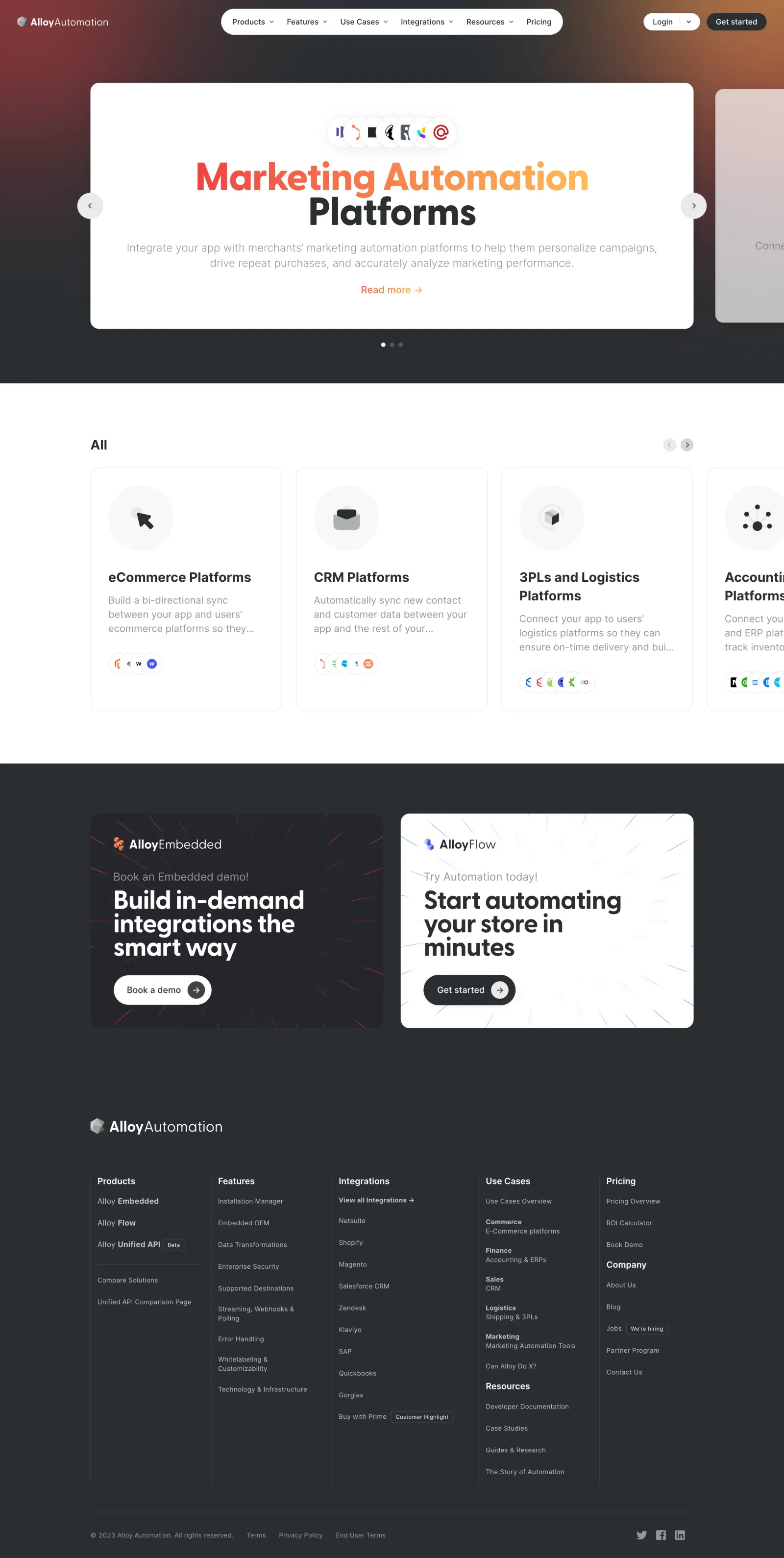
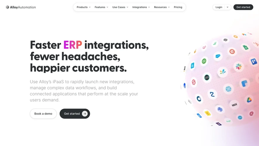
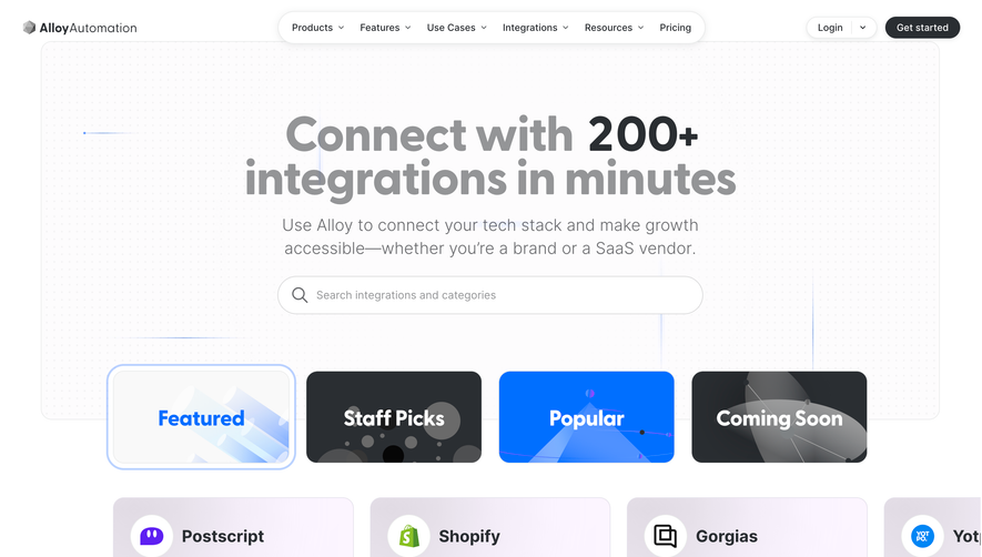
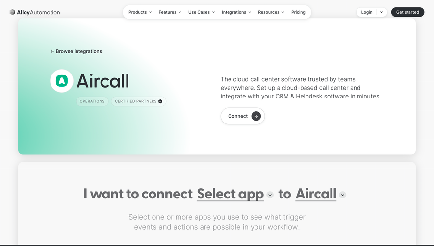
RunAlloy’s use cases page exudes a modern, professional vibe, featuring a clean, minimalist design that balances ample white space with striking, purposeful color accents. The visual atmosphere feels sophisticated yet approachable—catering to enterprise sensibilities without sacrificing warmth or personality.
Layout and Structure
The page opens with a focused, elegant hero section, utilizing succinct messaging and a clear call-to-action to anchor visitors’ attention. Below, use cases are segmented into highly scannable content blocks, each with its own illustrative icon and contextual description. The design avoids clutter, prioritizing readability and modular organization. The absence of intrusive pop-ups enhances the seamless scroll experience.
Visual Elements
Custom illustrations and clean, recognizable icons punctuate each use case, adding character while guiding the user’s eye. Subtle hover effects and micro-animations inject liveliness without overwhelming the core content. The visuals support, rather than distract from, the information, making complex workflows visually digestible.
Color Palette and Typography
RunAlloy employs a crisp palette—deep blues and purples for trust and energy, balanced by whites and greys for clarity. Accent colors highlight CTAs and key interactions. Typography features a modern, sans-serif font with strong hierarchy: bold headings, generous sub-headings, and legible body text, all enhancing scanability.
User Experience Patterns & Unique Touches
Intuitive navigation places key links at the top, with sticky elements ensuring effortless access. Primary CTAs stand out but don’t feel pushy. Attention to accessibility (contrast, font size) is evident. Overall, the tone is confident and innovative—projecting trust and clarity while showcasing complex capabilities in a digestible, visually inviting format.
 SaaSFrame