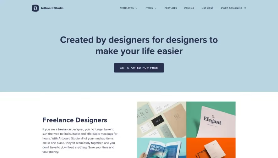
Generate a new design based on this screen using your own content.
Thank you! Your submission has been received!
Oops! Something went wrong while submitting the form.
# Design from Reference: The.com Use Cases
Create an original, high-fidelity visual design inspired by the reference. Prioritize composition, typography, colors, spacing, and component styling over technical implementation.
## Reference
- **Product:** The.com
- **Category:** Use Cases
- **Screenshot:** https://cdn.prod.website-files.com/5e9dc792e1210c5325f7ebbc/6acb723910423f7ec1f6520a_6acb70b859427db08a8b88d9_cms-cdbe8e77b5ff7b0fe6df78a8.webp
Analyze the screenshot first. If inaccessible, request it rather than guessing.
## Content
{{content.instructions}}
{{content.data}}
Preserve essential messaging and factual accuracy. Adapt structure and copy length for visual balance; never invent product claims.
## Visual Design
Use this context to reproduce the reference's visual language: layout, typography, colors, spacing, borders, radii, and distinctive elements. The screenshot takes priority if descriptions conflict.
## Direction
{{preferences.fidelityInstructions}}
## Output
{{output.instructions}}
Deliver a polished, cohesive design with precise alignment, hierarchy, and spacing. Produce the requested visual artifact, not just a description. If unsupported, explain the limitation.
The page exudes a modern, minimalist aesthetic with a distinct professional edge. The visual balance between generous white space and bold accent colors grounds the experience in clarity and focus, catering to tech-forward audiences. The tone is crisp and confident, with subtle touches of innovation visible in both content and presentation.
Layout and Structure
A meticulously organized layout guides the user journey. The hero section commands immediate attention, presenting a concise value proposition paired with a strong visual. Sequentially, feature sections break down use cases with prominent headings and scannable content blocks. A sticky navigation ensures easy jumps between key sections, while a strategically placed CTA ("Talk to Sales") persists throughout. The absence of testimonials and pricing streamlines the focus on product capabilities.
Visual Elements
Illustrations signal sophistication—abstract, colorful shapes underpinning each use case provide visual interest without overwhelming the message. Subtle micro-animations enliven iconography and transitions, fostering engagement. The imagery complements rather than distracts, echoing the SaaS commitment to adaptability and precision.
Color Palette and Typography
A palette dominated by deep navy, vibrant purples, and electric blues punctuates the calm background, producing energy and hierarchal clarity. Bold sans-serif headings reinforce scannability, while body text remains lightweight and readable. Hierarchy is distinct—each heading, subheading, and detail directs attention efficiently.
User Experience Patterns
Navigation is sticky and transitions smoothly, reducing friction as users explore. Multiple crisp, high-visibility CTAs nudge action without being aggressive. Scroll interactions are fluid, with anchoring effects that help orient users within the single-page layout.
Unique or Notable Design Choices
Standout features include the dynamic use-case tabs within a single scroll path, micro-animated transitions, and the seamless blend between abstract visuals and concrete product value. The energetic, trustworthy tone makes the experience both innovative and reliable—ideal for SaaS design inspiration.