
Thank you! Your submission has been received!
Oops! Something went wrong while submitting the form.
Get SaaSFrame Pro
Monthly
$18
Quarterly
$48
Yearly
$180
Upgrade to access this feature
Browse all screens & flows
Filter and search screens & flows
Access Figma files
Access mobile versions
Bookmark screens & flows
Join now
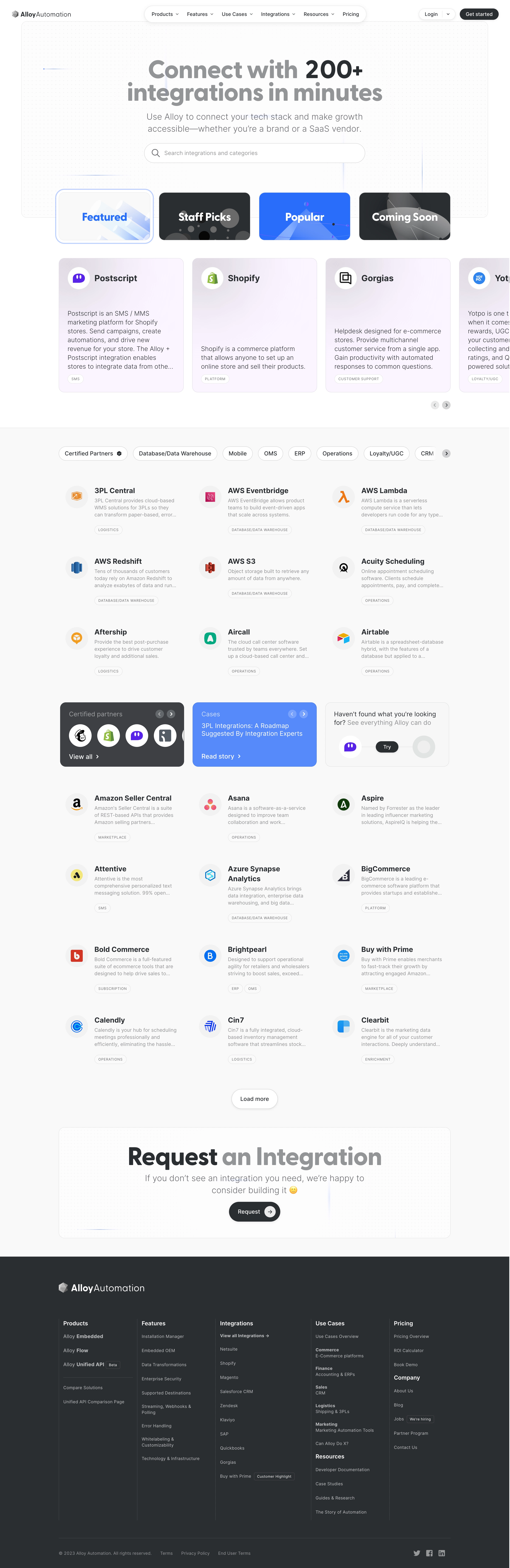

Alloy Integrations Library

Alloy
Build connected applications at the scale
Designed by
No items found.

Bookmark
Bookmark

Design with AI
Thank you! Your submission has been received!
Oops! Something went wrong while submitting the form.
# Design from Reference: Alloy Integrations Library
Create an original, high-fidelity visual design inspired by the reference. Prioritize composition, typography, colors, spacing, and component styling over technical implementation.
## Reference
- **Product:** Alloy
- **Category:** Integrations Library
- **Screenshot:** https://cdn.prod.website-files.com/5e9dc792e1210c5325f7ebbc/6acadbe8d05a3f53c0a862f5_6acadb35ca6d79c1e0c8de0f_cms-3b88bdf42eea2910a6c19711.webp
Analyze the screenshot first. If inaccessible, request it rather than guessing.
## Content
{{content.instructions}}
{{content.data}}
Preserve essential messaging and factual accuracy. Adapt structure and copy length for visual balance; never invent product claims.
## Visual Design
### Overall aesthetic
- **Character:** A polished integration directory combines oversized rounded headings, pill-shaped navigation, soft lavender cards, a dotted technical background, and a substantial dark footer.
- **Visual contrast:** The upper page is bright and airy; selected collections and promotional modules introduce electric blue and charcoal. Brand logos supply controlled multicolor detail.
- **Observed scale:** The source measures 2884 × 8872 pixels. CSS estimates below assume a 2× capture, approximately 1442 pixels wide; actual device pixel ratio and source CSS are unverified.
### Page composition
- **Header:** The Alloy Automation lockup sits at left, a floating white navigation capsule is centered, and Login plus a dark Get started pill sit at right. Dropdown chevrons accompany several navigation items.
- **Hero panel:** A large rounded bordered region with a faint dot grid contains a centered two-line integration headline, two-line supporting copy, and a wide rounded search field. Thin blue connector-like lines decorate the background.
- **Collection selector:** Four illustrated tiles overlap the hero’s lower boundary: Featured, Staff Picks, Popular, and Coming Soon. Featured has an outer pale-blue selected ring.
- **Featured carousel:** A horizontal row of tall lavender-tinted integration cards follows. Three cards are fully visible and a fourth is clipped at the right edge. Small previous/next controls sit beneath the row.
- **Directory region:** A very pale gray section begins with horizontally arranged category pills. Below, compact integration summaries form three columns and seven visible rows, with a promotional row inserted after the first three rows.
- **Promotional interruption:** Three equal-width modules show certified partners, a blue case-story card, and a light trial invitation with connected circular symbols.
- **Closing content:** A centered Load more button precedes a large dotted request-integration banner. The page then switches to a dark footer with branding, five main link columns, and a lower legal/social strip.
### Information hierarchy
- **Hero message:** The headline uses very large gray lettering with “200+” emphasized in charcoal. This is captured marketing copy, not a verified current integration count.
- **Discovery priority:** Search and the four collection tiles establish two immediate browsing methods. Category pills provide a second filtering level within the directory.
- **Featured versus standard:** Featured cards are large, tinted, and descriptive. Standard entries use smaller logos, bold titles, short muted descriptions, and category badges without enclosing card boxes.
- **Promotion hierarchy:** The blue case-story module interrupts the neutral directory, while the darker partner module echoes the footer palette.
- **Fallback action:** The request banner addresses missing integrations after the browsable list rather than competing with search at the top.
- **Footer organization:** Bold group headings and vertical rules organize many secondary destinations. Small badges annotate selected links.
### Typography
- **Typeface appearance:** Headings use a broad rounded sans-serif, while body and utility text use a lighter neutral sans-serif. Exact font identities are unverified.
- **Hero title:** Approximately 68–72 CSS pixels, bold around 700, with line-height near 68–74 pixels and slightly tight tracking.
- **Hero supporting copy:** Approximately 24–26 pixels, light/regular weight, with 32–34-pixel line-height and a broad centered measure.
- **Featured titles:** Around 25–28 pixels and semibold. Collection-tile labels are around 30–32 pixels, bold, and centered over artwork.
- **Directory text:** Entry names are approximately 21–23 pixels and semibold; descriptions are roughly 14–16 pixels with 20-pixel line-height. Titles wrap when needed.
- **Utility roles:** Navigation, buttons, and category filters are around 14–16 pixels. Category badges use about 10–11 pixels, uppercase, with expanded tracking.
- **Footer text:** Group headings are approximately 16 pixels and bold; links and legal details are around 12–14 pixels with generous vertical separation.
### Colors & surfaces
- **Measured base palette:** #F9F9F9 dominates the directory background. #FFFFFF and sampled near-white #FDFCFD support the brighter hero and controls.
- **Measured charcoal:** #2A2E32 appears extensively in the footer and dark controls, creating the page’s strongest large-area contrast.
- **Measured lavender:** #FCF5FF and nearby #FBF4FF occur in the softly tinted featured-card region.
- **Measured blue:** #438CFF appears in the blue promotional treatment. The Popular tile uses a more saturated electric-blue appearance.
- **Text tiers:** Main names are charcoal, descriptions are muted gray, and the oversized hero mixes gray and dark emphasis. Footer headings are white with softer gray links.
- **Depth and outlines:** Pills have subtle gray outlines and occasional soft shadows. Featured cards use fine lavender borders and gentle gradients; the directory entries remain largely flat.
- **Background texture:** Tiny pale dots and faint blue line segments add technical character without becoming a dense diagram.
### Components
- **Navigation capsule:** A rounded white bar approximately 625 pixels wide contains six destinations with compact spacing and small chevrons. A soft shadow separates it from the hero.
- **Search field:** About 625 × 56 CSS pixels, fully rounded, with a magnifying-glass icon at left and muted descriptive placeholder text. No entered query or result state is shown.
- **Collection tiles:** Four tiles around 255 × 135 pixels have roughly 16-pixel radii. Their illustrations use abstract translucent shapes; the selected first tile has a separate outer ring.
- **Featured integration card:** Approximately 350 × 380 pixels, with a circular white logo holder, bold name, substantial open vertical space, lower descriptive copy, and a small outlined category badge. Long copy truncates with an ellipsis.
- **Carousel controls:** Small gray circles contain directional chevrons. The clipped fourth card implies horizontal continuation; actual scrolling behavior is unverified.
- **Category filters:** Outlined white pills have varying widths according to label length. Certified Partners includes a small verification symbol; an arrow control indicates additional categories.
- **Directory entry:** A roughly 64-pixel circular logo holder sits left of a text block. The block contains name, two or three muted description lines, and one or more small category badges.
- **Partner module:** A dark rounded panel includes a muted heading, circular partner logos, small arrows, and a View all link.
- **Case module:** A blue rounded panel includes a small category label, multiline story title, carousel arrows, and Read story at the bottom.
- **Trial module:** A light outlined panel pairs a short invitation with a horizontal connection illustration and dark Try pill.
- **Request banner:** A large rounded dotted panel contains an oversized two-tone heading, centered supporting copy, and dark Request pill with a pale circular arrow inset at right.
- **Footer:** Five columns cover products, features, integrations, use cases/resources, and pricing/company. Fine vertical separators and small outlined badges add structure. A lower horizontal rule separates legal links from the main columns.
### Visual rhythm
- **Centered framework:** Hero, featured row, directory, request banner, and footer content share a broad central alignment, roughly 1100 pixels wide in the assumed CSS scale.
- **Large-to-small progression:** Oversized hero typography gives way to large collection tiles, tall featured cards, and then a denser three-column directory.
- **Directory spacing:** Rows have broad vertical gaps, around 60–80 pixels between content groups. Logos and text start consistently across columns.
- **Controlled interruption:** The promotional row breaks the repeated entry pattern while maintaining three-column alignment.
- **Shape repetition:** Pills, circles, rounded cards, and small outlined badges recur throughout. The dark footer supplies a clear visual ending.
- **Whitespace:** Featured cards intentionally leave open space between title and description, while directory entries use compact text blocks.
### Responsive
- **Evidence limit:** Only a desktop page is captured. Clipped carousel cards establish horizontal continuation but do not verify mobile behavior.
- **Recommended navigation:** Collapse the central navigation capsule to an accessible menu while retaining a clear primary action.
- **Recommended hero:** Reduce headline size to roughly 38–48 CSS pixels on small screens, keep the search field fluid, and reduce decorative lines where they interfere with text.
- **Recommended collections:** Use a two-by-two tile arrangement or an accessible horizontal selector. Preserve a visible selected state beyond color alone.
- **Recommended directory:** Move from three columns to two and then one. Keep logo size stable enough for recognition and permit long names to wrap.
- **Recommended promotional/footer layout:** Stack the three promotional modules and footer groups. Preserve logical reading order and usable link spacing.
### Adaptation guidance
- **Maintain discovery layers:** Offer search, curated collections, and category filters as distinct but coordinated browsing tools.
- **Use two entry templates:** Reserve large tinted cards for featured integrations and compact logo/text summaries for the main catalog.
- **Keep states explicit:** Define search results, no results, selected category, loading, pagination, and keyboard focus. Only the default and selected collection appearances are shown here.
- **Build a concise token set:** Start from measured near-white, charcoal, lavender, and blue, then standardize radii, pill heights, badge text, and directory spacing.
- **Make carousels accessible:** Provide labeled controls, keyboard navigation, meaningful logo alternative text, and a non-drag browsing method.
- **Validate content separately:** Integration counts, descriptions, partner status, and case-study claims are historical screenshot material. Use approved current data in a live adaptation.
Use this context to reproduce the reference's visual language: layout, typography, colors, spacing, borders, radii, and distinctive elements. The screenshot takes priority if descriptions conflict.
## Direction
{{preferences.fidelityInstructions}}
## Output
{{output.instructions}}
Deliver a polished, cohesive design with precise alignment, hierarchy, and spacing. Produce the requested visual artifact, not just a description. If unsupported, explain the limitation.


Category
Patterns
No items found.
Tech Stack

Added on
August 22, 2023
Similar screens
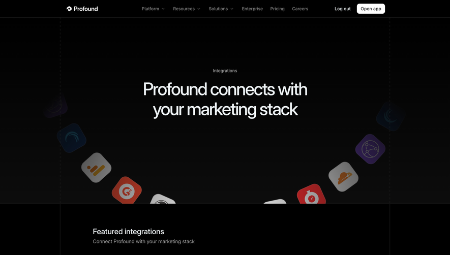




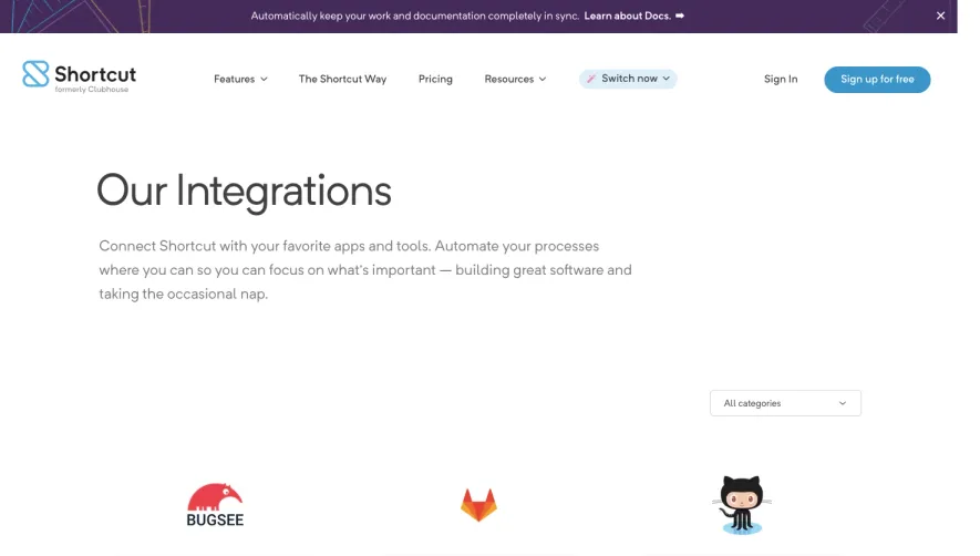

Upgrade to SaaSFrame Pro now to see similar examples.
Monthly
$18 /month
Billed $18 monthly
Browse all screens & flows
Filter and search screens & flows
Search text in screenshots
Access Figma files
Access mobile versions
Join now
Quarterly
$16 /month
Billed $48 quarterly
Browse all screens & flows
Filter and search screens & flows
Search text in screenshots
Access Figma files
Access mobile versions
Join now
Yearly
$15 /month
Billed $180 yearly
Browse all screens & flows
Filter and search screens & flows
Search text in screenshots
Access Figma files
Access mobile versions
Join now