Prompt 1,043 words Copy
# Design from Reference: Voiceflow Pricing Page

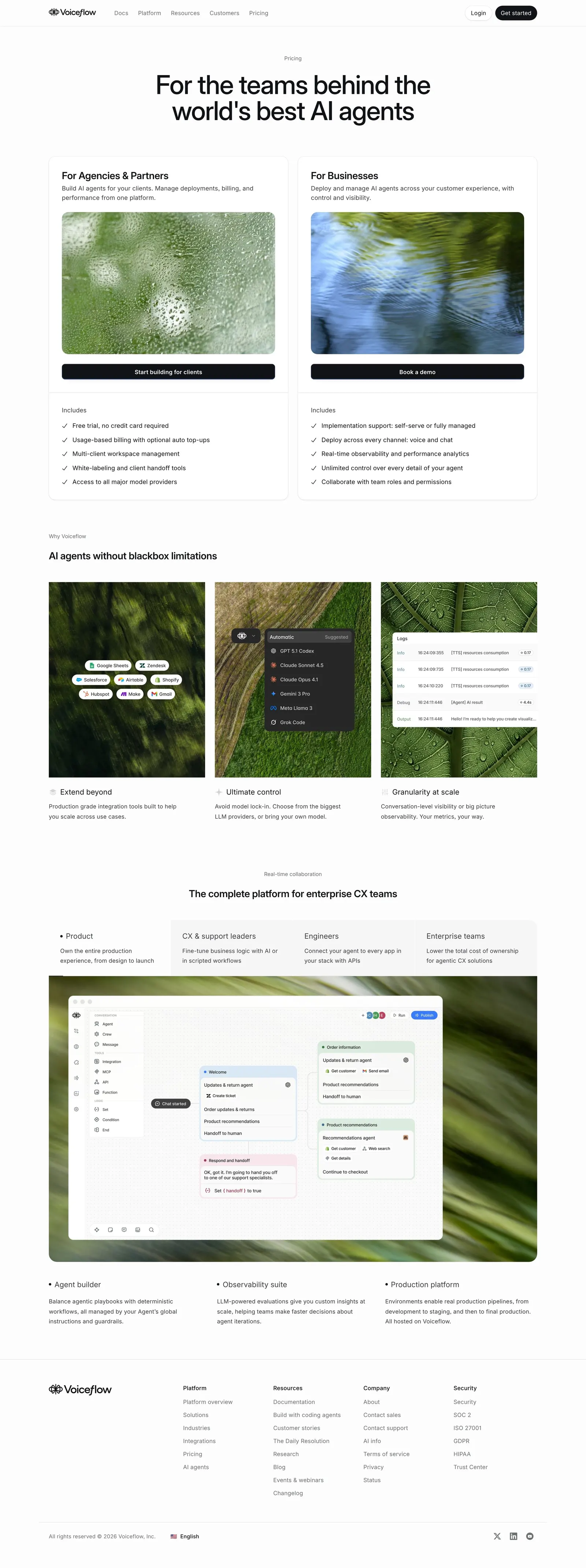
Create an original, high-fidelity visual design inspired by the reference. Prioritize composition, typography, colors, spacing, and component styling over technical implementation.

## Reference

- **Product:** Voiceflow
- **Category:** Pricing Page
- **Screenshot:** attached to this message (also available at https://media.saasframe.io/v/9b55055d2bff7e799f88-1600.webp)
- **Source:** https://www.voiceflow.com/pricing

Analyze the attached screenshot first. If no image is attached, open the screenshot link; if neither is accessible, ask for it rather than guessing.

## Visual Design Context

## Voiceflow — shared visual language

- **Theme**: light, near-monochrome marketing site. Off-white page (#FDFDFD) with white cards (#FFFFFF), hairline grey borders (~#E2E4E5) and 16px card radii; full-bleed near-black bands (#101215 / #1A1E23) for enterprise, security and testimonial moments.
- **Typography**: Inter (variable, weights 300/510/590) everywhere. Hero H1 64px/64px, weight 510, tracking -1.408px; section H2 40px/42px 510 (-0.88px) or 24px/32px 590 for card groups. Index pages switch the H1 to a light 300 weight. Eyebrows are small 13px/590 grey (#6E7174) labels above headings. Body 14–15px/400, line height 1.4, tracking 0.16px; lead copy 18px. JetBrains Mono for code and data in product mocks.
- **Colors**: ink #101215, secondary text #3B3D40 / #6E7174, muted #A0A3A6. Almost no brand color on the site: a single blue (#397DFF) appears on rare primary actions; soft pale blue (#C6E4FB) on a few product surfaces. Imagery is photographic and atmospheric (blurred foliage, aerial landscapes, roads) used as card backgrounds behind crisp UI.
- **Components**: 36px pill buttons (radius 9999px) — black primary "Get started", white/outline secondary, text links with a → arrow. Sticky slim top nav (logo, Docs, Platform, Resources, Customers, Pricing; Login + black pill). Real product UI screenshots (agent builder, playbooks, transcripts) framed in white windows over photos. Industry chips in tiny uppercase. Metric callouts ("70% AI resolution rate") set large in Inter. FAQ as a two-column list with a heading on the left and divider rows with chevrons on the right.
- **Layout**: 1248px content width, centered heroes on marketing pages, left-aligned heroes on index and content pages, breadcrumbs ("Home › Solutions") above H1s. A four-column footer (Platform, Resources, Company, Security) with the wordmark and a language selector.
- **Tone**: confident, engineering-minded and specific — "AI agents, built like software", real numbers, named customers, second person.

## Voiceflow app (creator.voiceflow.com) — product UI

- **Theme**: light grey canvas (#F1F2F2) with white content panels (#FFFFFF, 12px radius, hairline border) next to a dark fixed sidebar (#1F2429, items in #B7BCBD, active item on a lighter #30373F pill).
- **Typography**: UCity Pro throughout the app, mostly 13–15px; page titles ~22px semibold in #1A1E23; Fira Code for code and JSON.
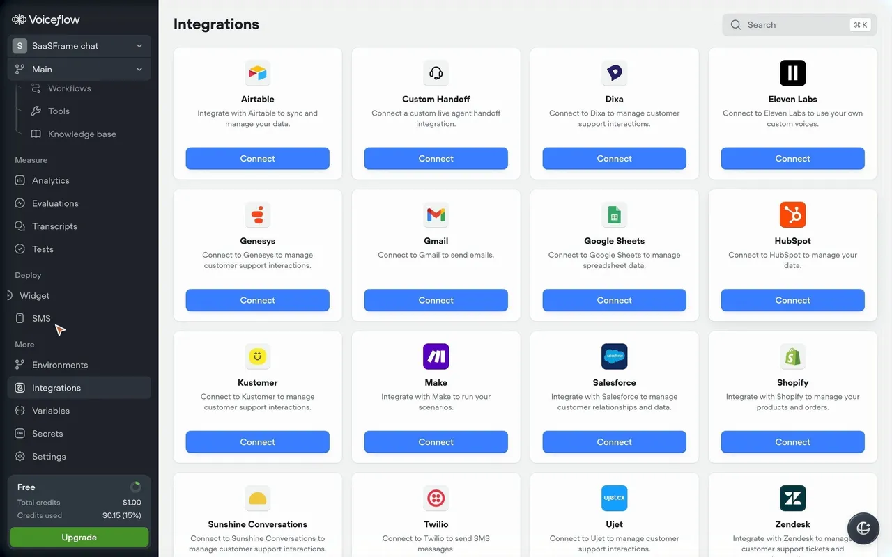
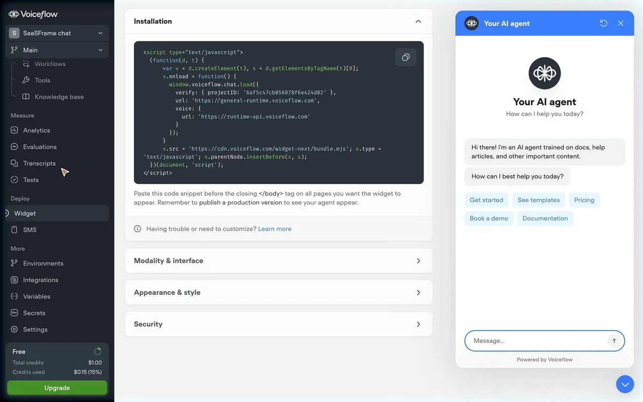
- **Sidebar**: agent switcher and branch ("Main") selects at the top, "Work with Atlas" entry with a "New" badge, then grouped sections Build (Agent, Playbooks, Workflows, Tools, Knowledge base), Measure (Analytics, Evaluations, Transcripts, Tests), Deploy (Widget, SMS) and More (Environments, Integrations, Variables, Secrets, Settings); a "Free" credits card with a green "Upgrade" button (#449127) at the bottom.
- **Colors**: blue #397DFF for primary actions ("New playbook", "Run", "Add data source", "Connect"), green #449127 for upgrade and publish, otherwise greys #30373F / #656D75 / #9AA1A3.
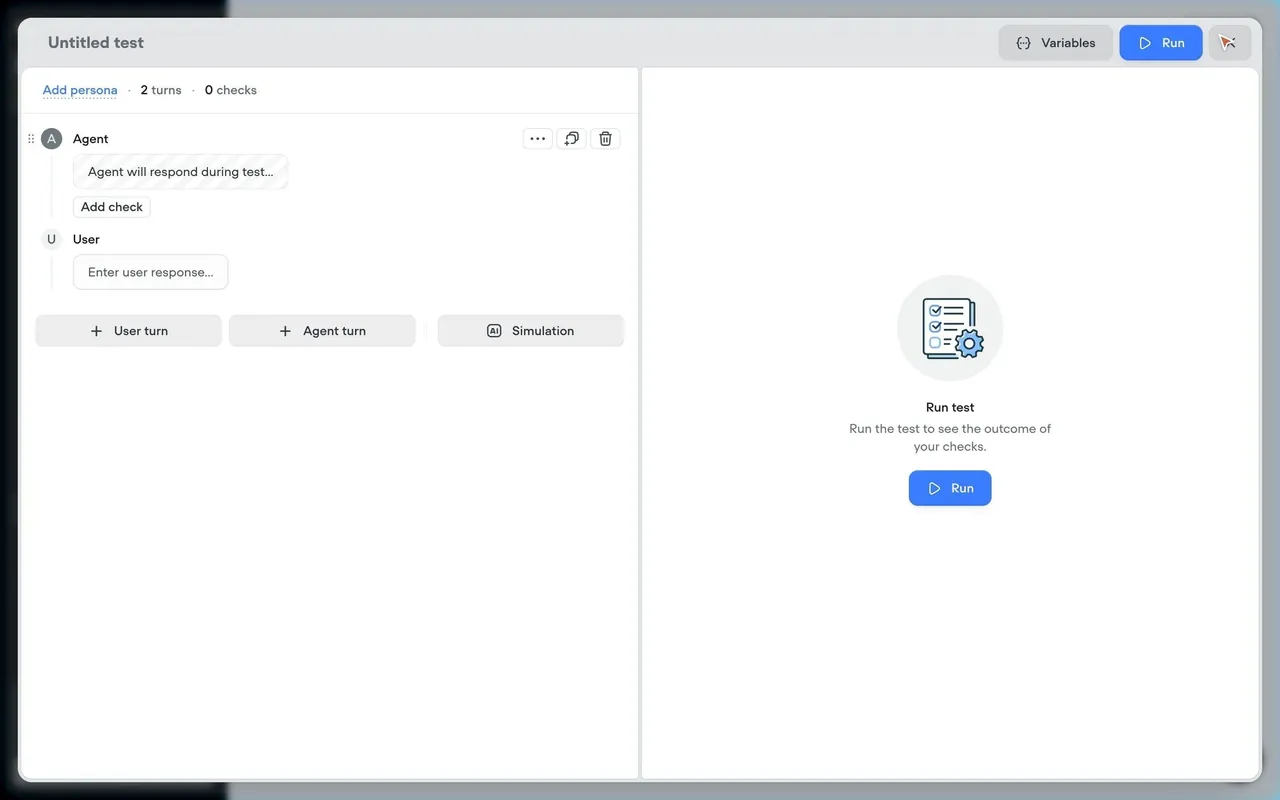
- **Components**: 32–40px buttons with 8–10px radii, line icons, empty states with a round grey illustration badge, one sentence and a blue call to action; right-hand panels for Atlas and test runs; ⌘K search fields.
- **Onboarding (creator.voiceflow.com/start)**: pre-signup chat with the Atlas assistant in a single centered white card over a pastel gradient, with a five-step checklist (Brand, Goal, Skills, Channel, Integrations) on the left.

### Overall aesthetic

- **Style:** Sales-led pricing page without numbers; photography and UI fragments carry the value.

### Page composition

- **Hero:** Centered 64px H1 with a small "Pricing" eyebrow.
- **Offers:** Two equal cards: photo header, title, short copy, full-width black CTA, then an "Includes" checklist under each.
- **Body:** Three-card argument row, a tabbed role section with a wide product screenshot over a blurred photo, three feature columns, footer.

### Typography

- **Scale:** H1 64px/510; card titles 24px/590 (-0.288px); body 14–15px; lists 14px with check icons.

### Colors & surfaces

- **Backgrounds:** #FDFDFD, white cards, nature photos (rain-on-glass, foliage), dark #101215 CTA bars.

### Components

- **Buttons:** Full-width black bars inside offer cards; 36px pills in the nav.
- **Radii:** 16px cards, 8–10px fragments, 20px photo frames.

### Responsive

- **Mobile:** Offer cards stack, the role tabs scroll horizontally.

### Adaptation guidance

- **Reuse:** When pricing is custom, segment by buyer (agencies vs businesses) with one clear action each and list what's included instead of prices.

## Content

**Instructions:**

Generate realistic example content that fits the selected design reference.

Create appropriate headlines, descriptions, labels, buttons, and supporting copy based on the type of interface being designed.

If a product or business description is provided, use it to guide the content.

Otherwise, invent a plausible fictional SaaS product appropriate for the reference.

Keep the content concise, coherent, and visually balanced.

Do not present fictional statistics, customer names, or testimonials as verified facts.

## Design Direction

**Instructions:**

Use the reference screenshot as the main source of visual inspiration rather than a strict layout template.

Preserve its most distinctive design characteristics, such as typography, visual rhythm, color relationships, component treatments, and overall aesthetic.

Feel free to modify section arrangements, proportions, spacing, and individual components to better suit my content.

Introduce original design decisions where they improve usability, composition, or brand consistency.

The result should clearly reflect the reference's visual language without looking like a direct reproduction.

Follow the visual identity of the reference design.

Use its typography, color palette, component styling, and overall aesthetic as the primary design direction.

Do not introduce an unrelated visual identity.

## Output

**Instructions:**

Generate a high-fidelity visual mockup of the requested interface.

Present the design as a polished, realistic website or product UI screenshot.

Prioritize visual composition, typography, spacing, colors, alignment, and component details.

Use the available image-generation or visual-design capabilities.

Do not replace the mockup with source code, a written design specification, or a textual description.

If direct visual generation is unavailable, clearly explain the limitation.

## Constraints

- Use the actual screenshot as the primary visual reference.
- Preserve essential messaging and factual accuracy.
- Prioritize visual quality and consistency.
- Do not invent unsupported product claims.
- Adapt structure and copy length for visual balance.
Reference image Attach it to your message: assistants can’t open image links. Open in ChatGPT ↗ Open in Claude ↗
Build it in Lovable ↗ v0 ↗ Figma Make ↗
Opening a tool copies the screenshot so you can paste it with your prompt.
 SaaSFrame