Overall Style and Aesthetic
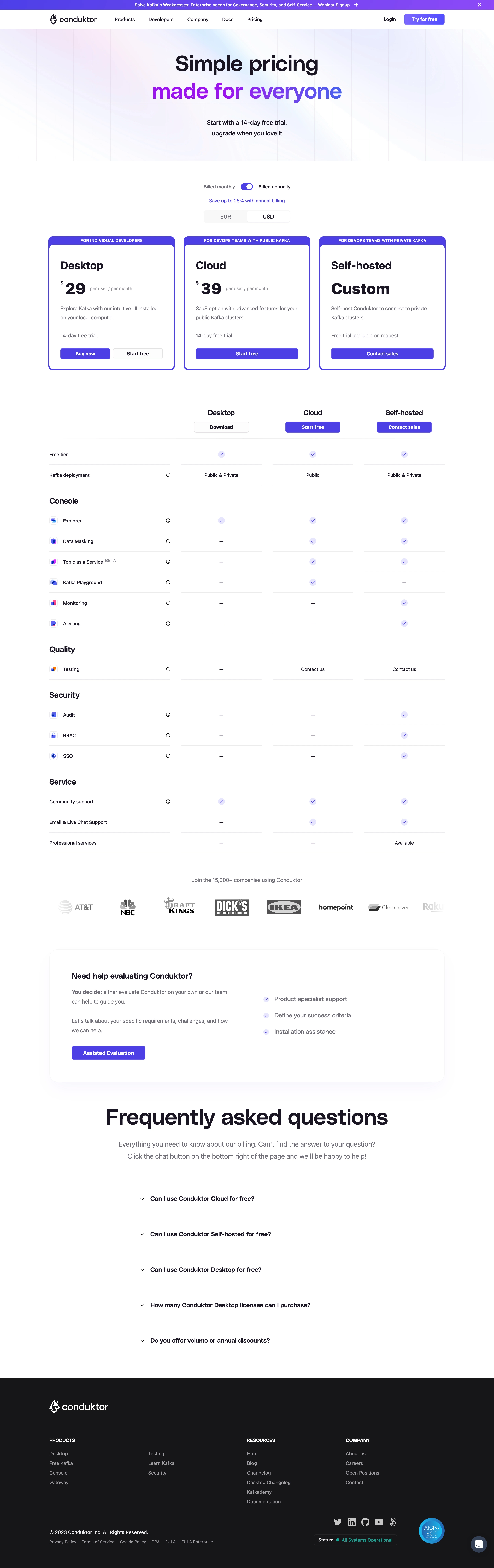
The Conduktor pricing page radiates a clean, modern professionalism that balances enterprise trustworthiness with vibrant energy. The design leans minimalist, leveraging ample white space and crisp sectioning to give every element room to breathe. Pops of vivid blue and gradient accents inject a sense of innovation and digital dynamism, culminating in an interface that feels both approachable and robust. Layout and Structure
The structure is highly intuitive: beginning with a compelling hero section that contextualizes pricing, followed by clearly divided plan cards. Each plan is distinctly bordered, neatly segmented, and topped with a succinct summary and single, prominent CTA. The pricing tables scroll horizontally—a fresh twist on the common vertical stack—minimizing cognitive load while maximizing comparison efficiency. Logos, FAQ, and a concise, confidence-building footer complete the journey. Visual Elements
Custom illustrations and bespoke icons punctuate the page, offering visual waypoints that help visitors parse key features. Subtle animations upon hover, including glowing call-to-action buttons and interactive toggle switches, create a tactile, interactive experience. The iconography feels tailored—simple yet memorable—while the restrained use of gradients adds a contemporary flair without distracting from core content. Color Palette and Typography
Dominated by deep blues contrasted with light backgrounds and vibrant accent gradients, the color palette exudes both security and digital innovation. Font choices are modern sans-serifs—likely Inter or a similar geometric family—with strategic weight variation for headlines, plans, and features, ensuring legibility and clear visual hierarchy. User Experience Patterns & Notable Choices
Navigation is sticky and minimal, guiding users effortlessly to core actions like contact or product tour. Pricing toggles are tactile, switching between payment cycles with smooth micro-interactions. Notably, the horizontal plan layout promotes rapid scanning, with each plan card’s CTA persistent. The site tone is confidently reassuring and progressive, inviting visitors to explore without overwhelm—a masterclass in balancing business gravitas with SaaS agility.