.webp)
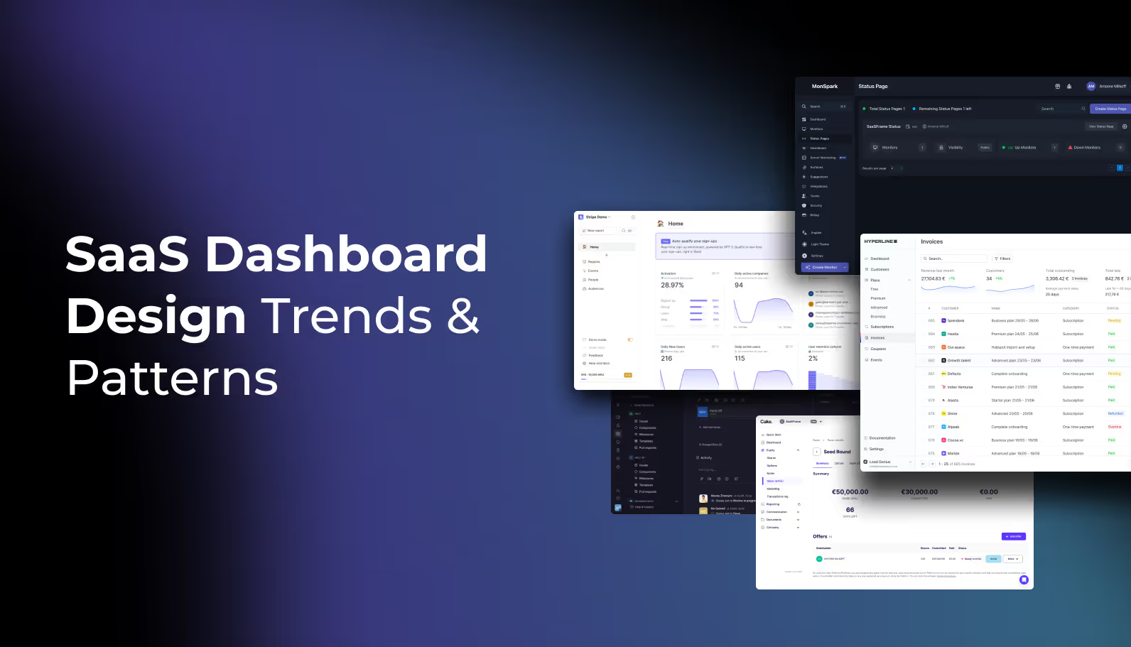
Designing a SaaS dashboard is a balancing act. You are tasked with condensing complex data into a simplified interface while ensuring the user feels empowered, not overwhelmed.
At Saasframe, we’ve analyzed hundreds of the world’s most successful SaaS products. We’ve noticed that the "pretty" dashboards often fail, while the high-retention dashboards follow a specific set of structural rules.
In this guide, we’re breaking down the anatomy of modern SaaS dashboard design based on real-world patterns from industry leaders.
1. Information Architecture: The "F-Pattern" for Data
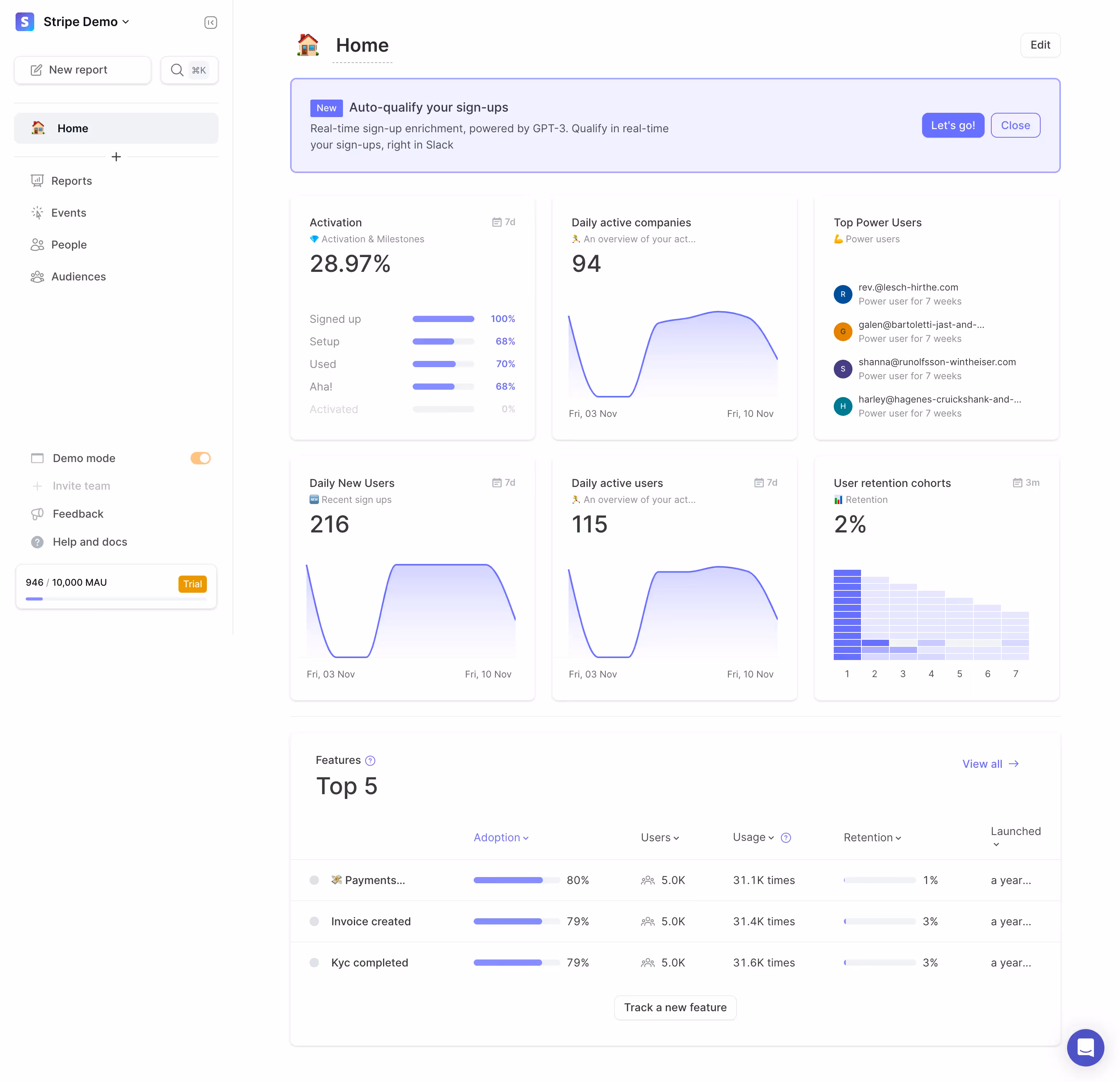
When a user lands on their dashboard, they aren't reading; they are scanning. Our research shows that the most effective dashboards prioritize information using a modified F-pattern.
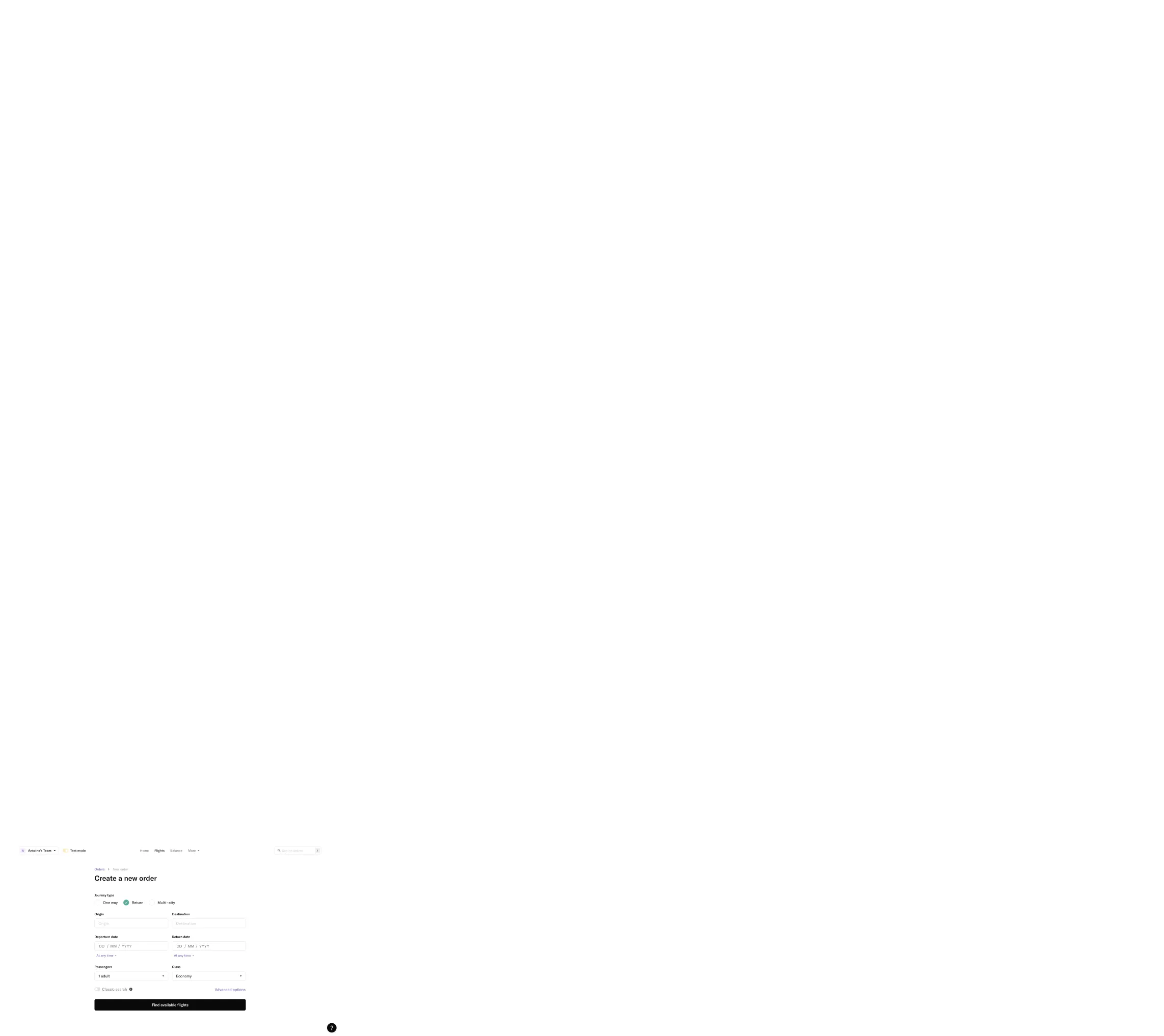
- The Top-Left Quadrant: This is the highest-value real estate. Reserve this for the "North Star Metric"—the single most important number your user needs to see to feel successful.
.avif)
- Global Navigation: While horizontal top-bars were popular, we see a massive shift back to collapsible left-sidebars. Why? It offers more vertical scaling for complex SaaS tools with multiple sub-modules.

2. Moving from "Information" to "Action"
The biggest mistake in SaaS dashboard design is treating it like a static report. Modern users expect Operational Dashboards.
Instead of just showing a chart that says "Sales are down 10%," high-performing designs provide an immediate "Next Best Action."
- A "Tasks" or "To-Do" widget integrated directly into the dashboard.

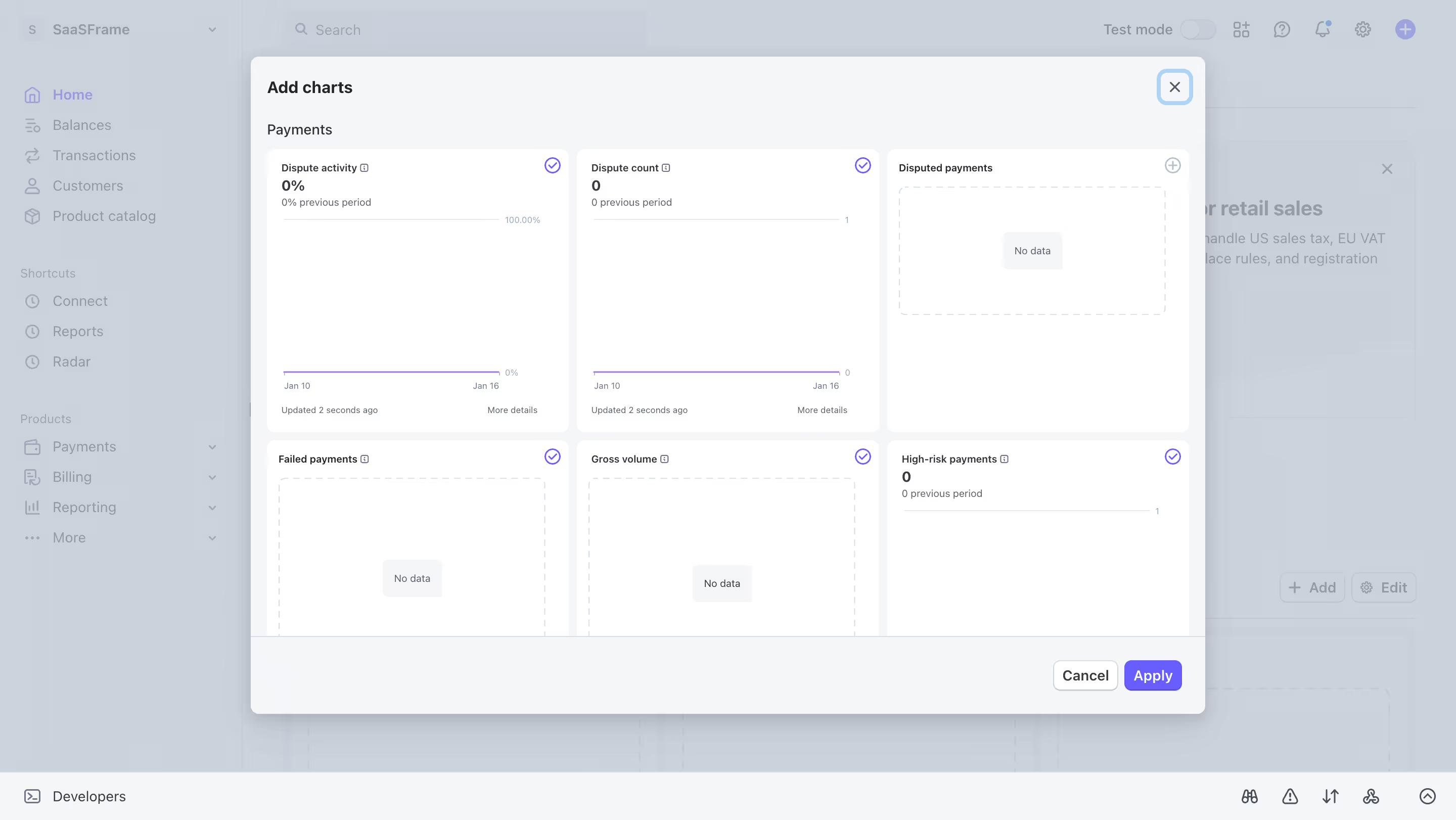
- Design Tip: Use "Empty States" strategically. If a user has no data, don't show a blank chart. Show a CTA (Call to Action) that explains how to get that data flowing.

3. Data Visualization: Clarity Over Aesthetics
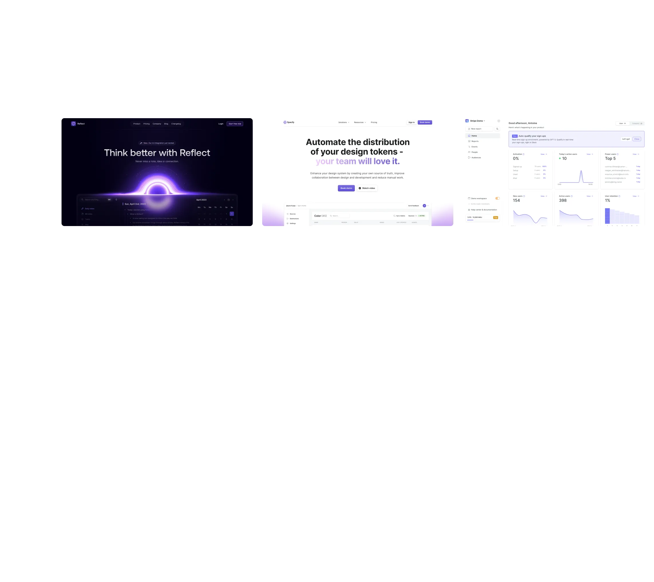
It is tempting to use unique, custom charts to make a dashboard look "innovative." However, our analysis of top-tier tools (like Stripe and HubSpot) shows they stick to the classics:
- Line Charts: For trends over time.
- Bar Charts: For comparing categories.
- Donut Charts: For part-to-whole relationships (but only with 3 or fewer variables).
The Golden Rule: If a user has to hover over a data point to understand the basic gist of the chart, the visualization has failed.
4. The Rise of the "Personalized" View
One size rarely fits all in SaaS. A "Manager" wants a high-level bird's-eye view, while an "Analyst" wants granular tables.
The best SaaS dashboard designs in 2026 are implementing Modular UI. This allows users to:
- Rearrange Widgets: Using drag-and-drop layouts.
- Filter Globally: A single date-picker or category filter that updates every widget on the page simultaneously.
- Save Views: Allowing users to toggle between different dashboard configurations based on their current task.
5. Accessibility and Dark Mode
In 2026, accessibility is no longer an "extra"—it’s a requirement. High-contrast ratios and screen-reader-friendly data tables are essential. Furthermore, Dark Mode has become a standard expectation for "Power User" tools to reduce eye strain during long sessions.

Conclusion: Start with Inspiration
Don't design in a vacuum. The best way to build a world-class dashboard is to see how the world's most successful companies have solved the same problems you are facing.
Whether you are looking for the perfect sidebar navigation or a better way to display data tables, you can find 5,000+ real-world SaaS dashboard examples in our curated library.