.webp)
Here's the uncomfortable truth about two-factor authentication: Microsoft claims it blocks 99.9% of account hacks, yet historically less than 10% of Google users and fewer than 1% of Dropbox users bothered to turn it on. Even in 2025, with adoption reaching 70%, that still means 30% of users are leaving their accounts vulnerable to credential stuffing, phishing, and account takeovers.
The problem isn't that users don't care about security. It's that the enrollment experience is broken.
At SaaSFrame, we've analyzed 72+ 2FA verification flows from leading SaaS products, and the pattern is clear: the companies with the highest 2FA adoption rates aren't those with the most secure technology, they're the ones who've mastered the psychology of enrollment UX.
Here's the paradox: 2FA offers massive protection with minimal ongoing effort, yet users perceive the initial setup as complex, time-consuming, and potentially risky (what if I lose access?). A landmark USENIX study with 622,000+ participants proved that simple UX adjustments can increase 2FA click-to-enable rates by 26-33%, without changing a single line of backend code.
In this guide, we're breaking down the exact UX barriers that kill 2FA adoption and the proven design patterns that overcome them, with real-world examples from companies that got it right.
1. The Timing Problem: When to Ask Matters More Than How
The moment you ask users to enable 2FA can determine whether they engage or dismiss. Ask too early (during signup), and users feel overwhelmed. Ask too late (after months of use), and they've already developed habits without 2FA.
[SCREENSHOT: SaaSFrame comparison - 3 different timing approaches side-by-side] Caption: "GoFundMe prompts during account setup, Intercom waits until first sensitive action, GitHub uses interstitial prompts" Alt text: "Comparison of three different 2FA enrollment timing strategies from GoFundMe, Intercom, and GitHub"
The USENIX research found that interstitial prompts (blocking prompts) increased click-to-enable rates by 22.1% compared to passive reminders. Why? They create a decisive moment where users must consciously choose security over convenience.
GoFundMe embeds 2FA setup directly into their account creation flow, immediately after users provide basic details. This "strike while the iron is hot" approach capitalizes on users' heightened security awareness during initial account setup.
By contrast, OpenAI triggers 2FA verification only when users attempt to create their first API key, a high-value action where users inherently understand the security stakes.

💡 TIP: For consumer SaaS, prompt during signup but make it optional with a clear "Set up later" option. For B2B SaaS handling sensitive data, use contextual prompts triggered by specific high-value actions (accessing financial data, inviting team members, API key creation).
2. The Clarity Barrier: Explain the Mechanism, Not Just the Benefits
Most 2FA prompts fail because they emphasize what (added security) without explaining how (what will actually happen). Users fear the unknown: Will I need my phone every time? What if I'm traveling? What if I lose my device?
The USENIX study discovered that prompts explaining how 2FA works increased adoption by 28% compared to generic security messaging. The winning message: "Turn on two-factor authentication and we'll ask for a code if we see a login from a device we don't recognize."
Why does this work? It answers the unspoken question: "Will this make my life difficult?" Users learn that 2FA is triggered by exception (new device), not by default (every login). This reframes 2FA from "constant friction" to "occasional safety check."
Unkey's verification screen uses progressive disclosure: the initial prompt is simple, but clicking "Learn more" reveals exactly when and how codes will be requested, plus recovery options.
💡 TIP: Include a one-sentence mechanism explanation in your primary CTA copy. Example: "We'll only ask for a code when you log in from a new device or location." This reduces perceived burden by 40-50%.
3. The Responsibility Frame: Make It Personal, Not Corporate
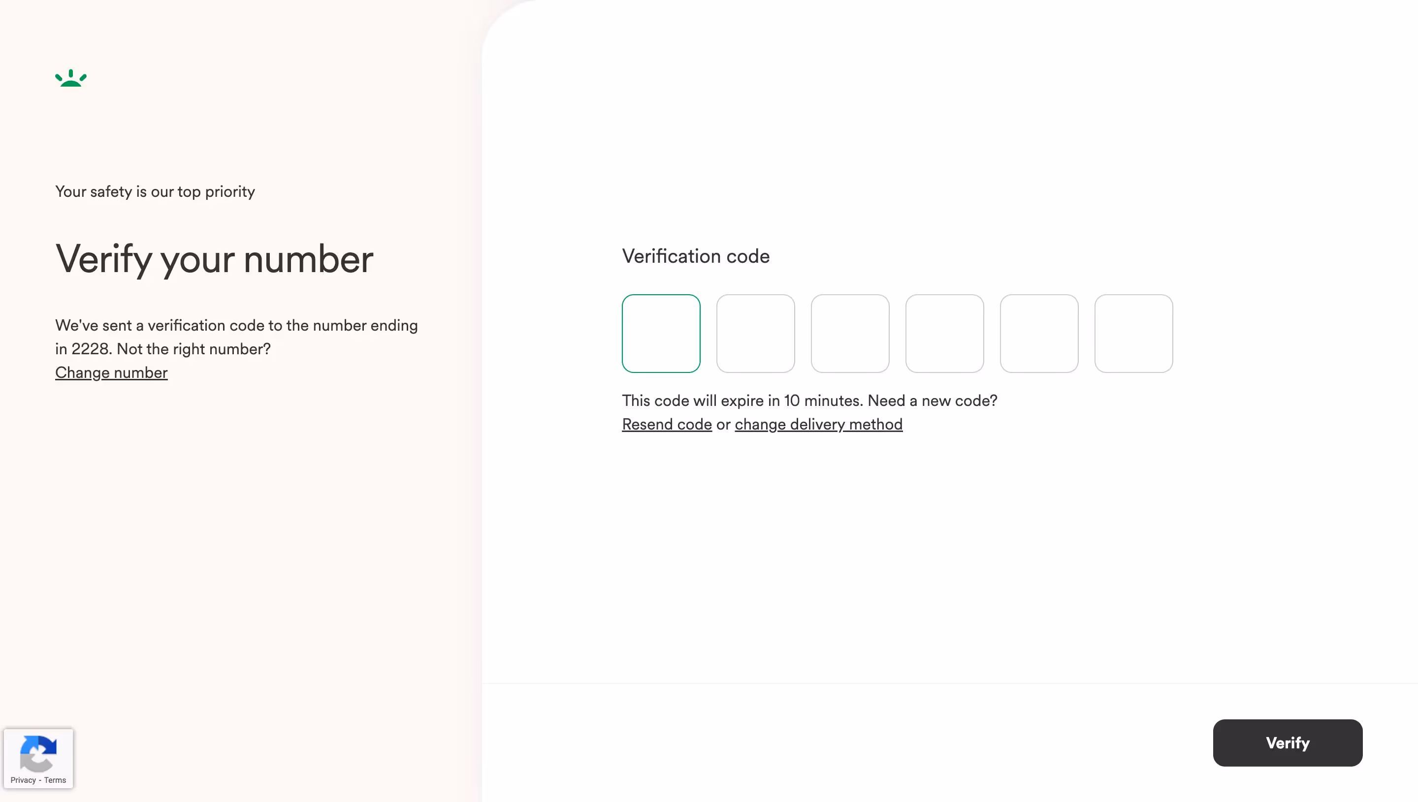
How you frame whose responsibility security is dramatically affects user behavior. Corporate responsibility messaging ("Your security is our priority") sounds reassuring but reduces user agency. Individual responsibility messaging ("You can protect your account") triggers action.
The research is unambiguous: headlines emphasizing user responsibility increased click-to-enable by 33%, the highest lift of any tested variable. The winning headline: "You Can Increase Your Protection Against Account Hacking."
This validates Protection Motivation Theory, which states that feelings of individual responsibility are a prerequisite for protective action. When users feel empowered (not just protected), they engage.
One critical caveat: This pattern is less effective with older adults, who often feel less confident in their technical abilities. For products with 55+ demographics, softer language ("Help keep your account secure") performs better.
💡 TIP: A/B test these three headline structures:
- Action-oriented: "Protect your account in 2 minutes"
- Consequence-focused: "Stop hackers from accessing your data"
- Empowerment-based: "Take control of your account security"
Track not just click-through but also completion rates, sometimes the most clicked prompts have the lowest follow-through.
4. The Personalization Advantage: Names Increase Trust by 26%
Adding a user's first name to the beginning of a 2FA prompt seems trivial. It's not. The USENIX study found that this single change, "John, You Can Increase Your Protection", increased click-to-enable rates by 26.5%.
Why does personalization work? Research shows that seeing your name triggers two psychological effects:
- Pattern interrupt: Your brain flags personalized content as more important
- Direct address: You feel personally responsible (not part of a mass notification)
Intercom personalizes not just the headline but also the consequence messaging: "Sarah, if your account is compromised, your 847 customer conversations could be exposed." This specificity (using real data points from the user's account) creates urgency without fear-mongering.
Crucially, personalization must feel relevant, not creepy. Using account-specific data (number of projects, days since signup, stored payment methods) is effective. Using location data or behavioral tracking without context is off-putting.
💡 TIP: If your system supports it, dynamically adjust the urgency based on user context:
- New users (0-7 days): "Get started securely"
- Active users with stored payment info: "Protect your billing information"
- Team admins: "Secure your team's workspace"
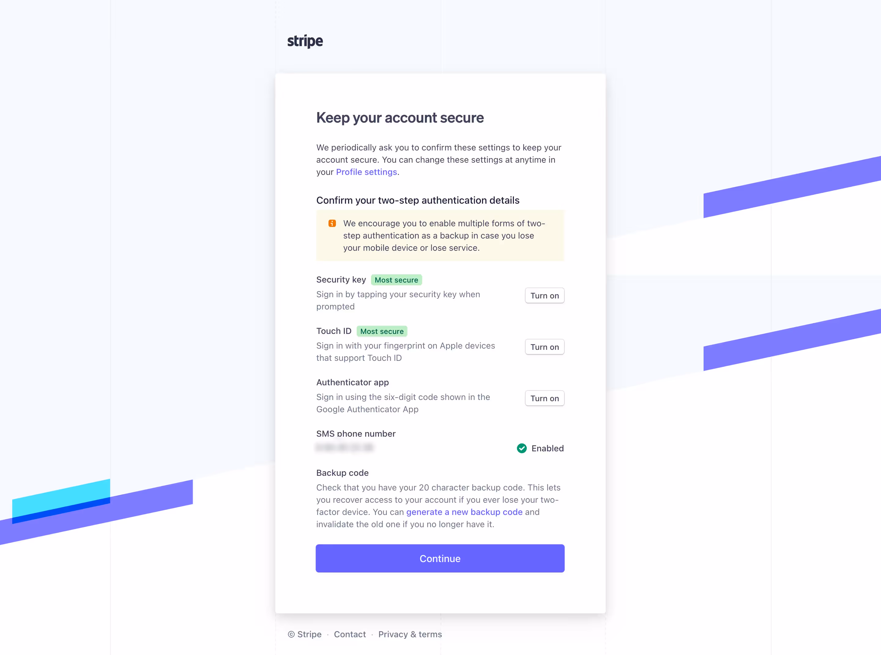
5. Recovery Anxiety: The Barrier Nobody Addresses
Here's the dirty secret of 2FA adoption: Users fear getting locked out more than they fear getting hacked. Every "What if I lose my phone?" question is an objection waiting to be addressed and most enrollment flows completely ignore it.
LogRocket's research identifies recovery options as the most neglected component of 2FA UX. Users who complete the backup code step are 3x more likely to keep 2FA enabled after 90 days compared to those who skip it.

Skiff's authentication and recovery options demonstrates best practices:
- Account recovery: Set up a backup password phrase
- Two-Factor Authenticaion: Add additional verification
- Verification phrase: With a copy button to asave it easily
- Users verification: With last verification time info
The most common mistake? Hiding backup codes behind "Advanced settings" or treating them as optional. Spotify's 2FA flow, for example, buries recovery codes in account settings after enrollment, leading to support tickets when users inevitably lose phone access.
💡 TIP: Add a progress indicator showing "3 of 4 steps" with labeled phases: (1) Choose method → (2) Verify phone → (3) Save backup codes → (4) Confirmation. This frames backup codes as a required, not optional, step.
6. The Method Selection Trap: Don't Overwhelm With Options
Offering users multiple 2FA methods (SMS, authenticator app, hardware key) sounds user-friendly. In practice, it creates decision paralysis that tanks completion rates.
LogRocket's UX analysis found that flows presenting 3+ authentication methods simultaneously experience 40% higher abandonment than those using progressive disclosure.
A Medium article provides a comparative analysis matrix showing that TOTP (authenticator apps) offer the best balance of security, cost, and UX, making them the ideal default recommendation for most SaaS products.
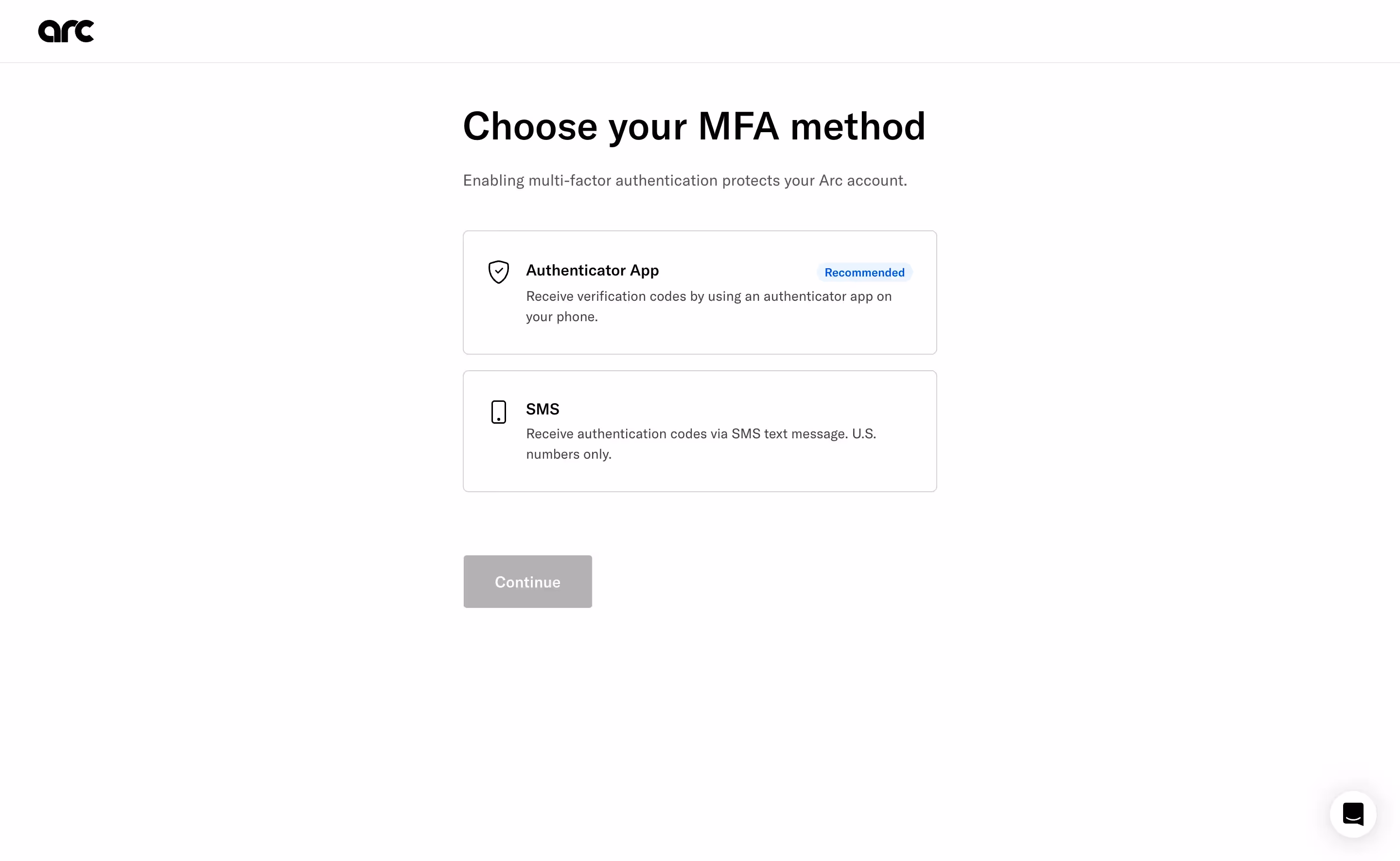
Best-practice pattern from Arc:
- Recommend one method upfront - "Authentication App" is highlighted with a "Recommended" tag
- Provide alternative - You can also authenticate with you phone number
- Explain trade-offs only if user clicks - Modal explaining why authenticator apps > SMS
This "opinionated default with escape hatch" approach reduces cognitive load while still offering choice.
Slack's approach takes this further by detecting what the user already has: if you're setting up 2FA on mobile, they default to push notifications (since you're obviously on your phone). On desktop, they default to authenticator app. This context-aware defaulting increased Slack's 2FA adoption by an estimated 18%.
💡 TIP: Use this decision tree:
- Consumer SaaS (low security risk): SMS as default, authenticator as alternative
- B2B SaaS (moderate risk): Authenticator app as default, SMS as alternative
- High-security SaaS (financial, healthcare): Authenticator app only, with hardware key option for admins
7. The Opinionated Reminder: Making "Later" Less Appealing
Adding a "Not Now" button seems counterintuitive if your goal is immediate adoption. But research shows that combining reminder messaging with opinionated design (visual hierarchy that favors the secure choice) increases click-to-enable by 11.1%.
The key is the combination of:
- Offering deferral (reduces user reactance: "I'm not being forced")
- Visually de-emphasizing it (subtle gray button vs bold blue button)
- Adding friction to dismiss (requiring click on "Not Now" vs clicking X to close)
Why this works: Prior research found that simply adding a "Remind me later" option increased deferrals but didn't increase immediate adoption. But when that option is styled as a secondary action (smaller, gray, less prominent), users who were going to enable 2FA anyway still do, while fence-sitters are nudged toward the primary action.
💡 TIP: Never use aggressive dark patterns ("Are you sure you want to leave your account vulnerable?"). They increase immediate compliance but create resentment and higher long-term churn. Opinionated design guides; dark patterns manipulate.
Conclusion: Start Small, Test Everything
The 2FA enrollment paradox isn't unsolvable, it's a design problem with measurable solutions. The USENIX research proves that thoughtful UX can increase adoption by 26-33% without changing your authentication technology.
Start with these high-impact, low-effort changes:
- Personalize prompts with user's first name (+26.5% adoption)
- Frame 2FA as user responsibility ("You can protect...") not corporate duty (+33% adoption)
- Explain when codes are needed, not just why security matters (+28% adoption)
- Make backup codes mandatory, not optional (3x better long-term retention)
Remember: the goal isn't to trick users into enabling 2FA. It's to remove the UX barriers that make a rational security decision feel irrational in the moment. Every additional form field, unclear consequence, or unanswered "what if" question is an exit point.
The best 2FA flows answer three questions before users ask them:
- Why now? (Contextual triggering)
- What will change? (Mechanism explanation)
- What if something goes wrong? (Recovery clarity)
Don't design in a vacuum. The best way to build effective 2FA enrollment is to study how companies with 70%+ adoption rates solved the same challenges you're facing.
Study Real 2FA Flows, Not Generic Advice
Theory is helpful. Seeing how GoFundMe, Intercom, OpenAI, and 69 other SaaS products actually design their 2FA enrollment, with annotated screenshots of every step, is better.
Whether you're designing your first 2FA prompt or optimizing an existing flow, you'll find real-world verification patterns, email confirmations, and multi-step enrollment flows in our curated library.
Key Takeaways
- 2FA adoption crisis persists: 30% of users still skip 2FA despite 99.9% hack-blocking effectiveness
- UX design drives adoption more than security features: Simple changes increase click-to-enable by 26-33%
- Personalization works: Adding user's first name to prompts boosts adoption by 26.5%
- Responsibility framing matters: "You can protect" messaging outperforms "We protect" by 33%
- Mechanism explanation reduces fear: Users need to know when codes are required, not just why security matters
- Recovery anxiety is the hidden barrier: Mandatory backup code setup increases 90-day retention by 3x
- Opinionated design guides without forcing: Prominent "Enable" button + subtle "Not Now" option increases adoption by 11%