Overall Style and Aesthetic
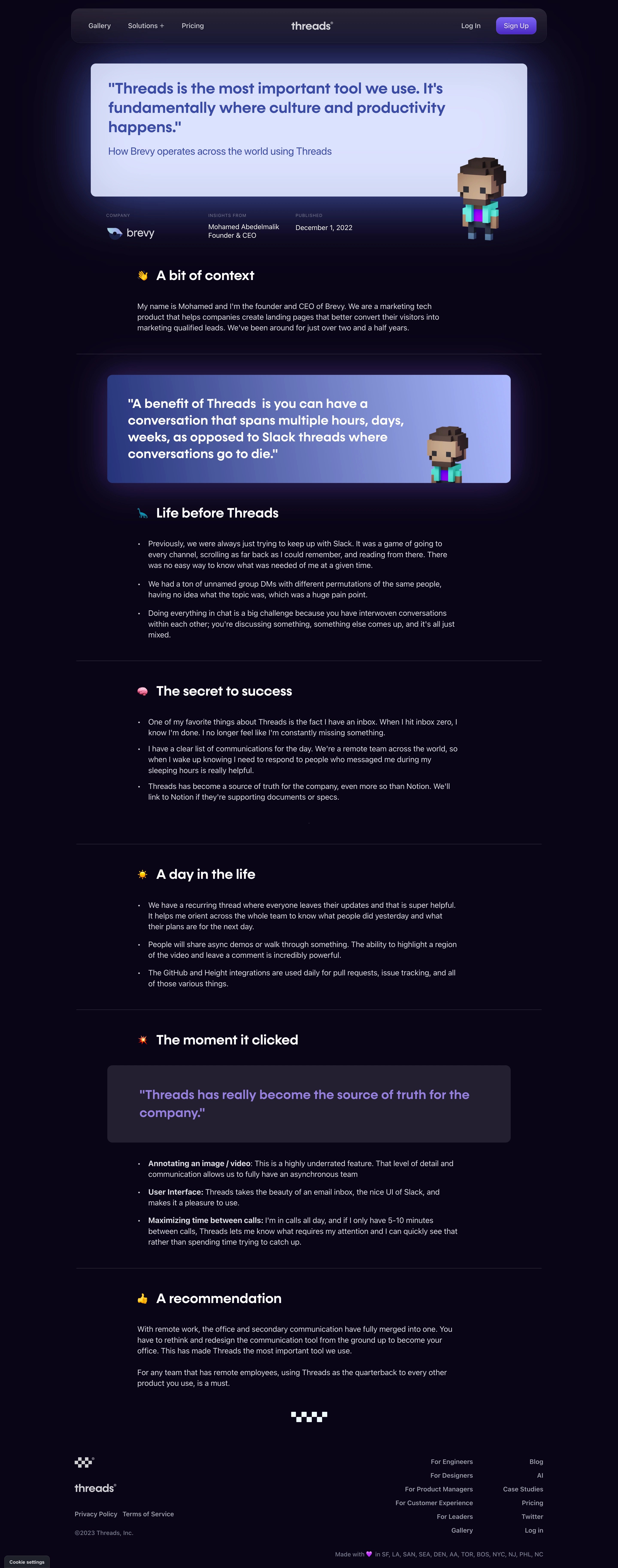
Threads’ Brevy case study page embraces a minimalist, ultra-modern aesthetic. The design strikes a balance between professional clarity and inviting warmth, using abundant whitespace, gentle gradients, and crisp visual elements to create a distinctly polished feel. The confident restraint in color and image use allows core content to shine, instilling trust and sophistication. Layout and Structure
The page flows intuitively from a clean hero section—featuring concise headlines and subheadings—to a well-ordered mix of visual storytelling and concise copy. Key sections highlight the problem, solution, and impact, all separated by generous spacing. Subtle anchor navigation allows quick jumps to relevant areas, while interspersed pull quotes and in-situation visuals maintain engagement. Visual Elements
Elegant product mockups, lightly-animated screen captures, and rounded module containers guide the user’s eye. Instead of stock photography, the design employs authentic team imagery and contextual product visuals—showcasing real use cases, not generic abstractions. Curated iconography adds subtle visual cues without visual clutter. Color Palette and Typography
A serene palette—anchored by whites, soft grays, and punctuated with blues and violet gradients—conveys reliability and modernity. Typography is clean and purposeful: large, bold headlines grab attention, while smaller sans-serif body text is inviting and ultra-readable. Hierarchy is laser-focused for easy scanning. User Experience Patterns
Navigation is frictionless, with consistent CTAs nudging activity (like “Learn More” or “Try Threads”). Microinteractions—such as subtle hover effects—add polish, while responsive design ensures a seamless experience across devices. Case study highlights are skimmable, with anchor links and scrolling effects gently guiding users. Unique or Notable Design Choices
Noteworthy details include immersive, side-by-side storytelling layouts, ambient fade-in animations, and an understated, sticky top navigation bar that quietly recedes until needed. The tone is authentic and optimistic—projecting innovation and reliability without boastfulness—making the page both memorable and genuinely inspirational for SaaS designers.