Overall Style and Aesthetic
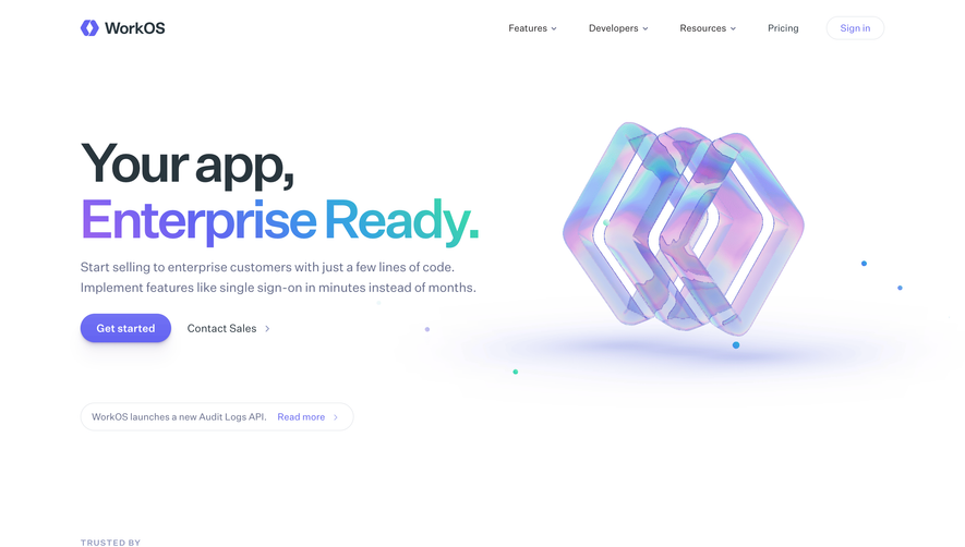
Rise Calendar’s website embodies a polished, modern aesthetic with a generous dose of playful professionalism. The design is unmistakably minimalist, giving every element space to breathe while subtle, friendly touches—like rounded shapes and lively gradients—convey a sense of approachability and innovation. Layout and Structure
The site features a classic SaaS homepage layout: a bold hero section immediately highlights the core value proposition, followed by a visually staggered features section, customer testimonials, and a clear call to action. The navigation bar is concise and sticky, ensuring users can effortlessly jump between product overviews, pricing, and resources. Visual Elements
Illustrations are central to Rise Calendar’s visual storytelling. Friendly, vector-based graphics depict scenarios of teams in action, supported by playful micro-animations and expressive, consistent iconography. The absence of photography keeps the focus on the product and its benefits, while subtle animated transitions add dynamism without distraction. Color Palette and Typography
A refreshing palette of purples, gradients, and whites dominates, accented by vibrant secondary hues for emphasis. The headline typography is bold, geometric, and inviting, ensuring strong visual hierarchy. Subheadings and body text employ highly legible sans-serif fonts, enhancing scan-ability and accessibility. User Experience Patterns
User journeys are streamlined with persistent, well-placed CTAs (“Get Started Free,” “Book a Demo”), low-friction forms, and smooth, scroll-driven storytelling. Navigation is intuitive; sections are clearly demarcated for quick skimming, while interactive elements respond swiftly, motivating engagement. Unique and Notable Design Choices
Standout choices include the animated hero illustration that evokes movement and organization—echoing the product’s promise—and the integration of testimonial “cards” that feel lively yet trustworthy. The overwhelmingly positive, energetic tone, combined with subtle interactivity, positions Rise Calendar as both authoritative and approachable in the crowded SaaS space.