
Thank you! Your submission has been received!
Oops! Something went wrong while submitting the form.
Get SaaSFrame Pro
Monthly
$18
Quarterly
$48
Yearly
$180
Upgrade to access this feature
Browse all screens & flows
Filter and search screens & flows
Access Figma files
Access mobile versions
Bookmark screens & flows
Join now
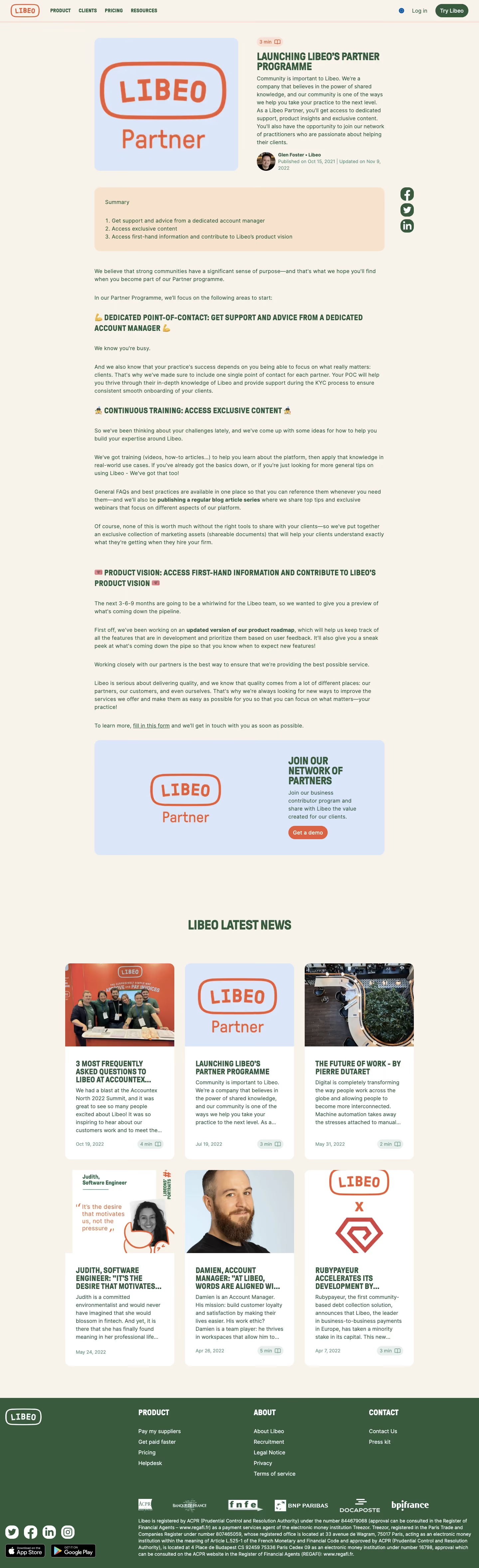

Libeo Blog Post

Libeo
Collect, approve, and pay easily
Designed by


Bookmark
Bookmark

Design with AI
Thank you! Your submission has been received!
Oops! Something went wrong while submitting the form.
# Design from Reference: Libeo Blog Post
Create an original, high-fidelity visual design inspired by the reference. Prioritize composition, typography, colors, spacing, and component styling over technical implementation.
## Reference
- **Product:** Libeo
- **Category:** Blog Post
- **Screenshot:** https://cdn.prod.website-files.com/5e9dc792e1210c5325f7ebbc/6acb72bd018523cfee2da287_6acb7044fb17204a8e24a11b_cms-939c7b28da6c7aefda5c4459.webp
Analyze the screenshot first. If inaccessible, request it rather than guessing.
## Content
{{content.instructions}}
{{content.data}}
Preserve essential messaging and factual accuracy. Adapt structure and copy length for visual balance; never invent product claims.
## Visual Design
### Overall aesthetic
- **Character:** Warm editorial fintech page combining a cream background, forest-green typography, coral branding and softly rounded article imagery.
- **Personality:** Condensed uppercase headings, occasional emoji markers and informal photography give the article a distinctive, approachable identity.
- **Capture:** The full screenshot measures 1440 × 4720 image pixels. Sizes below are image estimates; browser zoom and CSS scale are unverified.
### Page composition
- **Header:** A compact full-width bar has the outlined coral wordmark left, four uppercase navigation links, then a small locale symbol, login and green trial pill on the right. A faint coral rule separates it from the page.
- **Article hero:** An approximately 870 px-wide centered block starts with two near-equal columns: a rounded blue partner-brand image left and reading-time pill, title, introductory text and author metadata right.
- **Summary and sharing:** A peach rounded summary box spans the article width below the hero. Three green social-sharing symbols form a vertical rail just outside its right edge.
- **Body:** A single article column continues with paragraphs and three bold uppercase benefit headings. The width matches the hero/summary rather than expanding to the viewport.
- **Inline conversion:** A rounded light-blue banner pairs a large partner mark left with a short heading, paragraph and coral demo pill right.
- **Related content:** A centered latest-news heading leads to six white article cards in a three-column, two-row grid, wider than the reading column.
- **Footer:** A full-width dark-green block contains a left logo/social/app-badge area, three link groups, a row of institutional logos and dense regulatory text.
### Information hierarchy
- **Article title:** A compact two-line uppercase headline leads the right hero column; its visual weight exceeds the longer introductory paragraph below.
- **Reading aids:** A small duration pill, author avatar and published/updated metadata establish context. The peach numbered summary outlines three benefits before the body.
- **Body organization:** Condensed uppercase subheads and bold inline phrases segment otherwise plain paragraphs. A final underlined inline link precedes the larger conversion banner.
- **Related cards:** Large images lead each card, followed by uppercase titles, excerpt text and a bottom date/duration row. Some titles/excerpts visibly truncate.
- **Footer hierarchy:** Large white uppercase group headings precede small links; partner marks separate navigation from a fine-print legal paragraph.
### Typography
- **Heading family:** Tall, condensed, heavy sans-serif capitals are used for navigation, article headings and card titles. Exact font identity is unverified.
- **Body family:** A more conventional readable sans-serif appears in paragraphs and metadata; its identity is also unverified.
- **Title and sections:** The article title is approximately 29–32 image px with tight leading. Body subheads are about 23–25 px; the related-news heading is larger at approximately 36 px.
- **Body copy:** Roughly 16–17 px with 24 px line-height, forest-green color and normal tracking. Paragraph spacing is generous relative to line spacing.
- **Metadata:** Author/date/duration text is around 14 px. Card titles are about 23 px with compact line-height; excerpts use body-sized text.
- **Brand mark:** The stamped-looking uppercase wordmark uses an irregular rounded outline, visually separate from the editorial fonts.
### Colors & surfaces
- **Measured canvas:** ICC-aware sRGB sampling yields cream #F7F3EA as the dominant page background.
- **Measured brand tones:** Forest green #3A5A3D is used extensively in typography and the footer; coral #D96245 appears in brand and demo accents.
- **Measured panels:** Peach #F8E4CE fills the summary. Pale blues #DBE6F9 and #DCE6FA occur in partner-image/banner surfaces; white #FFFFFF fills related cards.
- **Secondary tones:** Muted green-gray #E8EEEC appears in subdued badge surfaces, contrasting gently with dark green text.
- **Depth:** Rounded color blocks and white cards define structure with little or no pronounced shadow; the footer is a solid inverse-color field.
### Components
- **Summary panel:** Approximately 870 × 190 image px with around 30 px inner padding and 16–18 px radius. A plain Summary caption sits above a three-item numbered list.
- **Author row:** A circular avatar around 56 px sits beside a bold name/organization and muted two-line date metadata.
- **Sharing rail:** Three approximately 40 px green circular/squircle social symbols stack with narrow gaps, vertically aligned near the summary.
- **Conversion banner:** Approximately 870 × 345 image px with rounded corners. Its left graphic dominates half the space; the right text column ends in a small coral rounded button.
- **News cards:** Approximately 330 px-wide white cards have roughly 16 px corners, edge-to-edge top images, about 30 px content padding and small pale duration pills near the lower right.
- **Footer details:** Plain link columns, white partner logos, circular social controls and two store badges sit on green. The dense legal content is left aligned beneath the logo row.
### Visual rhythm
- **Reading alignment:** Hero, summary, body and conversion banner share a stable centered width and left edge.
- **Body cadence:** Paragraph groups have approximately 30–40 px vertical gaps; uppercase benefit headings introduce stronger pauses.
- **Grid spacing:** Related cards use approximately 30 px horizontal gaps and a similar row gap, with consistent image heights and aligned card boundaries.
- **Macro spacing:** The conversion banner and latest-news area are separated by a large blank interval, giving the article ending room before related browsing.
- **Color rhythm:** Cream dominates, while peach summary, blue conversion and dark footer create distinct milestones down the scroll.
### Responsive
- **Evidence limit:** Only desktop is shown. The following are recommendations rather than observed breakpoint behavior.
- **Header and hero:** Collapse navigation and stack hero image above title/copy, keeping duration and author information close to the title.
- **Reading column:** Use fluid width with 20–24 px margins; wrap long uppercase headings naturally.
- **Sharing and conversion:** Move social sharing into a horizontal row and stack banner image/text without shrinking the demo action.
- **Cards and footer:** Reduce the three-column grid to two and then one; wrap institutional logos and reflow footer groups while retaining readable fine print.
### Adaptation guidance
- **Reusable pattern:** Combine a two-column article hero, highlighted numbered summary, plain long-form body and a branded inline conversion banner.
- **Identity:** Preserve the contrast between condensed uppercase headings and readable body text; use cream/green as the base and coral for focused accents.
- **Content modeling:** Give related cards consistent image ratios, bounded excerpts and stable metadata placement.
- **Accessibility:** Ensure condensed headings remain legible, provide descriptive image alternatives and accessible names for social controls, and maintain contrast in muted metadata.
- **Implementation:** Keep regulatory content as selectable text and use responsive logo groups rather than a single unreadable footer image.
Use this context to reproduce the reference's visual language: layout, typography, colors, spacing, borders, radii, and distinctive elements. The screenshot takes priority if descriptions conflict.
## Direction
{{preferences.fidelityInstructions}}
## Output
{{output.instructions}}
Deliver a polished, cohesive design with precise alignment, hierarchy, and spacing. Produce the requested visual artifact, not just a description. If unsupported, explain the limitation.


Category
Patterns
No items found.
Tech Stack

Added on
March 8, 2023
Similar screens




Upgrade to SaaSFrame Pro now to see similar examples.
Monthly
$18 /month
Billed $18 monthly
Browse all screens & flows
Filter and search screens & flows
Search text in screenshots
Access Figma files
Access mobile versions
Join now
Quarterly
$16 /month
Billed $48 quarterly
Browse all screens & flows
Filter and search screens & flows
Search text in screenshots
Access Figma files
Access mobile versions
Join now
Yearly
$15 /month
Billed $180 yearly
Browse all screens & flows
Filter and search screens & flows
Search text in screenshots
Access Figma files
Access mobile versions
Join now