Design with AI
Generate a new design based on this screen using your own content.
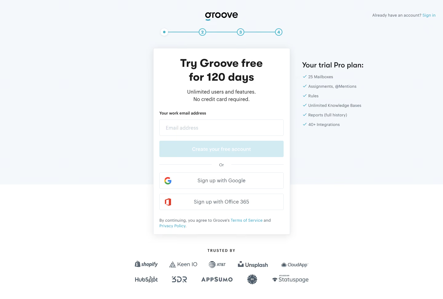
# Design from Reference: Groove Signup Page
Create an original, high-fidelity visual design inspired by the reference. Prioritize composition, typography, colors, spacing, and component styling over technical implementation.
## Reference
- **Product:** Groove
- **Category:** Signup
- **Screenshot:** https://cdn.prod.website-files.com/5e9dc792e1210c5325f7ebbc/6acbcec975891049b1840439_6acbcd107baf79c89e85ae04_cms-e23e24adc97df58a84f6dbd5.webp
Analyze the screenshot first. If inaccessible, request it rather than guessing.
## Content
{{content.instructions}}
{{content.data}}
Preserve essential messaging and factual accuracy. Adapt structure and copy length for visual balance; never invent product claims.
## Visual Design
### Overall aesthetic
- **Character:** Trust-oriented signup with a raised white form, pale blue background and compact plan-benefit reassurance.
### Page composition
- **Canvas:** 1440 × 971 screenshot pixels; CSS estimates are near screenshot scale, with capture scale unverified.
- **Structure:** Centered logo and four-step progress line above a narrow signup card. Trial-plan checklist sits to its right; two rows of customer logos appear below.
### Information hierarchy
- **Priority:** Bold trial headline, short reassurance, work-email input and primary create-account action.
- **Alternatives:** OR divider introduces Google and Office 365 signup; policy links sit at the card base.
### Typography
- **Family:** Clean sans-serif with bold rounded headings; exact font is unverified.
- **Scale:** Estimated CSS main heading 36px, checklist heading 24px, body/input text 16px and labels/legal 12–13px.
### Colors & surfaces
- **Sampled palette:** White #FFFFFF; pale blue variants #F4F8FB, #F4F8FC and #F5F9FC; pale action fill #D2EBF2; border #E4E8ED.
- **Accents:** Cyan progress/checkmarks and links; dark charcoal headings; muted blue-gray supporting text.
### Components
- **Form:** Approximately 444px CSS wide with 20px padding, fine border and soft shadow; full-width 52px controls with 3–4px radii.
- **Progress:** Four numbered circles linked by a cyan line. Social buttons include left-aligned provider marks.
### Visual rhythm
- **Spacing:** Regular 16px control gaps, generous heading separation and 48px before the logo proof block.
### Responsive
- **Guidance:** Mobile is not shown. Stack plan benefits under signup, wrap logo rows and keep progress legible.
### Adaptation guidance
- **Transfer:** Retain trial/form/benefits/proof hierarchy. Use current target trial terms and authorized customer marks.
Use this context to reproduce the reference's visual language: layout, typography, colors, spacing, borders, radii, and distinctive elements. The screenshot takes priority if descriptions conflict.
## Direction
{{preferences.fidelityInstructions}}
## Output
{{output.instructions}}
Deliver a polished, cohesive design with precise alignment, hierarchy, and spacing. Produce the requested visual artifact, not just a description. If unsupported, explain the limitation.