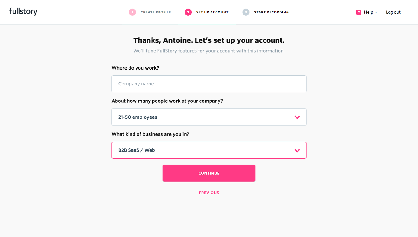
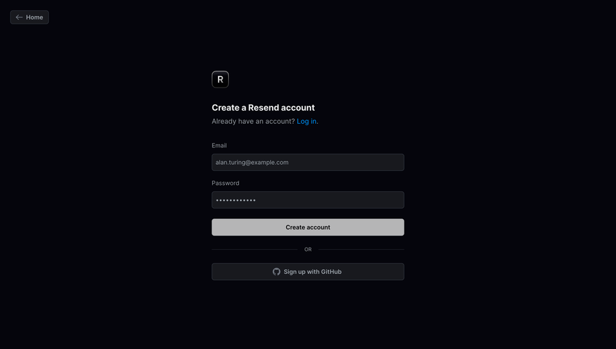
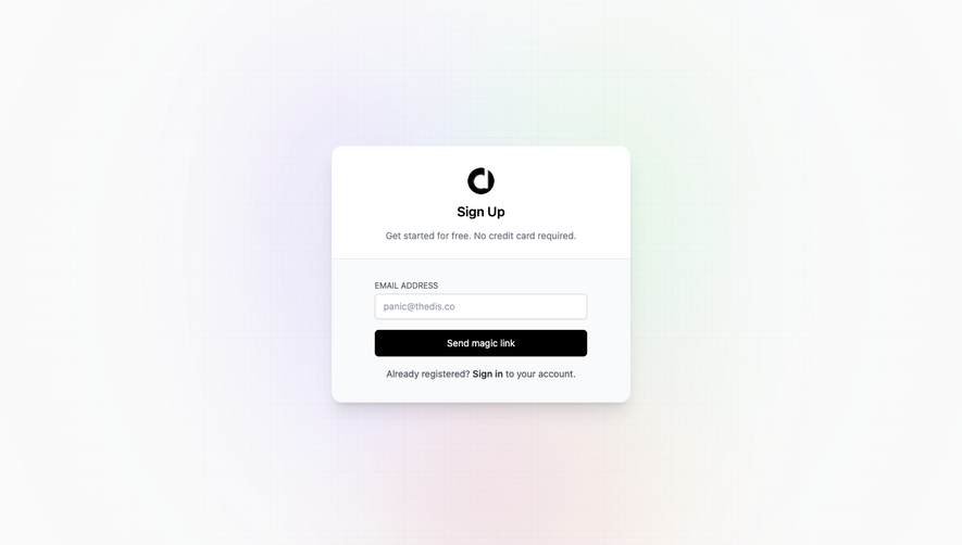
Generate a new design based on this screen using your own content.
Thank you! Your submission has been received!
Oops! Something went wrong while submitting the form.
# Design from Reference: Fullstory Signup Page
Create an original, high-fidelity visual design inspired by the reference. Prioritize composition, typography, colors, spacing, and component styling over technical implementation.
## Reference
- **Product:** Fullstory
- **Category:** Signup
- **Screenshot:** https://cdn.prod.website-files.com/5e9dc792e1210c5325f7ebbc/6acbd0458f05a14579f0476b_6acbcd126d0a156378f79608_cms-066c557d71cfc4e9a67e9249.webp
Analyze the screenshot first. If inaccessible, request it rather than guessing.
## Content
{{content.instructions}}
{{content.data}}
Preserve essential messaging and factual accuracy. Adapt structure and copy length for visual balance; never invent product claims.
## Visual Design
Use this context to reproduce the reference's visual language: layout, typography, colors, spacing, borders, radii, and distinctive elements. The screenshot takes priority if descriptions conflict.
## Direction
{{preferences.fidelityInstructions}}
## Output
{{output.instructions}}
Deliver a polished, cohesive design with precise alignment, hierarchy, and spacing. Produce the requested visual artifact, not just a description. If unsupported, explain the limitation.
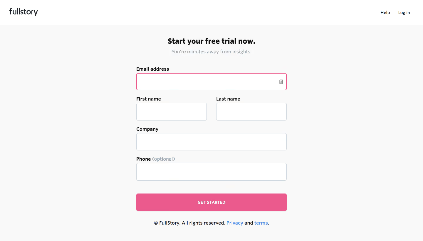
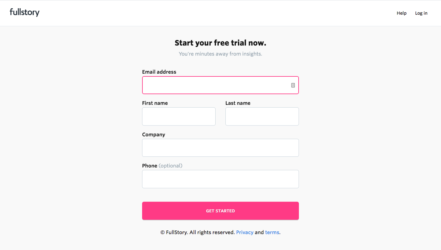
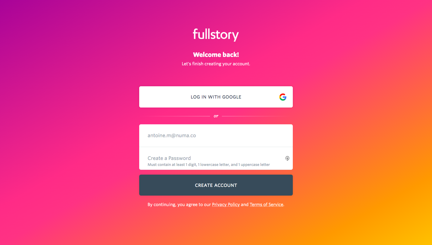
FullStory’s signup page epitomizes modern SaaS minimalism with a professional, approachable edge. The overall aesthetic is crisp and uncluttered, employing abundant whitespace to foster clarity and focus. Subtle gradients and rounded components lend a contemporary, friendly vibe, making the experience welcoming without sacrificing seriousness.
Layout and Structure
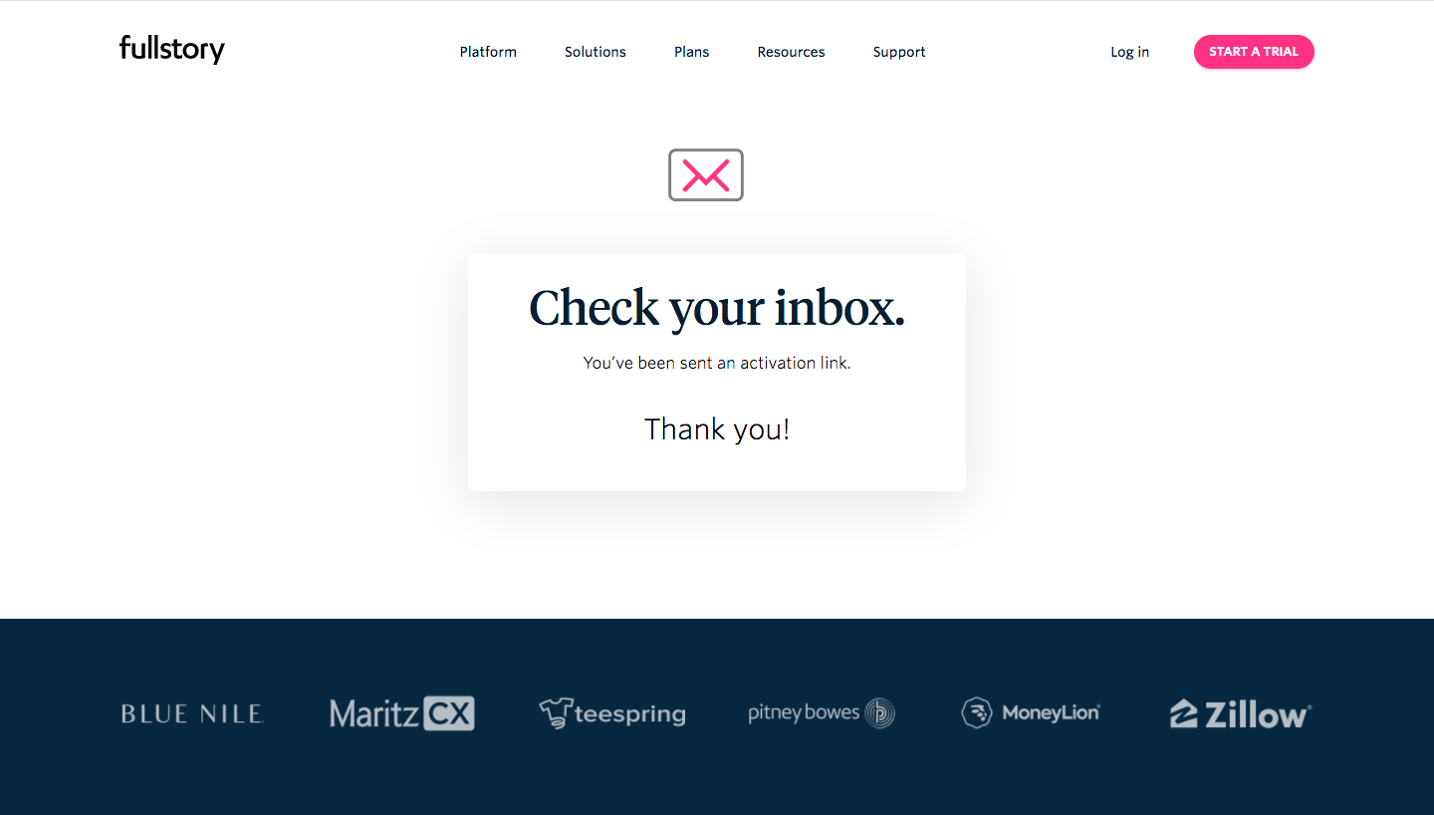
The layout is streamlined for conversion: the hero section dominates above the fold with a clear, high-contrast headline and a brief value proposition. To the left sits the carefully crafted signup form—central to the page—while supportive information and privacy reassurance flank it unobtrusively. Below, concise trust signals and client logos enhance credibility. The compact footer reinforces brand identity and offers quick access to support and legal information.
Visual Elements
Visual accents—like lightweight iconography and understated micro-illustrations—add visual interest without distraction. The page avoids heavy imagery, focusing instead on graphical details that subtly reinforce key points. Animations are sparing but effective, lending polish to state changes and form interactions.
Color Palette and Typography
Soft blues and muted purples anchor the calming palette, offset by clean whites and confident black text for high readability. Primary CTAs employ a vibrant, carefully chosen accent color that stands out yet complements the serene base. Typography leans into modern web standards with generous line spacing, distinct headings, and a harmonious sans-serif family that conveys both authority and warmth.
User Experience Patterns & Unique Choices
Navigation is minimal—intentionally so, limiting outflow to streamline the signup flow. Form design emphasizes ease, with a single clear action button and intelligent defaults. Inline validation and privacy messaging appear contextually, lowering friction and increasing reassurance. The page stands out with its laser focus on sign-up, impeccable balance of form and function, and subtle reinforcement of security and trust—making it a compelling model for SaaS onboarding design.