
Thank you! Your submission has been received!
Oops! Something went wrong while submitting the form.
Get SaaSFrame Pro
Monthly
$18
Quarterly
$48
Yearly
$180
Upgrade to access this feature
Browse all screens & flows
Filter and search screens & flows
Access Figma files
Access mobile versions
Bookmark screens & flows
Join now


Front Product Update

Front
Email client
Designed by
No items found.

Bookmark
Bookmark

Design with AI
Thank you! Your submission has been received!
Oops! Something went wrong while submitting the form.
# Design from Reference: Front Product Update
Create an original, high-fidelity visual design inspired by the reference. Prioritize composition, typography, colors, spacing, and component styling over technical implementation.
## Reference
- **Product:** Front
- **Category:** Product Update
- **Screenshot:** https://cdn.prod.website-files.com/5e9dc792e1210c5325f7ebbc/62ec9c601cef28061702e1f9_1659620521902-screenshot-device-808db6d47a16afddf255186f4dec9436-1659598249142.webp
Analyze the screenshot first. If inaccessible, request it rather than guessing.
## Content
{{content.instructions}}
{{content.data}}
Preserve essential messaging and factual accuracy. Adapt structure and copy length for visual balance; never invent product claims.
## Visual Design
### Overall aesthetic
- **Character:** An editorial product-announcement article combines a warm peach hero, dark navy ink, large serif display type and clean sans-serif body text.
- **Capture evidence:** The screenshot is 1440 × 5829 pixels and was inspected through five readable portions. Approximate dimensions refer to image pixels; near-1× CSS scale is estimated.
- **Tone:** Photography, generous white space and a narrow reading column give the page a publication-like character.
### Page composition
- **Two-level navigation:** A white corporate header contains brand, menu and account actions; a second pale publication bar contains the Front Page identity, topic links and search.
- **Hero:** A peach block holds a back-link and very large three-line article title. A wide rounded photograph overlaps its lower boundary into the white article area.
- **Article introduction:** A bold serif summary follows the photo, then an author/avatar block, metadata and small share icons.
- **Reading area:** A roughly 700px-wide left article column contains paragraphs, a product illustration, major subheadings and four numbered subsections. A pale newsletter card occupies the right side near the article opening.
- **Article ending:** Author/publication lines precede a large centered newsletter section with a combined email field and subscribe action.
- **Footer:** A pale warm-gray footer contains brand, an about paragraph, site-link groups, social icons and a small legal row.
### Information hierarchy
- **Headline:** A large navy serif title dominates the hero and sets an editorial tone.
- **Summary:** A smaller bold serif introduction bridges the hero photo and author metadata.
- **Body hierarchy:** Dark sans-serif headings divide themes; numbered bold subsection titles structure the main product benefits.
- **Links:** Blue inline links stand out within dark navy paragraphs without card treatment.
- **Subscription:** The sidebar card uses a vivid pink headline and navy pill action; the lower signup area uses a large serif message.
### Typography
- **Family pairing:** A high-contrast editorial serif is used for the title, summary and newsletter headline; a rounded sans-serif serves navigation and article text. Exact identities are unverified.
- **Hero title:** Approximately 72px, bold serif, around 86px line-height and slightly tight tracking.
- **Summary:** Approximately 24px bold serif with 36px line-height.
- **Article body:** Approximately 18px sans-serif with 26px line-height and normal tracking.
- **Headings:** Main body headings are around 30–32px semibold; numbered subheadings around 23–24px bold.
- **Metadata:** Author and publication details range approximately 12–16px; navigation labels are around 14–16px.
- **Newsletter display:** The lower centered serif message is approximately 46–48px across two lines.
### Colors & surfaces
- **Primary surface:** Sampled #FFFFFF dominates the article and navigation.
- **Hero:** Sampled #FFF0E3 supplies the pale peach title region.
- **Secondary surfaces:** Sampled #F4F2F0 supplies the sidebar newsletter card and footer.
- **Ink:** Sampled #001B38 supplies dark navy headings, body text and filled actions.
- **Accents:** Blue links appear within paragraphs, while saturated pink is used for the sidebar subscription message and small brand details.
- **Photography:** Warm wood, tan seating and soft daylight enrich the hero without changing the interface palette.
### Components
- **Hero image:** Approximately 925 × 485px, aligned with the title left edge, with subtle 8px corner rounding.
- **Author row:** A small circular portrait sits beside stacked name, role and date/read-time details; simple envelope and link icons sit farther right.
- **Product illustration:** A white chat-interface example with soft shadow and annotated callouts fits within the reading column.
- **Sidebar signup:** A roughly 370px-wide warm-gray card has around 10px radii, generous padding, a pink multiline heading and full-width navy pill action.
- **Lower form:** A roughly 500px-wide rounded outline combines a white email field with a navy right-hand Subscribe segment.
- **Header action:** A dark navy capsule contrasts with a plain sign-in link.
- **Footer:** The brand column is narrow; the about paragraph is broader than the adjacent compact link groups.
### Visual rhythm
- **Outer grid:** Approximately 120px side margins frame the main desktop content.
- **Reading width:** The article maintains a relatively narrow column even when the right sidebar ends, leaving open white space beside lower sections.
- **Paragraph spacing:** Roughly 32–40px gaps distinguish paragraphs; larger 40–56px breaks introduce section headings.
- **Hero overlap:** The photo extends from peach into white, joining the title and article rather than enclosing them in a card.
- **Closing space:** Large vertical padding surrounds the lower newsletter message and separates it from the footer.
### Responsive
- **Evidence limit:** Only a desktop layout is observed; navigation collapse and sidebar behavior are unverified.
- **Reading recommendation:** Use a fluid article with 20–24px side padding and a comfortable maximum line length.
- **Hero recommendation:** Reduce the title to around 40–48px on small screens and scale the photograph proportionally.
- **Sidebar recommendation:** Move the newsletter card below a suitable article section or omit duplicate subscription emphasis on narrow screens.
- **Footer recommendation:** Stack link groups and allow the email/action form to reflow without clipping.
### Adaptation guidance
- **Editorial template:** Define separate styles for serif headline/summary and sans-serif body/subheadings, retaining the observed hierarchy.
- **Content modules:** Use reusable hero, author metadata, annotated image, newsletter and footer components.
- **Imagery:** Choose a warm contextual photograph and keep instructional image annotations legible at the intended display width.
- **Accessibility:** Use semantic article headings, descriptive image alternatives, labeled subscription fields and accessible names for share/search icons.
- **Fidelity:** Preserve the open reading layout and restrained surface treatment instead of adding unsupported decorative cards.
Use this context to reproduce the reference's visual language: layout, typography, colors, spacing, borders, radii, and distinctive elements. The screenshot takes priority if descriptions conflict.
## Direction
{{preferences.fidelityInstructions}}
## Output
{{output.instructions}}
Deliver a polished, cohesive design with precise alignment, hierarchy, and spacing. Produce the requested visual artifact, not just a description. If unsupported, explain the limitation.


Category
Patterns
No items found.


Added on
April 21, 2020
Similar screens
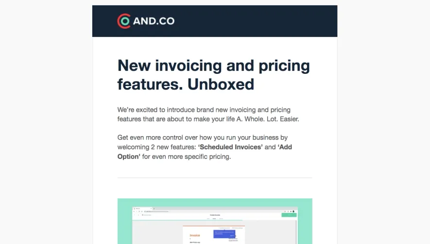


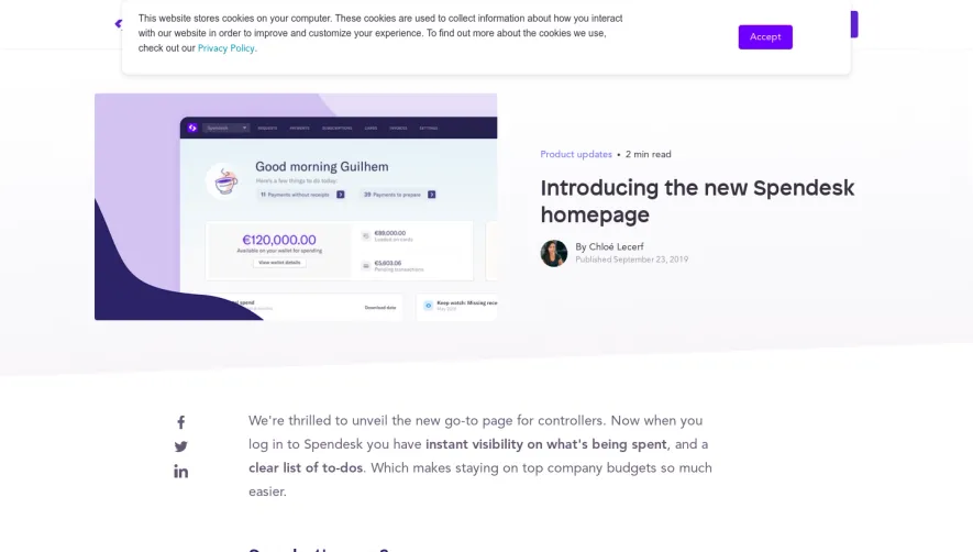

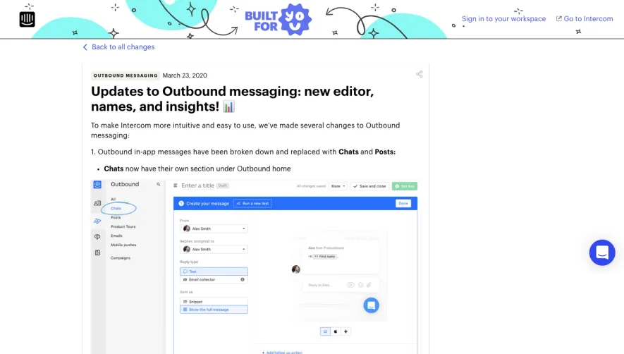

Upgrade to SaaSFrame Pro now to see similar examples.
Monthly
$18 /month
Billed $18 monthly
Browse all screens & flows
Filter and search screens & flows
Search text in screenshots
Access Figma files
Access mobile versions
Join now
Quarterly
$16 /month
Billed $48 quarterly
Browse all screens & flows
Filter and search screens & flows
Search text in screenshots
Access Figma files
Access mobile versions
Join now
Yearly
$15 /month
Billed $180 yearly
Browse all screens & flows
Filter and search screens & flows
Search text in screenshots
Access Figma files
Access mobile versions
Join now