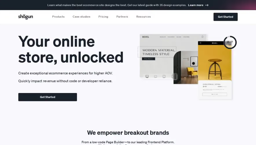
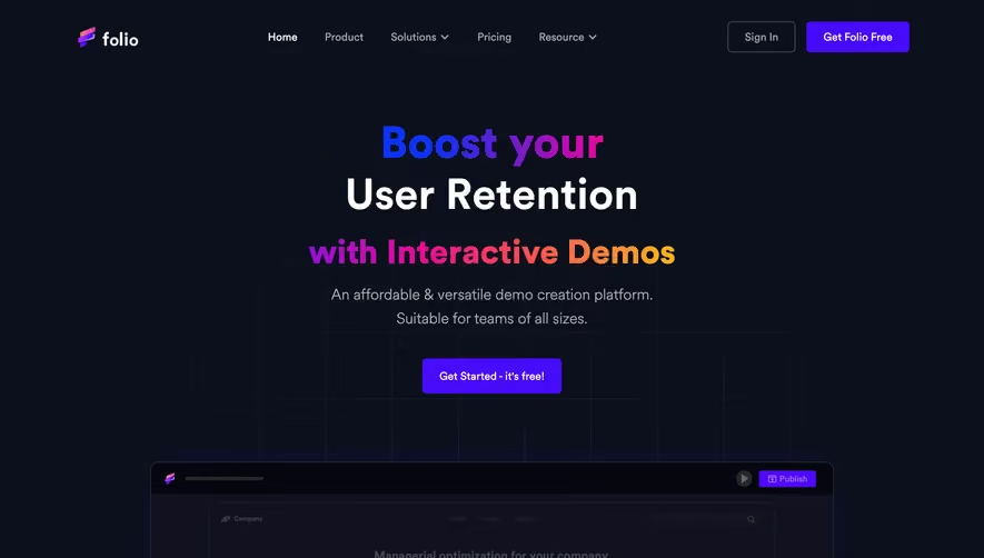
Overall Style and Aesthetic
Cycle.app showcases a sleek, modern, and highly professional aesthetic. The design leans into minimalism with ample white space, sharp edges, and a subtle vibrancy from accent gradients. It conveys innovation without sacrificing clarity, establishing instant trust with its refined, unfussy look. Layout and Structure
The structure is instantly intuitive. A concise hero section delivers the value proposition with prominent headline text, a succinct description, and a vibrant call-to-action button. Further down, features are organized in modular, horizontally-aligned blocks utilizing text and visuals for clarity. Rounding out the page are testimonials and trust logos for credibility, and a neatly organized footer with all key links. Visual Elements
Colorful, gently-animated illustrations bring energy to the page without being overwhelming. Custom icons support the copy in feature sections, and micro-animations—like subtle hover effects—add tactile depth. The use of motion is purposeful, directing attention while keeping load times snappy. Color Palette and Typography
Cycle.app uses a restrained palette centered on white backgrounds with gradients of blue, purple, turquoise, and soft pink. Pops of saturated color highlight CTAs and key UI bits. Typography is clean and geometric; bold headlines grab attention, while readable body text ensures accessibility and scannability. User Experience Patterns
Navigation is sticky and streamlined, keeping all core areas within reach. Calls-to-action remain visible and inviting. Scroll interactions gently animate elements into view for a dynamic, engaging experience. Signup flows and forms are short, guiding users efficiently. Unique or Notable Design Choices
The site’s custom animated illustrations and smooth, gradual color gradients distinguish it from competitors. The interplay between motion, whitespace, and vibrant accents strike a perfect balance between sophisticated and energetic—making it a standout example for SaaS web inspiration.