Overall Style & Aesthetic
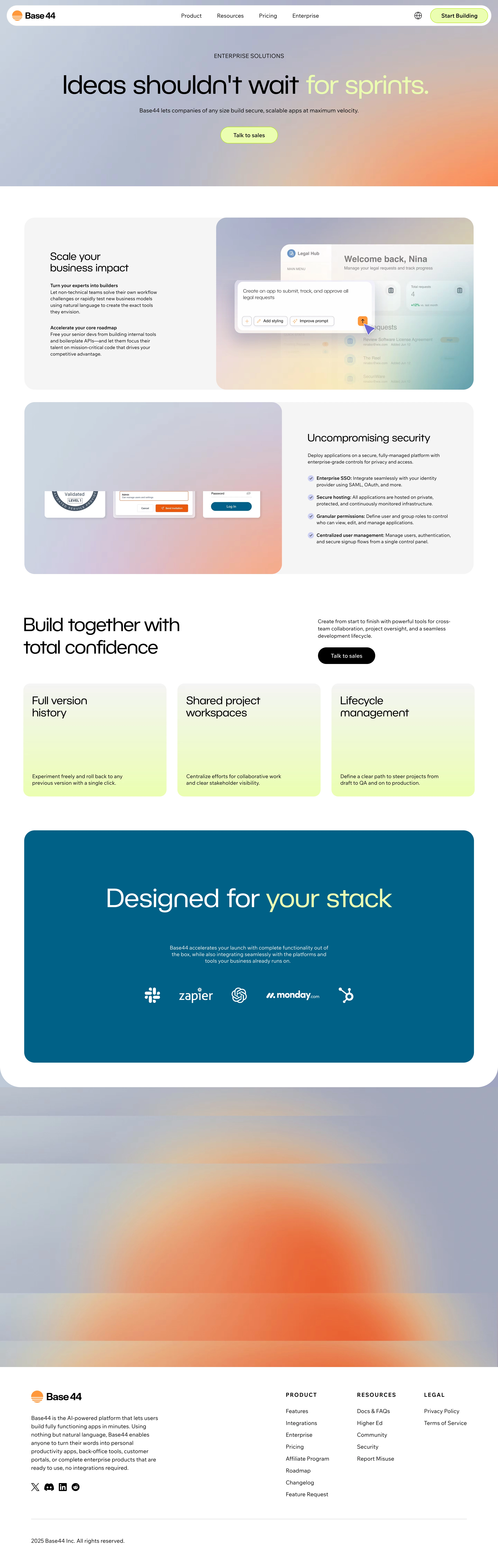
Base44's Enterprise page embodies a sleek, modern minimalism that expertly balances professionalism with approachability. Clean white space frames every element, allowing content and visuals to breathe. This cultivated restraint projects trust and sophistication while subtle gradients and playful accent colors prevent sterility. Layout & Structure
The structure is immediately inviting: an impactful hero section introduces the offering with bold typography and concise copy, accompanied by a stylized abstract graphic. Scrolling down, a horizontally-aligned “Capabilities” section uses large, visually separated icons to showcase key features, followed by client logos for social proof. There’s no crowded pricing grid—instead, a tailored enterprise CTA and contact form encourage direct engagement. Visual Elements
Vivid, geometric illustrations differentiate every core message, steering clear of cliched SaaS stock photography. Soft, animated flourishes enliven transitions as you scroll, creating a sense of movement and polish. Custom icons, devoid of harsh borders, maintain visual harmony and reinforce the brand’s distinctiveness. Color Palette & Typography
A restrained, mature palette—primarily white with deep navy and gentle indigo accents—anchors the interface. Strategic use of vibrant purples and blues guides attention to CTAs and highlights. Typography combines a bold, sans-serif display font for headings with a highly legible secondary font for body copy, offering clear hierarchy and effortless scanning. User Experience & Unique Touches
Navigation is fixed, unobtrusive, and intuitive, surfacing secondary options only when necessary. CTAs are prominent but not aggressive, reflecting the calm confidence of the brand. The site’s scroll experience is smooth, with micro-animations that provide delightful feedback. Notably, the lack of clutter and reliance on direct, visual storytelling distinguishes the site—making it feel cutting-edge yet comfortably familiar.