.webp)
Remember when finding a feature in your SaaS product meant navigating through three dropdown menus and two settings pages? Those days are disappearing fast. A quiet revolution has taken over modern SaaS design: the CMD+K search modal.
At SaaSFrame, we've analyzed 5,000+ product interfaces and noticed a striking pattern: the most retention-focused SaaS products of 2026 aren't the ones with the prettiest dashboards—they're the ones that let users find anything in under 2 seconds. The CMD+K pattern, popularized by products like Raycast, Linear, and Notion, has evolved from a power user feature to an expected UX standard.
In this guide, we're breaking down why search modals have become non-negotiable, how they're transforming user behavior, and exactly what you need to implement them successfully with real-world examples from industry leaders.
1. Universal Keyboard Shortcuts: The New UX Language
The CMD+K (or CTRL+K on Windows) shortcut has become the universal signal for "search and navigate." This standardization happened organically as users moved between Linear for project management, Notion for docs, and Figma for design—all using the same keyboard pattern.

When users develop muscle memory for a pattern across multiple tools, it reduces cognitive load. They don't need to learn your specific navigation system—they already know it.
💡 TIP: Place a subtle CMD+K indicator in your main navigation or search bar to educate new users about the shortcut's availability.
2. From Navigation to Command Center
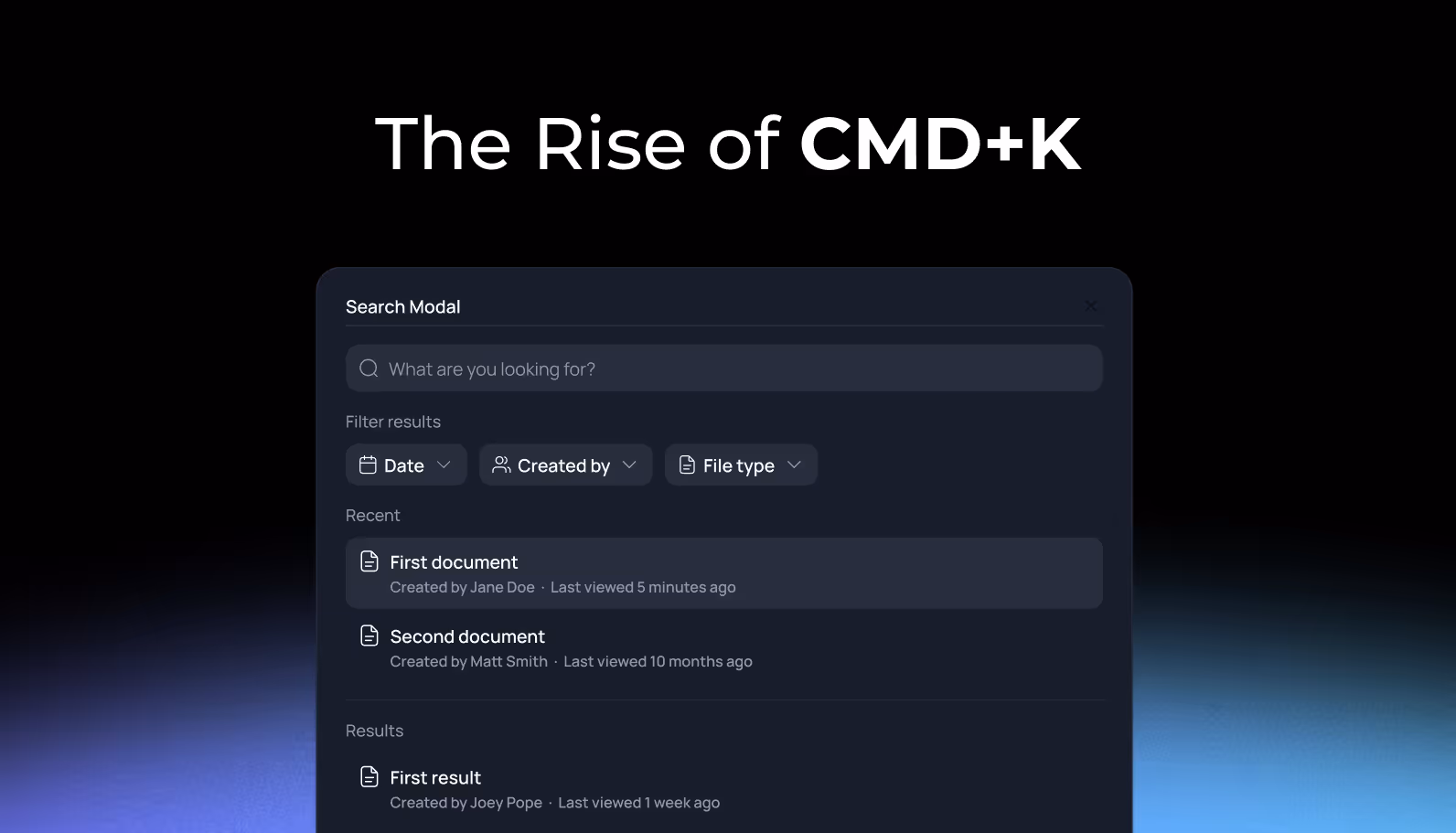
Modern search modals have evolved far beyond simple page navigation. They've become command palettes that unify search, actions, and help documentation in a single interface. Chameleon's research shows that products with comprehensive CMD+K interfaces see a 35-42% reduction in support tickets.
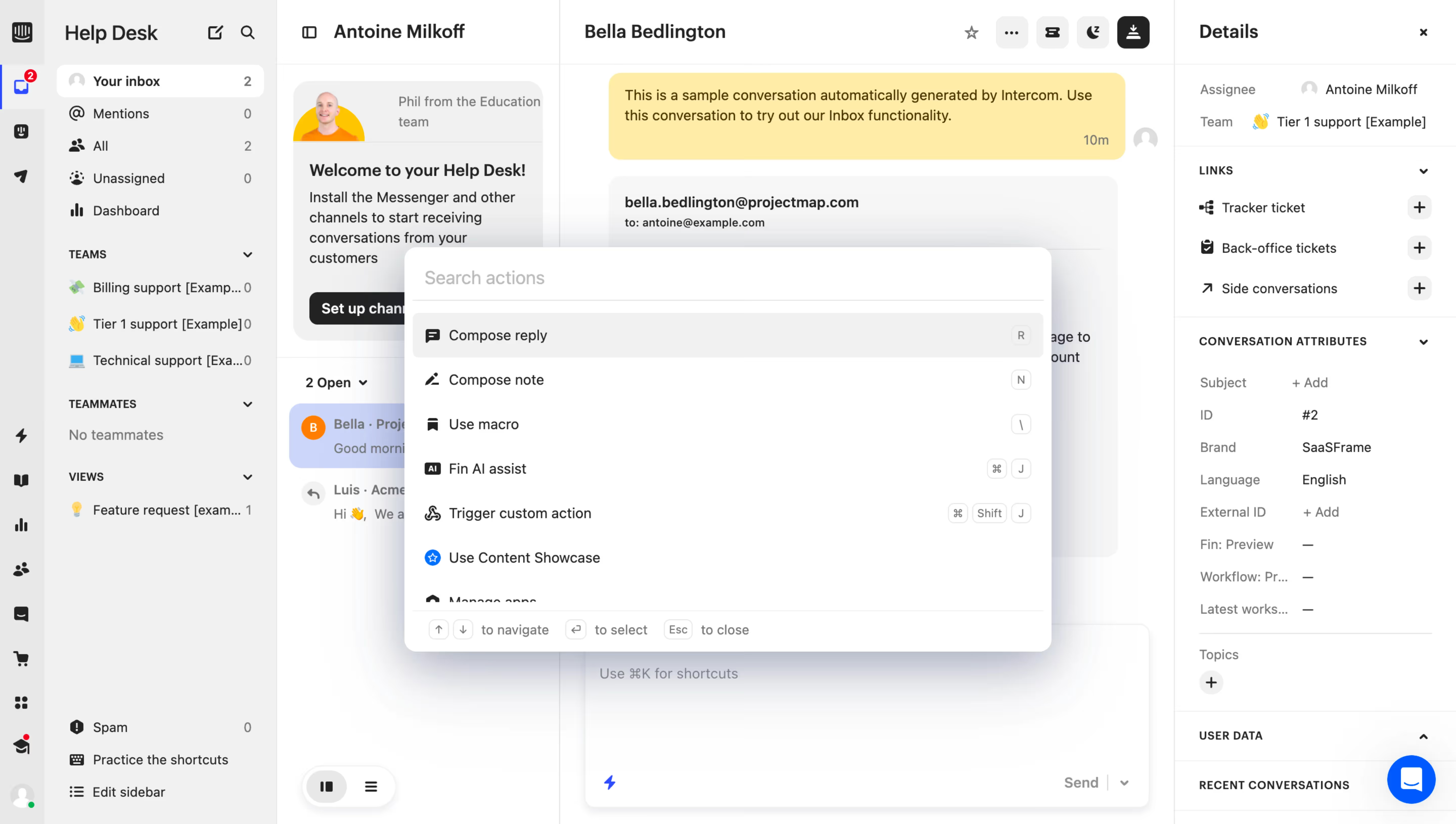
The best implementations include:
- Quick actions (Create invoice, Export data)
- Navigation links (Go to Settings, View Dashboard)
- Help documentation (How to set up SSO)
- Recent history (Last 5 searches)
- Keyboard shortcuts guide
💡 TIP: Implement "pinned items" that surface frequently-needed resources or encourage exploration of high-value features users might miss.
3. Self-Service Discovery That Scales
One of the most underrated benefits of search modals is their impact on user self-sufficiency. Users who can quickly find answers without leaving the product interface are 3x more likely to successfully onboard without support intervention.

Instead of opening a separate help center tab (breaking their workflow), users type their question and get contextual answers instantly. This seamless integration between product and documentation creates what Chameleon calls "self-serve discovery."
The business impact is tangible:
- Reduced support volume
- Faster time-to-value for new users
- Higher feature discovery rates
💡 TIP: Connect your search modal to your documentation system using semantic search. Users should be able to type "how do I..." and get relevant help articles alongside navigation options.
4. Mobile Challenges & Creative Solutions
Here's the uncomfortable truth: CMD+K patterns excel on desktop but struggle on mobile. There's no keyboard shortcut, tap targets need to be larger, and fullscreen modals often feel intrusive on small screens.
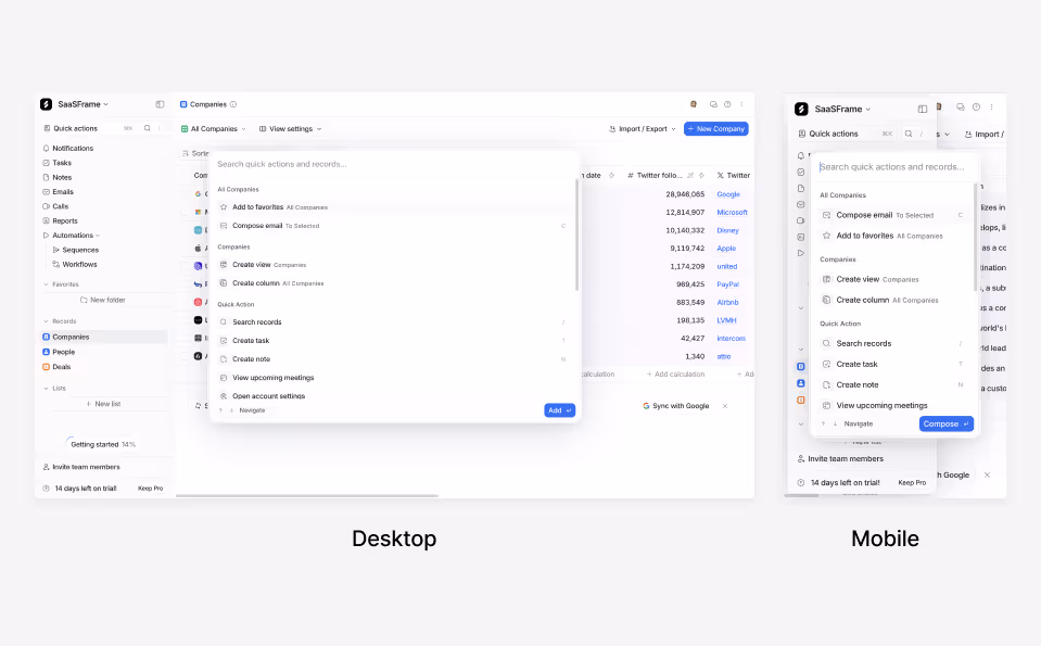
Smart SaaS products handle this by:
- Using a prominent search icon in mobile navigation
- Implementing fullscreen modals on mobile (not scaled-down desktop versions)
- Ensuring large tap targets (minimum 44x44px)
- Avoiding scroll traps within the modal
💡 TIP: Test your search modal on actual devices, not just in Chrome DevTools. The virtual keyboard behavior alone can break an otherwise solid design.
5. Accessibility: The Critical (And Often Missed) Layer
A beautiful search modal means nothing if 15% of your users can't operate it. Yet accessibility remains the most neglected aspect of modal design. Proper implementation requires ARIA labels, focus management, and keyboard navigation—not just visual polish.
The accessibility checklist:
- ✅ Focus automatically moves to search input when modal opens
- ✅ Tab key cycles through results; Escape closes modal
- ✅ Screen readers announce "Search dialog" on open
- ✅ Keyboard users can navigate results without mouse
- ✅ Focus returns to trigger element on close
💡 TIP: Use the native <dialog> HTML element as your foundation—it handles much of the accessibility heavy-lifting automatically when properly configured.
6. Performance Metrics: Speed Is Everything
The entire value proposition of a CMD+K modal collapses if search results take 3 seconds to appear. Users expect instant feedback—we're talking under 200ms for initial results. Any longer, and the pattern feels slower than traditional navigation.
Technical implementation tips:
- Use debounced search (wait 150-200ms after last keystroke)
- Implement client-side fuzzy matching for instant local results
- Show skeleton loaders during server searches
- Cache recent searches for zero-latency retrieval
The performance payoff: Usability research shows that shaving 1 second off search time can increase feature discovery by 25%.
💡 TIP: Display "Recent searches" or "Suggested commands" immediately when the modal opens, before users even type. This eliminates perceived loading time.
7. The Business Case: Beyond User Delight
Let's talk ROI. Search modals aren't just a UX nicety—they're a business multiplier. Companies implementing comprehensive CMD+K patterns report measurable improvements across key metrics.
Documented business impacts:
- 35-42% reduction in support tickets (Chameleon data)
- 25-30% increase in feature discovery rates
- 40%+ improvement in time-to-task completion
- Higher power user retention (users who adopt CMD+K stick around longer)
The pattern also creates opportunities for strategic interventions: embed upsell prompts for premium features, gather product feedback, or surface onboarding resources—all within the natural search flow.
💡 TIP: Instrument your search modal with analytics. Track: search query volume, null search results, most accessed features via search, and keyboard shortcut adoption rate.
8. Implementation Without Overwhelm
You don't need to build a Notion-level search experience on day one. Start small and iterate. The minimum viable search modal includes just three elements: navigation shortcuts, a basic search function, and proper keyboard controls.
.avif)
Phase your rollout:
- Phase 1: Basic navigation search with CMD+K trigger
- Phase 2: Add recent searches and keyboard shortcuts
- Phase 3: Integrate help documentation
- Phase 4: Add custom actions and AI assistance
Many SaaS teams use libraries like cmdk (by Raycast) or Algolia to accelerate development. These handle the heavy lifting of search logic, keyboard navigation, and accessibility.
💡 TIP: Before building, audit your existing navigation. If users struggle to find core features through normal navigation, a search modal will expose—not solve—deeper information architecture problems.
Conclusion: The Search Modal Isn't Optional Anymore
The CMD+K search modal has crossed the threshold from "innovative UX pattern" to "expected interface standard." Users moving between Linear, Notion, Figma, and dozens of other tools carry the expectation that CMD+K will work everywhere. When it doesn't, your product feels dated.
But implementation matters as much as adoption. A slow, inaccessible, or poorly designed search modal creates more friction than it removes. Focus on speed, accessibility, and progressive enhancement—start simple, measure usage, and expand based on real user behavior.
The best SaaS products of 2026 aren't trying to reinvent navigation. They're meeting users where muscle memory already lives: behind a CMD+K keystroke.
Start Your Search Modal Research
Don't design in a vacuum. The best way to build a world-class search modal is to see how the world's most successful SaaS companies have implemented this pattern.
Whether you're looking for navigation structures, keyboard shortcut displays, or help documentation integration, you can find 23+ real-world search modal examples from products like Linear, Notion, Intercom, and Figma in our curated library.
Key Takeaways
- CMD+K search modals have become a universal UX language expected by modern SaaS users
- Effective search modals combine navigation, actions, and help in a single interface
- Accessibility and performance are non-negotiable—focus management and sub-200ms results matter
- Search modals drive measurable business outcomes: 35-42% support reduction, 25-30% feature discovery increase
- Start with an MVP implementation and iterate based on user behavior analytics
- Mobile requires different patterns (fullscreen modals, prominent search icons, larger tap targets)