.webp)
Bento grids have exploded in 2026. 67% of the top 100 SaaS products on ProductHunt now use this modular layout system and for good reason: they're scannable, flexible, and convert better than traditional layouts.
But here's the problem: most designers either overuse bento grids (forcing them into contexts where they don't belong) or underutilize them (treating them like glorified card grids without leveraging their true power).
At SaaSFrame, we've cataloged 43 bento grid implementations from leading SaaS products. After analyzing implementations from Diagram, Notion, Linear, Customer.io, and dozens more, we've identified the patterns that separate effective bento grids from cluttered messes.
This guide will show you exactly how to design bento grids that work, when to use them (and when not to), and how to implement them in Figma without fighting your design system.
What Makes a Bento Grid Actually "Bento"
Not every grid layout is a bento grid. Here's what defines this pattern:
The Three Core Principles
1. Strict Compartmentalization
Each piece of content lives in its own clearly defined box. Unlike masonry grids where items flow freely, bento grids enforce visual boundaries. This creates what designers call "cognitive chunking," making complex information digestible at a glance.

Why it matters: Users can scan 10+ pieces of information instantly without cognitive overload. Tasks are completed 23% faster with modular layouts compared to traditional linear designs.
2. Size = Visual Hierarchy
The MOST important content gets the LARGEST box. This isn't about position (top left isn't always most important), it's about scale. A 2×2 box commands more attention than a 1×1 box.
Example breakdown:
- 1×1 box (100px × 100px): Supporting features, secondary actions
- 2×1 box (216px × 100px): Mid-tier features with horizontal emphasis
- 2×2 box (216px × 216px): Hero feature, primary value proposition
- 3×2 box (332px × 216px): Detailed feature demonstrations
Data point: Eye tracking studies show users fixate 2.6× longer on larger grid items, regardless of position.
3. Uniform Spacing
The gaps between boxes (called "gutters") must be identical throughout the entire grid. This consistency creates rhythm and makes the layout feel intentional rather than haphazard.
Standard gutter sizes:
- Desktop: 16-24px
- Tablet: 12-16px
- Mobile: 12px

When to Use Bento Grids
✅ Perfect Use Cases
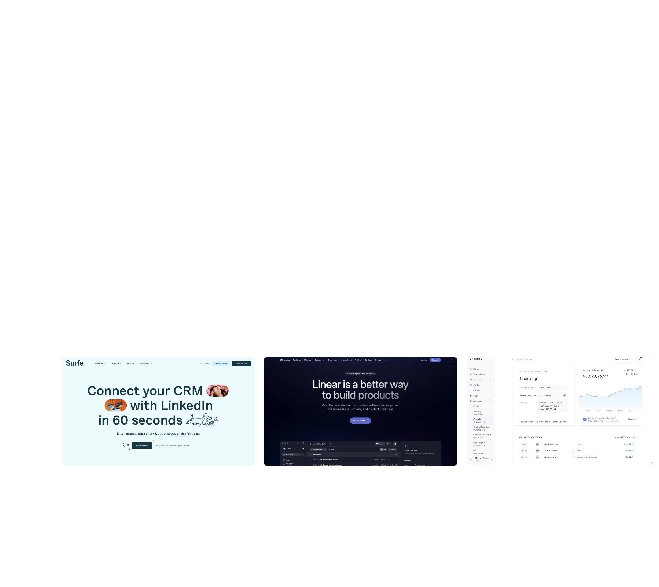
1. Feature Showcases
When you need to present 5-10 distinct features without overwhelming users. Each feature gets its own contained space with visual hierarchy built in.
Huly's features section uses a bento grid to showcase 8 different collaboration features, each in its own box with a visual + headline + description:

2. Dashboard Overviews
When users need to see multiple data points simultaneously. Bento grids let you mix different content types (charts, metrics, lists) without visual chaos.
Analytics dashboards often use bento grids to display KPIs (2×1 boxes), conversion funnels (2×2 boxes), and recent activity lists (1×2 boxes) side by side.
3. Landing Page Hero Sections
When you want to communicate multiple value propositions at once while maintaining a modern, premium aesthetic.
Payhawk's landing page uses a bento grid hero to show product screenshots, integrations, and feature highlights in one scannable view:

4. Portfolio/Case Study Pages
When you need flexible containers for different media types (images, videos, text blocks) that adapt to content rather than forcing content to adapt to layout.
The Base Unit System: Your Grid Foundation
The secret to scalable bento grids is the base unit system. Instead of arbitrary pixel sizes, everything is based on multiples of one foundational unit.
Setting Up Your Base Unit
Step 1: Choose your base unit
Common choices: 80px, 100px, or 120px
Example with 100px base:
- Small card: 1×1 = 100px × 100px
- Wide card: 2×1 = 216px × 100px (two 100px units + one 16px gutter)
- Large card: 2×2 = 216px × 216px
- Extra-wide: 3×1 = 332px × 100px
Step 2: Define your gutter
This is the spacing BETWEEN boxes. Standard: 16px, 20px, or 24px.
Formula:
Card width = (Base Unit × Columns) + (Gutter × (Columns - 1))
Example:
2-column card with 100px base + 16px gutter = (100 × 2) + (16 × 1) = 216px
Why This Matters
When you build with a base unit system:
- Scaling is mathematical, not arbitrary
- Responsive breakpoints become predictable
- Design handoff to developers is clearer
- Your design system stays consistent
Building Bento Grids in Figma
Method 1: Auto Layout with Grid Flow (Recommended for 2026)
Figma's new Grid auto layout flow (released 2024) is purpose-built for bento grids.
Step-by-step:
- Create a Frame (Shift+A for Auto Layout)
- Switch to Grid Mode
- In the Auto Layout panel, change from "Packed" to "Grid"
- Set columns: 3 (desktop), 2 (tablet), 1 (mobile)
- Set gap: 16-24px
- Create Your Cards
- Each card is a nested auto layout frame
- Set fixed widths based on your base unit system
- Set min-heights (content determines final height)
- Use Column Span
- Small card: spans 1 column
- Medium card: spans 2 columns
- Large card: spans 3 columns
Pro tip: Create component variants for 1×1, 2×1, 2×2, and 3×2 cards. Swap instances instead of resizing manually.
Method 2: Manual Grid with Layout Grid
For designers who want pixel-perfect control:
- Set up Layout Grid
- Select your frame
- Add Layout Grid (Shift+G)
- Type: Grid
- Size: Your base unit (100px)
- Gutter: Your gap (16px)
- Color: Low opacity red (#FF0000 at 10%)
- Snap Cards to Grid
- Create frames for each card
- Manually position to align with grid lines
- Use arrow keys (Shift+Arrow for 10px jumps)
When to use this method: Asymmetric layouts where cards don't follow standard column spans.
Designing Individual Bento Cards
Each card in your bento grid needs internal structure. Here's the anatomy of a well-designed bento card:
The Visual + Text Formula
Layout structure (top to bottom):
- Visual Element (60-70% of card height)
- Product screenshot
- Illustration
- Icon
- Video/GIF
- Abstract graphic
- Headline (20-30% of card height)
- 1-6 words maximum
- Font size: 18-28px depending on card size
- Bold or semibold weight
- Supporting Text (optional, 10-20%)
- 1-2 lines maximum
- Font size: 14-16px
- Regular weight
- Slightly muted color (60-70% opacity)
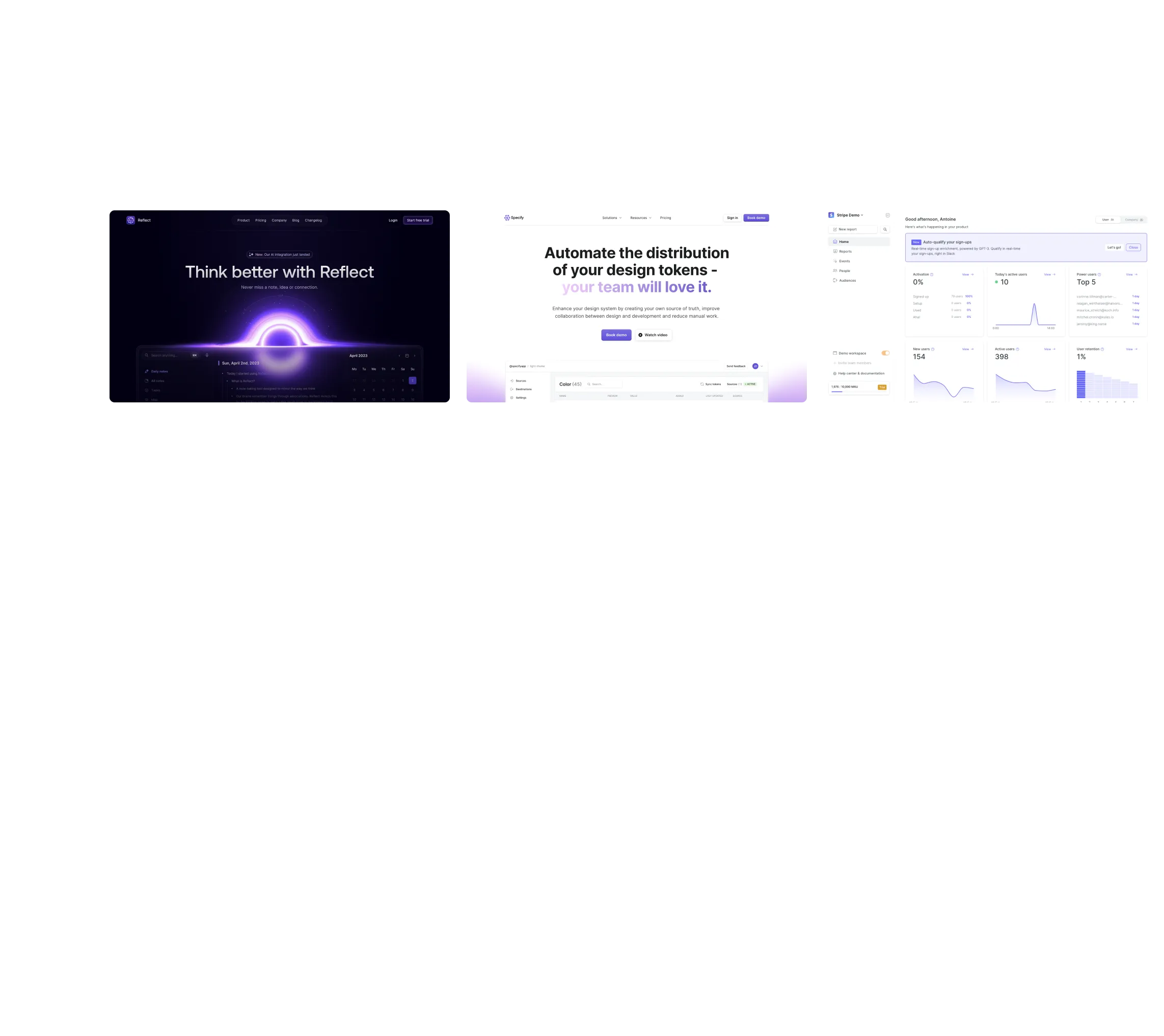
Customer.io's bento grid cards showing this formula:

Padding and Internal Spacing
Standard padding:
- Small cards (1×1): 16-20px all sides
- Medium cards (2×1): 20-24px all sides
- Large cards (2×2): 24-32px all sides
Internal spacing:
- Gap between visual and headline: 12-16px
- Gap between headline and body text: 8px
Rule of thumb: Larger cards = more breathing room. Don't try to cram more content, use the extra space for comfort.
Responsive Behavior: Desktop to Mobile
Bento grids shine in responsive design because they collapse gracefully. Here's the standard approach:
Breakpoint Strategy
Desktop (1200px+):
3-4 column grid with full bento complexity
Tablet (768-1199px):
2 column grid, some cards stack to maintain readability
Mobile (< 768px):
1 column grid, all cards stack vertically
Critical decision: On mobile, reorder cards by importance, not by desktop position. The 2×2 hero card should be first, even if it was bottom-right on desktop.
Maintaining Visual Interest on Mobile
When your bento grid collapses to a single column, you lose the "bento" effect. Combat this:
1. Vary card heights
Not all stacked cards should be the same height. Let important features have taller cards.
2. Maintain internal card design
The visual + headline formula still works. Don't switch to a different card style just because it's mobile.
3. Add subtle animations
Cards sliding in on scroll maintains engagement that static layouts lose.
Interactive States and Micro-interactions
Static bento grids are 2024. In 2026, successful implementations include subtle interactivity:
Hover States (Desktop)
Standard approach:
- Card lifts slightly (4-8px translateY)
- Shadow increases (from 0 to subtle shadow)
- Border or outline appears (1-2px)
- Slight scale increase (1.02×)
Duration: 200-300ms ease-out transition
Warning: Don't animate ALL properties. Choose 1-2 for performance.
Click/Tap Feedback
Even if cards aren't clickable links, providing feedback on interaction improves perceived responsiveness:
- Active state: Card scales down slightly (0.98×) for 100ms
- Ripple effect: Material Design-style ripple from touch point
- Color shift: Background darkens/lightens by 5%
Conclusion: Design Bento Grids with Purpose
Bento grids are powerful, but they're not a universal solution. Use them when you need to present multiple pieces of information with clear hierarchy and scannability. Avoid them when you need linear progression or deep content.
The three principles that matter:
- Strict compartmentalization creates cognitive chunking
- Size = hierarchy leverages visual weight, not position
- Uniform spacing creates rhythm and professionalism
Your next steps:
- Browse SaaSFrame's 43 bento grid examples
- Define your base unit system (recommend 100px + 16px gutters)
- Build card components in Figma using Grid auto layout
- Design for desktop, tablet, and mobile simultaneously
- Test with real users before shipping
Bento grids are defining SaaS UI in 2026 because they solve a real problem: presenting complex features in a scannable, visually engaging way. Master this pattern, and you'll have a layout system that scales from landing pages to dashboards to portfolios.