.webp)
Your pricing page is the ultimate conversion battleground. While design trends come and go, certain UI patterns consistently drive visitors to select a plan and convert. Research from ConversionXL reveals that 71% of SaaS websites fail to address buyer concerns effectively on their pricing pages, leaving massive revenue potential untapped.
At SaaSFrame, we've analyzed 211 real SaaS pricing pages to identify the patterns that consistently move the needle. In 2026, pricing page optimization isn't about aesthetics alone, it's about strategic UI decisions that guide users toward confident purchase decisions while maximizing both conversion rates and average revenue per customer.
This guide breaks down 10 proven UI patterns used by companies like Linear, Vercel, and Dust to turn pricing page visitors into paying customers, backed by behavioral psychology research and conversion data.
1. The Strategic Three-Tier Structure
The "Rule of Three" isn't just a design convention, it's rooted in cognitive psychology. Research from ProfitWell across 12,000+ SaaS companies shows that offering three main pricing tiers optimizes conversion rates for most products. More options create decision paralysis, a phenomenon confirmed by psychologist Barry Schwartz's research showing that when presented with 24 options, only 3% of customers convert, compared to 30% with just 6 options.
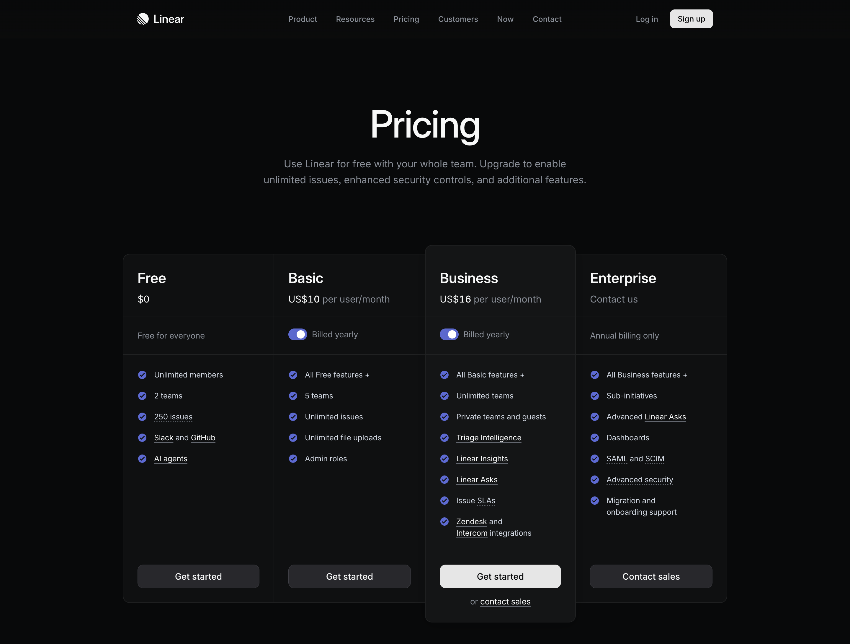
Linear's pricing page demonstrates this principle perfectly with three clearly differentiated tiers (Free, Standard, Plus) that create natural progression paths without overwhelming visitors. The clean three-column layout makes comparison effortless while guiding users toward the middle tier.
💡 Implementation Tip: Structure your tiers to address distinct customer segments (individual users, small teams, enterprises) with features that specifically solve each segment's pain points. Limit to three core tiers with optional add-ons.
2. Center-Stage Highlighting with Visual Emphasis
Stanford University research on the "center-stage effect" demonstrates that consumers naturally gravitate toward the middle option when presented with multiple choices. CXL Institute's eye-tracking studies show that users spend 42% more time looking at highlighted plans and plans with contrasting colors receive 65% more attention.
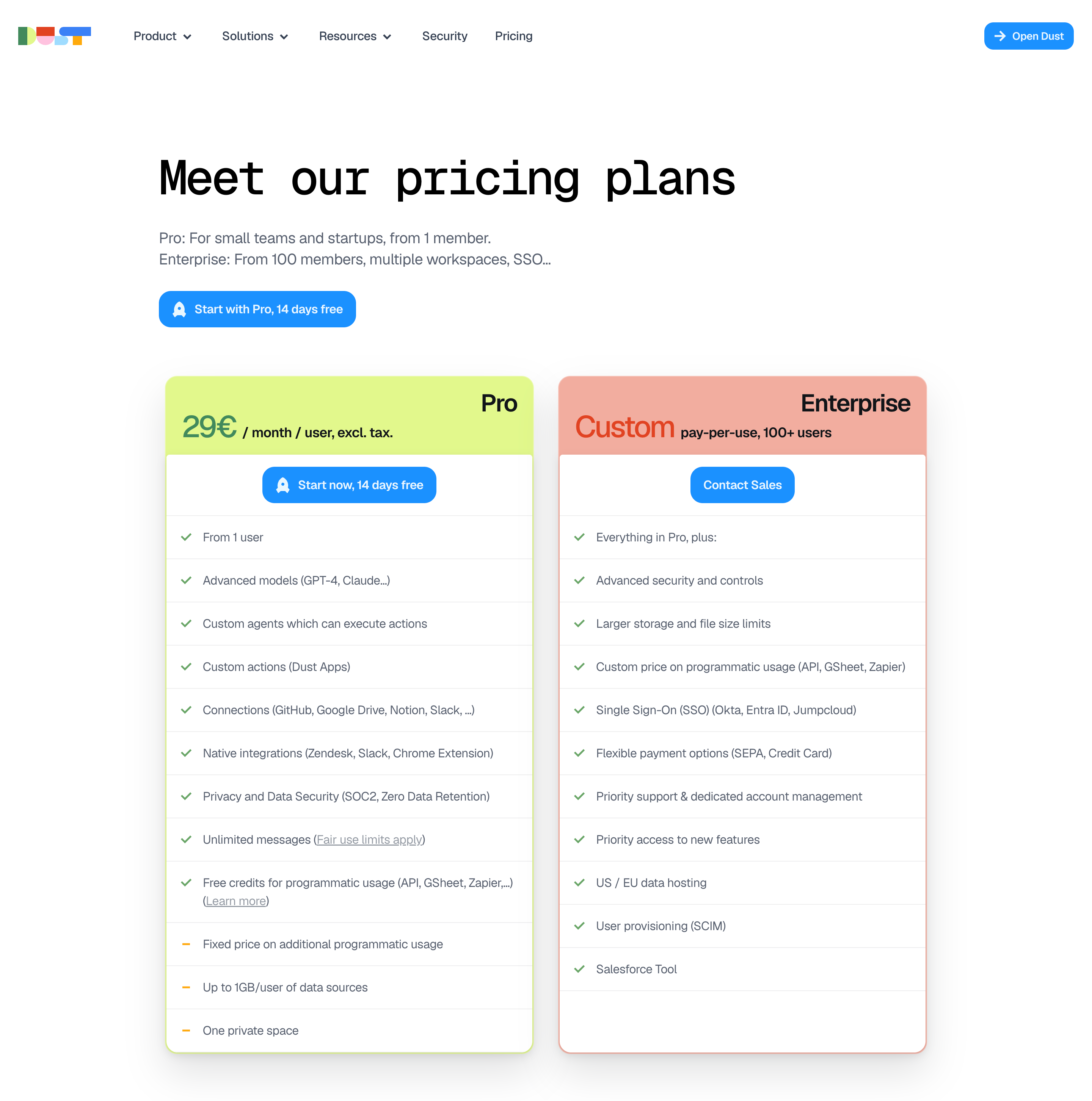
Dust's pricing page leverages contrasting colors and elevated design elements to make their recommended "Team" plan visually prominent. The subtle border treatment and "Most Popular" badge naturally draw the eye to their preferred conversion point.
💡 Implementation Tip: Use color contrast, elevated shadows, or border treatments on your preferred tier. Add subtle badges like "Most Popular" or "Best Value" to create social proof without being pushy.
3. Annual vs. Monthly Toggle with Savings Callout
Offering both annual and monthly pricing options with an interactive toggle is now table stakes. Mainsail Partners research shows that leading with annual pricing (typically 15 to 20% discounted) while maintaining easy comparison increases annual plan selection by encouraging commitment while reducing churn.
Base44 implements this pattern with a prominent toggle that defaults to annual pricing and displays the percentage savings clearly. The interface allows instant comparison without requiring mental math from users.
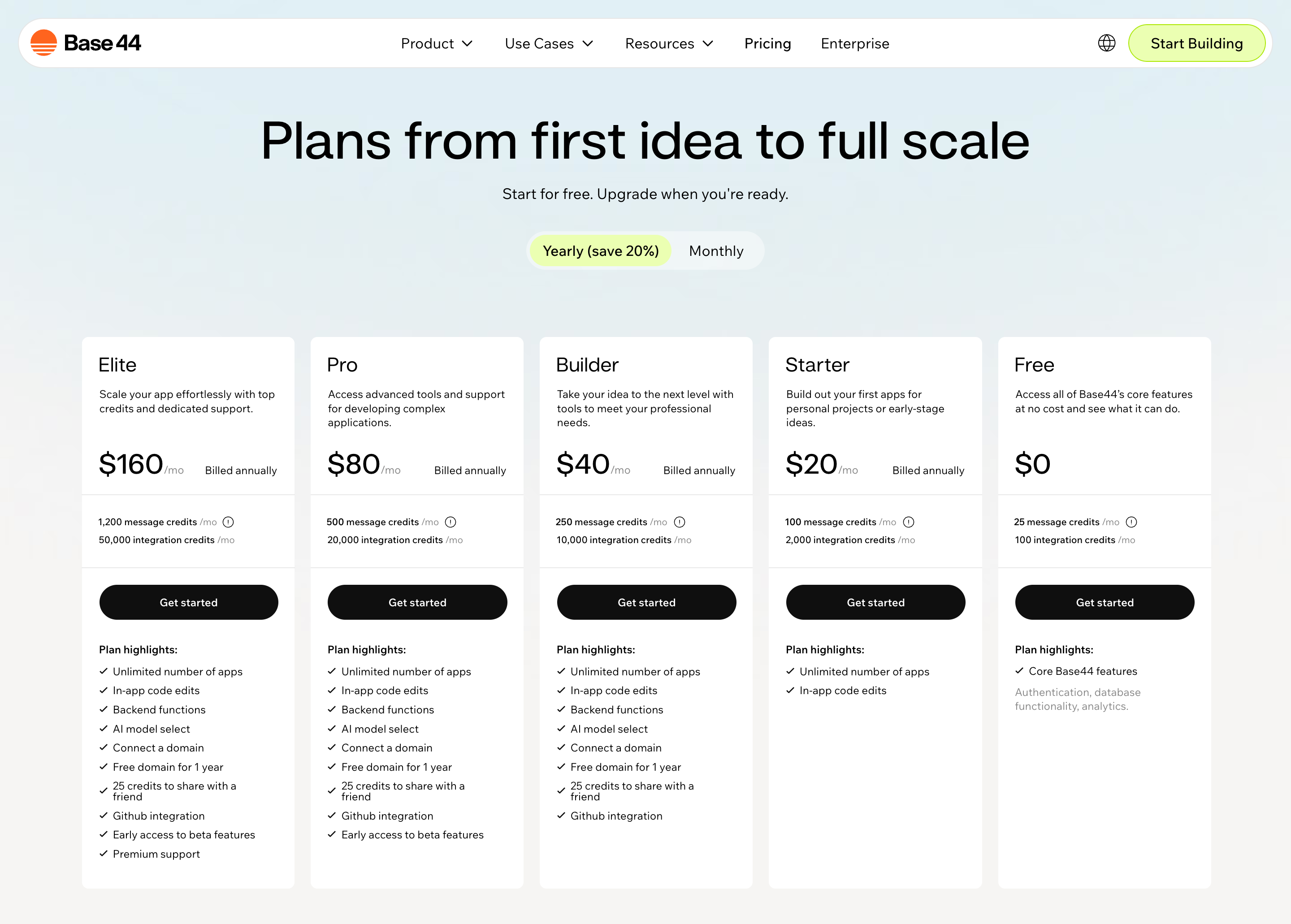
💡 Implementation Tip: Default to annual pricing, display both annual and monthly costs in the same units (monthly), and add a "Save 20%" badge next to the annual option to make the value proposition obvious.
4. Feature Comparison Tables with Progressive Disclosure
Detailed feature lists can overwhelm visitors. Research from Nielsen Norman Group suggests that progressive disclosure (revealing detailed information in stages) reduces cognitive load and improves decision-making. Testing data from GoodUI indicates that clearly marking included features with visual cues increases conversion rates by 20%.
Webflow's plans comparison section shows concise feature summaries upfront with an expandable "View all plans features" table that allows detail-oriented customers to dive deeper without cluttering the primary pricing cards.
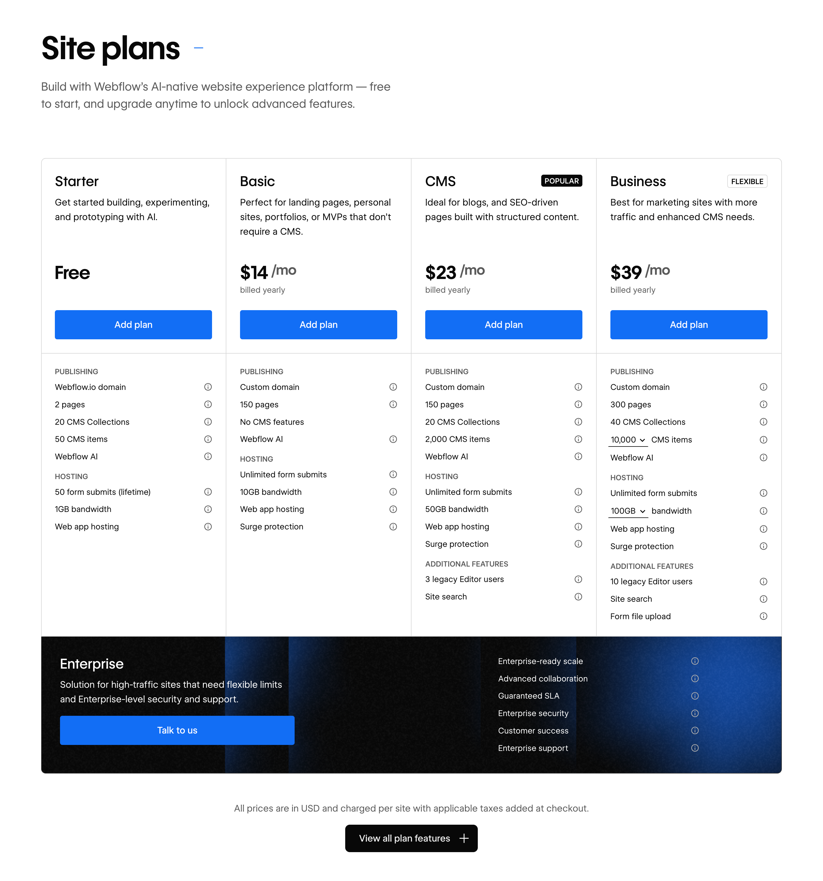
💡 Implementation Tip: Display 4 to 6 key differentiating features on your main pricing cards, then provide a "Compare plans" link that expands a detailed feature matrix. Use checkmarks, icons, and visual hierarchy to make scanning easy.
5. Transparent Pricing Calculators for Usage-Based Models
For usage-based or variable pricing, research by TrustPilot found that 81% of consumers cite hidden fees as a primary reason for abandoning purchases. Pricing calculators eliminate this friction by showing customers exactly what they'll pay based on their specific usage.
Brevo provides clear usage-based pricing with transparent unit costs, allowing customers to estimate their actual costs based on email volume without requiring a sales conversation.

💡 Implementation Tip: For usage-based models, provide interactive sliders or input fields where prospects can enter their expected usage and see real-time cost estimates. Display both base fees and variable costs transparently.
6. Social Proof Elements Positioned Strategically
Nielsen research indicates that 92% of consumers trust peer recommendations over brand messaging. Integrating social proof directly on pricing pages reduces perceived risk at the critical decision moment.
Searchable strategically places customer logos and testimonials above their pricing tiers, establishing credibility before visitors evaluate options. The social proof creates confidence in the platform's value proposition.
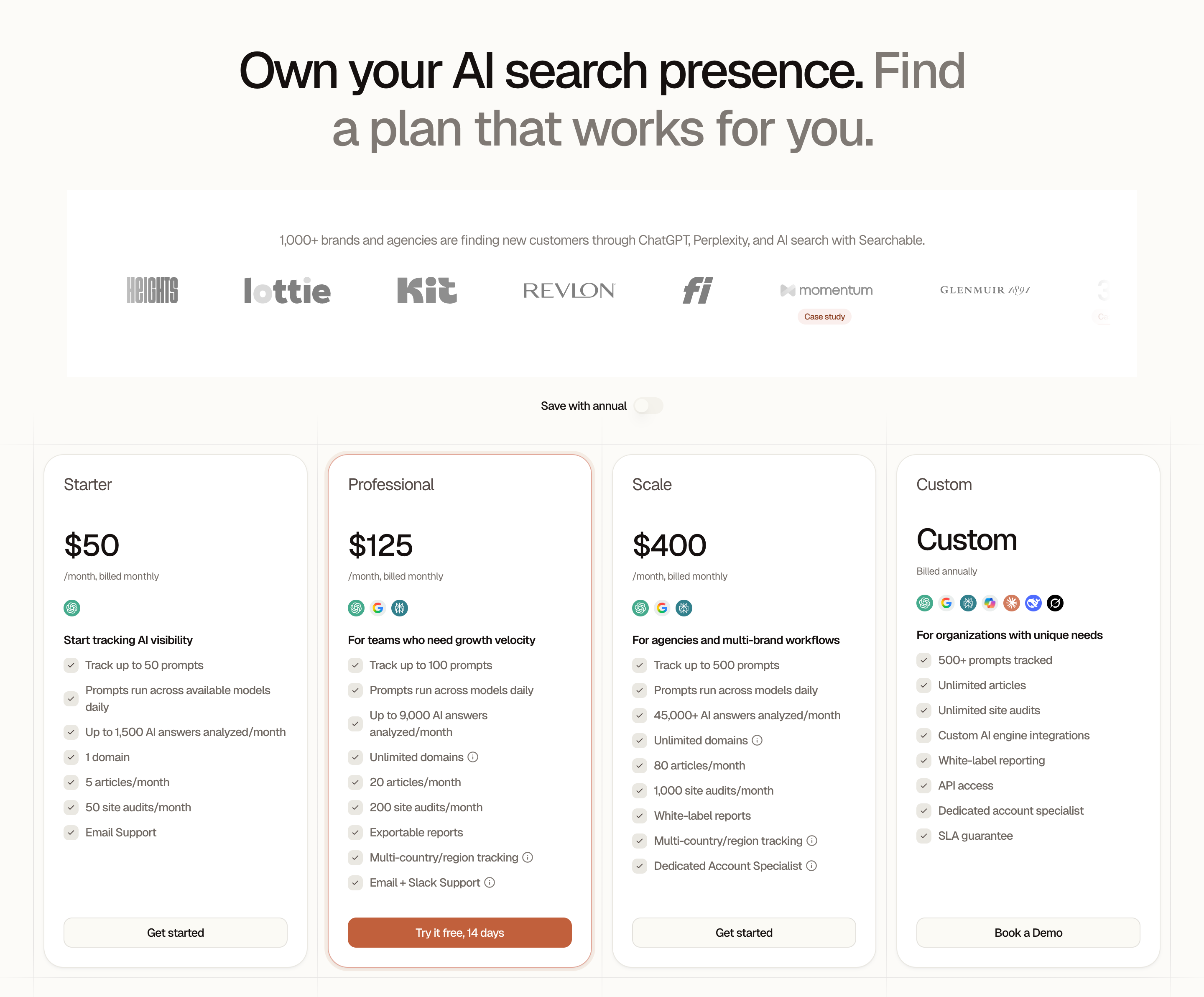
💡 Implementation Tip: Position customer logos of recognizable brands at the top of your pricing page or between the hero section and pricing tiers. Include 2 to 3 short testimonials that specifically address value for money or ROI.
7. Clear CTA Hierarchy with Action-Oriented Copy
Visual hierarchy on call-to-action buttons dramatically impacts conversion. Mainsail Partners research shows that pricing pages should have prominent CTAs for each tier, with action-oriented phrases that remove friction from the purchase decision.
Prelude uses high-contrast CTAs with clear, action-oriented copy ("Start Free Trial," "Start Verifying") that tells users exactly what happens when they click. The button hierarchy makes the primary action obvious while providing secondary options.
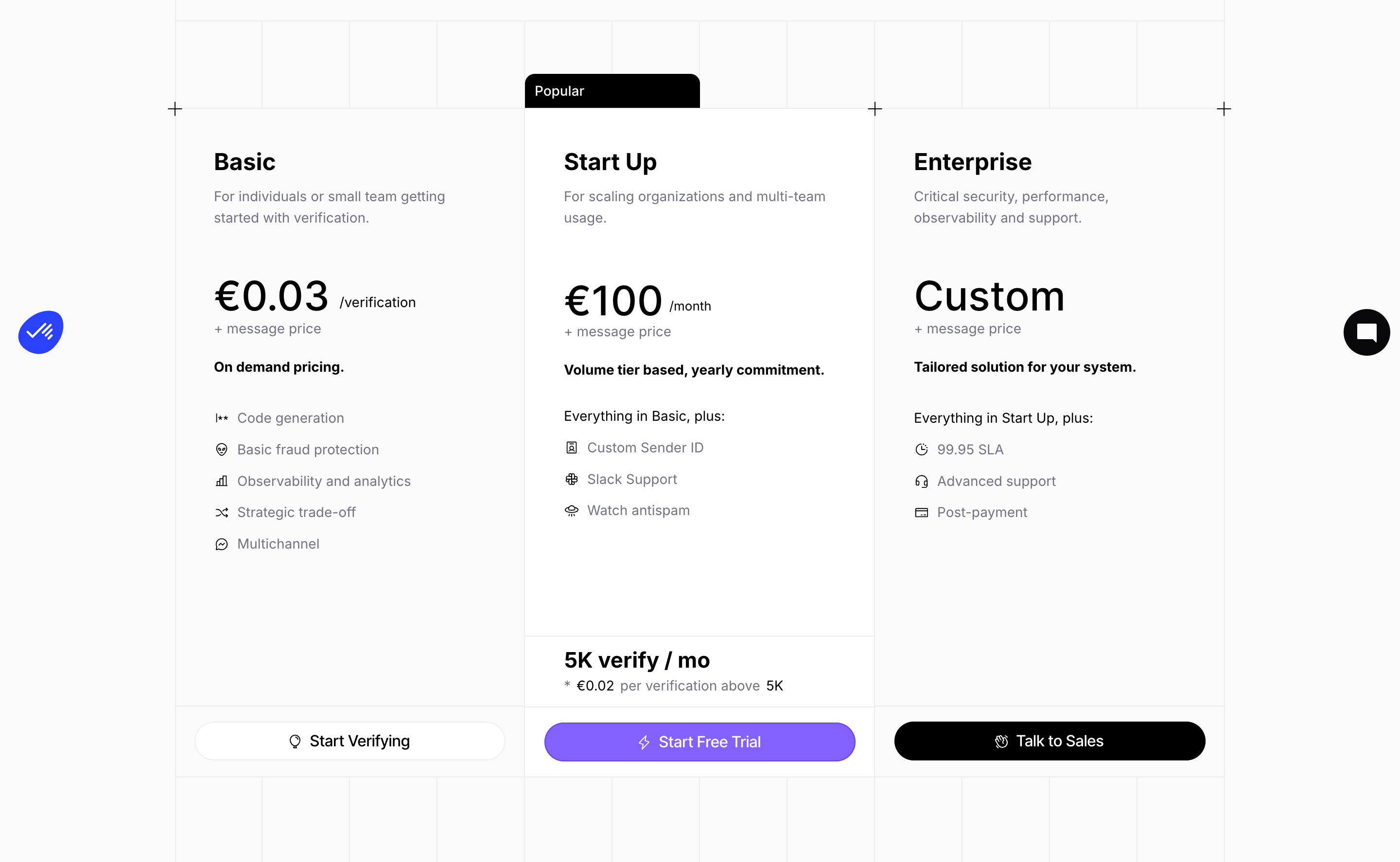
💡 Implementation Tip: Use high-contrast colors for primary CTAs, ensure buttons are large enough to be easily clickable, and use action verbs ("Start Trial," "Get Started," "Contact Sales") rather than passive phrases like "Learn More."
8. Pricing FAQ Section to Address Objections
Mainsail Partners recommends limiting pricing FAQs to no more than six questions focused on the most common concerns. This proactive approach addresses objections before they become conversion blockers.
Tailscale's pricing page includes a concise FAQ section below the pricing tiers that addresses common questions about billing, plan changes, and refunds, eliminating uncertainty at the decision point.
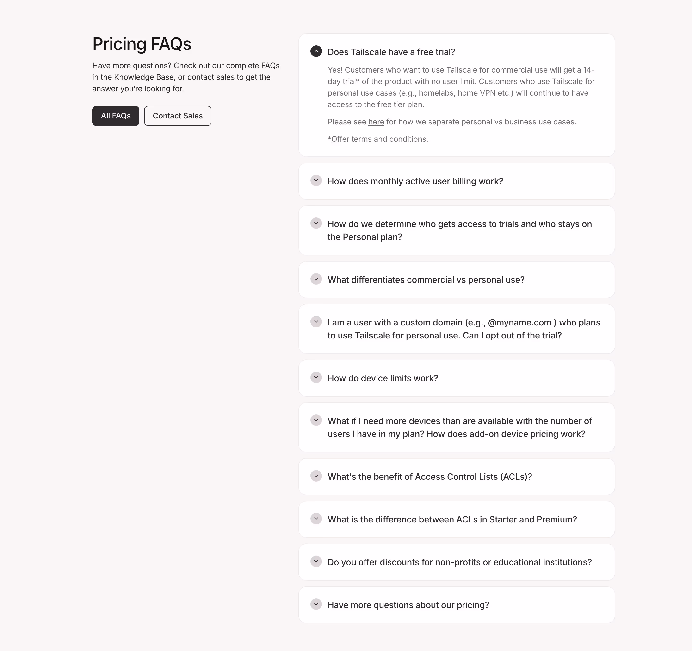
💡 Implementation Tip: Survey your sales team and analyze support tickets to identify the top 4 to 6 questions prospects ask about pricing. Answer them concisely on the pricing page with expandable accordions to keep the page scannable.
9. Mobile-Optimized Responsive Layouts
Google data indicates that up to 40% of B2B research is conducted on mobile devices. Pricing pages must maintain clarity and usability across all screen sizes, with stacked layouts, collapsed feature lists, and tappable CTAs.
FulleEnrich demonstrates excellent mobile optimization by converting their horizontal pricing layout to a vertical stack on smaller screens while maintaining clear feature comparison and prominent CTAs that remain easily tappable.
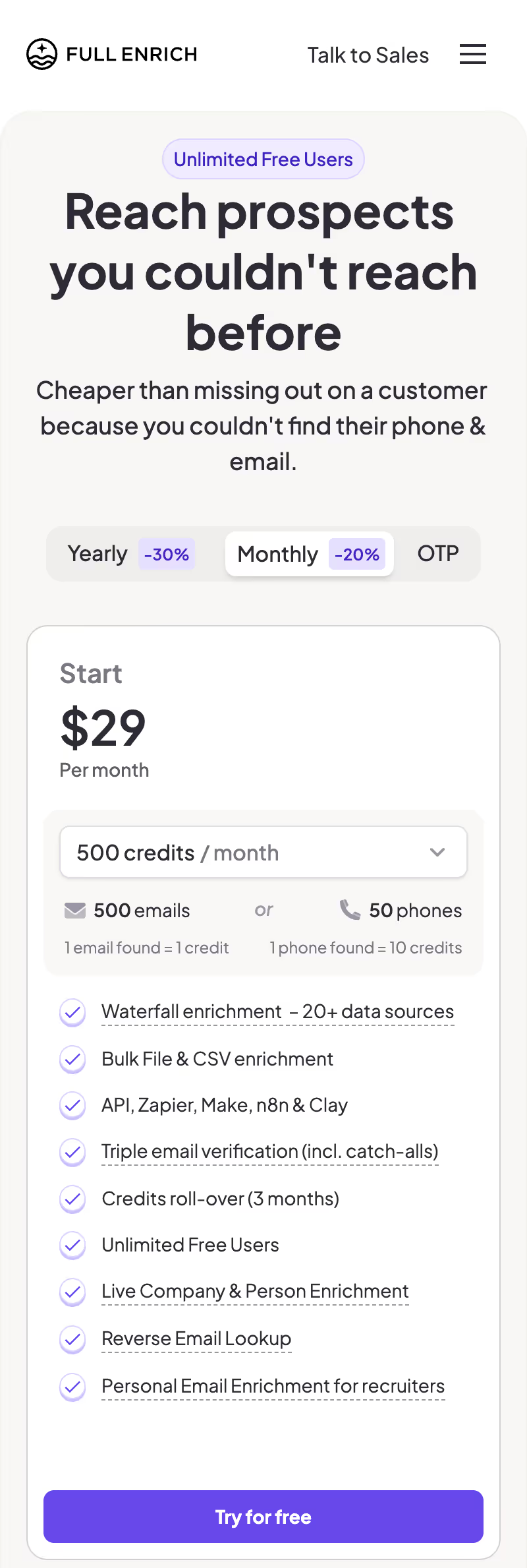
💡 Implementation Tip: Test your pricing page on multiple device sizes. Ensure pricing cards stack vertically on mobile, use expandable sections for features, and make buttons at least 44x44 pixels for easy tapping.
10. Enterprise "Contact Sales" Tier with Custom Positioning
For products serving multiple market segments, an enterprise tier with custom pricing acknowledges that high-value customers have unique needs. This pattern allows you to capture leads from larger prospects while maintaining transparent pricing for self-service buyers.
Paddle positions their Enterprise tier alongside transparent pricing for smaller tiers, with a "Contact Sales" CTA that leads to a qualified conversation rather than a transactional self-serve flow.
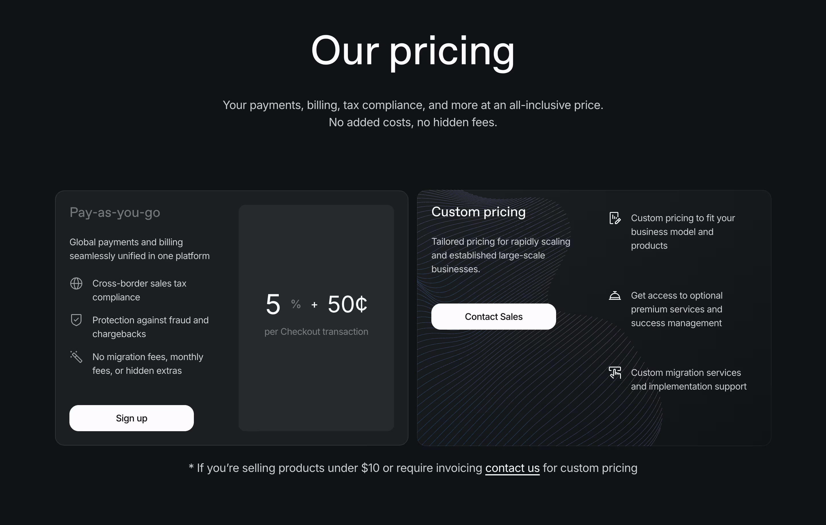
💡 Implementation Tip: Position your Enterprise tier as the fourth option (after three transparent tiers), highlight custom features like dedicated support, SLAs, and advanced security, and use "Contact Sales" or "Get Custom Quote" as the CTA.
Conclusion: From Research to Revenue
The most effective SaaS pricing pages in 2026 aren't accidents, they're the result of strategic UI decisions backed by behavioral psychology and continuous testing. ProfitWell's research shows that companies regularly testing pricing components achieve 30% higher growth rates than those that treat pricing pages as static assets.
According to McKinsey research, 83% of B2B customers value transparency above brand reputation, and Deloitte data shows that 39% of consumers have switched to competitors due to hidden costs. The patterns outlined in this article address these concerns head-on while guiding visitors toward confident purchase decisions.
Whether you're launching a new SaaS product or optimizing an existing pricing page, these 10 UI patterns provide a roadmap for conversion-focused design. Start by auditing your current pricing page against these patterns, prioritize the highest-impact gaps, and implement changes systematically while measuring results.
Don't design in a vacuum. The best way to build a world-class pricing page is to see how the world's most successful companies have solved the same challenges you face. You can explore 5,000+ real-world SaaS pricing page examples in SaaSFrame's curated library.