SaaSFrame
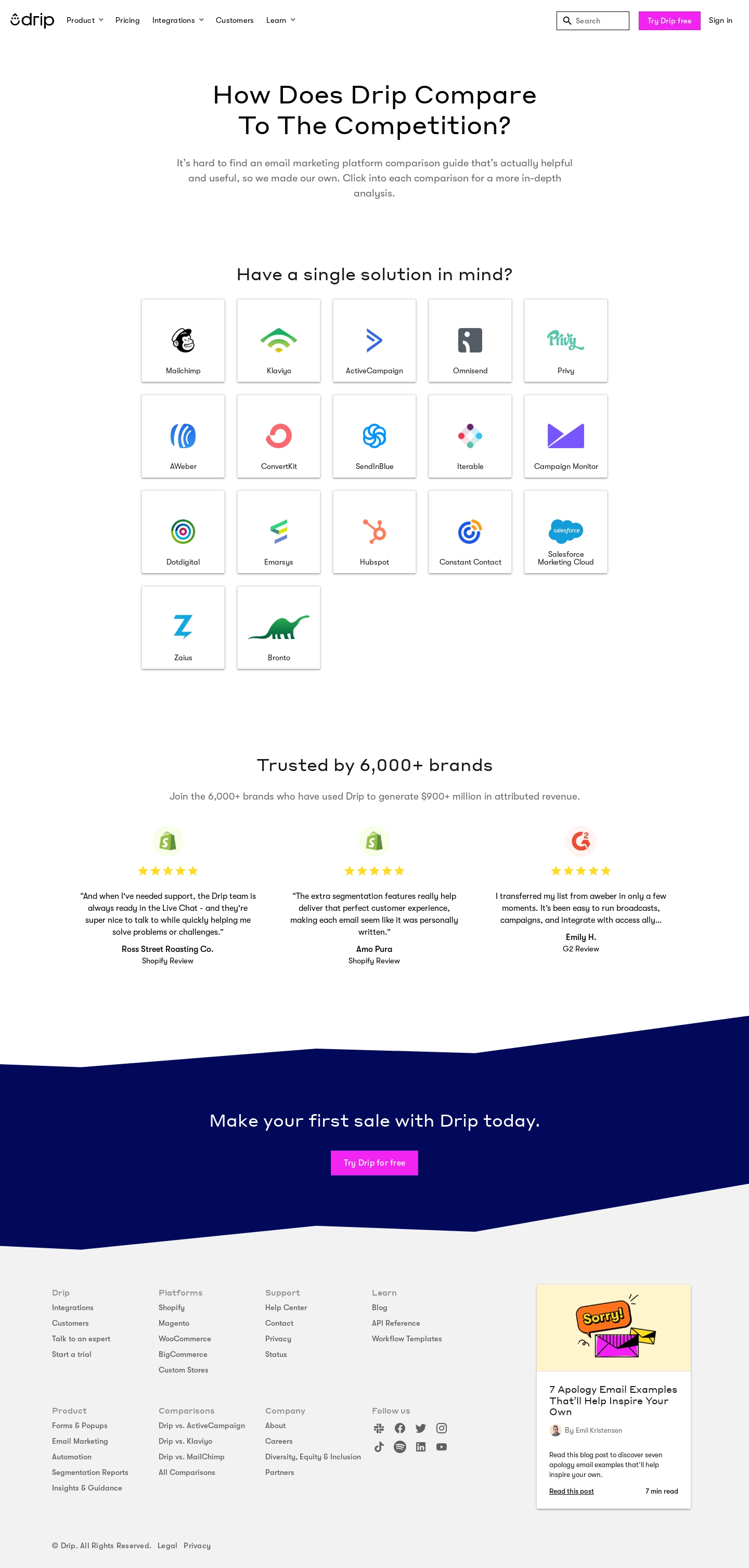
1. Heading and Navigation Bar: At the top of the page, there is a heading that introduces the website and a navigation bar that allows users to select different pages, including "Features," "Pricing," "Resources," and "Sign In." 2. Hero section: A large banner image is placed underneath the navigation bar with a title, "Compare Drip to the rest," and a subheading, "See how Drip compares to other ESPs on the market and get a full feature breakdown." 3. Feature sections: The page is divided into multiple feature sections, such as "Automation," "Reporting," and "Campaigns." Each section contains information about specific features, including a brief description, pricing comparison, and a table comparing Drip to other email service providers (ESPs). 4. Comparison table: The table comparing Drip to other ESPs is the most prominent feature on the page. Each column in the table represents a different ESP, and each row represents a different feature. The table allows users to compare prices and features quickly. 5. Customer testimonials: Throughout the page, there are several customer testimonials that provide insight into the value of using Drip. 6. Footer: At the bottom of the page, there is a footer that contains links to the company's social media profiles, contact information, and legal disclosures. Overall, the structure of the page is designed to provide users with a clear understanding of how Drip compares to other ESPs on the market. The use of feature sections, comparison tables, and customer testimonials make it easy for users to navigate the page and make informed decisions about which email service provider to use.