Prompt 1,233 words Copy
# Design from Reference: Senja Comparison Page

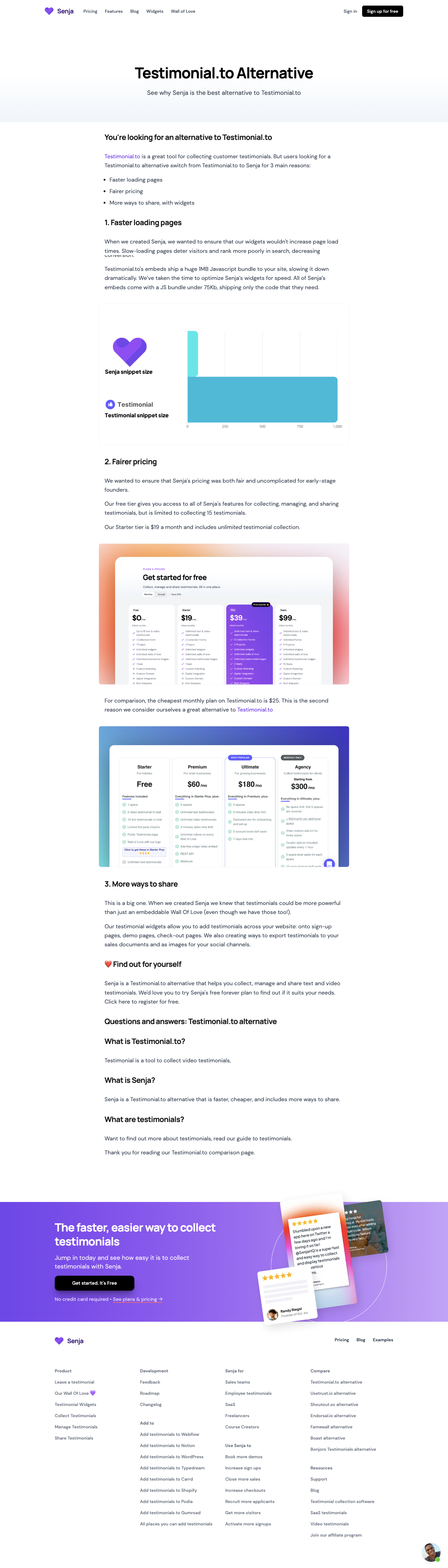
Create an original, high-fidelity visual design inspired by the reference. Prioritize composition, typography, colors, spacing, and component styling over technical implementation.

## Reference

- **Product:** Senja
- **Category:** Comparison Page
- **Screenshot:** attached to this message (also available at https://media.saasframe.io/o/b2d241cae4ca25b6b8a8.webp)
- **Source:** https://senja.io/testimonial-to-alternative

Analyze the attached screenshot first. If no image is attached, open the screenshot link; if neither is accessible, ask for it rather than guessing.

## Visual Design Context

### Overall aesthetic

- **Style:** A clean, article-led comparison page uses a white canvas, broad margins and straightforward typography, with purple branding and a more expressive closing conversion band.
- **Character:** The upper page feels editorial and factual in presentation; embedded charts and pricing screenshots supply visual evidence. Their claims are page content, not independently verified facts.

### Page composition

- **Capture:** The source is 1440 × 5042 pixels. Measurements below approximate image pixels; the relationship to CSS scale is unverified.
- **Header:** A roughly 1160-pixel-wide row contains the heart logo and wordmark left, five compact navigation links, then sign-in and a black signup button right.
- **Hero:** A large centered comparison title and one-line subtitle occupy a spacious pale gray-to-white band below the header.
- **Article:** A centered column around 800 pixels wide begins with an introduction and three-item list, then three numbered arguments. Paragraphs alternate with a bar-chart image and two pricing screenshots.
- **Closing article:** A heart-prefixed invitation, an FAQ heading and three expanded question-and-answer blocks remain in the same column.
- **Conversion band:** A full-width violet gradient strip has white heading and copy plus a black CTA left, and overlapping tilted testimonial cards right.
- **Footer:** A brand/navigation row precedes four columns containing multiple link groups. A small circular support portrait sits at bottom right.

### Information hierarchy

- **Hero title:** The largest black text establishes the comparison topic immediately.
- **Article structure:** Bold numbered headings lead each reason; regular paragraphs and a simple bullet list form the supporting layer.
- **Evidence:** A large horizontal bar chart and two screenshot panels interrupt the text rhythm without changing the central alignment.
- **FAQ:** Questions are bold, with visible answers beneath; no accordion controls are shown.
- **Conversion priority:** The colored band, white heading and black button create a strong final action zone after the long article.

### Typography

- **Family:** A rounded-looking sans serif is used throughout; exact font identity is unverified.
- **Hero:** Approximately 48 pixels, heavy weight and tight line height; the subtitle is around 20 pixels.
- **Article headings:** Approximately 24 pixels, bold, with compact leading and slightly tight tracking.
- **Body:** Approximately 18 pixels with 28–30-pixel line height, dark slate color and moderate line lengths. Occasional italic emphasis and purple inline links appear.
- **Navigation and footer:** Around 14 pixels, medium or semibold; footer text is muted and more tightly spaced than the article.
- **Closing pitch:** Roughly 36 pixels bold with a two-line wrap; supporting copy is around 20 pixels.

### Colors & surfaces

- **Measured base:** White #FFFFFF dominates; light gray #F3F4F6 and pale #F5F8FB appear in subtle surfaces.
- **Text:** Sampled dark slate #384250 supports body text; black #000000 supplies strong headings and buttons.
- **Evidence color:** Blue #6BB7D3 is sampled in the chart image. Other image colors include cyan and pricing-panel gradients.
- **Brand accent:** Purple is visible in the logo, links and conversion gradient; exact gradient stops are unverified.
- **Depth:** The article remains flat. Embedded panels use rounded edges, while overlapping testimonial cards have visible drop shadows.

### Components

- **Header CTA:** A compact black rounded rectangle, approximately 130 × 36 pixels, with white semibold text.
- **Comparison chart:** A roughly 800-pixel-wide bordered panel pairs logos and labels at left with two horizontal colored bars and a numeric axis at right.
- **Pricing imagery:** Two broad screenshots use rounded outer corners and colorful background treatments; their internal cards are part of the embedded images.
- **FAQ blocks:** Open text sections with generous question-to-answer spacing, rather than boxed cards.
- **Closing CTA:** Approximately 255 × 48 pixels, black fill, rounded corners and a soft shadow; a smaller reassurance line and underlined pricing link follow.
- **Testimonial collage:** Three overlapping cards vary in angle and depth, with stars, text and small portraits over a fine circular outline.
- **Support launcher:** A circular portrait with a small green status dot anchors the lower-right edge.

### Visual rhythm

- **Article cadence:** Paragraph gaps are around 24–32 pixels, with larger breaks before numbered headings and wide images.
- **Alignment:** The hero is centered, while article and conversion text align left. Images slightly exceed the article's text inset.
- **Density shift:** A long restrained article leads into a vivid, compact conversion band and then a denser multi-column footer.

### Responsive

- **Evidence:** Only a desktop layout is observed; menu behavior and mobile breakpoints are unverified.
- **Recommended text:** Make the article fluid with 20–24-pixel side padding and retain readable body size.
- **Recommended reflow:** Collapse header navigation, stack conversion copy above the testimonial collage and reduce footer columns progressively.
- **Evidence handling:** Preserve image proportions and offer enlarged chart/pricing views rather than shrinking every embedded label beyond readability.

### Adaptation guidance

- **Preserve:** Keep the editorial column, numbered comparison sequence, open FAQ and purple final action band.
- **Build:** Use distinct hero, article, evidence-image, conversion and footer regions; maintain shared alignment within each.
- **Content fidelity:** Treat comparison and pricing details as supplied screenshot content; do not infer current product facts or reproduce unsupported claims.
- **Interaction:** Define accessible links, focus states and support behavior explicitly, since only their visual appearance is shown.

## Content

**Instructions:**

Generate realistic example content that fits the selected design reference.

Create appropriate headlines, descriptions, labels, buttons, and supporting copy based on the type of interface being designed.

If a product or business description is provided, use it to guide the content.

Otherwise, invent a plausible fictional SaaS product appropriate for the reference.

Keep the content concise, coherent, and visually balanced.

Do not present fictional statistics, customer names, or testimonials as verified facts.

## Design Direction

**Instructions:**

Use the reference screenshot as the main source of visual inspiration rather than a strict layout template.

Preserve its most distinctive design characteristics, such as typography, visual rhythm, color relationships, component treatments, and overall aesthetic.

Feel free to modify section arrangements, proportions, spacing, and individual components to better suit my content.

Introduce original design decisions where they improve usability, composition, or brand consistency.

The result should clearly reflect the reference's visual language without looking like a direct reproduction.

Follow the visual identity of the reference design.

Use its typography, color palette, component styling, and overall aesthetic as the primary design direction.

Do not introduce an unrelated visual identity.

## Output

**Instructions:**

Generate a high-fidelity visual mockup of the requested interface.

Present the design as a polished, realistic website or product UI screenshot.

Prioritize visual composition, typography, spacing, colors, alignment, and component details.

Use the available image-generation or visual-design capabilities.

Do not replace the mockup with source code, a written design specification, or a textual description.

If direct visual generation is unavailable, clearly explain the limitation.

## Constraints

- Use the actual screenshot as the primary visual reference.
- Preserve essential messaging and factual accuracy.
- Prioritize visual quality and consistency.
- Do not invent unsupported product claims.
- Adapt structure and copy length for visual balance.
Reference image Attach it to your message: assistants can’t open image links. Open in ChatGPT ↗ Open in Claude ↗
Build it in Lovable ↗ v0 ↗ Figma Make ↗
Opening a tool copies the screenshot so you can paste it with your prompt.
 SaaSFrame