 SaaSFrame
Progress Indicator
Keep users informed with SaaS Progress Indicator patterns. Use these for long-running tasks, multi-step onboarding, and data imports to manage user expectations.
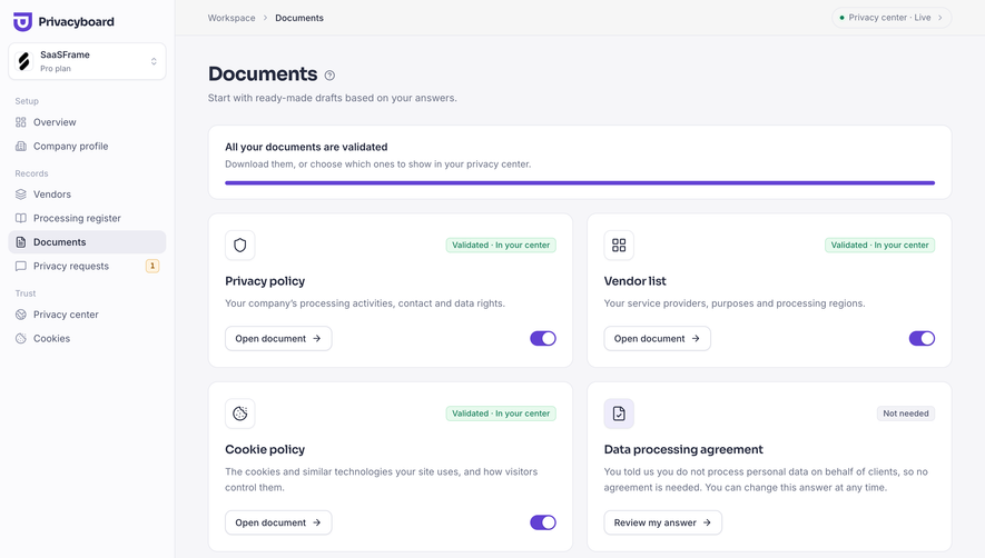

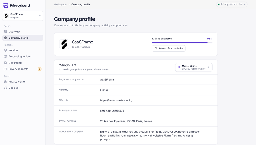
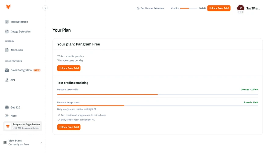

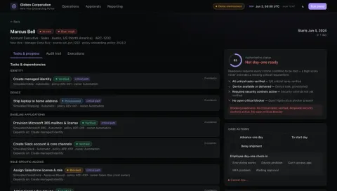
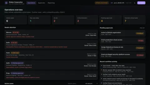
Index of all 473 Progress Indicator examples
- Tines Onboarding Performance Report
- Tines Employee Onboarding Checklist
- Tines Employee Onboarding Dashboard
- Glide Project tasks and progress
- Glide Project manager app preview
- Context.dev Onboarding complete
- EigenPal Generate an agent from instructions
- Hugging Face Complete your profile
- Cloudflare Speed Observatory
- Cloudflare Agent Readiness
- Profound Content Brief
- Profound Select Topics
- Profound Select Region
- Profound Running Prompts
- Profound AI Visibility Ranking
- Profound Add Company Details
- Profound Email Verification
- Profound Create Account
- Profound Set Company Size
- Profound Set Email
- Rankfender Review Generated Prompts
- Rankfender Targeted Audience
- Rankfender Validate Topics
- Rankfender Select Topics
- Rankfender Select Keywords
- Rankfender Add Competitors
- Rankfender Add Competitors
- Rankfender Content Preferences
- Rankfender Review Brand Book
- Rankfender Generate Brand Book
- Rankfender Set Up Brand
- Claude Code Onboarding
- Dust Data Sync in Progress
- Dust Welcome Screen
- Dust Setup Platforms
- Dust Account Setup
- Prelude Add Prelude To App
- Prelude Welcome Screen
- Prelude Create First App
- Unkey API Key Ready
- Unkey Create First API Key
- Unkey Create First API Key
- Unkey Create Company Workspace
- Unkey Verification
- Visitors Setup Tracking
- Visitors Project Domain
- Visitors Project Name
- Visitors Profile Picture
- Visitors Account Name
- Visitors Signup Code
- FullEnrich Export A Contact
- FullEnrich User Onboarding
- FullEnrich User Onboarding
- FullEnrich User Onboarding
- FullEnrich User Onboarding
- FullEnrich User Onboarding
- FullEnrich Welcome Screen
- FullEnrich Account Setup
- Hume AI Usage
- Hume AI Generating New Voice
- Hume AI Account Setup
- Atlas Export Map
- Atlas Welcome Screen
- Atlas Account Setup
- Atlas Account Setup
- Atlas Account Setup
- Atlas Account Setup
- Wise Review & Confirm Conversion
- Wise Select Conversion Amount
- Wise Select Conversion Amount
- Wise Convert Money
- Wise Send Payment Request
- Wise Request Money
- Wise Add Money With Card
- Wise Add Money
- Wise Confirm & Send Money
- Wise Select Transfer Recipient
- Wise Search Transfer Recipient
- Wise Add Transfer Recipient
- Wise Send A Payment
- Wise Multi-Factor Authentication Setup
- Wise 2FA Phone Number Already Used
- Wise Multi-Factor Authentication Setup
- Wise Multi-Factor Authentication Setup
- Wise Choose Country
- Wise Choose Account Type
- Pitch Import Presentation
- Pitch Product Tour
- Pitch Product Tour
- Pitch Product Tour
- Pitch Product Tour
- Pitch Product Tour
- Pitch Welcome Screen
- Pitch Account Setup
- Pitch Invite Team Members
- Pitch Account Setup
- Pitch Privacy Optin
- Customer.io Data Import Mapping
- Customer.io Uploading CSV
- Customer.io Upload CSV
- Customer.io Import CSV
- Customer.io Send First Campaign
- Customer.io First Campaign Created
- Customer.io Campaign Review
- Customer.io Campaign Goals Settings
- Customer.io Campaign Review
- Customer.io Campaign Workflow
- Customer.io Create First Campaign
- Customer.io Welcome Screen
- Customer.io Account Setup
- Customer.io Skills Setup
- Customer.io Channels Setup
- Customer.io Goals And Experiences Set Up
- Customer.io Company Setup
- Checkout.com Generating Report
- Superlist Checklist
- Superlist User Onboarding
- Superlist User Onboarding
- Superlist User Onboarding
- Superlist Account Setup
- Superlist Account Setup
- Superlist Account Setup
- GoFundMe Setup Banking Transfers
- GoFundMe Setup Banking Transfers
- GoFundMe Setup Banking Transfers
- GoFundMe Account Setup
- GoFundMe Edit Profile Picture
- GoFundMe Setup Profile Picture
- GoFundMe Onboarding Checklist
- GoFundMe Foundraiser Review
- GoFundMe Foundraiser Details Setup
- GoFundMe Foundraiser Cover Photo Setup
- GoFundMe Edit Cover Photo
- GoFundMe Foundraiser Cover Photo Setup
- GoFundMe Multi-Factor Authentication Challenge
- GoFundMe Multi-Factor Authentication Setup
- GoFundMe Account Details Setup
- GoFundMe Foundraiser Goal Setup
- GoFundMe Foundraiser Setup
- GoFundMe Foundraiser Setup
- Steep Welcome Screen
- Steep Account Setup
- Steep Account Setup
- Wiza Import Data Configuration
- Wiza Import Data Output
- Wiza Import Data Mapping
- Wiza Welcome Screen
- Wiza Install Chrome Extension
- Wiza Account Setup
- OpenAI Loading Playground
- OpenAI Enter Code
- OpenAI Phone Number Verification
- OpenAI Verify Phone to Create API Key
- OpenAI Welcome Screen
- OpenAI Account Setup
- Mintlify Make A Repository Update
- Mintlify Create Repository
- Mintlify Login to Github
- Mintlify Verification
- Latitude Welcome Screen
- Latitude Account Setup
- Intercom Empty Content List
- Intercom Setup AI Chatbot
- Intercom Help Desk Onboarding
- Intercom Help Desk Onboarding
- Intercom Help Desk Onboarding
- Intercom Help Desk Onboarding
- Intercom Help Desk Onboarding
- Intercom Help Desk Onboarding
- Intercom Help Desk Onboarding
- Intercom Help Desk Onboarding
- Intercom Welcome Screen
- Intercom Verification
- Intercom Account Setup
- Intercom Account Setup
- Intercom Account Setup
- Intercom Account Setup
- Intercom Account Setup
- Oku Welcome Screen
- Uvodo Uvodo Welcome Screen
- Uvodo Uvodo Account Setup
- Uvodo Uvodo Phone Verified
- Uvodo Uvodo Phone Verification
- Remote Employee Product Onboarding
- Remote Employee Product Onboarding
- Remote Employee Product Onboarding
- Remote Welcome Screen
- Remote Employee Profile Setup
- Remote Employee Profile Setup
- Remote Employee Profile Setup
- Remote Employee User Onboarding
- Remote Hire Onboarding Progress
- Remote Add A New Hire
- Remote Complete Company Details
- Remote Complete Company Details
- Remote Basic Information Account Setup
- Remote Signup
And 273 more in the library.
Progress Indicator: design guide
A progress indicator helps users understand how far a task or process has advanced and what remains. In SaaS products, it can orient someone within a setup flow, show the completion of a background operation, or summarize a checklist. Its value depends on an honest relationship between the displayed progress and the work being measured.
Squeaky's site-setup screens use compact step markers to show position within a sequence. Profound's content workflow combines a percentage, a completed-step count, and named operations. These examples represent different kinds of progress: moving through decisions and finishing a system process. The screenshots show specific states rather than the timing or interaction behavior of the entire flow.
Decide whether you are showing position, completed work, or time
Position in a sequence answers “Where am I?” Completed work answers “How much has finished?” Remaining time answers “How long will this take?” A single bar or row of dots cannot communicate all three reliably without additional context.
A four-step setup indicator does not imply that each step takes the same effort. A background job at half its item count may not be halfway through its duration. Choose the model that supports the user's decision and name the measured unit where ambiguity matters.
Keep progress distinct from status. “Running” tells users the current condition, while “Seven of ten files processed” describes advancement. Both can be useful together. A green completed badge alone does not communicate how much work was included or whether review remains.
Use step markers to orient users within a short sequence
Squeaky's site-type screen shows four circular markers above a choice between Website and Web app. The first marker is outlined in blue, while later markers are pale. The page title identifies the current decision even though the markers themselves are unlabeled.
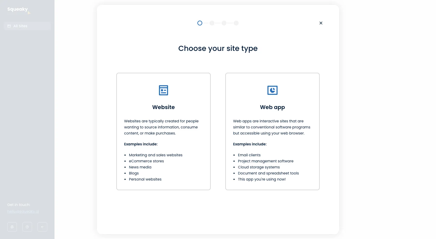
The visual treatment gives a sense of sequence without consuming much space. Its limitation is that users cannot learn what later steps involve from the dots alone. For a short, low-complexity task this may be acceptable; for consequential setup, named steps can help people prepare.
Do not assume the markers are clickable because they look like a stepper. The screenshot does not establish navigation behavior. In your product, decide whether the indicator is informational, supports revisiting completed steps, or provides full navigation. Make that affordance clear.
A textual current-step description helps people who cannot distinguish the marker styles. “Step 1 of 4: Choose site type” can communicate the same relationship through an accessible name or nearby text without relying on color.
Make advancement visible without implying that the whole task is done
On Squeaky's site-details screen, the first marker is filled blue and the second is outlined blue. The form asks for site name and URL, and provides Back and Next. That combination suggests completed versus current position within the setup sequence.
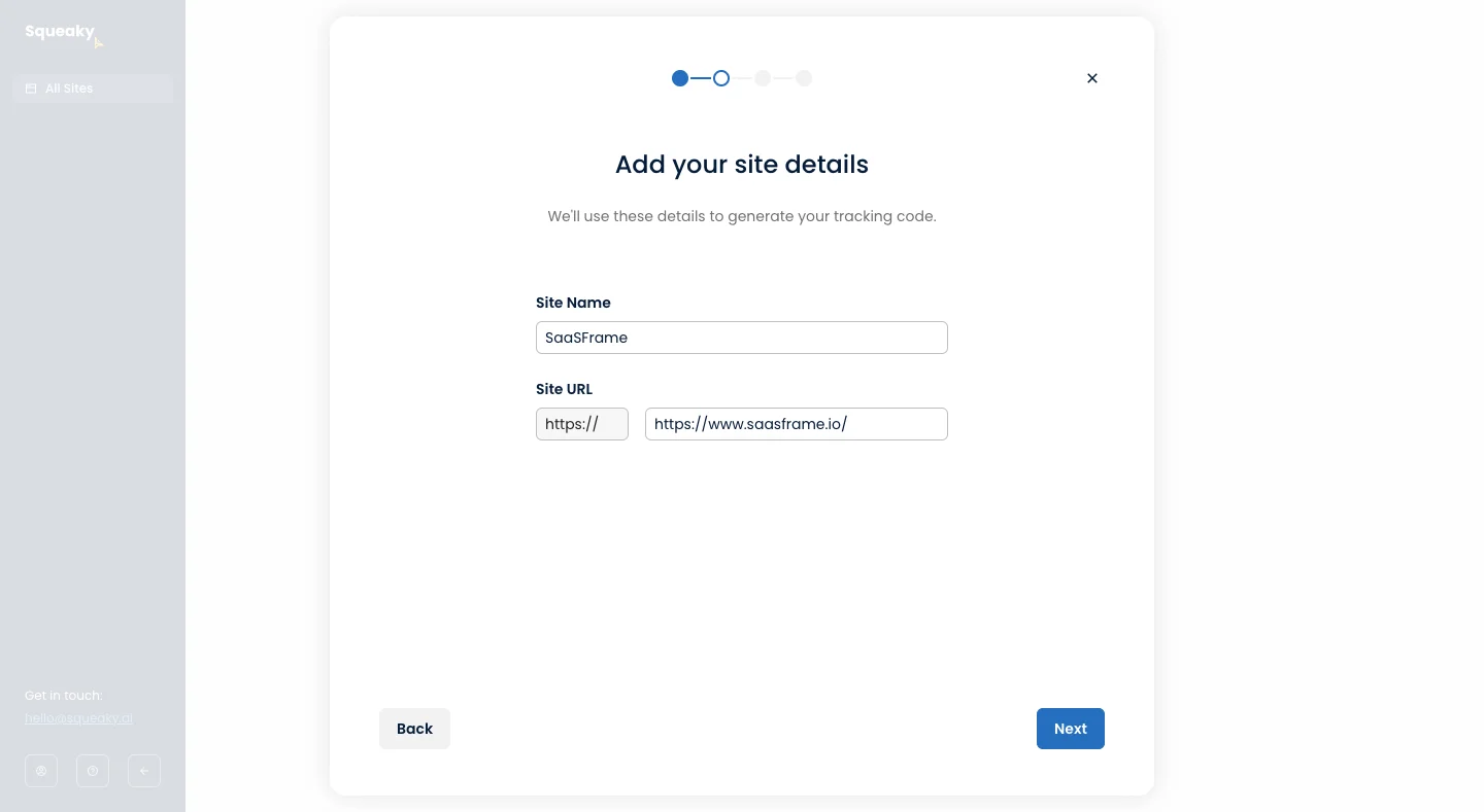
Use separate treatments for completed, current, and upcoming steps. A single highlight that moves along the row may identify location but does not explain whether earlier steps are complete. Keep the distinction perceivable through more than a color change.
Completion should correspond to the product's actual requirement. Visiting a step is not the same as satisfying its validation. If someone goes back and changes an answer that invalidates a later configuration, update the relevant completion states rather than leaving misleading checkmarks.
Keep the current heading and progress information aligned. If the next step has loaded but the indicator still highlights the prior one, the interface briefly contradicts itself. Treat the transition as one coherent update, including focus and announcement behavior.
Show background work in terms that explain the outcome
Profound's workflow panel shows nine of nine steps completed, a green 100% bar, and a named list of operations. The sequence includes research, analysis, outline extraction, brief building, metadata, and workflow completion. The surrounding document still has a Draft state and a Create Final Draft action.
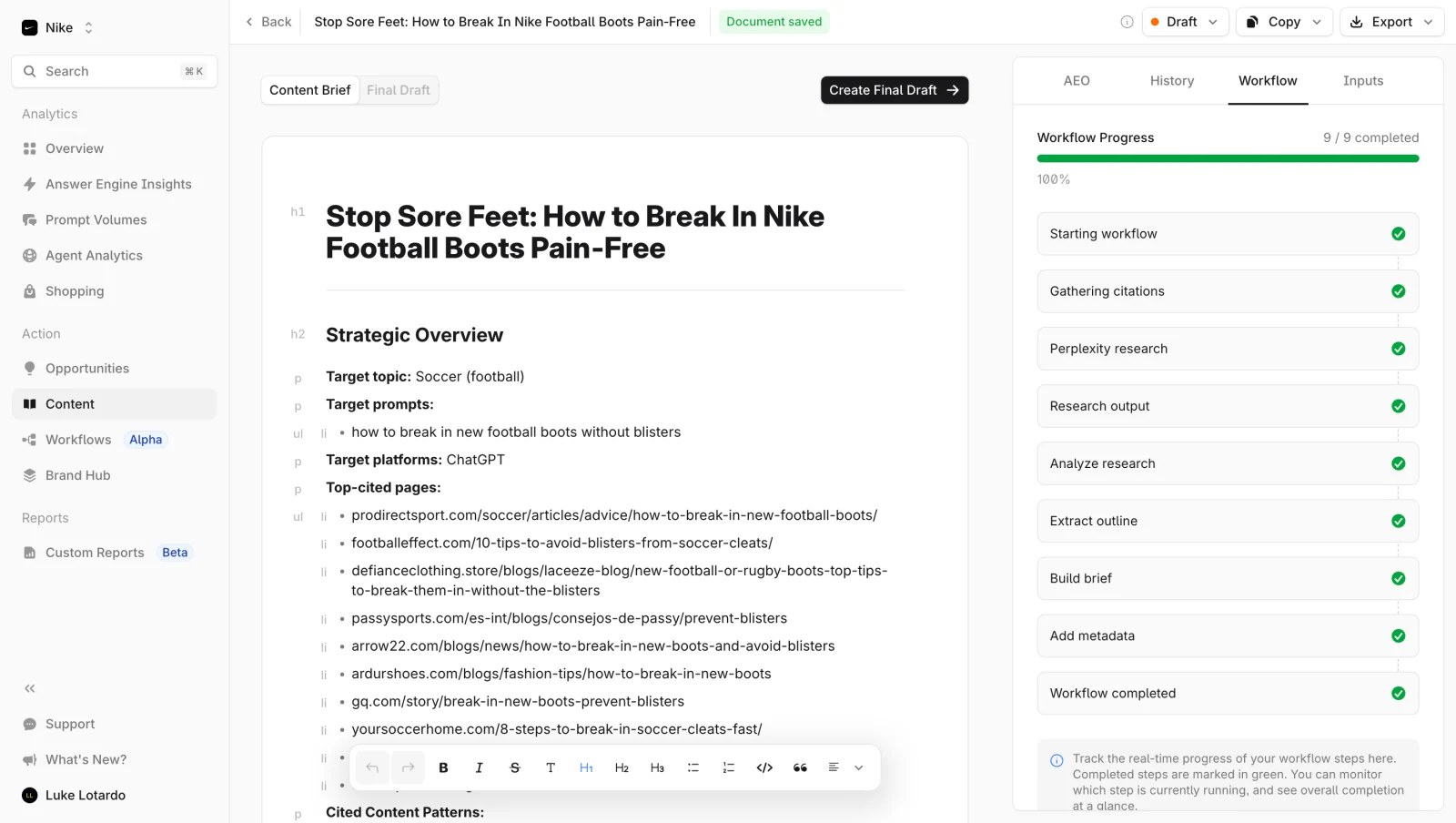
The step names help explain what the completed process did. They also make clear why a generic “Done” message may be insufficient. A generated brief can be ready while the final draft or publication still requires another action.
Use completion language that matches the measured boundary. “Import processed” may still include rejected records. “Analysis complete” may still require review. Name the outcome and expose any remaining work so the percentage does not become an unintended promise.
The screenshot demonstrates the final display but not how intermediate percentages are calculated. In your own implementation, connect the bar to a defined measure rather than assuming that a checklist and a percentage are automatically equivalent.
Use determinate progress only when the measurement is defensible
A determinate indicator presents a value within a known total: files processed, bytes transferred, tasks completed, or another meaningful unit. It should update according to actual work rather than an animation chosen to feel fast.
When the total is unknown, a waiting indicator and a clear state explanation can be more honest than a fabricated percentage. A task may discover additional work as it proceeds; communicate that change instead of hiding it behind a bar that stalls at ninety-nine percent.
Units can have unequal effort. Ten records may take less time than one large attachment. If the indicator counts records, make that unit clear and avoid claiming an exact remaining duration from it. A useful measure does not need to be a perfect time forecast.
For multi-stage processing, consider showing the current stage alongside its progress. Uploading, validating, and applying changes are different operations. Finishing the upload should not fill an overall completion bar if the consequential work is still pending.
Give time estimates as useful expectations, not guarantees
Some tasks can provide a reasonably supported estimate; others have highly variable dependencies. Display a range or a qualified expectation when uncertainty is significant. Update the explanation if the task enters a stage with different timing.
Do not use a countdown that repeatedly resets without explaining why. Users may interpret it as a promise and assume something is wrong when it expires. An honest description of the current operation can be more reassuring than a precise but unreliable number.
Distinguish elapsed time from remaining time. A timestamp showing when a job began helps someone decide whether to wait or investigate, but does not estimate completion. If external approval or a scheduled execution is required, explain that dependency instead of displaying an endlessly moving bar.
Support pauses, interruption, and returning later
A progress interface needs more than running and complete. Depending on the operation, users may encounter queued, paused, cancelled, failed, or partially completed states. Describe what happened to the work already finished and what remains possible.
If a task can continue after navigation, tell users where to find it. A temporary modal should not be the only record of a long-running process. Provide a persistent job, notification, or relevant object state that remains available after returning.
When pausing or cancelling is supported, explain whether the action stops immediately and whether completed work is retained. A cancellation request can itself take time. Keep its transitional state distinct from a confirmed cancellation.
For setup flows, preserve entered information where appropriate. Returning to a step should not erase work unexpectedly. If saving is unavailable or limited, explain the boundary before the user leaves rather than relying on the progress markers to imply persistence.
Explain partial completion and offer focused recovery
A process can reach the end while producing mixed outcomes. An upload batch might finish with several rejected files. A setup checklist might include an optional item that was deliberately skipped. Show those distinctions instead of treating every uncompleted item as the same failure.
Offer recovery at the correct scope. Retrying failed items can avoid duplicating successful work. Editing an invalid setup value can be more useful than restarting the entire flow. Preserve evidence about what completed so users can choose confidently.
Keep a failed progress state informative. “Failed at validation: two files use an unsupported format” explains more than a red bar. If the outcome is uncertain because a request timed out, provide a way to check the operation before repeating it.
A summary should not hide individual failures when they affect the user's task. Let users inspect details or download an appropriate error report, and explain whether the usable result includes only the successful subset.
Avoid rewarding completion at the expense of useful work
Checklist percentages can motivate setup, but they can also imply that every optional feature is required. Separate essential readiness from recommended exploration. A user should not feel that the product is broken because they chose not to invite colleagues or connect an irrelevant integration.
Define completion according to the user's goal. Installing tracking, confirming data arrival, and creating a report may be different milestones. A setup wizard can be complete before the product delivers its first useful result, so keep the next goal visible.
Use a stable completion rule. Adding new optional tasks later should not make an established user appear to have lost progress without explanation. If the checklist changes, describe the new opportunity rather than treating prior completion as invalid.
Make progress perceivable without unnecessary announcements
Provide text that conveys the current stage and meaningful value. A progress bar needs appropriate semantics when it represents a measured process; an informational step list needs a readable structure and identification of the current step.
Use color, icons, and labels together to distinguish states. Motion should support understanding rather than becoming the only signal that work continues. Respect the user's motion needs and ensure that a static presentation still communicates the task state.
Announce consequential changes such as a new stage, completion, or failure deliberately. Announcing every tiny percentage increment can overwhelm someone using a screen reader. Preserve focus while a background operation updates.
Test zoom, narrow layouts, long stage names, and localized text. A horizontally arranged sequence may need a different presentation on mobile. Keep current position and next action visible without forcing users to scroll across a decorative progress line.
Progress indicator review checklist
- Does the indicator measure position, completed work, or time clearly?
- Are completed, current, upcoming, and failed states distinguishable?
- Does progress correspond to actual validation or processing?
- Is the total and unit defined for a determinate value?
- Are unknown totals and external dependencies explained honestly?
- Does 100% describe the measured process rather than imply publication or approval?
- Can users understand pauses, cancellation, and returning later?
- Are partial results and focused retry actions available?
- Are required readiness and optional checklist tasks separated?
- Can users perceive meaningful updates across devices and assistive technology?
Progress indicator FAQ
Is a progress indicator the same as a stepper?
A stepper shows position within a sequence and may support navigation. Progress indicators also include measured background operations and completion summaries. Choose the representation according to the task.
When should I show a percentage?
Use a percentage when a defined total and meaningful completed measure exist. If the work cannot be measured reliably, explain the current stage and waiting state instead.
Should a progress bar reach 100% before the result is ready?
Only if it explicitly describes a completed sub-process such as upload. An overall completion indicator should align with the outcome it names and make any remaining stage clear.
How should optional steps affect progress?
Separate optional exploration from required completion, or show skipped states deliberately. Avoid implying that the user must adopt every feature to make the product usable.
Compare the surrounding process patterns
Explore Stepper for sequence orientation, Wizard for multi-step decisions, Loading Indicator for waiting states, and Status Indicator for the condition of an object. Onboarding Checklist addresses readiness tasks after signup. Use the gallery to inspect how progress is explained, then test the measurement and transitions behind the visual.