 SaaSFrame
✈️ Landing Page
Drive more signups with a library of high-converting SaaS landing page designs. From hero section layouts and value proposition placements to social proof bars, these examples follow 2026's best practices for CRO and mobile-first design.
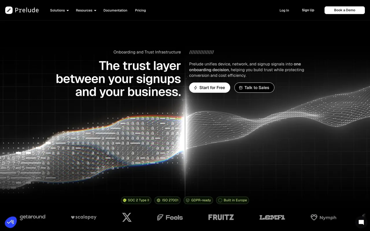

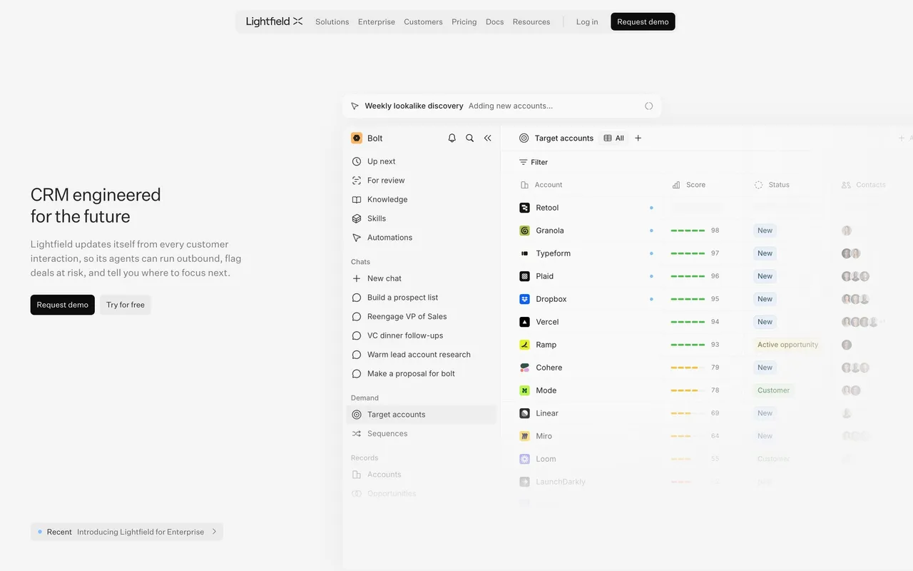

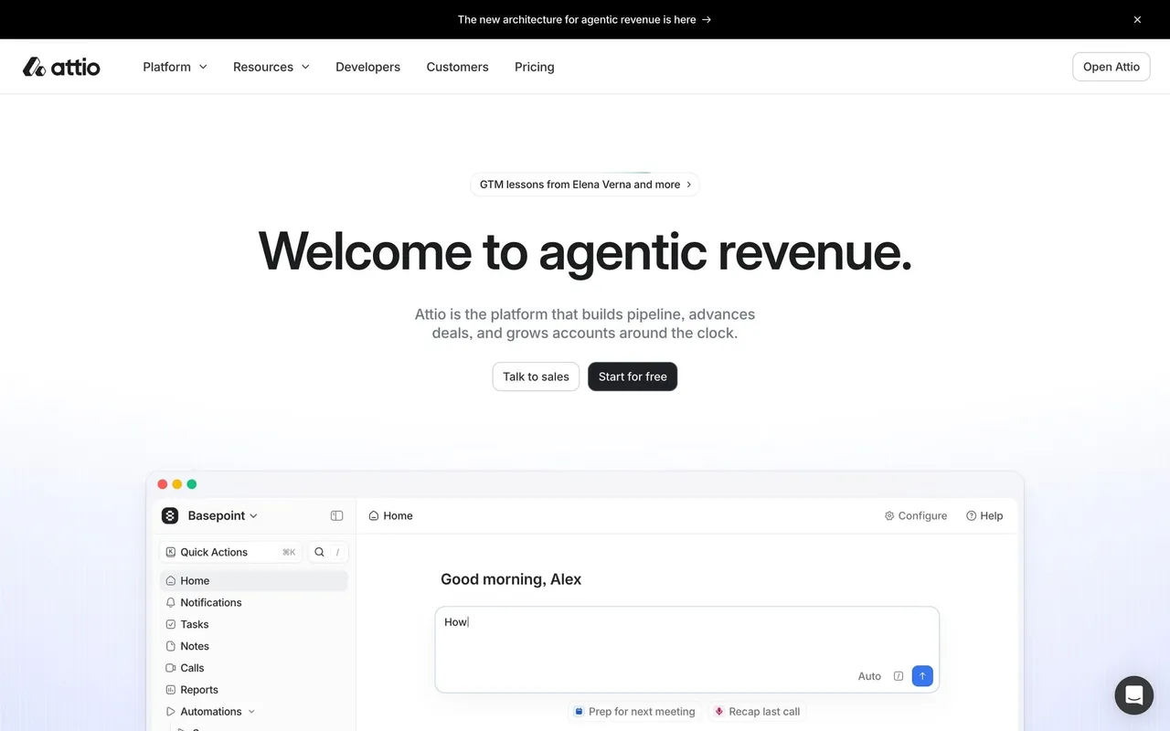

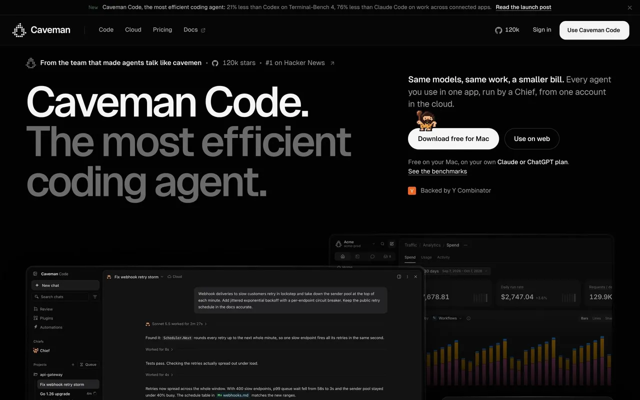
Index of all 310 Landing Page examples
- Caveman Landing Page
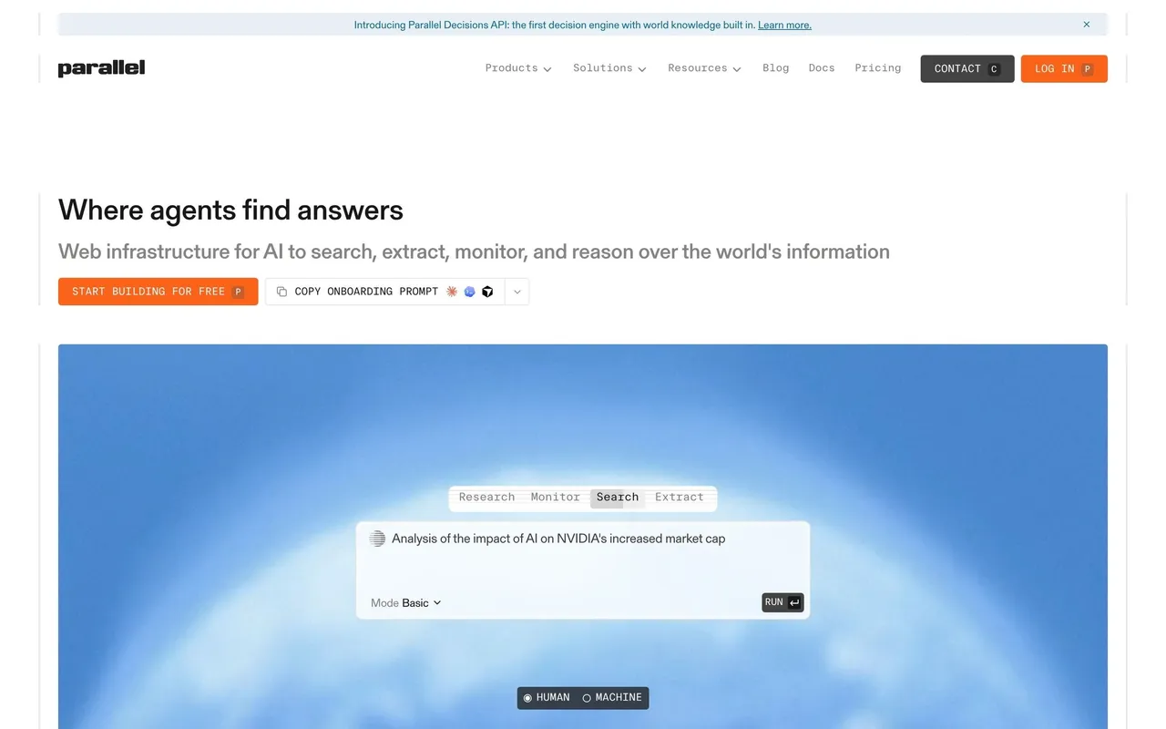
- Parallel Landing Page
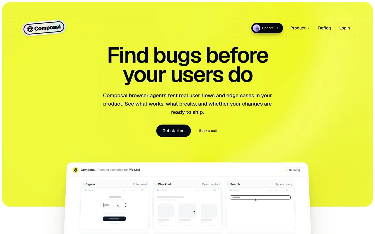
- Composal Landing Page
- Latent Landing Page
- Privacyboard Landing Page
- Rox Landing Page
- AskAiRank Landing Page
- Slash Landing Page
- Unabyss Landing Page
- Voiceflow Landing Page
- Respan Landing Page
- Datashake Landing Page
- Privy Landing Page
- Pivot Landing Page
- Moss Landing Page
- Dub Landing Page
- Pangram Landing Page
- Tines Landing Page
- Lightspark Landing Page
- Context.dev Landing Page
- Hugging Face Landing Page
- NewsCatcher Landing Page
- Cloudflare Landing Page
- Koyeb Landing Page
- Lightdash Landing Page
- Profound Landing Page
- Dust Landing Page
- Span Landing Page
- Searchable Landing Page
- Solidroad Landing Page
- ParityDeals Landing Page
- Hyperline Landing Page
- FullEnrich Landing Page
- Composer Landing Page
- Forest Admin Landing Page
- Paddle Landing Page
- Duna Landing Page
- Visitors Landing Page
- Unkey Landing Page
- Hume AI Landing Page
- Peec AI Landing Page
- Reducto Landing Page
- Base44 Landing Page
- Speakeasy Landing Page
- Clutch Landing Page
- Cluely Landing Page
- Payhawk Landing Page
- Linear Landing Page
- Atlas Landing Page
- Huly Landing Page
- Wise Landing Page
- Customer.io Landing Page
- Checkout.com Landing Page
- Tailscale Landing Page
- Superlist Landing Page
- GoFundMe Landing Page
- Anchor Landing Page
- Steep Landing Page
- GitBook Landing Page
- Wiza Landing Page
- WorkOS AuthKit Landing Page
- Mintlify Landing Page
- OpenAI Landing Page
- Latitude Landing Page
- Mintlify Landing Page
- Oku Landing Page
- Uvodo Landing Page
- Remote Landing Page
- FlowMapp Landing Page
- Hyperline Landing Page
- Plain Landing Page
- CommandBar Landing Page
- Mollie Payments Landing Page
- Outerbase Landing Page
- Clay Landing Page
- Makelog Landing Page
- Copperx Landing Page
- Vercel Landing Page
- Dimension Landing Page
- Cal.com Landing Page
- Klu Landing Page
- Asana Landing Page
- Dock Landing Page
- Vidzflow Landing Page
- Audienceful Landing Page
- Frame Landing Page
- Swan Landing Page
- Sandhill Markets Landing Page
- Gitness Landing Page
- Rise Landing Page
- Expertpage Landing Page
- Albato Landing Page
- Sellx Landing Page
- Threads Landing Page
- Sequence Landing Page
- Duffel Landing Page
- Meiro Landing Page
- Alloy Landing Page
- Greenly Landing Page
- Zeda.io Landing Page
- Routine Landing Page
- Deel Landing Page
- Rye Landing Page
- Supabase Landing Page
- DataPulse Landing Page
- Specify Landing Page
- Cake Equity Landing Page
- Tona Landing Page
- Anytype Landing Page
- WhatsApp Landing Page
- Linktree Landing Page
- Primer Landing Page
- Arc Landing Page
- Blobr Landing Page
- MonSpark Landing Page
- Popwork Landing Page
- Hopscotch Landing Page
- Brevo Landing Page
- Resend Landing Page
- Conduktor Landing Page
- Front Landing Page
- Clearbit Landing Page
- Contractbook Landing Page
- Current Landing Page
- Bucket Landing Page
- Artboard Studio Landing Page
- Folio Landing Page
- Diagram Landing Page
- Acquire Landing Page
- Channeled Landing Page
- WorkOS Landing Page
- Dokably Landing Page
- Folk Landing Page
- Ruul Landing Page
- Reflect Landing Page
- Lettria Landing Page
- Mercury Landing Page
- The.com Landing Page
- Luma Landing Page
- Height Landing Page
- Makelog Landing Page
- Cohere Landing Page
- Klu Landing Page
- Pirsch Analytics Landing Page
- Zencal Landing Page
- Surfe Landing Page
- Better Stack Landing Page
- Decipad Landing Page
- Twingate Landing Page
- Nord VPN Landing Page
- ChartMogul Landing Page
- Lattice Landing Page
- Channeled Landing Page
- Lemon Squeezy Landing Page
- Hotjar Landing Page
- Blobr Landing Page
- Sketch Landing Page
- Figma Landing Page
- Wistia Landing Page
- Mailchimp Landing Page
- Moderne Landing Page
- Beau Landing Page
- Qatalog Landing Page
- Dub Landing Page
- Logbook Landing Page
- Bento Landing Page
- Kinsta Landing Page
- June Landing Page
- GitHub Landing Page
- Café Landing Page
- Overflow Landing Page
- Bannerbear Landing Page
- GitBook Landing Page
- Libeo Landing Page
- Coherence Landing Page
- Aircall Landing Page
- Specify Landing Page
- Skiff Landing Page
- Help Kit Landing Page
- Sidebird Landing Page
- Campsite Landing Page
- Senja Landing Page
- MentionFunnel Landing Page
- The Org Landing Page
- Butter Landing Page
- Pipe Solution Page
- Pipe Inverstors Page
- Fernand Landing Page
- Wope Landing Page
- Evervault Landing Page
- Crew Landing Page
- Highnote Landing Page
- Junip Landing Page
- Reveal Landing Page
- Vercel Landing Page
- Logsnag Landing Page
- Formcarry Landing Page
And 110 more in the library.
✈️ Landing Page: design guide
Short answer
A SaaS landing page helps visitors understand the product, judge whether it fits and choose a next step. Define the audience, make the hero say what the product does, show the product at a useful level of detail, organise sections around evaluation questions and back claims with proof.
In the libraryas of November 2026
- Screens
- 312
- SaaS products
- 283
- Last added
- Nov 2026
Common patternsFeatures 109Testimonial 65Call to Action 44Bento Grid 41Footer 38
Recently addedAttioLightfieldPreludeParallelCaveman
A SaaS landing page helps a visitor understand a product, assess whether it fits their needs, and choose a useful next step. It has to connect a clear promise with evidence, product detail, and an appropriate call to action. A striking hero can attract attention, but the rest of the page must make the promise understandable and credible.
The SaaSFrame references below illustrate different product explanations and conversion paths. They are captured pages, so prices, offers, and product claims should be read as historical design content. Use the examples to study hierarchy and proof rather than treating their wording or outcomes as established facts about your own product.
Who is the landing page for, and what should they decide?
Decide who the page serves and what they need to judge. A developer evaluating an API needs different information from a team leader considering a new collaboration tool. The same visitor may also arrive with different levels of product awareness.
Choose the page's primary next step. A trial, interactive demo, sales conversation, or documentation visit can each be appropriate. The right action depends on the product's buying process and the visitor's readiness, rather than a universal preference for one button label.
Make the rest of the page support that decision. If technical evaluation is necessary, show enough of the product to reduce uncertainty. If organizational adoption is the main challenge, explain collaboration, implementation, and the evidence relevant to that audience.
Make the hero answer what the product does
A useful hero connects a product category or recognizable task with an outcome. A broad aspirational headline can work when nearby copy gives it a concrete meaning. Without that clarification, visitors may admire the design while remaining unsure what is being sold.
The hero should establish who the product helps, what work it supports, and where to go next. These answers can be distributed across the headline, supporting sentence, visual, and action labels. They do not all need to fit into one crowded line.
Avoid stacking several unrelated claims into the opening. Pick the central promise and develop secondary benefits later. The visitor needs a coherent starting point before they can evaluate a long feature set.
Study how Speakeasy connects a broad promise to developer work
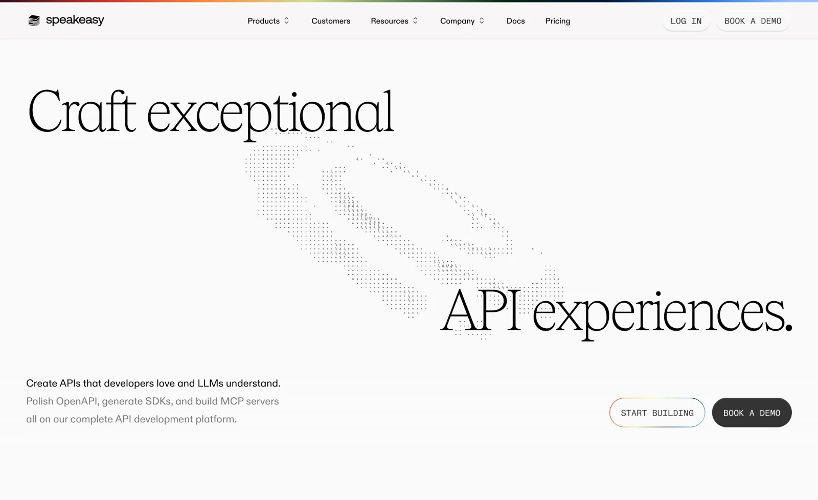
The Speakeasy landing-page capture leads with a large API-experience headline and a distinctive illustration. Supporting copy makes the promise more specific through references to OpenAPI, SDKs, and MCP. The opening presents both a building action and a demo route.
The relationship between headline and supporting text matters more than the size of the typography. The headline establishes an ambition; the surrounding language explains the developer work involved. Two actions accommodate different evaluation paths.
When using a similar structure, make the distinction between the actions clear. Explain whether starting means creating an account, entering a tool, or opening documentation. A demo route should also set expectations about whether it is self-guided or a conversation with a person.
Show the product at a useful level of detail
A product image should help visitors understand the work they could accomplish. A dashboard, editor, API response, or workflow can make an abstract promise tangible. Choose a view that demonstrates the main task rather than the interface with the most decoration.
Captions and nearby copy can direct attention to the relevant part of a dense screenshot. On smaller screens, avoid shrinking the entire product into unreadable text. A focused crop or simplified demonstration may communicate the concept more clearly.
Keep sample data and illustrative states honest. A concept animation can explain a workflow, but it should not imply a capability the product does not provide. Static screenshots also cannot establish that a shown control is interactive or that a result was produced in real time.
Connect positioning to an observable product view
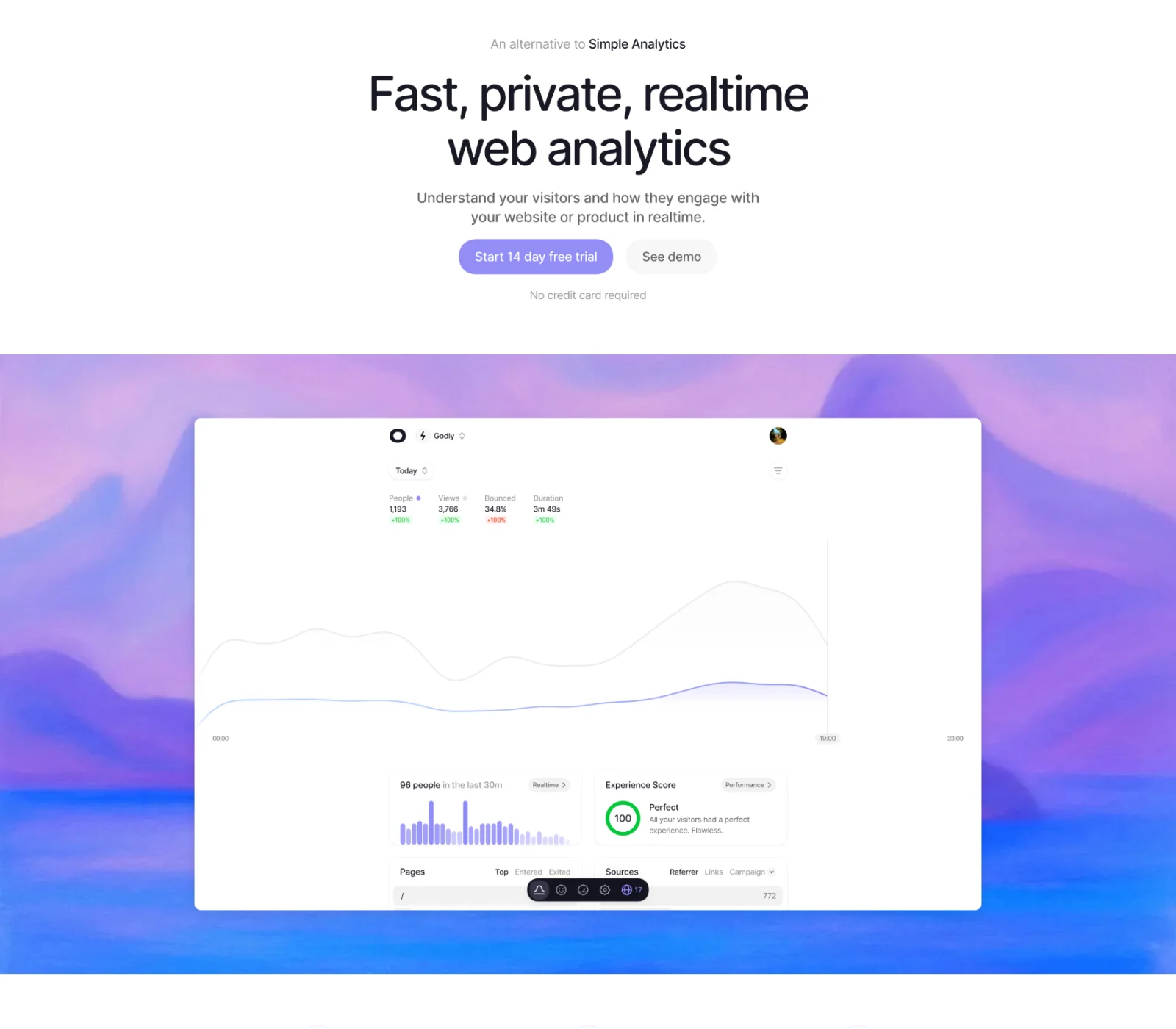
The Visitors capture presents web analytics through an opening focused on speed, privacy, and real-time information. It places a trial route and a demo route near a visible analytics interface, with reassurance about the trial beside the action area.
The product view gives visitors a concrete way to interpret the proposition. Rather than relying only on an analytics claim, the page shows the kind of information the interface presents. The secondary demo route can also serve people who want to inspect the experience before creating an account.
The privacy language remains the page's own claim, not independent verification. When adapting this approach, support important claims with appropriate detail and make reassurance specific to the actual offer. Do not copy a no-card statement or trial duration unless it is true for your product.
Organize the page around evaluation questions
A long landing page needs a reason for its sequence. After the opening, visitors may ask how the product works, whether it supports their situation, what evidence exists, and what effort adoption requires. Arrange sections to answer those questions in a useful order.
Features become easier to evaluate when connected to a task or outcome. Instead of listing isolated capabilities, explain how a person moves from an input to useful work. Keep the description concrete enough that visitors can distinguish the product from alternatives.
Repeat the main action at natural decision points. Repetition helps on a long page when the visitor's readiness changes after seeing evidence. It should not make every section feel like an interruption or obscure secondary evaluation routes.
Use role-based examples when the product serves several teams
A broad product can become vague if it speaks to everyone at once. Role-based sections can show how the same underlying system supports different work. They are most useful when the examples are genuinely different, rather than the same benefit with different job titles.
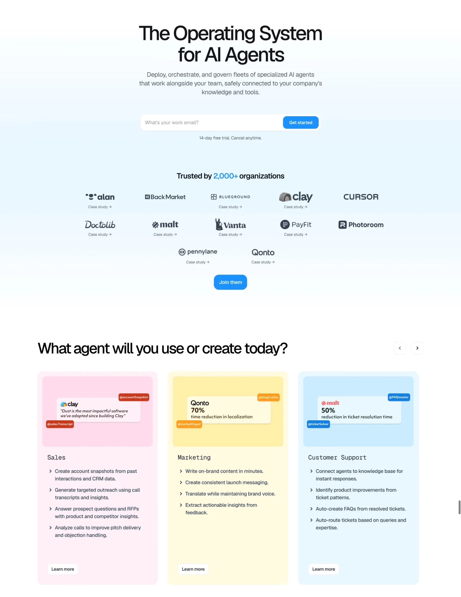
The Dust capture introduces an AI-agent proposition and follows it with examples organized around teams such as sales, marketing, and support. The opening also includes an email-based starting action and nearby trial reassurance. Later sections develop the product story beyond the hero.
This structure can connect a shared platform with recognizable use cases. The design task is to show enough specificity for each role without making the page read like several disconnected products. Keep a consistent explanation of what the platform does across the examples.
Do not repeat numerical outcome claims unless you have the corresponding evidence and context. A customer example needs an attributable source and an understandable scope. A visible percentage on a reference page is not a result that another product can borrow.
Make technical capabilities inspectable
Developer-oriented pages often need to show the shape of the output or workflow. A code sample, API response, or short implementation explanation can support a decision more effectively than a generic illustration.
The Context.dev landing-page capture includes task tabs around web-context actions and output views such as Markdown, JSON, screenshots, and brand information. This provides a way to present both what the service accepts and what it returns. The captured view does not prove how the demonstration behaves when used.
When building a similar section, keep examples readable and internally consistent. Explain what is sample output, provide a route to fuller documentation, and avoid making visitors scroll through a large block of code before they understand its purpose.
Choose proof that supports the specific claim
Customer logos can establish recognizable adoption, but they do not explain what customers accomplished. A case study, quote, product demonstration, or implementation detail serves a different evidence need. Match the proof to the question the visitor is trying to answer.
Attribute testimonials clearly and avoid presenting a person's broad enthusiasm as evidence for an unrelated technical claim. For case studies, provide enough context to understand the organization, use case, and outcome. Make a fuller account available when the claim warrants it.
Trust information should be discoverable near the concern it addresses. A buyer evaluating security may need a meaningful route to documentation, while a first-time trial user may need to understand account creation and cancellation. A large collection of badges cannot replace those explanations.
Make calls to action describe the actual next step
The action label should set a reasonable expectation about what happens next. “Start building” suggests a different path from “Book a demo.” If the next screen requests substantial information or requires a meeting, avoid language that implies immediate access.
Use visual hierarchy to identify the main route while preserving useful alternatives. A self-service product may benefit from a demo link beside a trial action; a complex enterprise product may lead with a conversation and offer documentation for technical evaluation.
Place reassurance beside the action when it answers a likely concern. Trial conditions, account requirements, or availability details should reflect the real offer. Keep them concise and provide further detail where needed rather than hiding important conditions in vague copy.
Use inline forms only when the request is justified
An email field in the hero can shorten a familiar account-creation path, but it also asks visitors to provide information before they see the next screen. Explain what submitting does and avoid making a field look like a product demo when it actually starts registration.
Keep required inputs proportional to the next action. A single work-email request and a detailed sales form have different costs. Collect additional context when it becomes useful rather than assuming every landing-page visitor is ready to complete a qualification questionnaire.
Validation and failure states matter here as much as in a product form. Preserve the input, show useful feedback, and make keyboard submission work. A prominent form that fails without explanation can undermine the confidence built by the surrounding page.
Preserve hierarchy on mobile and at increased zoom
Large typography, illustrations, and full-width screenshots can create a strong desktop composition. On a small screen, they may push the explanation and action far below the opening. Review the actual reading order rather than only shrinking the elements.
Keep the headline, supporting explanation, and primary action connected. Product visuals should remain informative, and navigation should provide access to evaluation destinations without overwhelming the page. Avoid sticky elements that consume too much of the available viewport.
Ensure adequate contrast, visible focus, meaningful image descriptions, and usable controls. Essential information should not depend on a hover state or an animation. Motion can support explanation, but visitors need a stable way to read and act.
Evaluate comprehension as well as conversion
Ask visitors to describe what the product does, who it serves, and what they expect after clicking the primary action. Misunderstandings in these answers reveal problems that a conversion rate alone may not explain.
Study the quality of downstream behavior. More sign-ups are not automatically better if visitors arrive with the wrong expectations or cannot reach a useful outcome. Connect landing-page measurement to the onboarding and purchasing path.
Test different acquisition contexts and realistic devices. A visitor arriving from a specific feature search may need a more focused explanation than someone reaching the home page through a brand query. Use those differences to decide when a dedicated page is useful.
Frequently asked questions about SaaS landing pages
How long should a SaaS landing page be?
Use enough content to answer the audience's important evaluation questions. Complexity, buying effort, and product familiarity influence the required depth. Length alone is not a useful measure of quality.
Should the hero include a product screenshot?
Include one when it makes the product or workflow easier to understand. An illustration may suit a broader concept, but visitors should still be able to inspect relevant product detail elsewhere on the page.
Should pricing appear on the landing page?
Make the commercial model discoverable at a useful point in evaluation. The amount of detail depends on the buying process. The pricing page guide covers plan comparison, billing units, and choosing the appropriate next action.