Prompt 1,149 words Copy
# Design from Reference: Fernand Landing Page

Create an original, high-fidelity visual design inspired by the reference. Prioritize composition, typography, colors, spacing, and component styling over technical implementation.

## Reference

- **Product:** Fernand
- **Category:** Landing Page
- **Screenshot:** attached to this message (also available at https://media.saasframe.io/o/bed50a632d38d071a17b.webp)
- **Source:** https://getfernand.com/

Analyze the attached screenshot first. If no image is attached, open the screenshot link; if neither is accessible, ask for it rather than guessing.

## Visual Design Context

### Overall aesthetic

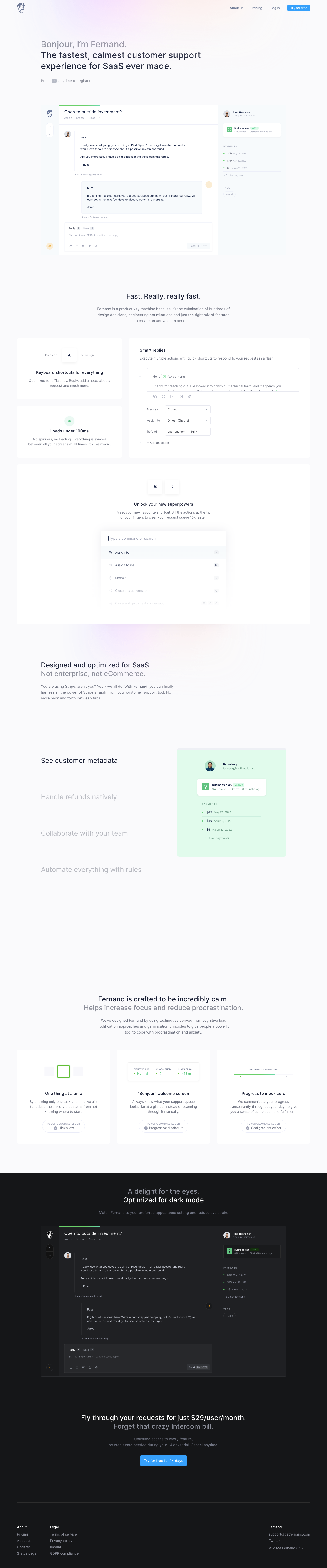
- **Style:** A calm customer-support landing page with soft gray-lavender surfaces, restrained blue actions, subtle pastel glows, and highly detailed product-interface demonstrations.
- **Character:** Quiet and polished rather than loud: regular-weight headings, muted copy, delicate boundaries, and keyboard motifs emphasize focus and speed.

### Page composition

- **Capture and scale:** The screenshot measures 1440 × 6900 pixels. Approximate dimensions below refer to screenshot pixels; CSS scale is unverified.
- **Hero:** A small illustrated brand mark sits left in the header, with four links/actions right. A left-aligned introduction and two-line value statement precede a keyboard-registration hint and a large light-mode conversation screenshot.
- **Speed region:** A centered heading and paragraph introduce a mixed-width white card grid: two small cards for shortcuts/speed, a larger smart-replies panel, and a broad command-palette demonstration below.
- **SaaS region:** A left-aligned introduction leads into a vertical feature-label list beside a green-tinted customer-metadata example. Only the first label is emphasized in the capture.
- **Closing regions:** Three calm-workflow cards follow a centered introduction. The page then switches to charcoal for a dark-mode product screenshot, pricing/trial conversion, and a restrained three-group footer.

### Information hierarchy

- **Narrative:** The page progresses from product overview to speed, SaaS-specific operations, focus principles, dark appearance, and conversion.
- **Demonstration:** Interface screenshots and miniature UI diagrams carry most of the visual evidence; body copy remains short.
- **Selection emphasis:** The metadata feature list uses dark selected text and much lighter alternatives. Do not infer the unseen alternate demonstration states.

### Typography

- **Family:** A neutral contemporary sans serif is visible; exact identity is unverified.
- **Display:** Hero copy is approximately 38–40 px, medium weight, with 48 px line-height. Major section headings are around 30–32 px, with softened secondary lines.
- **Body:** Supporting paragraphs are roughly 16–17 px with 25–27 px line-height. Card titles are approximately 18–20 px medium.
- **Utilities:** Product UI, shortcut labels, metadata, and small capsule annotations use smaller 11–14 px text, sometimes with monospace-like key labels.

### Colors & surfaces

- **Light foundation:** Sampled sRGB #FAFAFC, #FFFFFF, and #F7FAFC form the page, cards, and pale product regions.
- **Dark system:** Sampled #151618 defines the dark section, #1F2023 its product surfaces, with #27282B and #191A1C among related dark tones.
- **Feature tint:** Sampled pale green #E7F9EC supports the customer-metadata illustration. Small green status indicators recur across product examples.
- **Accents:** Blue controls and very subtle pink/lavender glows add color locally; their exact hex values are unverified. Text uses dark blue-gray on light surfaces and softened gray/white on dark.

### Components

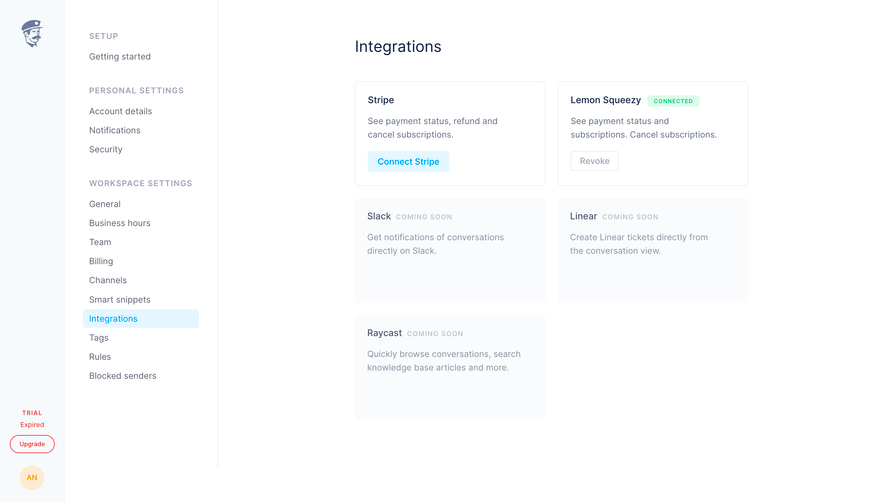
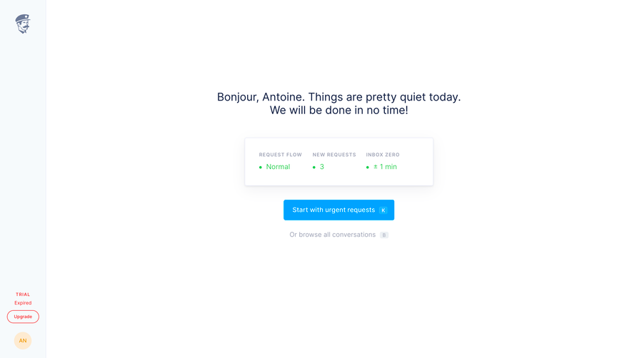
- **Hero product view:** A wide conversation workspace combines a narrow icon rail, message thread/composer, and right customer/payment sidebar. Fine borders and small radii maintain a light feel.
- **Feature cards:** White cards with approximately 8 px radii use generous padding and minimal shadows. Shortcut keys appear as raised white squares; the smart-reply panel includes text and stacked action selectors.
- **Command palette:** A centered white command menu uses a search row, icon-led actions, and small right-aligned shortcut badges, fading softly toward the bottom.
- **Focus cards:** Three equal cards pair simple UI diagrams with centered titles, copy, and outlined capsule annotations. Their diagrams include a single selected task, queue-status summary, and progress bar.
- **Dark demonstration:** The same conversation composition appears in charcoal tones, establishing theme continuity. The final blue trial action sits beneath centered pricing copy.
- **Footer:** A thin rule precedes two small link groups left and brand/contact/legal information right.

### Visual rhythm

- **Spacing:** Major regions have generous 120–180 px intervals. Card gaps are approximately 28–32 px, with 24–36 px between titles and related copy/media.
- **Width hierarchy:** Broad card grids use around 1290 px, while the hero/product frame narrows to approximately 1080 px and centered descriptions to about 600 px.
- **Calm pacing:** Keep interfaces and text aligned cleanly, with decorative glows soft enough to remain background texture.

### Responsive

- **Observed state:** Only desktop is visible.
- **Recommended reflow:** Stack mixed-width cards and the feature-list/media pair, collapse the three focus cards to one column, and reduce hero type to roughly 28–34 px CSS.
- **Product legibility:** Use readable screenshot crops or enlargement options rather than squeezing detailed support UI into tiny thumbnails. Replace keyboard-only hints with an accessible visible action on touch devices.

### Adaptation guidance

- **Preserve:** Retain muted light surfaces, regular-weight typography, detailed product evidence, keyboard motifs, and the coherent light-to-dark theme transition.
- **Adapt:** Use genuine workflows and interface imagery for the new product. Keep performance, psychological, and pricing claims only when supplied and verified.
- **Avoid:** Do not invent alternate feature states or copy the reference's customer/payment data. Scale section count to actual content.

## Content

**Instructions:**

Generate realistic example content that fits the selected design reference.

Create appropriate headlines, descriptions, labels, buttons, and supporting copy based on the type of interface being designed.

If a product or business description is provided, use it to guide the content.

Otherwise, invent a plausible fictional SaaS product appropriate for the reference.

Keep the content concise, coherent, and visually balanced.

Do not present fictional statistics, customer names, or testimonials as verified facts.

## Design Direction

**Instructions:**

Use the reference screenshot as the main source of visual inspiration rather than a strict layout template.

Preserve its most distinctive design characteristics, such as typography, visual rhythm, color relationships, component treatments, and overall aesthetic.

Feel free to modify section arrangements, proportions, spacing, and individual components to better suit my content.

Introduce original design decisions where they improve usability, composition, or brand consistency.

The result should clearly reflect the reference's visual language without looking like a direct reproduction.

Follow the visual identity of the reference design.

Use its typography, color palette, component styling, and overall aesthetic as the primary design direction.

Do not introduce an unrelated visual identity.

## Output

**Instructions:**

Generate a high-fidelity visual mockup of the requested interface.

Present the design as a polished, realistic website or product UI screenshot.

Prioritize visual composition, typography, spacing, colors, alignment, and component details.

Use the available image-generation or visual-design capabilities.

Do not replace the mockup with source code, a written design specification, or a textual description.

If direct visual generation is unavailable, clearly explain the limitation.

## Constraints

- Use the actual screenshot as the primary visual reference.
- Preserve essential messaging and factual accuracy.
- Prioritize visual quality and consistency.
- Do not invent unsupported product claims.
- Adapt structure and copy length for visual balance.
Reference image Attach it to your message: assistants can’t open image links. Open in ChatGPT ↗ Open in Claude ↗
Build it in Lovable ↗ v0 ↗ Figma Make ↗
Opening a tool copies the screenshot so you can paste it with your prompt.
 SaaSFrame