Prompt 707 words Copy
# Design from Reference: Unabyss Export Document

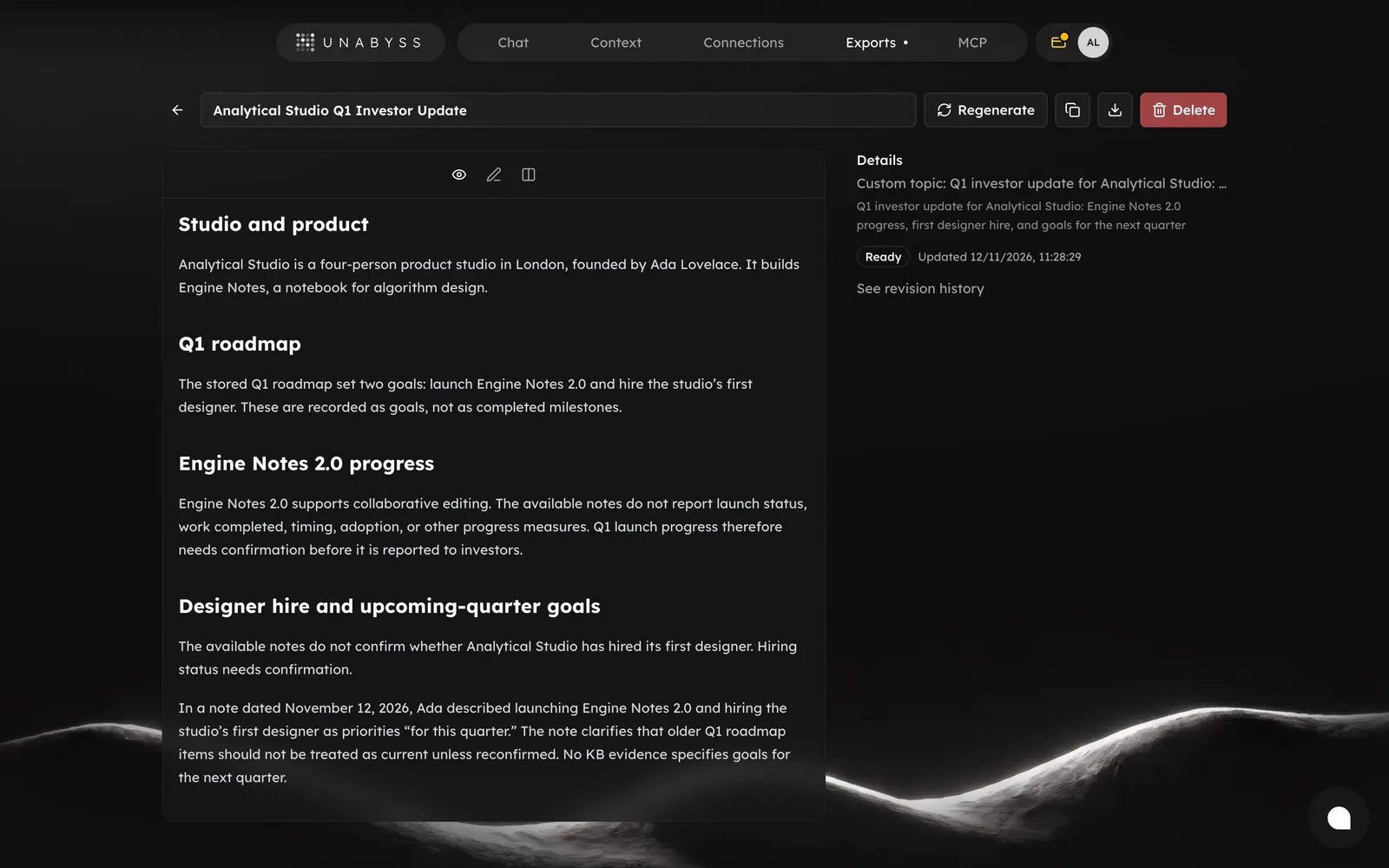
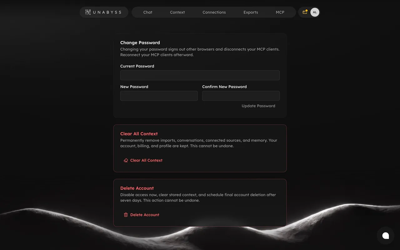
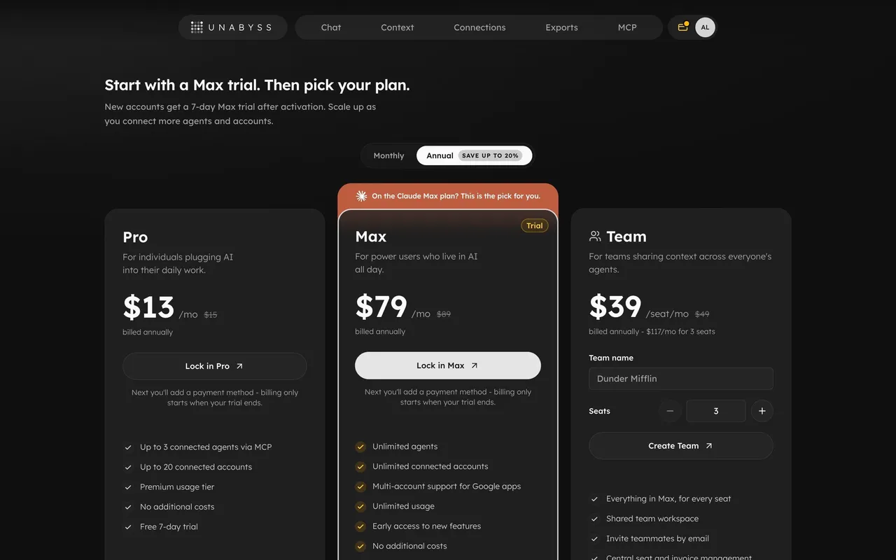
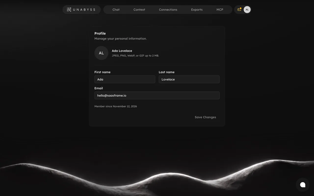
Create an original, high-fidelity visual design inspired by the reference. Prioritize composition, typography, colors, spacing, and component styling over technical implementation.

## Reference

- **Product:** Unabyss
- **Category:** Details
- **Screenshot:** attached to this message (also available at https://media.saasframe.io/v/8f438432d8baf2b5e537-1600.webp)
- **Source:** https://app.unabyss.com/exports/ad19c6e6-e85e-45a2-be7a-1769024e47fa

Analyze the attached screenshot first. If no image is attached, open the screenshot link; if neither is accessible, ask for it rather than guessing.

## Visual Design Context

## Unabyss — shared visual language

- **Theme**: dark-only marketing site. Near-black warm background (#191817), cards one step lighter (~#1F1E1C) with 1px hairline borders (white at ~8% opacity) and 16–20px radii.
- **Typography**: Lexend throughout. Headlines 600 weight, ~60px on desktop, tight tracking; a two-line hero where the second line drops to a muted grey (~#8A8784) for contrast. Body copy 16–17px, light grey, generous line height. Small uppercase labels with very wide letter spacing ("WORKS WITH", "BACKED BY"); wordmark set in spaced capitals.
- **Accent**: a restrained warm gold/amber (#E8B33A-ish) used for highlight strokes, glowing rings, pill outlines ("confidential", "You own it") and connector lines; a green status dot for "In sync".
- **Components**: pill-shaped floating nav bar with a separate pill logo chip; white solid pill CTAs with a ↗ arrow icon; dark rounded logo tiles for integrations (Claude, ChatGPT, Cursor, Gmail, Slack, Notion, GitHub…); tag chips; mini UI mock cards ("Your context", "Unabyss · MCP") built from bars and status labels rather than screenshots.
- **Layout**: centered hero, then bento grids of feature cards mixing a short heading, one-line copy and an illustrative widget; inline brand icons placed inside headlines.
- **Tone**: calm, technical, confident; short declarative headings, developer-friendly vocabulary (MCP, context, memory).

### Overall aesthetic

- **Style:** Dark document page with a wide reading column and a slim metadata sidebar.

### Page composition

- **Header:** Back arrow, title field, Regenerate button, copy and download icon buttons, red Delete button.
- **Body:** View-mode toolbar centered above a ~700px document panel; Details column on the right.

### Typography

- **Scale:** Section headings ~16px semibold; body ~12–13px light; details ~11px grey.

### Colors & surfaces

- **Surfaces:** Document panel #171717 on #0F0F0F; destructive button red fill; status chip dark.

### Components

- **View mode toggle**, **icon buttons**, **status chip**, **revision history link**, **destructive button**.

### Responsive

- **Mobile:** Details column moves under the document.

### Adaptation guidance

- **Reuse:** Give AI-generated documents a metadata sidebar (source, status, history) and keep regenerate next to the title.

## Content

**Instructions:**

Generate realistic example content that fits the selected design reference.

Create appropriate headlines, descriptions, labels, buttons, and supporting copy based on the type of interface being designed.

If a product or business description is provided, use it to guide the content.

Otherwise, invent a plausible fictional SaaS product appropriate for the reference.

Keep the content concise, coherent, and visually balanced.

Do not present fictional statistics, customer names, or testimonials as verified facts.

## Design Direction

**Instructions:**

Use the reference screenshot as the main source of visual inspiration rather than a strict layout template.

Preserve its most distinctive design characteristics, such as typography, visual rhythm, color relationships, component treatments, and overall aesthetic.

Feel free to modify section arrangements, proportions, spacing, and individual components to better suit my content.

Introduce original design decisions where they improve usability, composition, or brand consistency.

The result should clearly reflect the reference's visual language without looking like a direct reproduction.

Follow the visual identity of the reference design.

Use its typography, color palette, component styling, and overall aesthetic as the primary design direction.

Do not introduce an unrelated visual identity.

## Output

**Instructions:**

Generate a high-fidelity visual mockup of the requested interface.

Present the design as a polished, realistic website or product UI screenshot.

Prioritize visual composition, typography, spacing, colors, alignment, and component details.

Use the available image-generation or visual-design capabilities.

Do not replace the mockup with source code, a written design specification, or a textual description.

If direct visual generation is unavailable, clearly explain the limitation.

## Constraints

- Use the actual screenshot as the primary visual reference.
- Preserve essential messaging and factual accuracy.
- Prioritize visual quality and consistency.
- Do not invent unsupported product claims.
- Adapt structure and copy length for visual balance.
Reference image Attach it to your message: assistants can’t open image links. Open in ChatGPT ↗ Open in Claude ↗
Build it in Lovable ↗ v0 ↗ Figma Make ↗
Opening a tool copies the screenshot so you can paste it with your prompt.
 SaaSFrame