Prompt 909 words Copy
# Design from Reference: Datashake Blog Post

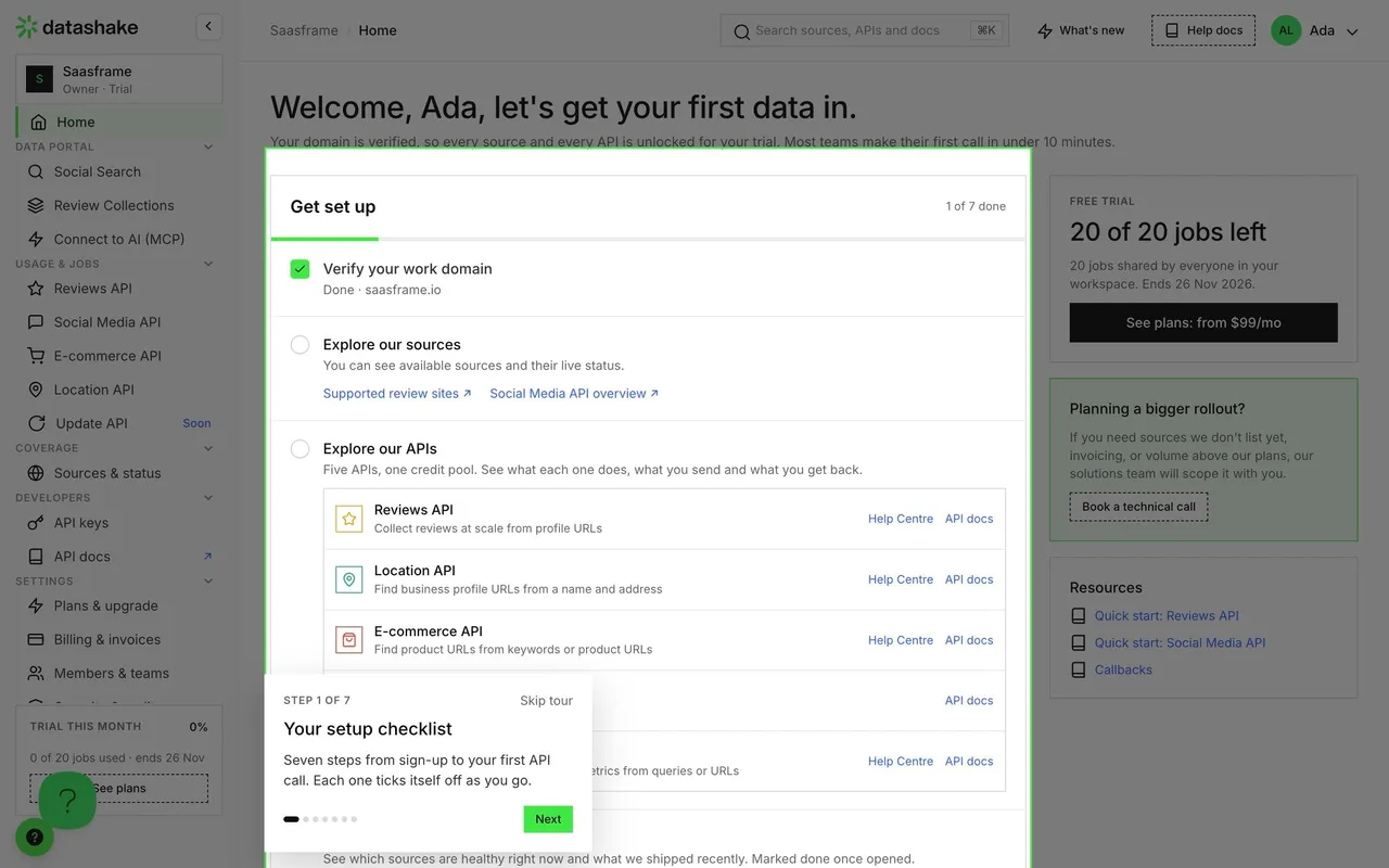
Create an original, high-fidelity visual design inspired by the reference. Prioritize composition, typography, colors, spacing, and component styling over technical implementation.

## Reference

- **Product:** Datashake
- **Category:** Blog Post
- **Screenshot:** attached to this message (also available at https://media.saasframe.io/v/0ad33de6aaa7ab4f1804-1600.webp)
- **Source:** https://www.datashake.com/blog/introducing-the-datashake-free-trial-sign-up-and-pull-your-first-data-in-minutes

Analyze the attached screenshot first. If no image is attached, open the screenshot link; if neither is accessible, ask for it rather than guessing.

## Visual Design Context

## Datashake — shared visual language

- **Theme**: light, editorial data-infrastructure site. White and #FAFAFA bands separated by thin grey rules, a faint grid of green "data points" in hero and CTA backgrounds, and deep green (#103A11) blocks for benchmark and enterprise sections.
- **Typography**: a custom grotesk display face ("Altriviera") at weight 400 for headings: H1 56px/61.6px (-1.12px), H2 48px/57.6px (-0.72px), H3 32px; Inter 16–20px for body in #666666 and #0D0D0D. Small eyebrow labels with arrow brackets ("<- The Solution ->") in 14px.
- **Colors**: near-black #0D0D0D text and buttons; signature neon green #3FE844 for primary buttons and highlighted words; pale green #ECFDEC tints; secondary accents used per category tag: blue #3981FF / #2D62FF, purple #A72BFF, orange #FF930F.
- **Components**: square 40px buttons (0px radius) with a small arrow icon box ("Sign up ↳"); logo strip with category captions under each logo; feature cards in bordered grids; product fragments (search query builder with Boolean chips, result cards with source badges); pastel testimonial columns; FAQ accordions with plus icons; newsletter bar and a five-column footer over a green dotted field; a WhatsApp chat bubble fixed bottom right.
- **Layout**: full-width 1440px bands with content in bordered columns, left-aligned H2 next to right-aligned supporting copy, frequent 3-column card grids.
- **Tone**: direct, technical, numbers-led ("150+ sources", "98.3% uptime", "One API. One schema. Cleaned, normalized.").

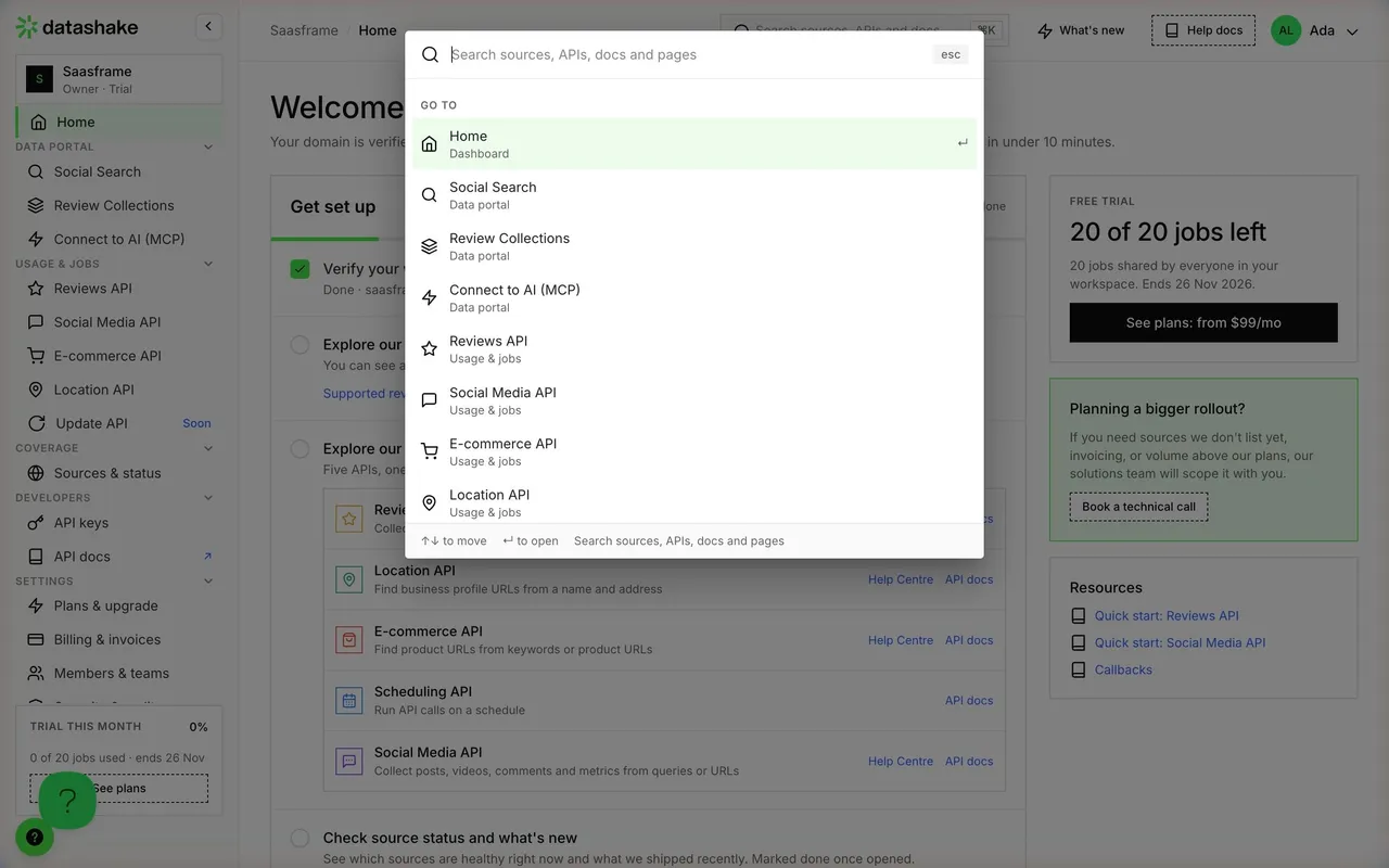
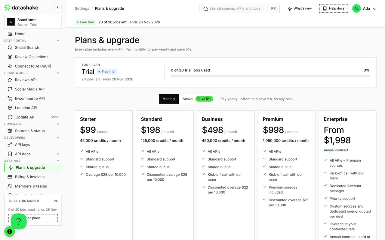
## Datashake dashboard (dashboard.datashake.com) — product UI

- **Theme**: light app on #FAFAFA with white cards and #EBEBEB borders; green #3FE844 for primary buttons, active nav and the trial banner.
- **Typography**: Inter; page titles 32px/38.4px w500 (-0.48px), card titles 18px w600, labels 11px uppercase w600, body 12–14px #666666; Geist Mono for code and URLs.
- **Shell**: left sidebar (~215px) with workspace switcher ("Saasframe · Owner · Trial"), grouped nav (Data portal, Usage & jobs, Coverage, Developers, Settings) and a "Trial this month 0%" usage card; top bar with breadcrumb, ⌘K search "Search sources, APIs and docs", "What's new", "Help docs" and the user avatar; a green "Free trial · 20 of 20 jobs left" strip with "See plans".
- **Components**: 28px buttons with 6px radius, metric tiles with uppercase labels, segmented time ranges (24 h / 7 days / 30 days), status pills (Operational, Degraded, Down), dark code blocks with "Copy".

### Overall aesthetic
- **Style:** light long-form article with product screenshots and a promotional side rail.

### Page composition
- **Columns:** reading column (~620px) left, table of contents + trial card right.
- **Body:** breadcrumb, H1, summary, cover, text with inline screenshots and UI cards, tags, author, related posts, newsletter, footer.

### Typography
- **H1:** display grotesk 56px/61.6px w400, -1.12px. **H2:** 32px/38.4px, -0.5px. **H3:** 24px/28.8px. **Body:** Inter 18px/27px #666666, bold 700 lead-ins.

### Colors & surfaces
- **Base:** white; #103A11 related covers; #3FE844 progress and links; category dots in purple #A72BFF, green and red.

### Components
- **TOC rail:** list of H2 links, reading progress, CTA card with green button.
- **Inline UI card:** bordered product fragment inside the text.

### Responsive
- **Mobile:** side rail hidden, screenshots full width, related posts stack.

### Adaptation guidance
- **Lesson:** in a product launch post, show a real screenshot within the first scroll and keep a trial CTA in a sticky side rail.

## Content

**Instructions:**

Generate realistic example content that fits the selected design reference.

Create appropriate headlines, descriptions, labels, buttons, and supporting copy based on the type of interface being designed.

If a product or business description is provided, use it to guide the content.

Otherwise, invent a plausible fictional SaaS product appropriate for the reference.

Keep the content concise, coherent, and visually balanced.

Do not present fictional statistics, customer names, or testimonials as verified facts.

## Design Direction

**Instructions:**

Use the reference screenshot as the main source of visual inspiration rather than a strict layout template.

Preserve its most distinctive design characteristics, such as typography, visual rhythm, color relationships, component treatments, and overall aesthetic.

Feel free to modify section arrangements, proportions, spacing, and individual components to better suit my content.

Introduce original design decisions where they improve usability, composition, or brand consistency.

The result should clearly reflect the reference's visual language without looking like a direct reproduction.

Follow the visual identity of the reference design.

Use its typography, color palette, component styling, and overall aesthetic as the primary design direction.

Do not introduce an unrelated visual identity.

## Output

**Instructions:**

Generate a high-fidelity visual mockup of the requested interface.

Present the design as a polished, realistic website or product UI screenshot.

Prioritize visual composition, typography, spacing, colors, alignment, and component details.

Use the available image-generation or visual-design capabilities.

Do not replace the mockup with source code, a written design specification, or a textual description.

If direct visual generation is unavailable, clearly explain the limitation.

## Constraints

- Use the actual screenshot as the primary visual reference.
- Preserve essential messaging and factual accuracy.
- Prioritize visual quality and consistency.
- Do not invent unsupported product claims.
- Adapt structure and copy length for visual balance.
Reference image Attach it to your message: assistants can’t open image links. Open in ChatGPT ↗ Open in Claude ↗
Build it in Lovable ↗ v0 ↗ Figma Make ↗
Opening a tool copies the screenshot so you can paste it with your prompt.
 SaaSFrame