Prompt 1,274 words Copy
# Design from Reference: Fiberplane Blog Post

Create an original, high-fidelity visual design inspired by the reference. Prioritize composition, typography, colors, spacing, and component styling over technical implementation.

## Reference

- **Product:** Fiberplane
- **Category:** Blog Post
- **Screenshot:** attached to this message (also available at https://media.saasframe.io/o/36b89de64a6252c49aa2.webp)
- **Source:** https://fiberplane.com/blog/pagerduty-fiberplane-incident-workflow-integration

Analyze the attached screenshot first. If no image is attached, open the screenshot link; if neither is accessible, ask for it rather than guessing.

## Visual Design Context

### Overall aesthetic

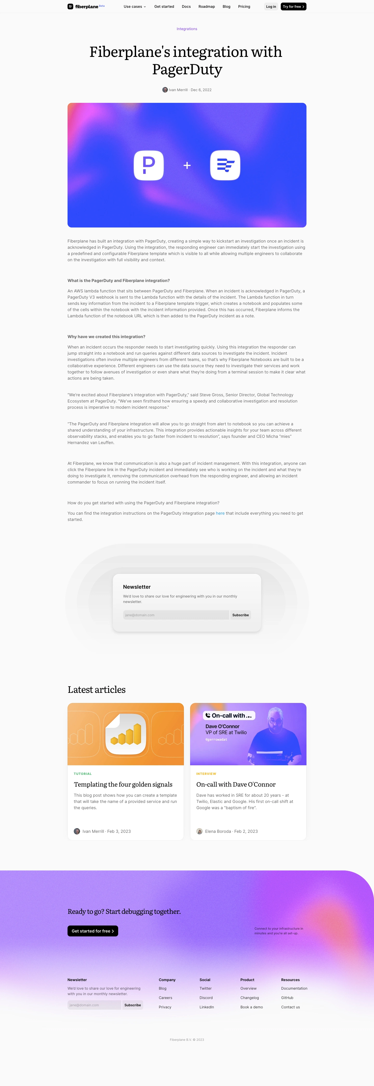
- **Character:** An engineering blog article with an airy near-white canvas, editorial serif titles and restrained gray sans-serif reading text. Vivid blue/purple gradient imagery contrasts with the quiet article body.
- **Image basis:** The 1440 × 4182 source was inspected across all three crops at approximately 1400 px wide. Sizes below are approximate inspection pixels; CSS scale and font families are unverified.

### Page composition

- **Header:** A thin horizontal bar uses an approximately 895 px centered content width. Brand and beta marker sit left, navigation spans the middle, and small login/free-trial actions sit right.
- **Article opening:** A centered category label precedes a large two-line serif title and compact avatar/author/date row. A roughly 895 × 467 px rounded hero image fills the content width below.
- **Reading body:** Left-aligned paragraphs, small bold subheads and quotations share the hero image's width. The article concludes with a short linked getting-started paragraph.
- **Newsletter and related content:** A centered newsletter card sits inside multiple broad pale rounded halo shapes. A serif Latest articles heading introduces two equal article cards.
- **Closing footer:** A full-width textured lavender gradient region has a very large upper-right corner radius, a left-aligned CTA, small supporting copy to the right, a newsletter form and four compact link groups. Copyright sits below.

### Information hierarchy

- **Opening:** The approximately 56 px serif title is the dominant textual element. A small purple category and muted metadata frame it.
- **Reading:** Regular gray paragraphs carry most content; bold sans-serif subheads provide small visual anchors. Quotes remain inline reading blocks rather than oversized pull quotes.
- **Related articles:** Colorful thumbnails, uppercase colored categories, serif titles, excerpts and bottom author/date rows create a distinct secondary browsing system.
- **Conversion:** The standalone newsletter card and repeated footer form invite subscription; the black CTA button is the strongest closing action.

### Typography

- **Display:** The article title uses a high-contrast serif at approximately 56 px with roughly 64 px line-height. Related-section text is around 36 px; card and closing CTA titles are around 26–28 px serif.
- **Article text:** Body copy is approximately 16 px with 23–24 px line-height, in a regular sans-serif. Subheads retain the body scale with bold weight.
- **Metadata:** Author/date and navigation are around 14 px. Categories are smaller; related-card categories use uppercase letters, bold weight and modest tracking.
- **Form roles:** Newsletter heading is approximately 21 px semibold; helper text is approximately 14 px with 20 px line-height. Exact font identities cannot be confirmed.

### Colors & surfaces

- **Measured base:** Near-white #FAFAFA dominates, with white #FFFFFF and pale neutrals #F3F3F3, #F7F7F7 and #F8F8F8 among card and halo surfaces.
- **Measured imagery:** Saturated blues #1663F7 and #1963F7 appear in the hero artwork. Lavender, pink and warm orange soften the textured gradients.
- **Text and action:** Black titles and buttons contrast with medium-gray body text. Purple category text and blue inline links supply restrained navigation accents.
- **Card depth:** Newsletter and related-story cards use faint outlines or shadows; their white surfaces lift subtly from the near-white page.

### Components

- **Hero artwork:** An approximately 895 × 467 px landscape panel has roughly 16 px corners. Two white rounded icon tiles and a plus sign sit in a blue textured gradient field.
- **Newsletter card:** A roughly 557 × 218 px white rounded card uses around 40 px padding, approximately 24 px corners and a soft shadow. Email input and Subscribe action form a joined horizontal control.
- **Related cards:** Two approximately 435 px wide cards have colorful landscape thumbnails, white text areas, roughly 20 px outer corners and bottom-aligned attribution rows.
- **Header controls:** Login uses a pale-gray fill; the free-trial action uses black with white type and a trailing chevron. Both are compact and softly rounded.
- **Footer CTA:** A black rounded button with white label sits below the serif prompt. Footer subscription and navigation groups use smaller, lower-contrast styling.
- **States:** No focused form, validation, hover or expanded navigation state is visible.

### Visual rhythm

- **Shared width:** Header, article, hero and related cards align to a centered content area with broad approximately 250 px side margins at inspection scale.
- **Reading rhythm:** Paragraphs have comfortable line-height and substantial separation; subhead blocks introduce larger pauses.
- **Section spacing:** Broad gaps surround newsletter and related-content modules. The halo shape makes the newsletter a visual pause within the long article.
- **Type contrast:** Large black serif titles alternate with modest gray sans-serif text, giving the page an editorial tone without dense decoration.

### Responsive

- **Evidence limit:** Only the wide page is observed.
- **Recommended article:** Reduce side gutters, scale the title fluidly and keep body text comfortably readable with a bounded line length.
- **Recommended modules:** Stack the related cards, allow the newsletter form to wrap and scale the decorative halo without horizontal overflow.
- **Recommended footer:** Collapse link columns and bring supporting CTA copy into the main flow. Replace the wide header menu with an accessible compact navigation.

### Adaptation guidance

- **Preserve:** Keep the serif/sans-serif contrast, broad content alignment, colorful integration artwork and quiet article typography.
- **Build:** Reuse article metadata, rich-text body, newsletter, related-card and footer-group components.
- **Control decoration:** Keep grain and gradient effects in artwork or background layers so text remains crisp and legible.
- **Validate:** Confirm typefaces, CSS dimensions, gray-text contrast and mobile form behavior; the screenshot does not verify interactive behavior.

## Content

**Instructions:**

Generate realistic example content that fits the selected design reference.

Create appropriate headlines, descriptions, labels, buttons, and supporting copy based on the type of interface being designed.

If a product or business description is provided, use it to guide the content.

Otherwise, invent a plausible fictional SaaS product appropriate for the reference.

Keep the content concise, coherent, and visually balanced.

Do not present fictional statistics, customer names, or testimonials as verified facts.

## Design Direction

**Instructions:**

Use the reference screenshot as the main source of visual inspiration rather than a strict layout template.

Preserve its most distinctive design characteristics, such as typography, visual rhythm, color relationships, component treatments, and overall aesthetic.

Feel free to modify section arrangements, proportions, spacing, and individual components to better suit my content.

Introduce original design decisions where they improve usability, composition, or brand consistency.

The result should clearly reflect the reference's visual language without looking like a direct reproduction.

Follow the visual identity of the reference design.

Use its typography, color palette, component styling, and overall aesthetic as the primary design direction.

Do not introduce an unrelated visual identity.

## Output

**Instructions:**

Generate a high-fidelity visual mockup of the requested interface.

Present the design as a polished, realistic website or product UI screenshot.

Prioritize visual composition, typography, spacing, colors, alignment, and component details.

Use the available image-generation or visual-design capabilities.

Do not replace the mockup with source code, a written design specification, or a textual description.

If direct visual generation is unavailable, clearly explain the limitation.

## Constraints

- Use the actual screenshot as the primary visual reference.
- Preserve essential messaging and factual accuracy.
- Prioritize visual quality and consistency.
- Do not invent unsupported product claims.
- Adapt structure and copy length for visual balance.
Reference image Attach it to your message: assistants can’t open image links. Open in ChatGPT ↗ Open in Claude ↗
Build it in Lovable ↗ v0 ↗ Figma Make ↗
Opening a tool copies the screenshot so you can paste it with your prompt.
 SaaSFrame