 SaaSFrame
ℹ️ Details
Organize complex data with professional SaaS Details and Profile page designs. See how to use tabbed navigation, collapsible sections, and metadata grids to display deep product information without overwhelming the interface.


Index of all 80 Details examples
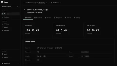
- Moss Search index storage overview
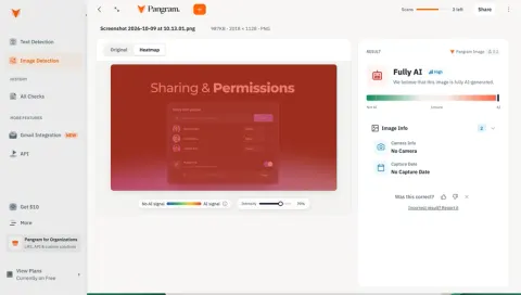
- Pangram AI image detection heatmap
- Pangram Text detection results
- Tines Onboarding Blocker Summary
- Tines Onboarding Execution Details
- Tines Onboarding Audit Trail
- Tines Employee Onboarding Checklist
- Tines Onboarding Workflow Runbook
- Lightspark Transaction Details
- Lightspark USD Account Details
- Glide CRM account details
- Glide Project tasks and progress
- Glide Project manager app preview
- Context.dev API request details
- Context.dev Watched page details
- EigenPal API endpoint reference
- EigenPal Automation execution details
- EigenPal Automation run details
- Hugging Face Model repository overview
- Hugging Face Public profile overview
- Hugging Face Browse research papers
- Hugging Face Dataset details and viewer
- GraphCMS Asset details and preview
- ReflexAI AI persona configuration summary
- NewsCatcher Result Details
- Claude Project Details
- Huly Issue Tracker
- Huly Profile Details
- Huly Room Detail
- Wise Transaction Details
- Wise Payment Request Confirmation
- Customer.io Segment Overview
- Customer.io Contact Details
- Checkout.com Payment Details
- Checkout.com API Key Details
- Checkout.com Top Up Details
- Intercom Content Details
- Intercom User Details
- Oku Book Highlights
- Oku Book Reviews
- Oku Book Details
- June User Details
- Remote Employee Personal Details
- Remote Hire Onboarding Progress
- Hyperline Cancel Subscription
- Hyperline Customer Details
- Hyperline New Customer Created
- Copperx Customer Details
- Copperx Payment Link Details
- Rise Event Details
- Zeda.io Customer Details
- Zeda.io Feedback Details
- Zeda.io Feedback Details
- Zeda.io Feedback Details
- Stripe Payment Dashboard
- Mixpanel User Details
- Livestorm Event Details
- Cake Equity Raise Details
- Popwork Objective Details
- Assembly Post Details
- Assembly Post Details
- Clay Contact Details
- Resend Webhook Details
- Mercury Transactions Details
- Luma Event Details
- Luma Event Emails
- Luma Event Registrations
- Luma Event Guests
- Luma Event Overview
- Makelog Details
- Height Details
- Plain Issues Details
- Olvy Feedback Details
- Zencal Meeting Details
- Senja Dashboard
- Reveal Dashboard
- Mine Dashboard
ℹ️ Details: design guide
A SaaS details screen explains one object well enough for a user to inspect it, understand its state, and take a relevant action. It can describe a project, account, transaction, contact, or document. Its design should preserve the relationship between identity, facts, lifecycle, and the context from which the user arrived.
The SaaSFrame references include a project detail view, an account drawer, and a transaction page with a technical representation. These demonstrate different levels of depth. Captured values are interface examples, not live account information or financial guidance.
Define the object and the user's reason for opening it
A detail screen needs an unmistakable subject. Show a recognizable name or identifier and the relevant workspace context. A generic heading such as Details should not be the only indication of what the page contains.
Identify the main inspection task. A user reviewing a project may need progress and next work; a developer reviewing a transaction may need identifiers and response data. These needs imply different hierarchies even if both screens use a sidebar.
Preserve the route back to the original collection or filtered view. Users often open several records in succession. Losing the table's search and position makes that investigation unnecessarily expensive.
Separate identity, status, and attributes
Identity answers which object this is. Status describes its current lifecycle. Attributes explain its properties. Keeping them distinguishable helps users scan without treating every label as an equally important fact.
Place the most consequential state near the identity. A completed transaction and a pending one should not differ only in a field buried far down the page. The status still needs an understandable meaning and appropriate freshness.
Use units and time context for values. A balance needs a currency, a date may need a timezone, and a progress figure needs a defined denominator. Visual precision alone does not explain what the information means.
Study a project detail that connects summary and work
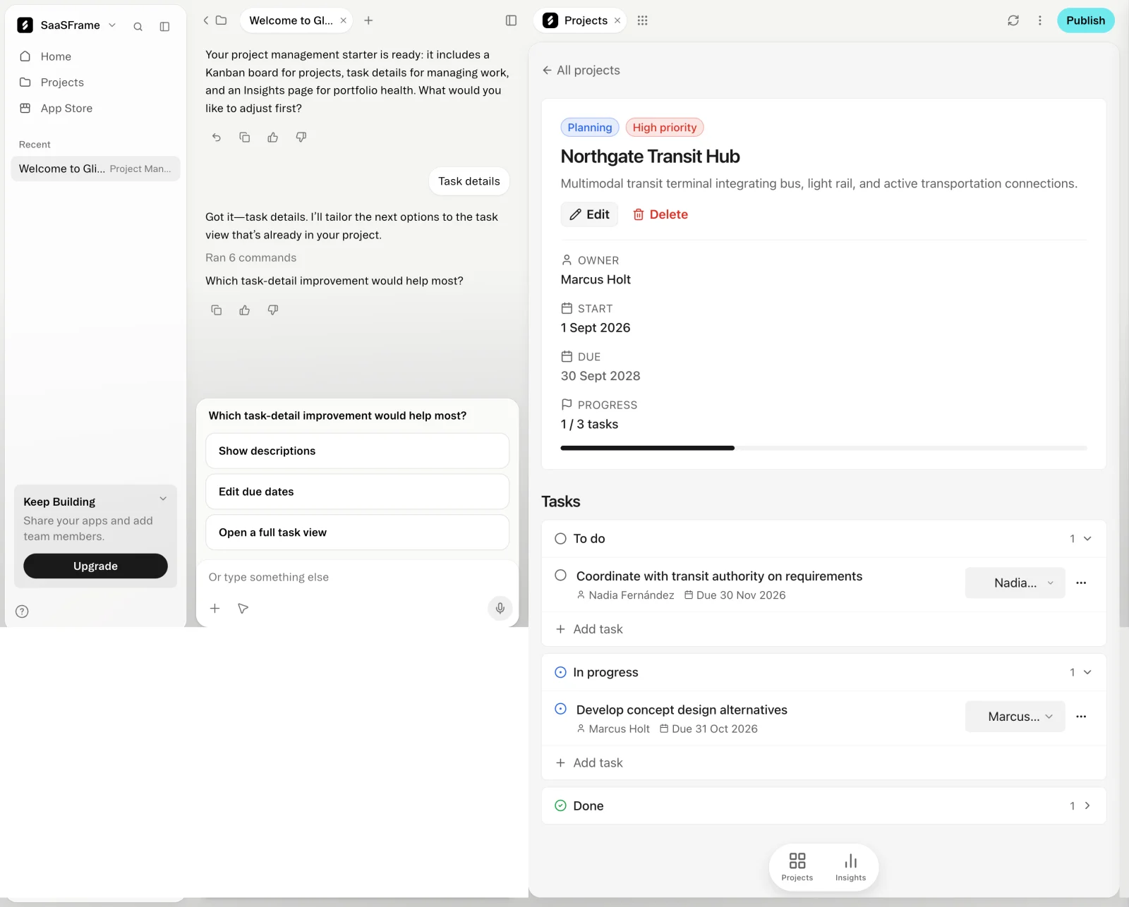
The Glide capture shows a project with status and priority labels, a description, edit and delete actions, owner information, start and due dates, progress, and tasks grouped by state. It appears within an app-building environment.
The hierarchy connects an overview of the project to its constituent work. The progress value gains meaning from the task groups beneath it. The surrounding builder context also matters: this is a displayed app configuration, not evidence of a live organization's project delivery.
When adapting the structure, define how progress is calculated. A task count and a percentage can imply different models. Explain the relationship between the summary and the underlying records where users need to interpret it.
Choose a page or drawer according to the task
A drawer can preserve the surrounding list or dashboard while exposing one record. It suits inspection that is short enough to fit comfortably and benefit from visible context. A dedicated page provides more room for deep work and direct navigation.
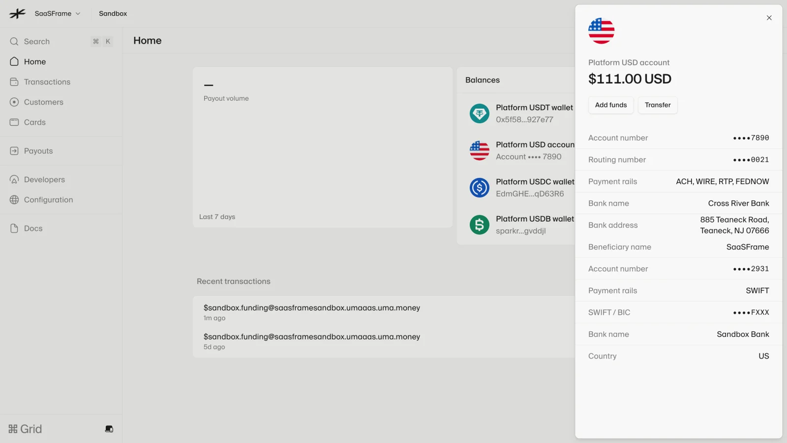
The Lightspark USD-account capture uses a side drawer over an account overview. It displays a balance, account-related identifiers and banking details, and actions near the top. Some values are visibly masked, and the account is in a sandbox context.
This keeps the parent screen visible while focusing on one account. When adapting it, make the selected object and close route clear. A drawer should not become an excessively long hidden page that users struggle to navigate or share.
Give technical users a deeper representation
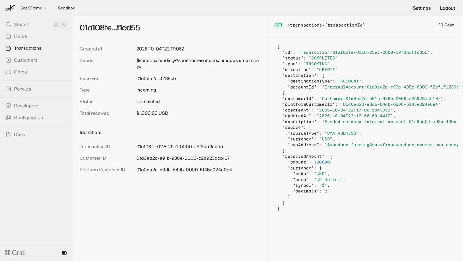
The Lightspark transaction capture places a readable field summary beside a structured technical response. The summary includes creation time, sender and receiver context, type, status, total received, and identifiers.
This supports two forms of inspection. A readable summary helps scan the record, while a raw representation can support technical investigation. The two should describe the same confirmed object rather than unrelated snapshots.
Avoid exposing sensitive values merely because they are available in a response. Masking and permissions should follow the product's access model. A raw-data panel is not a reason to bypass the protections used in the readable summary.
Group properties by meaning
A long sequence of label-value pairs can become difficult to scan. Group identity, timing, ownership, configuration, and related records according to the object. The grouping should help users answer a question rather than decorate the page.
Put uncommon detail behind an appropriate disclosure or secondary view when it does not affect the main task. Keep critical state and action conditions visible. Hidden information should not be necessary to understand the effect of the primary action.
Use empty values deliberately. Not provided, not applicable, unavailable, and not yet generated are different states. A dash can suit a defined absence, but it should not silently combine all of them.
Connect actions to the object's lifecycle
Edit, duplicate, archive, delete, run, and share have different effects. Present the actions relevant to the current state and viewer. Avoid a universal toolbar containing operations the user cannot perform.
Show the target clearly for consequential actions. A delete control inside a detail page should identify the object and explain the meaningful consequence. If related items are affected, make that relationship reviewable.
After an action, confirm the actual result. A saved edit should update the visible summary. An asynchronous operation should show pending work rather than immediately replacing the status with an assumed outcome.
Make related records useful rather than exhaustive
Related tasks, transactions, contacts, or documents can explain the object, but not every relationship belongs in the first viewport. Prioritize those needed for the main task and offer a fuller route when necessary.
Keep relationship counts and filters understandable. A detail screen showing open tasks should not label the count as all tasks. If the relationship is derived or delayed, communicate the relevant limitation.
Opening a related object should preserve navigation context. Users need to understand whether they moved to another record, opened a temporary panel, or changed the main subject of the page.
Preserve editing and viewing boundaries
A detail screen may allow inline editing or route users to a form. In either case, distinguish the current saved value from a pending edit. A changed field should not appear confirmed before persistence succeeds.
Provide a coherent save and cancel model. If some fields save immediately and others require a final action, make that difference understandable. Mixing persistence behaviors without explanation creates uncertainty.
Handle concurrent changes according to the product's collaboration model. A person should not unknowingly overwrite a colleague's update or continue viewing an old state as though it is current.
Keep freshness and partial failure visible
Some detail pages combine data from several sources. If one section fails, preserve trustworthy parts and identify the affected area. A full-page blank state can hide useful information, while silent stale data can mislead.
Show a meaningful loading transition when switching objects. Avoid displaying the previous object's fields under the newly selected heading. This is particularly important in fast drawer navigation.
For objects with ongoing activity, explain whether status updates automatically or require refresh. A last-updated value should describe the relevant data state rather than merely the page load.
Support accessible inspection and return navigation
Use a logical heading hierarchy and readable label-value relationships. Copy controls need clear targets and feedback. Repeated actions should have distinguishable names for assistive technology.
A drawer needs appropriate focus behavior and a useful return target when it closes. On small screens, it may become a full-screen view, but the subject and return route should remain clear.
Test long names, absent fields, large related lists, role restrictions, and unusual identifier lengths. Real data reveals where a clean sample layout fails to communicate the object.
Frequently asked questions about details screens
When should details open in a drawer?
Use a drawer when preserving surrounding context helps a relatively focused inspection task. A dedicated page often fits deeper work or complex navigation better.
Should technical response data be shown?
Show it when it supports the audience's task and can be presented under appropriate access controls. Keep it consistent with the readable summary.
What should an empty field mean?
Define the actual state: absent, unavailable, not applicable, or pending. Do not use one unexplained placeholder for all of them.