Prompt 1,394 words Copy
# Design from Reference: Abstract Invite Team Members: Choose Role

Create an original, high-fidelity visual design inspired by the reference. Prioritize composition, typography, colors, spacing, and component styling over technical implementation.

## Reference

- **Product:** Abstract
- **Category:** Invite Team Members
- **Screenshot:** attached to this message (also available at https://media.saasframe.io/o/0ac9a91ddf5cf8ccdb38.webp)

Analyze the attached screenshot first. If no image is attached, open the screenshot link; if neither is accessible, ask for it rather than guessing.

## Visual Design Context

### Overall aesthetic

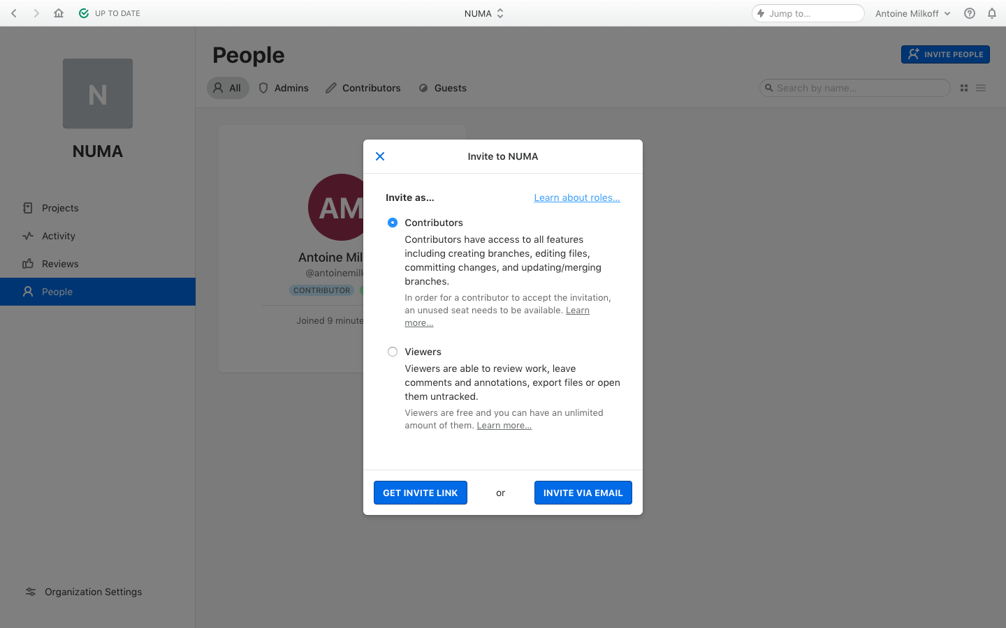
- **Style:** Conventional desktop collaboration application shown with a centered team-invitation modal over a dimmed People directory.
- **Character:** Neutral gray application chrome, white modal, compact sans-serif text and strong blue actions. Role selection is explained through text rather than decorative illustrations.
- **Captured state:** The invitation dialog is active and Contributors is selected. Background colors are composited through a gray scrim and should not be treated as confirmed undimmed theme tokens.

### Page composition

- **Capture scale:** 1440 × 900 image px. Approximate CSS reconstruction assumes an unverified 1× capture.
- **Application toolbar:** A shallow strip spans the top, with navigation/status controls left, organization selector center and search/account/help/notification controls right.
- **Organization sidebar:** Approximately 280 px wide, containing a large square initial avatar, organization name, four navigation links and bottom-aligned organization settings. People is the selected blue row.
- **Directory background:** Large People title, role-filter tabs, search and invitation action sit above a member card. This content is dimmed and partly obscured.
- **Modal:** Approximately 400 × 538 px, positioned near x=520, y=200. It is slightly above the vertical center of the available workspace.
- **Modal header:** A roughly 48 px-high row contains a blue close icon at left and centered invitation title, separated from the body by a fine rule.
- **Body:** A compact Invite as label and role-help link precede two vertically stacked radio options. Each has a title, explanatory paragraph and smaller secondary note.
- **Footer:** A separate approximately 64 px-high action row contains two blue buttons with a centered or separator.

### Information hierarchy

- **Dialog focus:** White surface, shadow and undimmed text draw attention to the invitation task.
- **Role hierarchy:** Contributors and Viewers are the primary choices. Main paragraphs explain access, while smaller gray notes explain seat availability and viewer conditions.
- **Selected state:** Contributors has a filled blue radio; Viewers has an empty outlined radio. No alternate selection state is shown.
- **Help hierarchy:** Learn about roles appears at the upper right of the body; smaller Learn more links are embedded in the role notes.
- **Action hierarchy:** Get invite link and Invite via email share strong blue styling and equal visual weight. No email-entry or generated-link screen is visible.

### Typography

- **Family:** Compact neutral application sans serif; exact font identity is unverified.
- **Dialog title and labels:** Approximately 14 px, semibold, with 18–20 px leading.
- **Role descriptions:** Approximately 14 px with 20 px leading, regular weight and dark neutral text.
- **Secondary notes:** Approximately 13 px with 18–19 px leading, muted gray.
- **Actions:** Approximately 13 px bold uppercase, with slight positive tracking and centered alignment.
- **Background hierarchy:** The People heading is approximately 32 px bold; navigation and filters are around 14 px. These values are visual estimates under the unverified 1× scale.

### Colors & surfaces

- **Active modal:** Sampled sRGB #FFFFFF fills the dialog, with related near-white #FBFBFB among subtle surface details.
- **Primary action:** Sampled #1076E4 is a principal saturated blue reference for invitation controls.
- **Background selection:** Sampled #073A71 appears in the dimmed selected-navigation region; its undimmed value is unknown.
- **Overlay:** Dominant sampled #7B7B7B and #7F7F7F describe the captured scrim-composited background, not the original application canvas.
- **Secondary details:** Sampled #5B5E60 is a muted gray reference among interface details. The dimmed member avatar includes sampled #461E29.
- **Contrast treatment:** Dark body text and medium-gray notes remain readable on the active white modal; blue underlined links identify supporting actions.

### Components

- **Dialog container:** Approximately 400 px wide, small 5–6 px corner radius, subtle border and soft dark shadow beneath.
- **Close control:** Blue X near the header's left edge; the static image does not establish keyboard or dismissal behavior.
- **Radio controls:** Approximately 14 px circles aligned beside role titles. The selected option uses a blue center; the unselected option uses a fine gray outline.
- **Role blocks:** Text begins roughly 60 px from the dialog's left edge, leaving room for the radio column. Main and secondary paragraphs use consistent indentation.
- **Action buttons:** Approximately 135–140 px wide and 34 px high, blue fill, white uppercase labels and small 3–4 px radii.
- **Footer rule:** Fine horizontal separator spans the modal above the action row.
- **Background filters:** Compact icon/text tabs for all members and roles; a search field and small view toggles align right.
- **Member card:** Large initial avatar, name/handle, role badge and join information sit within a bordered card behind the dialog.

### Visual rhythm

- **Modal spacing:** Compact header and footer frame a more spacious body with a clear vertical gap between role options.
- **Text rhythm:** Each role follows title, main explanation, smaller operational note and help link.
- **Focus contrast:** The static scrim removes visual competition from the larger People page while preserving enough context to explain the invitation location.
- **Alignment:** Radio titles and description paragraphs share stable left edges; footer buttons sit at opposite sides of the action row.

### Responsive

- **Evidence limit:** Only desktop is shown; recommendations below are not observed behavior.
- **Dialog recommendation:** Clamp width to the viewport with at least 16 px margins and allow body scrolling if text exceeds available height.
- **Action recommendation:** Stack the two invitation routes on narrow screens while preserving their clear alternative relationship.
- **Text recommendation:** Keep role explanations readable and permit long help text to wrap without shifting radio alignment.
- **Accessibility recommendation:** Use accessible dialog focus handling, labeled radios, keyboard dismissal where appropriate and visible focus states; these behaviors are not verified by the capture.

### Adaptation guidance

- **Preserve informed choice:** Explain each invitation role's actual capabilities and constraints before asking the user to choose an invitation route.
- **Use accurate permissions:** Replace contributor/viewer descriptions and seat requirements with the target application's real access model.
- **Keep context visible:** Retain a subdued directory background while making the active invitation surface clearly dominant.
- **Match action behavior:** Use distinct link/email routes only if both exist; do not invent follow-up screens or successful invitations.
- **Separate overlay colors:** Reconstruct the base application palette independently from the sampled dimmed screenshot values.

## Content

**Instructions:**

Generate realistic example content that fits the selected design reference.

Create appropriate headlines, descriptions, labels, buttons, and supporting copy based on the type of interface being designed.

If a product or business description is provided, use it to guide the content.

Otherwise, invent a plausible fictional SaaS product appropriate for the reference.

Keep the content concise, coherent, and visually balanced.

Do not present fictional statistics, customer names, or testimonials as verified facts.

## Design Direction

**Instructions:**

Use the reference screenshot as the main source of visual inspiration rather than a strict layout template.

Preserve its most distinctive design characteristics, such as typography, visual rhythm, color relationships, component treatments, and overall aesthetic.

Feel free to modify section arrangements, proportions, spacing, and individual components to better suit my content.

Introduce original design decisions where they improve usability, composition, or brand consistency.

The result should clearly reflect the reference's visual language without looking like a direct reproduction.

Follow the visual identity of the reference design.

Use its typography, color palette, component styling, and overall aesthetic as the primary design direction.

Do not introduce an unrelated visual identity.

## Output

**Instructions:**

Generate a high-fidelity visual mockup of the requested interface.

Present the design as a polished, realistic website or product UI screenshot.

Prioritize visual composition, typography, spacing, colors, alignment, and component details.

Use the available image-generation or visual-design capabilities.

Do not replace the mockup with source code, a written design specification, or a textual description.

If direct visual generation is unavailable, clearly explain the limitation.

## Constraints

- Use the actual screenshot as the primary visual reference.
- Preserve essential messaging and factual accuracy.
- Prioritize visual quality and consistency.
- Do not invent unsupported product claims.
- Adapt structure and copy length for visual balance.
Reference image Attach it to your message: assistants can’t open image links. Open in ChatGPT ↗ Open in Claude ↗
Build it in Lovable ↗ v0 ↗ Figma Make ↗
Opening a tool copies the screenshot so you can paste it with your prompt.
 SaaSFrame