SaaSFrame
SaaS About Page Design: 9 Real Examples
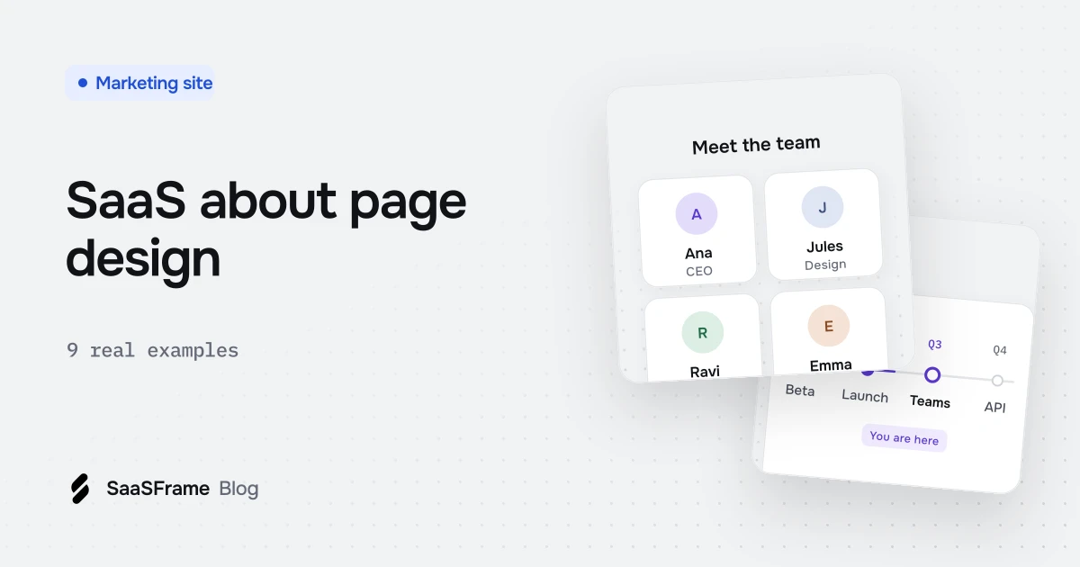
A good SaaS about page proves the company is credible: a one-line mission, a short dated story, a few clearly labeled numbers, real people with names and roles, and a next step such as open roles. Linear, Paddle, Duffel, Framer, Clearbit, Tailscale, Cube, Resend and Peec AI each show one of these sections done well.
- A SaaS about page is evidence for buyers, candidates and partners, so every section should answer what you do, how you got here, how big you are or who is behind it.
- Open with one large sentence about what the company believes or does, ideally backed by the product rather than stock imagery.
- Timelines turn company history into scannable, dated milestones; tabs or a horizontal line keep them compact.
- Show two or three plainly labeled numbers that each measure something different, such as companies, users and devices.
- End the page with a path to open roles or the product, backed by a reason to join such as funding or the team.
An about page is where buyers, candidates and investors go to check whether a company is real, who runs it and why it exists. Most SaaS about pages answer those questions with a wall of mission copy; the good ones answer them with a sharp headline, a few verifiable facts and real faces.
As of November 2026, SaaSFrame holds 143 about pages from 138 SaaS companies. Below are 9 of them, one per product, grouped by the job each section does.
What is a SaaS about page for?
A SaaS about page proves the company behind the product is credible and worth betting on. Prospects late in an evaluation read it to judge whether the vendor will still be around next year, candidates read it to picture the team, and journalists or partners read it for the short version of the story.
That means the page is less about brand storytelling and more about evidence. Every section should answer one of four questions: what you do and why, how you got here, how big you are, and who is behind it.
What should a SaaS about page include?
A strong about page includes a one-line mission, a short origin story, a handful of numbers, the team, and a next step such as open roles. The library shows how often each of these building blocks gets its own designed section.
| Section | Question it answers | Sections in SaaSFrame (Nov 2026) |
|---|---|---|
| Mission headline | What do you do, and why? | Usually the hero of the page |
| Timeline or milestones | How did you get here? | 16 timeline sections |
| Company numbers | How big and how stable are you? | 52 stats sections (all page types) |
| Team or leadership | Who is behind it? | 33 team sections |
| Hiring call to action | Can I join? | Often links to a careers page |
You rarely need all five. A seed-stage startup with no history can skip the timeline; a company with thousands of customers should lead with its numbers.
How should an about page open?
Open with a single sentence that states what the company believes or does, set large, with no stock imagery behind it. Both examples below lead with that one idea before anything else.
Linear: a belief, shown on top of the product
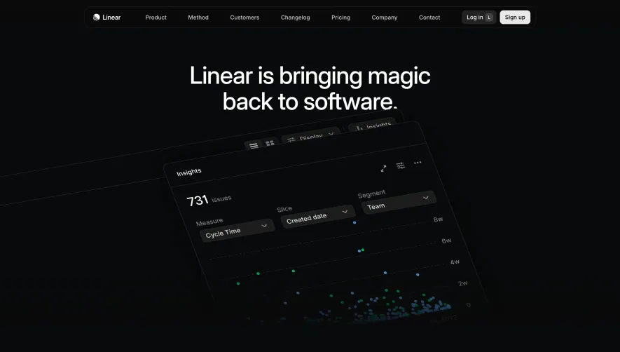
Linear does not use a team photo or an illustration in its hero. The background is a real product view, which keeps the about page tied to what you actually buy.
Paddle: define the category before telling the story
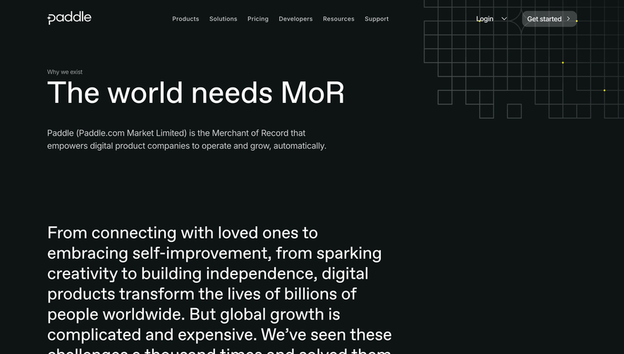
When your category needs explaining, the about page is the right place to do it. Paddle states the acronym, defines it in one line, and only then moves to the narrative.
How do you tell a company story without a wall of text?
Break the story into dated milestones and let the reader step through them. Timelines turn paragraphs of history into scannable facts. As of November 2026, the library holds 16 timeline sections.
Duffel: mission on the left, milestones underneath
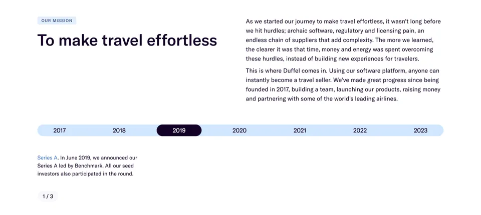
The tabs keep the section compact: seven years of history take the height of a single card. The "1 / 3" pager shows that each year can hold more than one event.
Framer: the product line is the timeline
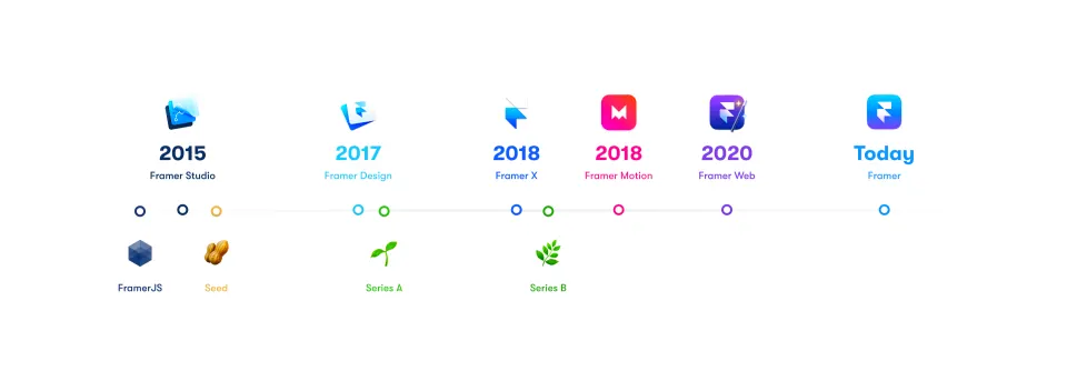
Placing products above the line and funding below it tells two stories at once without a single paragraph. Product icons do the work that photos usually do.
Clearbit: a timeline that ends in numbers
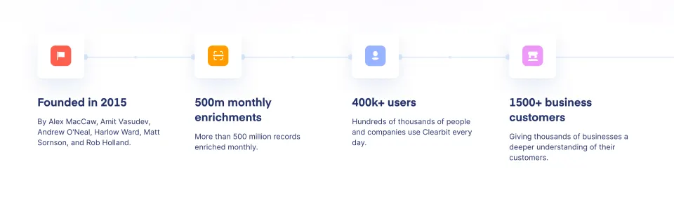
This is the shortest possible company story: where it started and where it is now. It suits companies whose history matters less than their current size.
Which numbers belong on an about page?
Show the few numbers that prove adoption or stability, such as customers, active users, or volume processed, and label each one plainly. Three is usually enough; more starts to look like padding.
Tailscale: three numbers under one sentence
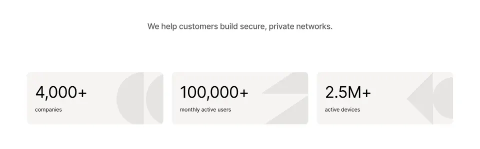
Each figure measures a different thing (organizations, people, machines), so none of them repeats another. The sentence above gives the numbers a reason to be there.
Rule of thumb Every number on an about page should be one a journalist could quote. If it needs a footnote to make sense, leave it out.
How should you show the team on an about page?
Show real people with their name and role, and pick a format that matches your size: a leadership grid for larger companies, a candid photo for small teams.
Cube: a leadership grid with direct links
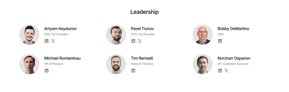
The social links matter more than they look. For a buyer doing due diligence, they turn a list of names into verifiable people.
Resend: one photo instead of a grid

A small team does not need a directory. One unposed photo with a specific caption says more about the culture than a row of headshots.
How do you turn an about page into a hiring page?
End the page with a clear path to open roles, backed by a reason to join such as funding, growth or the team itself. Candidates are a core audience of an about page, so the last section should speak to them directly.
Peec AI: funding, growth and a hiring button in one block
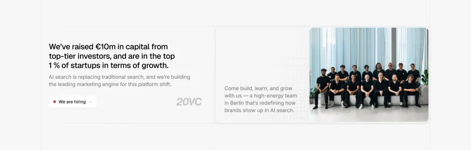
The section answers the three questions a candidate has, in order: is the company funded, who would I work with, and where do I apply.
What mistakes should you avoid on a SaaS about page?
The most common mistake is writing the about page for the founders instead of the reader. These are the patterns the examples above avoid:
- Abstract mission copy. "We empower teams to unlock potential" says nothing; Duffel's "To make travel effortless" names the domain.
- Stock photography. None of the nine examples uses it: they show the product, the real team or nothing.
- Unlabeled or vanity numbers. Tailscale and Clearbit say exactly what each number counts.
- A dead end. Link to careers, contact or the product, as Peec AI does with its hiring button.
The same principles apply to the rest of your marketing site. For layouts that group several of these facts into one block, see our guide to bento grid design, and for the pages around it, the SaaS landing page trends for 2026.
Frequently asked questions
What should a SaaS about page include?
Most strong about pages combine a one-line mission, a short origin story or timeline, a few company numbers, the team or leadership, and a call to action such as open roles. You rarely need all of them: an early-stage startup can skip the timeline and lead with the founders.
How long should an about page be?
Long enough to answer what you do, why, and who is behind it, which usually means four to six sections. Duffel fits seven years of history into one tabbed card, which shows that length matters less than how much each section proves.
Should a SaaS about page show the whole team?
Larger companies usually show a leadership grid with names, titles and social links, as Cube does. Small teams often do better with one candid photo and a specific caption, like Resend's remote team meeting in person for the first time.
Which numbers should go on an about page?
Pick two or three numbers that prove adoption or scale and label them plainly, such as customers, monthly active users or volume processed. Tailscale uses companies, monthly active users and active devices, so each number measures something different.
What is the difference between an about page and a careers page?
The about page explains the company to everyone: buyers, partners, press and candidates. The careers page is for candidates only and lists roles and benefits, so the about page should end with a clear link to it.
Where can I find more about page examples?
As of November 2026, SaaSFrame has 143 about pages from 138 SaaS companies, plus isolated team, timeline and stats sections you can browse by pattern.
 Team33 examples
 Timeline21 examples
 Statistics61 examples