Prompt 787 words Copy
# Design from Reference: Latent Datasets Upload

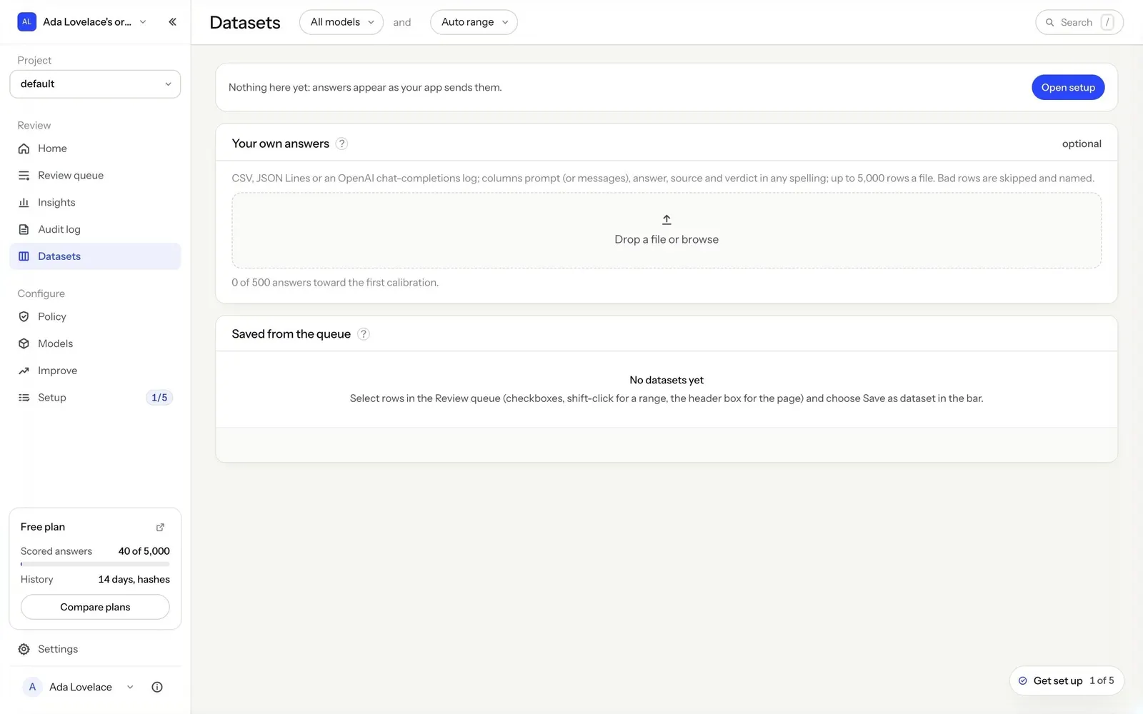
Create an original, high-fidelity visual design inspired by the reference. Prioritize composition, typography, colors, spacing, and component styling over technical implementation.

## Reference

- **Product:** Latent
- **Category:** Empty State
- **Screenshot:** attached to this message (also available at https://media.saasframe.io/v/076c62afece106013c05-1600.webp)
- **Source:** https://app.runlatent.ai/datasets

Analyze the attached screenshot first. If no image is attached, open the screenshot link; if neither is accessible, ask for it rather than guessing.

## Visual Design Context

## Overall aesthetic
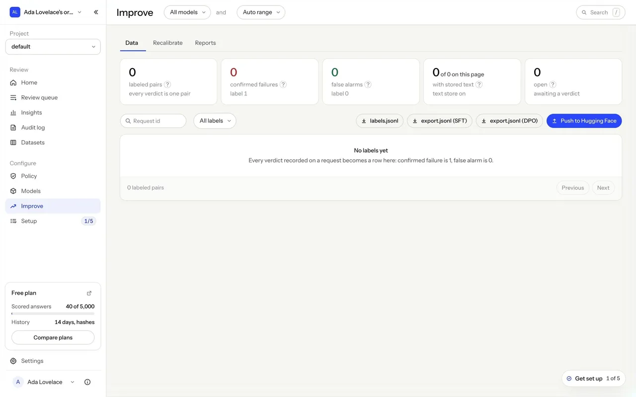
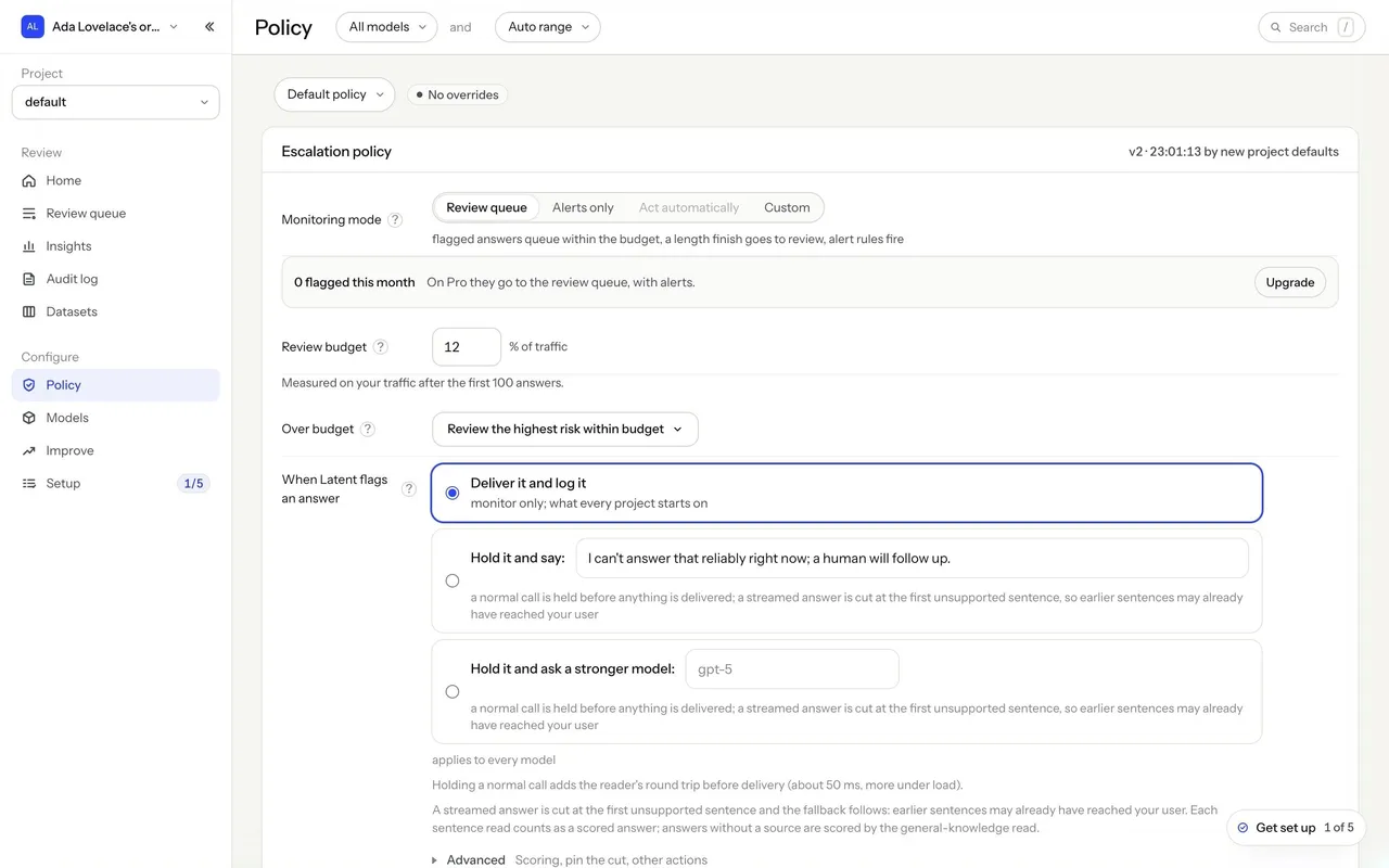
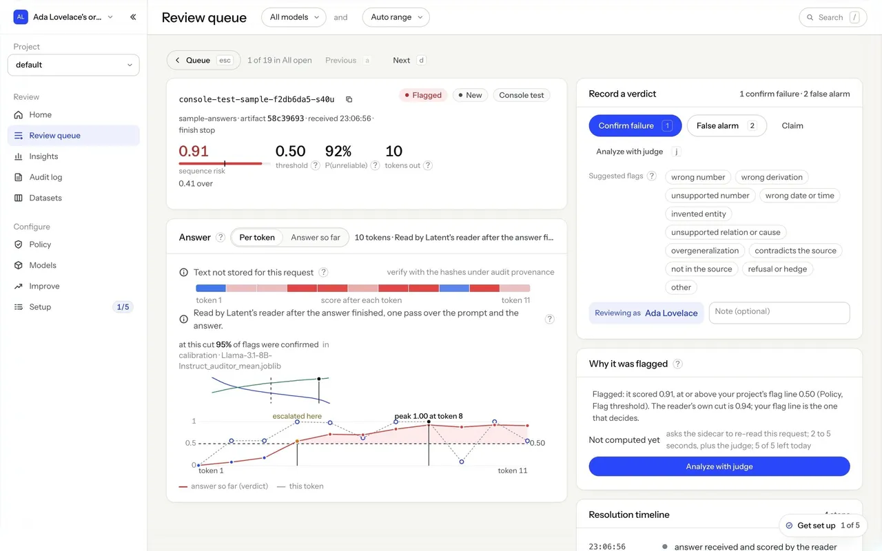
Latent detects LLM hallucinations in real time by reading a model's internal state. The marketing site is a technical, research-flavored dark theme: near-black hero sections with a starfield, cobalt-blue accents and data visualizations (token risk bars, layered activation stacks, speed and cost comparisons), alternating with warm off-white sections. The console is a calm, light, data-dense tool on a warm grey background.

## Typography
Instrument Sans throughout, with a monospace for code, ids and numbers. Marketing headlines are Instrument Sans 500 at 50–86px with tight negative tracking (-3.9px at 86px); body 15–17px. The console uses 22px page titles, 15px section titles and 13px body text, with numbers set large (26px) in stat cards.

## Colors & surfaces
Marketing: #0A0B10 / #0F1118 / #12141B dark sections, #F5F5F2 warm off-white sections, white cards, cobalt blue #2B46F9 for primary pill buttons (38px, fully rounded) and highlights, a full-bleed blue footer. Console: #F5F5F2 page, #FFFFFF and #FAFAF8 cards, #ECECEF borders, text #0E1017 / #474B56 / #80848E, blue #2B46F9 for primary actions and links, red for flagged answers and high risk, orange for escalations.

## Components
Hero with a starfield and pill CTAs, interactive demo picking an answer and a policy, highlighted text where invented words are marked in red, comparison cards (176× faster, 660× cheaper), FAQ accordions. Console: sidebar with organization and project selectors and a free-plan usage card, model and time-range pills in the header, tables with risk bars and verdict labels, stat cards, step lists, radio cards, segmented controls, code blocks with Copy buttons and a floating "Get set up" checklist.

## Layout
Marketing content width about 1240px, with 950px text columns and rounded section panels that alternate dark and light. The console uses a 240px sidebar and content up to about 1408px; onboarding is a two-column layout with a numbered step list beside a single card.

## Tone
Precise and evidence-based: concrete numbers, measurement dates and plain verbs ("Catch wrong LLM answers before your users do", "Pay for the answers you score").

### Overall aesthetic
Light upload page with empty states.

### Page composition
Notice banner, "Your own answers" card with drop zone, "Saved from the queue" card with empty state.

### Typography
Instrument Sans 15px card titles, 13px help text.

### Colors & surfaces
White cards, dashed drop zone, cobalt Open setup button.

### Components
Drag-and-drop upload area, empty states, notice banner.

### Responsive
Cards take full width.

### Adaptation guidance
List accepted formats and column names right in the drop zone.

## Content

**Instructions:**

Generate realistic example content that fits the selected design reference.

Create appropriate headlines, descriptions, labels, buttons, and supporting copy based on the type of interface being designed.

If a product or business description is provided, use it to guide the content.

Otherwise, invent a plausible fictional SaaS product appropriate for the reference.

Keep the content concise, coherent, and visually balanced.

Do not present fictional statistics, customer names, or testimonials as verified facts.

## Design Direction

**Instructions:**

Use the reference screenshot as the main source of visual inspiration rather than a strict layout template.

Preserve its most distinctive design characteristics, such as typography, visual rhythm, color relationships, component treatments, and overall aesthetic.

Feel free to modify section arrangements, proportions, spacing, and individual components to better suit my content.

Introduce original design decisions where they improve usability, composition, or brand consistency.

The result should clearly reflect the reference's visual language without looking like a direct reproduction.

Follow the visual identity of the reference design.

Use its typography, color palette, component styling, and overall aesthetic as the primary design direction.

Do not introduce an unrelated visual identity.

## Output

**Instructions:**

Generate a high-fidelity visual mockup of the requested interface.

Present the design as a polished, realistic website or product UI screenshot.

Prioritize visual composition, typography, spacing, colors, alignment, and component details.

Use the available image-generation or visual-design capabilities.

Do not replace the mockup with source code, a written design specification, or a textual description.

If direct visual generation is unavailable, clearly explain the limitation.

## Constraints

- Use the actual screenshot as the primary visual reference.
- Preserve essential messaging and factual accuracy.
- Prioritize visual quality and consistency.
- Do not invent unsupported product claims.
- Adapt structure and copy length for visual balance.
Reference image Attach it to your message: assistants can’t open image links. Open in ChatGPT ↗ Open in Claude ↗
Build it in Lovable ↗ v0 ↗ Figma Make ↗
Opening a tool copies the screenshot so you can paste it with your prompt.
 SaaSFrame