SaaSFrame
Upgrade Prompt Design: 10 Real In-App Examples
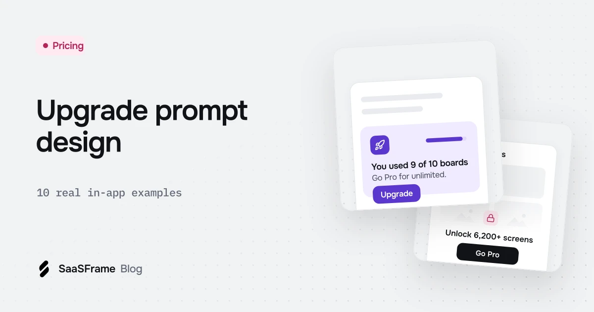
A good upgrade prompt appears where the user feels the limit, says in one sentence what the paid plan adds for them, shows the price and keeps a way out. Dub and Narrative BI lock features in place, Pangram ties the offer to a credit meter, Superlist compares plans in a modal and Supernotes keeps a clear "Not right now".
- Place an upgrade prompt where the limit is felt: on the locked feature, next to the usage meter or right after a paid action.
- A locked feature should look like a preview of the product, with one sentence on what it does and the name of the plan that unlocks it.
- Show quotas and credits before they run out, with the upgrade action next to the meter.
- In a plan modal, show the user's current plan and usage beside the offer, with the price visible before checkout.
- Always keep a way out, such as a close button or "Not now": a prompt without an exit reads as a wall.
An upgrade prompt is the moment a free or trial user meets the edge of their plan: a locked feature, a full quota or an expired trial. Handled well, it explains what the paid plan adds at the exact moment the user wants it; handled badly, it reads as a wall.
As of November 2026, SaaSFrame holds 138 product screens tagged upgrade prompt, from 40 SaaS products. The 10 examples below come from that set, one per product, grouped by where the prompt appears: inside a feature, next to a usage meter, in a modal or as a full-screen paywall.
What is an upgrade prompt in SaaS?
An upgrade prompt is any in-app element that invites a user to move to a higher plan: a button, a banner, a locked state, a modal or a paywall. It lives inside the product, unlike the pricing page, and it is triggered by what the user is doing.
Most prompts in the library are small and contextual. Only 25 of the 138 screens (from 11 products) put the offer in a modal, and 8 screens from 8 products block the product with a hard paywall. Nine screens from 9 products pair the prompt with a usage indicator, so the user sees how close they are to the limit.
Where should an upgrade prompt appear?
Put the prompt where the limit is felt: on the locked feature itself, beside the meter that is running out, or in a modal right after the user tries a paid action. A generic "Upgrade" button in the header works as a reminder, not as an argument.
How do you design a locked feature?
Show the feature's empty shell, say in one sentence what it would do for this user, and name the plan that unlocks it. The page should feel like a preview, not an error.
1. Dub: a locked page that still looks like the product
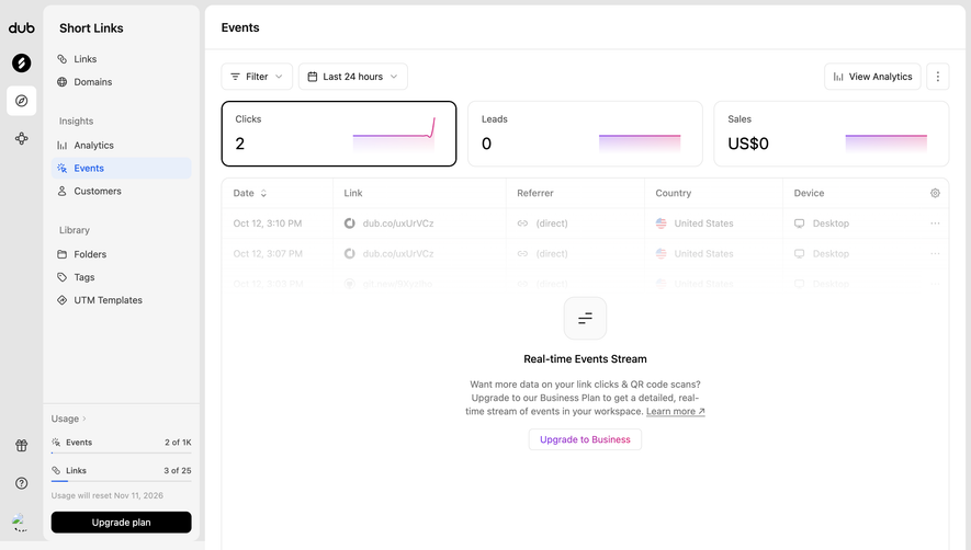
The copy starts from the user's need ("Want more data on your link clicks & QR code scans?") before naming the Business plan. In the sidebar, a usage block shows Events at 2 of 1K and Links at 3 of 25, the reset date, and a second "Upgrade plan" button for anyone who wants the whole picture.
2. Narrative BI: plan badges in the navigation
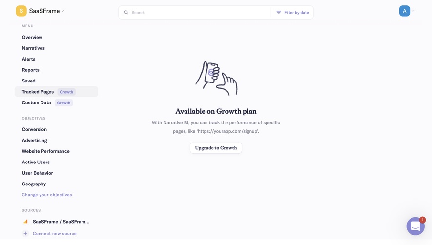
The badges tell users which pages are paid before they click, so the locked state is never a surprise. The explanation uses a real-looking example ("https://yourapp.com/signup") rather than a list of benefits.
3. Latent: one inline line inside a setting
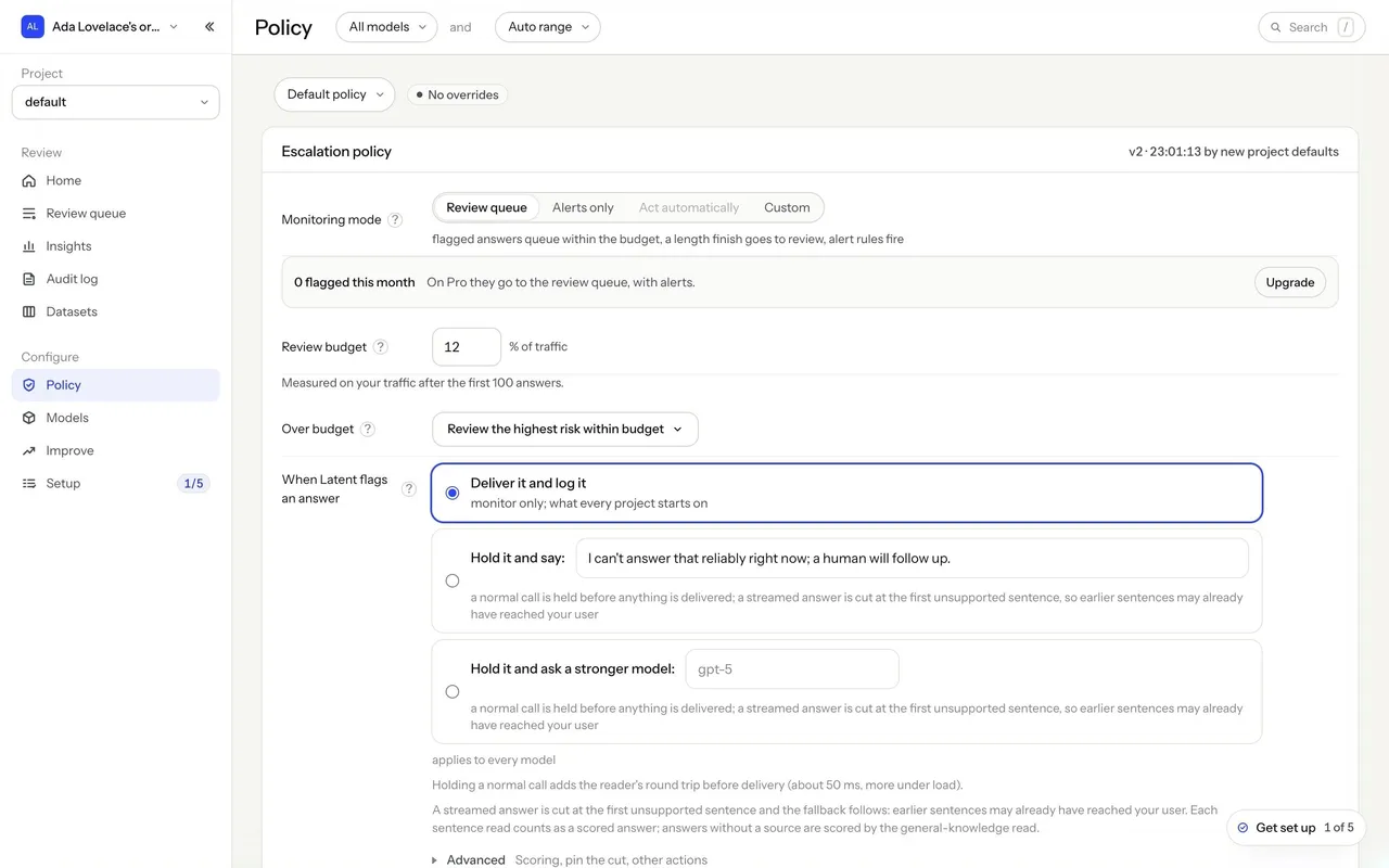
The prompt sits next to the setting it affects and uses the account's own number (0 flagged answers this month). That is the lightest possible upgrade prompt: no modal, no illustration, just what changes on the paid plan.
How do usage limits lead to an upgrade?
Show the quota before it runs out, in the same place every time, and put the upgrade action right next to it. A visible meter turns the limit into information instead of a surprise block. Our guide to AI pricing pages covers how credits are presented before signup.
4. Pangram: credits in the header and on the plan page
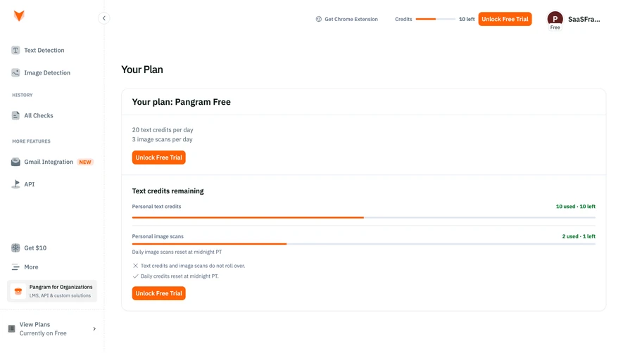
The page states the reset rules in plain words: daily credits reset at midnight PT and do not roll over. The call to action offers a free trial rather than a purchase, which lowers the cost of saying yes.
5. Parallel: a dismissible card above the balance
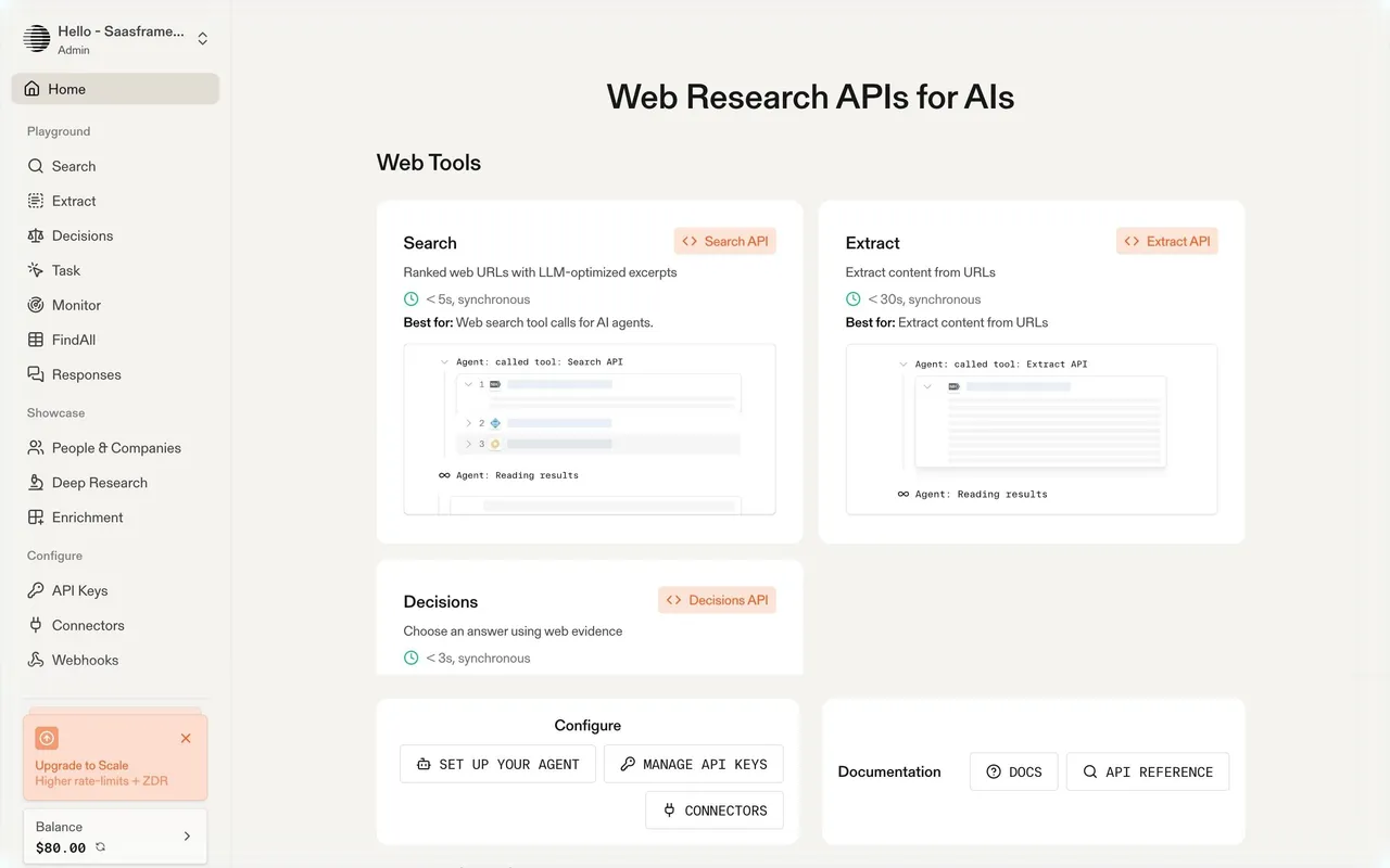
The card sits directly above the $80.00 balance, where an API customer already looks at spend. The close button matters: a prompt users can dismiss is one they will not learn to resent.
When should an upgrade prompt be a modal?
Use a modal when the user has just asked for something paid and needs to compare plans to decide. Keep the current plan visible, show the price, and always offer a way out.
6. Superlist: current plan next to the offer
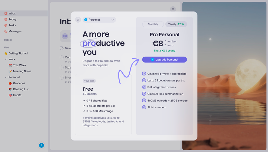
Showing the user's own usage on the Free card makes the comparison personal. A Monthly / Yearly toggle with "-20%" and the line "That's €96 yearly" answer the price question before checkout.
7. Visitors: let the user size the plan
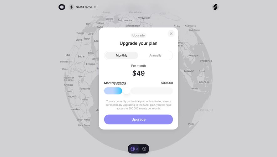
For usage-based pricing, a slider replaces a grid of tiers. The note under it explains the change from the trial ("unlimited events") to the 500k plan, so the user knows what they give up and what they get.
8. Caveman: four tiers with a clear default
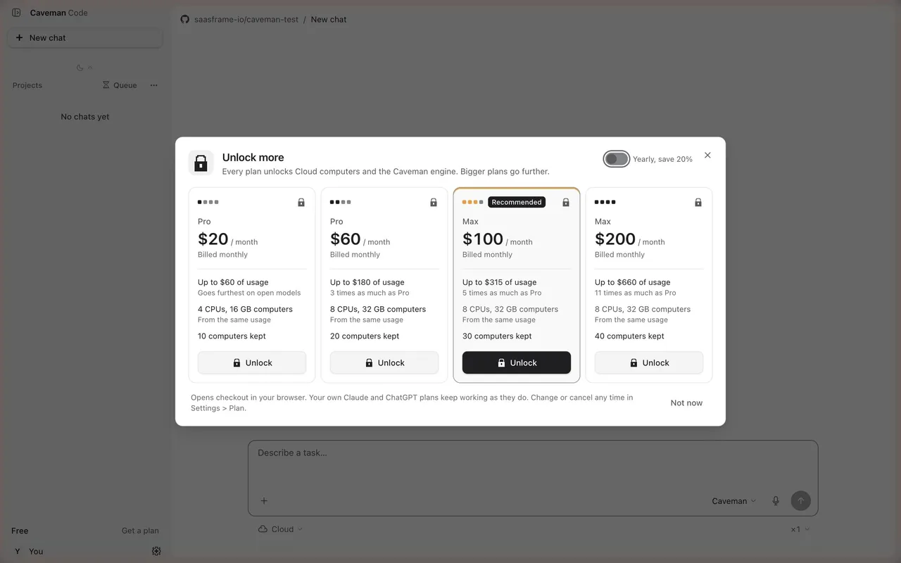
Each tier is described in the units users care about (usage allowance, computer size, computers kept), relative to the one before it ("5 times as much as Pro"). The footer explains what happens next, "Opens checkout in your browser", and "Not now" closes the modal.
When is a full-screen paywall the right choice?
Use a full-screen paywall only when the user cannot continue without paying, such as at the end of a trial, or for a one-off offer. It should state the reason, list a few concrete gains and leave a visible exit when there is one.
9. Supernotes: a special offer with a soft exit
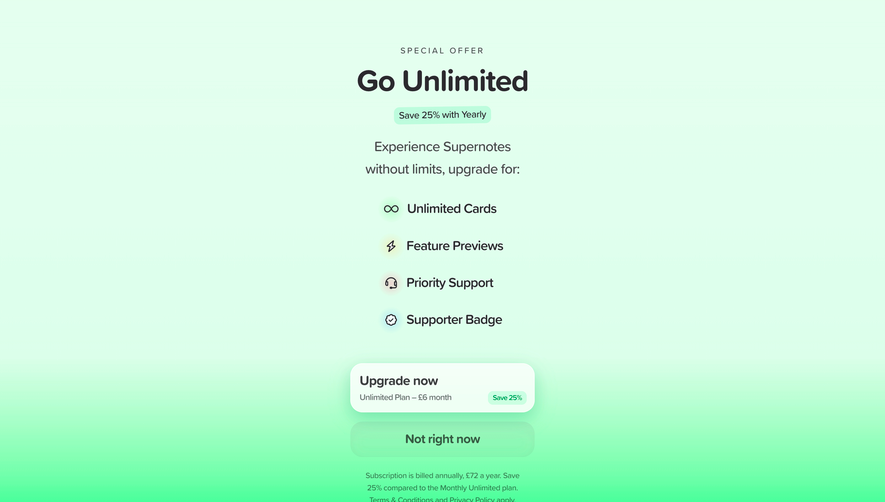
The price is inside the button ("Unlimited Plan – £6 month") with a "Save 25%" tag, and the small print states the annual total of £72. "Not right now" is almost as large as the main button, so declining never feels like a trick.
10. Avocode: the end of a trial, said plainly
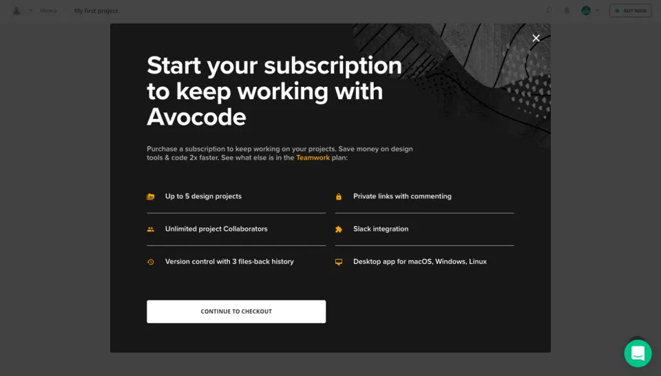
The headline states the consequence (keep working on your projects) rather than the plan name. Six short features in two columns, from private links to the desktop app, make the case without a pricing table.
What should every upgrade prompt include?
Every prompt in this set answers the same four questions: what is locked, why it matters to this user, what it costs and how to say no. The table shows which placement fits which situation.
| Placement | Use it when | Seen in |
|---|---|---|
| Locked page or empty state | A whole feature is paid | Dub, Narrative BI |
| Inline line in a setting | One option is paid | Latent |
| Usage meter with a button | Plans differ by quota or credits | Pangram, Dub |
| Dismissible sidebar card | A standing reminder is enough | Parallel |
| Comparison modal | The user just tried a paid action | Superlist, Visitors, Caveman |
| Full-screen paywall | Trial ended or one-off offer | Supernotes, Avocode |
Rule of thumb Name the plan, show the price and keep a "Not now": an upgrade prompt without an exit is a wall.
Upgrade prompts lead to two other screens worth designing with the same care: the plan page users land on, covered in our SaaS billing page examples, and the public pricing page. For locked features that start empty, see our empty state examples, and browse every upgrading screen and plan screen in the library.
Frequently asked questions
What is an upgrade prompt?
An upgrade prompt is an in-app element that invites a free or trial user to move to a higher plan: a button, banner, locked state, modal or paywall. Unlike the pricing page, it is triggered by what the user is doing inside the product.
Where should upgrade prompts appear in a SaaS product?
Where the user meets the limit: on the locked feature, next to a usage meter that is running out, or in a modal right after a paid action. A header button is useful as a reminder but rarely convinces on its own.
Should an upgrade prompt be a modal?
Only when the user has just tried something paid and needs to compare plans to decide. Show the current plan beside the offer, the price and a clear way to close it, as Superlist and Caveman do.
What is the difference between an upgrade prompt and a paywall?
An upgrade prompt invites the user to upgrade while the rest of the product keeps working. A paywall blocks access until the user pays, which suits the end of a trial or a fully paid feature.
How do you show usage limits without annoying users?
Keep a quota meter in the same place at all times, state when it resets and put the upgrade action beside it. Dub shows events and links in the sidebar, and Pangram shows remaining credits in the header.
Should upgrade prompts show the price?
Yes, when the user is close to deciding. Superlist, Visitors and Caveman show prices inside the modal, so checkout holds no surprise; a small inline prompt can link to the plans instead.
 Upgrade Prompt138 examples
 Paywall9 examples
 Usage Indicator52 examples