Prompt 1,126 words Copy
# Design from Reference: Atlas Dashboard

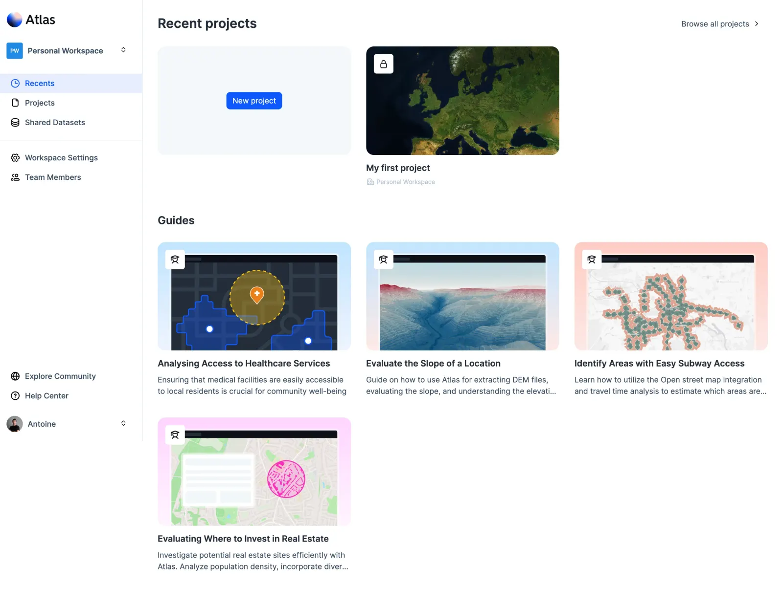
Create an original, high-fidelity visual design inspired by the reference. Prioritize composition, typography, colors, spacing, and component styling over technical implementation.

## Reference

- **Product:** Atlas
- **Category:** Dashboard
- **Screenshot:** attached to this message (also available at https://media.saasframe.io/v/c8cfa91a9c1f7a1164d8-1600.webp)
- **Source:** https://app.atlas.co/

Analyze the attached screenshot first. If no image is attached, open the screenshot link; if neither is accessible, ask for it rather than guessing.

## Visual Design Context

### Overall aesthetic

- **Character:** Spacious light geospatial workspace with a clean left rail, blue active states and large map-driven project/guide thumbnails.
- **Evidence and scale:** Screenshot is 2880 × 2240 image pixels. Dimensions estimate a 1440 × 1120 CSS canvas at 2× capture scale; actual DPR and exact font family are unverified.

### Page composition

- **Sidebar:** Approximately 262px CSS wide, white with a thin right divider. Brand and workspace selector occupy the top; primary destinations and settings form two groups; community/help/profile controls sit lower down.
- **Recent projects:** Main content begins around x290 with a bold heading and right-aligned browse link. A pale new-project tile and an existing map-thumbnail project sit side by side.
- **Guides:** A second heading introduces three guide cards across the first row and a fourth below at left, leaving broad white space to the right.
- **Viewport behavior:** The sidebar ends above the bottom of the long capture while guide content continues lower; fixed positioning or independent scrolling cannot be established from this still image.

### Information hierarchy

- **Primary navigation:** Recents uses a pale blue full-width highlight with blue icon/text, while other destinations remain dark.
- **Project creation:** A bright blue New project button sits centered in the first pale tile; the existing project uses a satellite thumbnail, bold name and quieter workspace metadata.
- **Learning content:** Guide illustrations carry the strongest visual weight, followed by bold titles and two-line muted descriptions with truncation.

### Typography

- **Section headings:** Recent projects is approximately 25px CSS, bold; Guides is around 22px bold.
- **Card roles:** Project/guide titles are approximately 16px semibold with 22px leading. Descriptions are around 14px with 20px leading.
- **Navigation/utilities:** Sidebar links and browse action are around 14px; workspace metadata below projects is around 12px in pale gray-blue. Exact typeface and computed weights remain unverified.

### Colors & surfaces

- **Measured foundation:** White #FFFFFF dominates, with pale #F4F7FA in the new-project tile and #F7F7F7 in small preview elements.
- **Measured text:** Dark slate #242C38 supports headings; #374A5E appears in secondary navigation/body copy.
- **Measured blue:** Active/primary accent includes #0E58FF; dark map/interface blue #1B3B7D and #254488 appears in thumbnail content. Pale #E6EEFE supports selection surfaces.
- **Illustration variety:** Guide stages use pale blue, coral-pink and lavender grounds; maps supply greens, satellite texture and colorful analytical overlays.

### Components

- **Workspace selector:** Small blue square initials badge, bold workspace label and compact chevrons align in one row.
- **Navigation items:** Outline icons precede labels; the active item uses a full-width pale-blue rectangular band. A horizontal divider separates content destinations from settings/team controls.
- **Project tiles:** Approximately 355 × 200px CSS with 14px rounded corners. The existing project has a white rounded lock badge at its upper-left; its title and metadata sit below the image.
- **New-project action:** Compact blue button around 103 × 32px CSS, white label and radius near 6px.
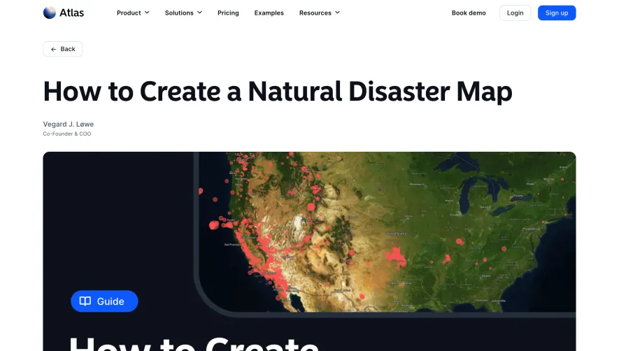
- **Guide cards:** Three equal columns around 355px wide with 28px gaps. Rounded thumbnails around 200px high show map interfaces; white square education badges overlap their upper-left corners.
- **Guide text:** Titles sit roughly 12px below images, followed by short slate descriptions. Overflow uses ellipses on longer descriptions rather than equal-height boxed card bodies.

### Visual rhythm

- **Main gutters:** Content has approximately 28px inset from the sidebar and similar outer right spacing.
- **Section separation:** A generous gap around 50px separates project metadata from the Guides heading.
- **Grid rhythm:** Consistent image dimensions, badge positions and text spacing align diverse map examples; the second row retains the same column start.
- **Whitespace:** Borderless card bodies and broad unused areas make the dashboard feel open and approachable.

### Responsive

- **Observed limit:** Only the desktop workspace is visible; menus, project creation, guide opening and mobile navigation are unobserved.
- **Recommended grids:** Reduce guide columns from three to two to one and let project tiles wrap with matching widths.
- **Recommended navigation:** Move the full rail into a drawer or compact navigation on phones, preserving clear workspace context.
- **Recommended controls:** Keep lock/status and education badges readable, allow longer titles to wrap and avoid truncating essential project identities.

### Adaptation guidance

- **Preserve clarity:** Use a simple white rail, one saturated blue navigation/action accent and large visual thumbnails.
- **Separate work from learning:** Keep recent projects and guides as distinct sections, with a low-friction new-project tile alongside existing work.
- **Implementation:** Use semantic links/buttons, accessible image alternatives, visible focus and clear private-project labels. Screenshot map imagery and guide topics establish visual examples rather than verified analytical capabilities.

## Content

**Instructions:**

Generate realistic example content that fits the selected design reference.

Create appropriate headlines, descriptions, labels, buttons, and supporting copy based on the type of interface being designed.

If a product or business description is provided, use it to guide the content.

Otherwise, invent a plausible fictional SaaS product appropriate for the reference.

Keep the content concise, coherent, and visually balanced.

Do not present fictional statistics, customer names, or testimonials as verified facts.

## Design Direction

**Instructions:**

Use the reference screenshot as the main source of visual inspiration rather than a strict layout template.

Preserve its most distinctive design characteristics, such as typography, visual rhythm, color relationships, component treatments, and overall aesthetic.

Feel free to modify section arrangements, proportions, spacing, and individual components to better suit my content.

Introduce original design decisions where they improve usability, composition, or brand consistency.

The result should clearly reflect the reference's visual language without looking like a direct reproduction.

Follow the visual identity of the reference design.

Use its typography, color palette, component styling, and overall aesthetic as the primary design direction.

Do not introduce an unrelated visual identity.

## Output

**Instructions:**

Generate a high-fidelity visual mockup of the requested interface.

Present the design as a polished, realistic website or product UI screenshot.

Prioritize visual composition, typography, spacing, colors, alignment, and component details.

Use the available image-generation or visual-design capabilities.

Do not replace the mockup with source code, a written design specification, or a textual description.

If direct visual generation is unavailable, clearly explain the limitation.

## Constraints

- Use the actual screenshot as the primary visual reference.
- Preserve essential messaging and factual accuracy.
- Prioritize visual quality and consistency.
- Do not invent unsupported product claims.
- Adapt structure and copy length for visual balance.
Reference image Attach it to your message: assistants can’t open image links. Open in ChatGPT ↗ Open in Claude ↗
Build it in Lovable ↗ v0 ↗ Figma Make ↗
Opening a tool copies the screenshot so you can paste it with your prompt.
 SaaSFrame