 SaaSFrame
Trial Banner
A persistent banner or badge showing how much of a free trial is left, with a path to upgrade.


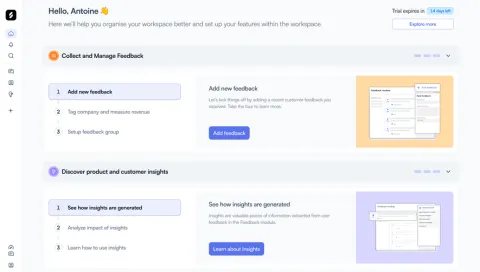
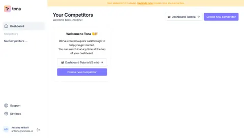
Index of all 16 Trial Banner examples
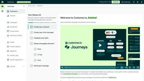
- Customer.io Welcome Screen
- Zeda.io Welcome Screen
- Tona Welcome Screen
- Makelog Empty Dashboard
- Café Create An Event: Social Hub
- Specify Loading Screen
- Arcade Appearance Settings
- Hey Sign Up Flow: Imbox
- Reply Sign Up Flow: Empty Sequences
- Buffer Analytics: Overview
- Basecamp Upgrading
- Bonsai Referral Flow: Dashboard
- Viral Loops Upgrading Page
Trial Banner: design guide
Short answer
A trial banner keeps the remaining free-trial time visible across the app, with one path to upgrade. Lead with the days left, keep it in one stable place (top strip or sidebar card), raise its weight only near the end, state what happens when the trial ends and send the action straight to checkout.
In the libraryas of November 2026
- Examples
- 16
- SaaS products
- 15
- Last added
- Nov 2026
Most common inWelcome Screen 4Empty State 2Account Setup 1Add & Edit 1Analytics 1
Recently addedAskAiRankDustCustomer.ioZeda.ioTona
A trial banner tells someone on a free trial how much time is left and where to go to keep the account. It usually lives at the top of the app or in the sidebar, stays visible across pages, and pairs a countdown with a single upgrade action. Its job is to keep a deadline in view without competing with the work the person came to do.
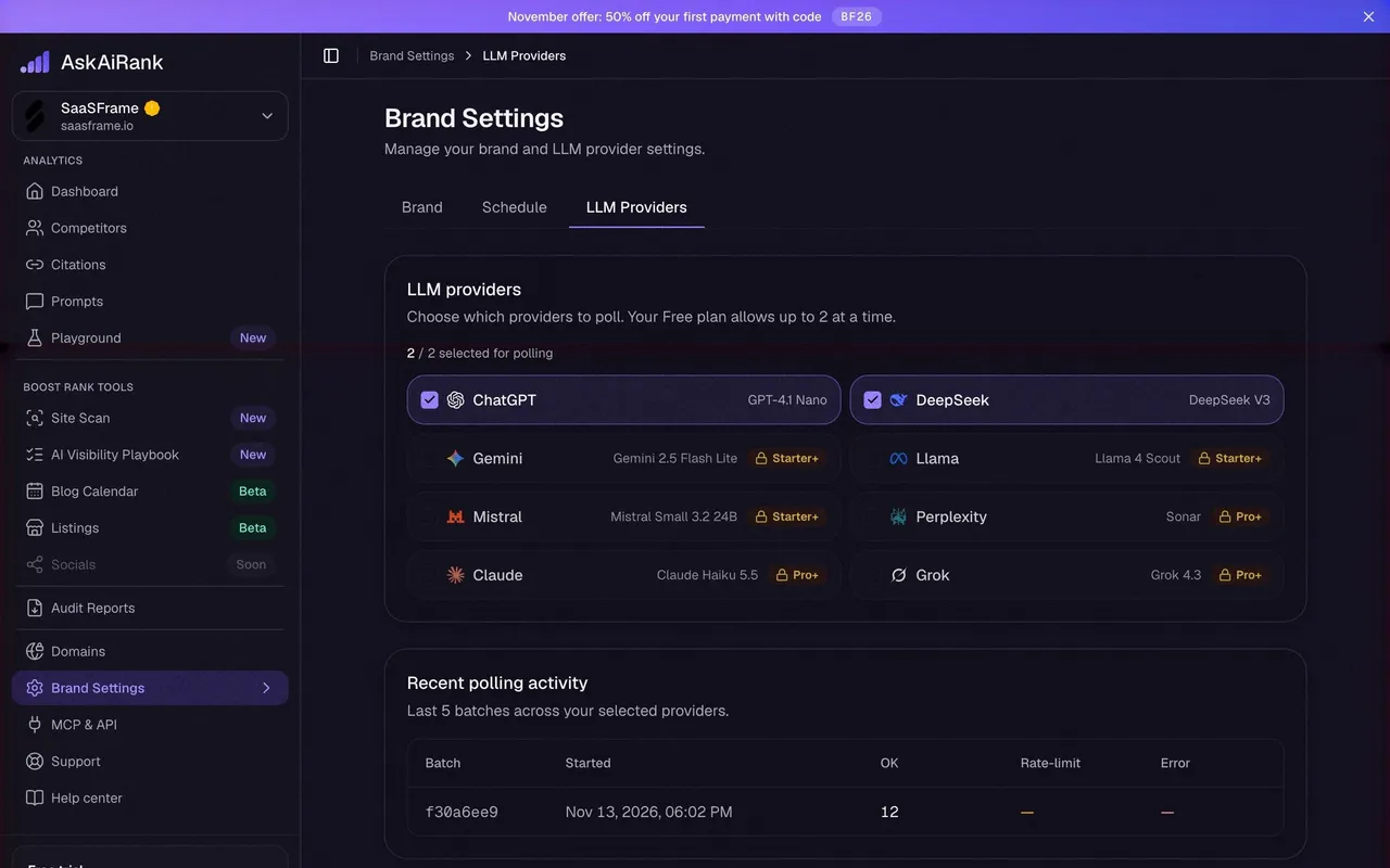
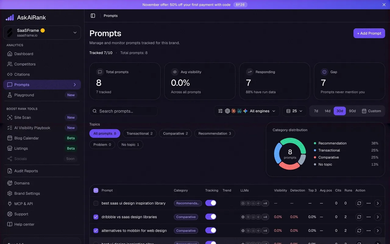
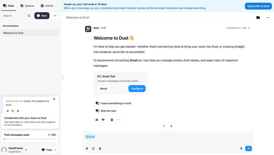
The captured examples show two main placements. Hey, Specify, Tona and Dust use a full-width strip above the interface. Arcade, Makelog and AskAiRank place a compact card at the bottom of the sidebar, next to the account menu. Both work; the choice depends on how much attention the trial deserves at that moment.
What should a trial banner say?
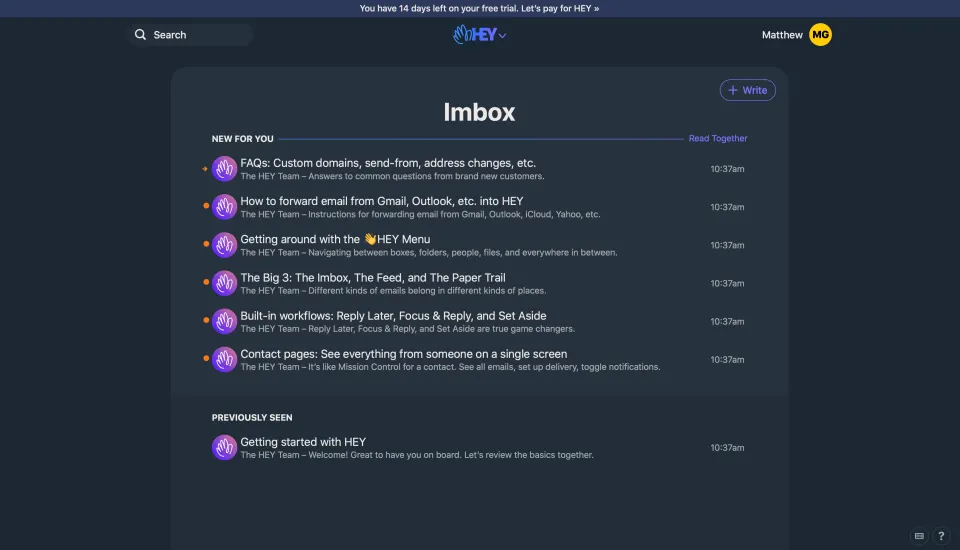
Lead with the remaining time, then the action. “You have 14 days left on your free trial” is clear in a single read. A banner that opens with a feature pitch or a discount pushes the one fact the person needs further down the line.
Hey keeps the whole message to one sentence in a thin strip above its header: the days left, then “Let’s pay for HEY” as a link. Nothing else competes with the Imbox below, which is still the focus of the screen.
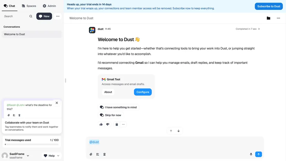
Add a second line only when it carries information the person cannot infer. Dust’s banner says the trial ends in 14 days, then explains what happens at the end: connections and team member access will be removed. That sentence turns a generic deadline into a concrete consequence the person can weigh.
Top strip or sidebar card?
A full-width strip is hard to miss and works on any layout, including screens without a sidebar. Specify shows its strip even on a loading screen while a Notion connection is being created, which keeps the deadline consistent from the very first view. The cost is vertical space on every page and a permanent tint at the top of the product.
A sidebar card is quieter. It sits where people look for account and plan information, and it has room for more than one line. Arcade’s card reads “Free trial, 14 days left”, explains that the account reverts to the Free plan afterwards, shows a progress bar and offers an Upgrade button.
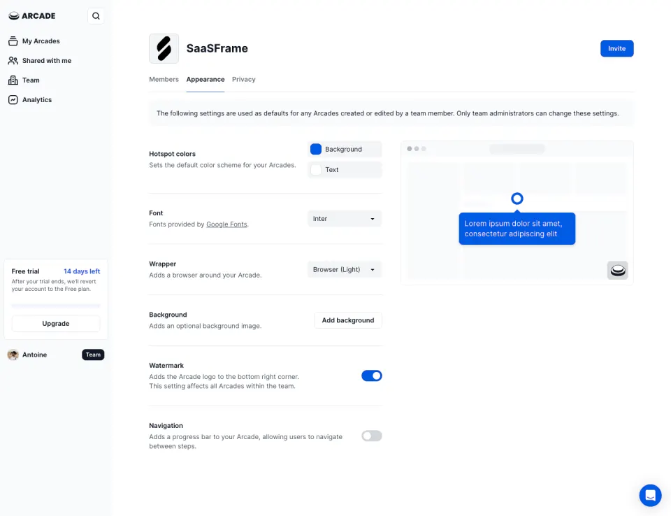
A reasonable default is a sidebar card for most of the trial and a top strip, or a stronger card style, in the last few days. Whichever you choose, keep it in the same place on every page so people learn where to find it.
How prominent should it be?
Match the visual weight to the urgency. Tona uses a pale yellow strip with “Upgrade now” as an underlined link and a short reason: “to keep your account active.” It reads as information, not as a warning, which suits a trial that still has two weeks to run.
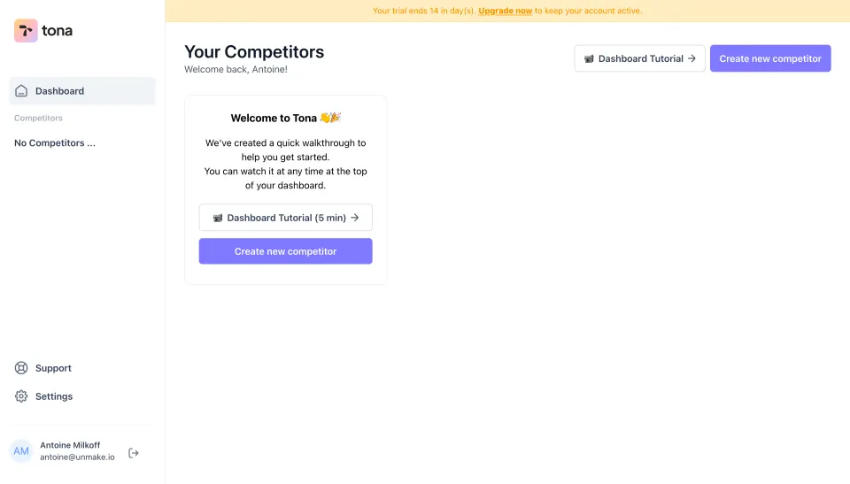
Reserve stronger colors and solid buttons for the final days or for a trial that has already expired. If the banner looks the same on day 14 and day 1, people stop seeing it. Changing tone near the end, from neutral to warning, gives the reminder meaning when it matters.
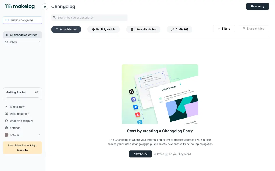
Avoid making the banner the loudest element on a screen whose real task is elsewhere. Makelog’s empty changelog has a large “New Entry” action in the center, and the trial message sits in a small yellow box at the bottom of the sidebar with a Subscribe link. The empty state keeps the priority.
Show what the trial includes, not only the time
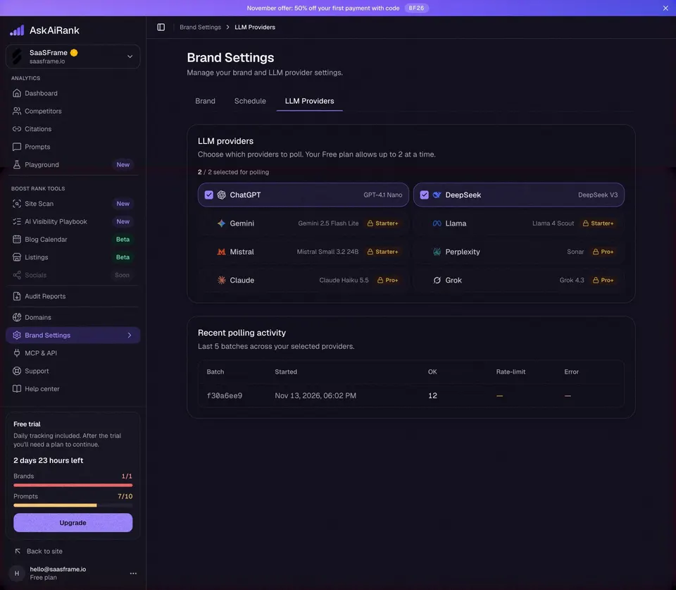
Some trials are limited by usage as well as time. When that is the case, the banner is a natural place to show both. AskAiRank’s sidebar card shows “2 days 23 hours left”, then progress bars for brands (1/1) and prompts (7/10), above an Upgrade button. Dust also places a “Trial messages used” counter (1 / 100) in its sidebar, separate from the time banner.
Switch to hours when the remaining time is short. “0 days left” is ambiguous; “2 days 23 hours” or “ends today at 18:00” is not. Use the person’s time zone and say whether the trial ends at a precise time or at the end of the day.
Keep the trial banner separate from promotions. In the same AskAiRank capture, a promotional strip at the top advertises a discount code for the first payment, while the trial status stays in the sidebar. Merging the two into one message makes it harder to tell what is a deadline and what is an offer.
Where should the upgrade action lead?
The action should open the plan choice or checkout directly, ideally with the current workspace and plan context already filled in. A link that drops the person on the public pricing page, logged out of their context, adds a step at the moment they decided to pay.
Basecamp shows the other end of the journey: on its upgrade page, with two payment options and a short FAQ, a purple bar at the bottom still reads “You have 30 days left on your trial.” Keeping the countdown visible during checkout reassures people that paying now does not cut the trial short, or tells them clearly if it does.
Label the action with what it does. “Upgrade”, “Subscribe” and “Pay for HEY” are all specific. Name the product or plan when the screen does not make it obvious.
Handle the states around the trial
- Early trial: neutral tone, sidebar or slim strip, a link rather than a heavy button.
- Last days: stronger color, a clear consequence (“connections will be removed”), a solid button.
- Payment added: replace the countdown with a confirmation of when billing starts; do not keep asking someone who already subscribed.
- Expired: say what is still accessible, what is locked and how to recover it. This often becomes a paywall rather than a banner.
- Non-admin members: if only an owner can pay, say who can upgrade instead of showing a button that leads to a permission error.
Let people dismiss a top strip for the session if it is not urgent, and bring it back as the deadline approaches. A banner that cannot be closed for 14 days becomes background noise.
Accessibility and layout details
Make sure text contrast holds on tinted backgrounds: pale yellow and light blue strips often carry low-contrast gray text. Do not rely on color alone to signal urgency; change the wording too. If the banner pushes content down, reserve its height on load so the layout does not jump when it appears.
On small screens, shorten the text to the essential (“14 days left · Upgrade”) rather than wrapping a long sentence over three lines. Expose the banner as a status region only when it changes, so screen readers do not announce it on every page load.
Trial banner review checklist
- Does the banner lead with the remaining time?
- Is there one clear action, labeled with what it does?
- Does the action open checkout or plan choice in the current workspace?
- Is the consequence of the trial ending stated when it matters?
- Does the visual weight increase as the deadline gets closer?
- Are usage limits shown when they can end the trial before the date?
- Does short remaining time switch to hours or an exact end time?
- Is the banner kept separate from promotions and discount offers?
- Does it disappear or change once payment details are added?
- Do members who cannot pay see who can?
- Is contrast sufficient and urgency conveyed by text, not only color?
Trial banner FAQ
Should the trial banner be dismissible?
Early in the trial, yes, at least for the session. In the final days or once the trial has expired, keep a persistent reminder, ideally in a less intrusive spot such as the sidebar.
Days or a date?
Days left is easier to read at a glance. Add the exact date or time when the trial is close to ending, or in the checkout, where people need to know precisely when they will be charged.
Should it mention a discount?
Only if the discount is tied to the trial. Otherwise keep promotions in a separate message, so the deadline stays readable and the offer does not look like a condition of keeping the account.
How is a trial banner different from an upgrade prompt?
A trial banner is persistent and time-based: it reports status on every page. An upgrade prompt appears in context, when someone reaches a limit or tries a feature outside their plan.
Related patterns
See Upgrade Prompt for contextual upsells, Usage Indicator for limits shown alongside the countdown, Countdown for time-based messages, Announcement Bar for other top strips, Paywall for the expired state and Billing & Subscription for where the upgrade leads.