 SaaSFrame
Countdown
Drive urgency for launches and promos with SaaS Countdown timer patterns. Learn how to use ticking clocks to boost conversions for webinars, early-bird pricing, and limited-time software offers.
Website sections 1

Product screens 3




Countdown: design guide
A countdown shows the time remaining before a real deadline, such as a launch, an event or an offer ending. Define what happens at zero, show the actual date and time zone beside it, choose precision that fits the decision and design the expired state before the animation.
In the libraryas of November 2026
- Examples
- 4
- SaaS products
- 2
- Last added
- Apr 2024
Most common inBilling 2Checkout 1Events Page 1
A countdown makes the distance to a real deadline visible. It can help visitors anticipate an event, understand when registration closes, or prepare for an upcoming release. Its usefulness depends on a clear endpoint and an honest relationship between the timer and what happens when it reaches zero.
The pattern should answer more than how much time remains. Visitors also need to know what the deadline means, which date and time it refers to, and what action is available before or after it. A dramatic timer without that context creates urgency without helping someone plan.
What happens when the countdown reaches zero?
Decide whether the timer counts down to the start of an event, the end of registration, a release, or another concrete change. These endpoints can occur at different times. A conference beginning tomorrow may stop accepting in-person registrations earlier, while virtual participation remains available.
Use wording that identifies the endpoint precisely. Event starts in and registration closes in are different promises. If the same page contains several deadlines, avoid placing one unlabeled timer near actions governed by another deadline.
Do not add a countdown solely to make a permanent offer feel scarce. A deadline that resets without explanation undermines the meaning of the interface. When a period is genuinely specific to an individual visitor, explain the basis and make sure the underlying experience supports that distinction.
Keep the calendar context visible beside the relative time
The Vercel capture centers four large numeric tiles labeled Days, Hours, Minutes, and Seconds. Smaller text around the composition identifies a one-day event, participation modes, a community invitation, and a calendar date with a physical location. The timer is prominent, but it does not stand alone.
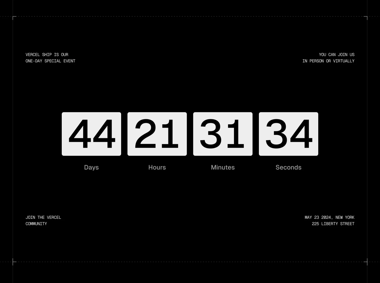
The calendar information gives visitors a second way to interpret the deadline. A relative timer is convenient for immediate anticipation; an absolute date is useful for planning and checking meaning. The capture records a historical event page and one timer value, not a current event schedule or proof that the numbers update correctly.
For your own event, make the endpoint date, time, and time-zone interpretation available in readable text. Do not expect someone to reconstruct the date by adding the displayed days to their local clock. The absolute context also remains useful when an animated timer is unavailable.
Choose the precision that serves the decision
Seconds can make an imminent start feel tangible. Several weeks before an event, they may add constant movement without improving planning. Choose units according to the visitor's task and the distance to the deadline rather than assuming every countdown needs four rapidly changing tiles.
Days and hours may be sufficient for an advance announcement. Minutes can matter near a live start. A concise remaining-time statement may work better in a small notification bar than a full set of tiles. Keep the unit labels explicit so an isolated number cannot be mistaken for something else.
Review how the format changes as the deadline approaches. Removing a zero-valued unit can shift the layout unexpectedly. Keeping a stable structure can preserve readability, while a deliberate transition to a shorter format may be appropriate if it does not change the interpretation of the remaining values.
Make the next action depend on the actual deadline
The action beside a countdown should help visitors prepare or participate. Depending on the page, that might mean registering, reviewing an agenda, adding an event to a calendar, or opening a live experience. The label should describe what happens now, not what will happen after the countdown expires.
If registration closes before the event begins, reflect that distinction in the action state and explanation. Do not let a still-positive event timer imply that a closed registration action remains available. Likewise, a launch countdown should not promise immediate access if eligibility or rollout conditions still apply.
Offer useful context before requesting commitment. A visitor may need to know the format, location, audience, or prerequisites. A timer can support that information hierarchy, but it should not replace the explanation required to make a sensible decision.
Design the zero state before designing the animation
At zero, the page needs an intentional state. A live event may expose a join action. A completed event may link to recordings. An expired registration period may explain the closure and offer an appropriate alternative. Avoid a timer that simply continues into negative numbers.
Different events can share the same visual timer while needing very different endpoint behavior. Define that behavior with the people who own the event or release. Make sure it is supported by the actual destination rather than changing a button label before the destination is ready.
Consider someone who leaves the page open across the deadline. They should receive a coherent transition without needing to infer that the timer has stopped. A person arriving after the deadline should see the correct post-deadline content immediately, not a flash of an expired offer.
Distinguish timekeeping failures from expired availability
A countdown can become misleading if the endpoint is wrong, the visitor's clock differs, or the page resumes after being inactive. Review these conditions as part of the implementation. The visible result should represent the intended deadline rather than merely decrementing a number from when the page loaded.
If the interface cannot establish a reliable remaining time, preserve the absolute date and an explanatory state. Do not present a fabricated timer to keep the design visually complete. A static date with a clear participation route is more useful than a confident but incorrect countdown.
Also separate an unavailable destination from a completed timer. If a live session cannot be opened, explain the access problem rather than implying that the event has not begun. The time state and the service state are related but not identical.
Limit movement to what helps anticipation
Large flipping tiles or repeated transitions can dominate a page. Use motion only when it helps visitors track the countdown. A constantly changing seconds display should not pull attention away from the agenda or interrupt reading every moment.
Provide a meaningful static presentation when reduced motion is appropriate. Keep unit labels and deadline context independent of animation. The information should remain understandable even if a visual transition is disabled or the visitor does not watch the timer continuously.
The Vercel screenshot shows a high-contrast typographic treatment with separated tiles. It cannot establish whether those tiles animate, how updates are announced, or which preferences the page respects. Treat those behaviors as implementation questions to test, not properties inferred from the image.
Make the timer understandable without repeated announcements
Expose a readable deadline and meaningful time units. Someone using assistive technology should not need to listen to four unrelated numbers and guess their relationship. A concise description can communicate the endpoint and remaining interval more clearly than decorative tile markup alone.
Avoid repeatedly announcing every second in a way that interrupts the rest of the page. Communicate important state changes, such as the event becoming available, deliberately. The visitor should remain able to read surrounding information and operate the primary action.
On smaller screens, retain the association between numbers and units. A row that wraps unpredictably can separate a value from its label. Use a stable layout and test large day values, translated unit names, and text zoom rather than shrinking everything until it fits one line.
Align all deadline references on the page
The timer, registration copy, calendar destination, confirmation message, and post-deadline state should refer to compatible times. A clear timer cannot compensate for a calendar file with a different start or a button that expires at another time without explanation.
If participation varies by region or mode, explain which deadline the displayed timer uses. A virtual attendee and an in-person attendee may face different logistics. Keep the shared countdown useful while identifying the conditions that affect each route.
Assign ownership for updating or retiring the page. Event announcements often remain reachable through search long after the event. Historical context and recordings can preserve usefulness; an expired countdown presented as current promotion can create confusion.
Test the boundary cases that visitors will actually encounter
Check the page before, exactly at, and after the endpoint. Review a session that stays open across zero, a return from an inactive tab, and a direct visit after the deadline. Verify that the action and explanatory copy agree with the visible time state.
Test slow loading, unavailable time data, narrow layouts, keyboard navigation, and readable fallback text. Ask visitors what they believe will happen at zero and whether they can identify the absolute deadline. If their answers differ from the intended endpoint, improve the context.
Explore the SaaSFrame countdown collection to study how timer prominence, unit labels, and event details work together. Adapt the hierarchy to your deadline, then verify the timekeeping and endpoint behavior separately from its appearance.
Questions to answer before using a countdown
Does every event page need seconds? No. Use the precision that helps visitors plan or participate. Seconds are often less useful far from the endpoint than clear dates and participation details.
What should happen when the timer reaches zero? Show the state appropriate to the actual event: participation, closure, release access, or historical material. Define it before launch and test visitors who arrive after the deadline.
Can a countdown replace an absolute date? It should not carry the whole explanation. A readable date and time-zone context help visitors plan, verify meaning, and understand the page when the timer cannot update.