 SaaSFrame
AI Feedback
Controls attached to an AI response to rate, copy or regenerate it.



Index of all 6 AI Feedback examples
AI Feedback: design guide
Short answer
AI feedback controls are the small actions attached to an AI response: copy, rate, regenerate and sometimes report. Attach them to the exact response they act on, keep them quiet until needed, make copy produce clean output, ask a specific question when rating, show versions and limits when regenerating and keep destructive actions apart.
In the libraryas of November 2026
- Examples
- 6
- SaaS products
- 6
- Last added
- Nov 2026
Most common inChat 2Details 2Text Editor 2Add & Edit 1Success 1
AI feedback controls sit under or beside a generated response and let people do something with it: copy it, say whether it helped, ask for another version, or flag a wrong result. They serve two audiences at once. The person reading needs quick ways to use or replace the output, and the team building the product needs signals about quality.
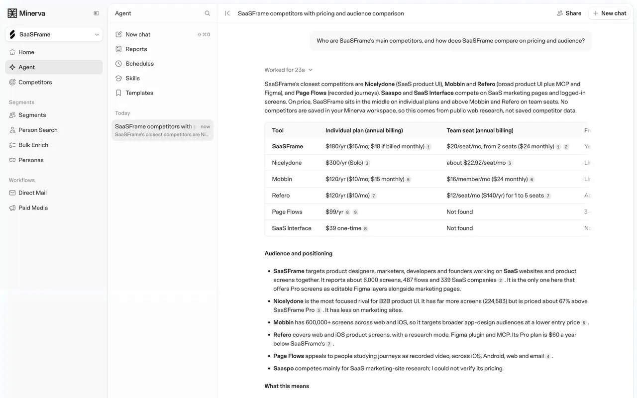
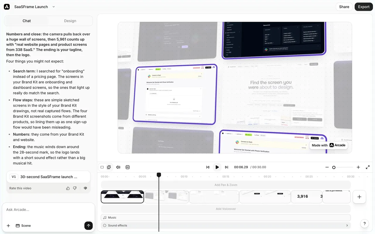
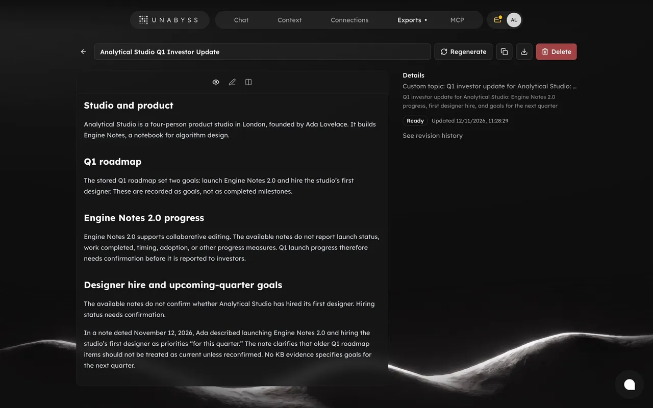
The captures cover chat answers in Glide and Minerva, a detection verdict in Pangram, a generated document in Unabyss, a generated video in Arcade and a generated quiz in Meiro. The controls look similar, a row of small icons or buttons, but what each one does depends on the object it is attached to.
What belongs in an AI feedback row?
Start with the actions people actually take after reading a response. Copy is the most common. A rating (thumbs up and down) gives a lightweight quality signal. Regenerate replaces an unsatisfying answer. Products that produce documents or media add download, export or version actions.
Keep the row short. Each extra icon makes the others harder to recognise, and a response that ends with six unlabelled glyphs reads as clutter. Put rarely used actions in an overflow menu and keep the primary three visible.
Attach controls to the response they act on
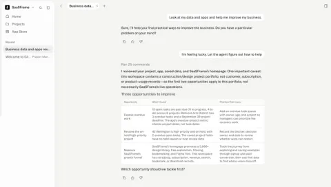
In a conversation, every assistant message can be copied, rated or regenerated on its own. Glide places copy, thumbs up and thumbs down directly under each assistant message, both under a one-line clarifying question and under a long analysis with a table. The controls start where the message text starts, so it is obvious which reply they belong to.
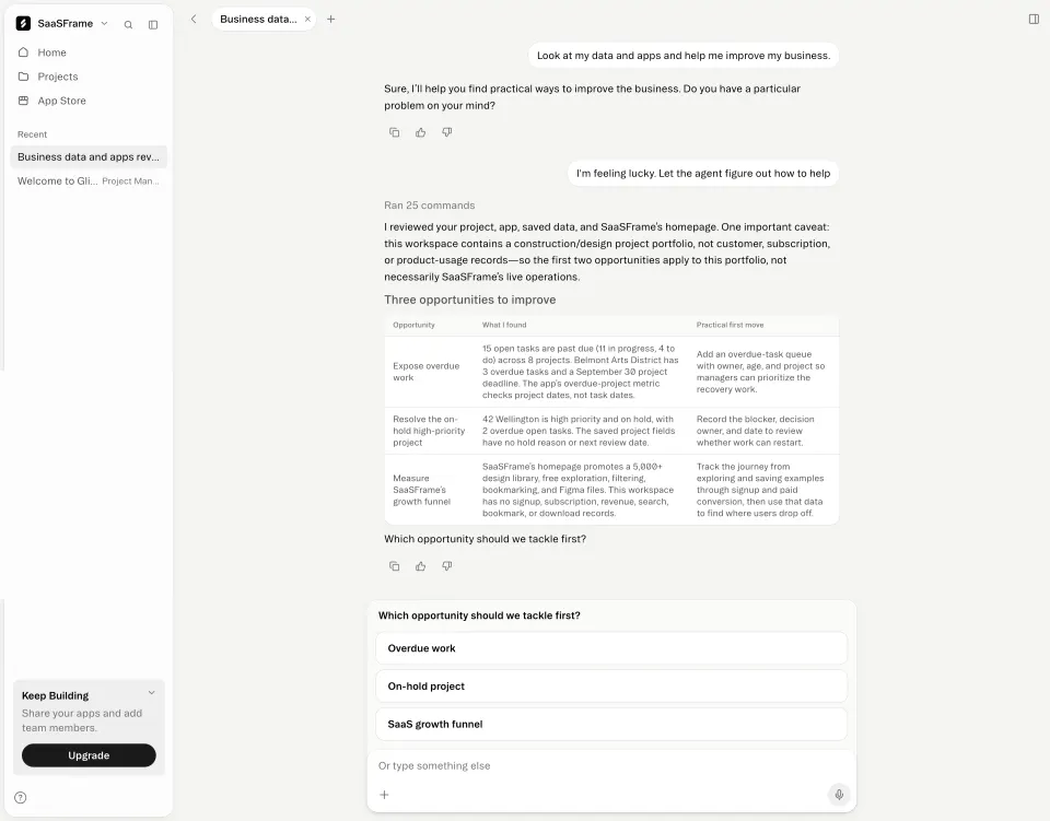
Avoid putting a single feedback row at the bottom of the conversation. People rate the answer they just read, and a shared control makes it impossible to tell which response the signal refers to.
Place the row after everything the response includes
Agent answers often include sources, tables and follow-up actions. Put the feedback row after the whole response, including its sources, so the rating covers what the person evaluated. Minerva's research answer ends with a numbered list of sources, each with its site, and only then shows a row of small icons including copy, thumbs up and regenerate.
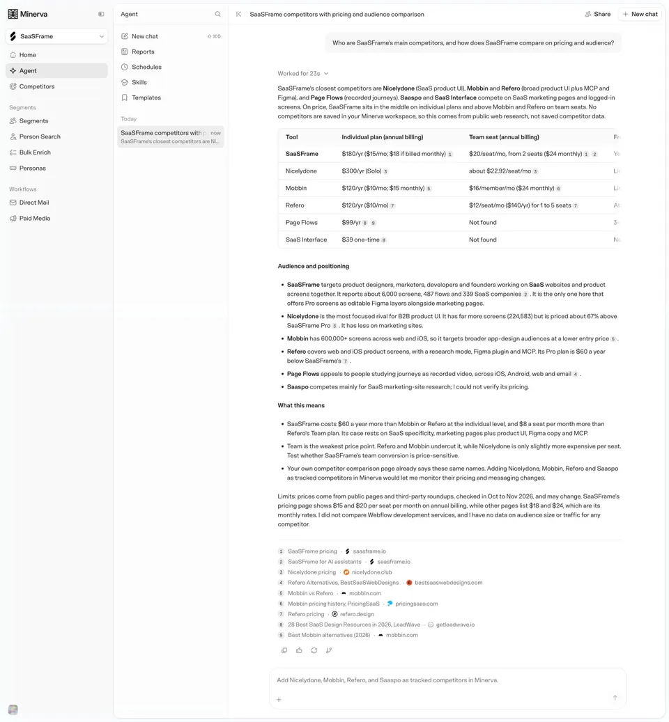
Copy needs care with rich answers. When a response contains a table, a list and citation markers, decide what the clipboard receives: Markdown, rich text or plain text, and whether source markers are kept. Test pasting into the tools your users actually use. A copy button that produces broken tables is worse than no button.
Ask a specific question when you ask for a rating
Thumbs are ambiguous on their own. Did the person dislike the tone, the facts, or the format? A short question tells people what you are measuring. Pangram's verdict card ends with Was this result helpful? followed by thumbs up, thumbs down and a dismiss button, and a separate link below: Incorrect result? Report it.
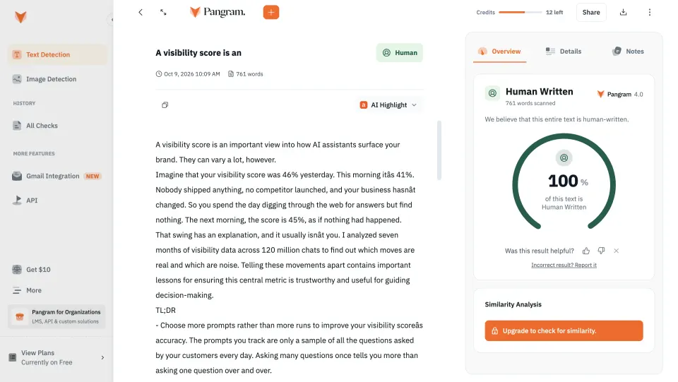
That separation is useful whenever the AI produces a judgement rather than prose. Helpful and correct are different signals. A report path lets people contest a result with details, while the thumbs capture a quick reaction without asking for effort.
Let people dismiss the question. A rating prompt that stays forever on every result becomes noise, and people learn to ignore it.
What should happen after a thumbs down?
Acknowledge the click immediately by showing the selected state. Then, optionally, offer a few reasons (inaccurate, not what I asked, too long, unsafe) and a free text field. Keep this follow-up skippable. Many people will only click once, and that click is still a signal.
Tell people what happens to their feedback. If the response and the conversation are sent for review, say so near the form. This matters most in products that handle private data, where people may hesitate to share a conversation with the vendor.
A negative rating can also lead somewhere useful for the person, not only for the team: a regenerate button, an option to rephrase, or a way to change the model.
Show versions and limits when people regenerate
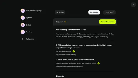
Regenerate replaces the output, so people need to know what they will lose and how many attempts they have. Meiro's quiz generator shows a bar above the preview with a 1st version label, a Regenerate button and a 25/25 left counter with an info icon. The primary action, Create full version, sits on the preview itself.
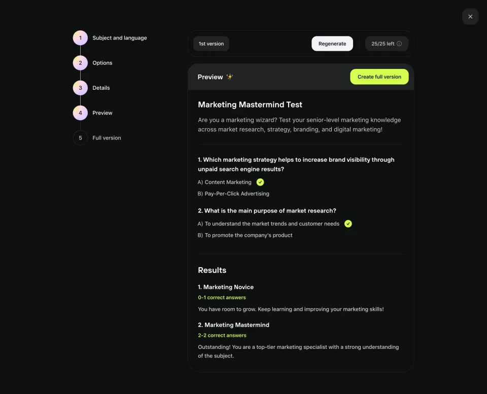
Keep earlier versions reachable when you can. Replacing a decent draft with a worse one, with no way back, makes people reluctant to regenerate at all. A version label, arrows between versions or a revision history all solve this.
Treat generated documents and media as objects
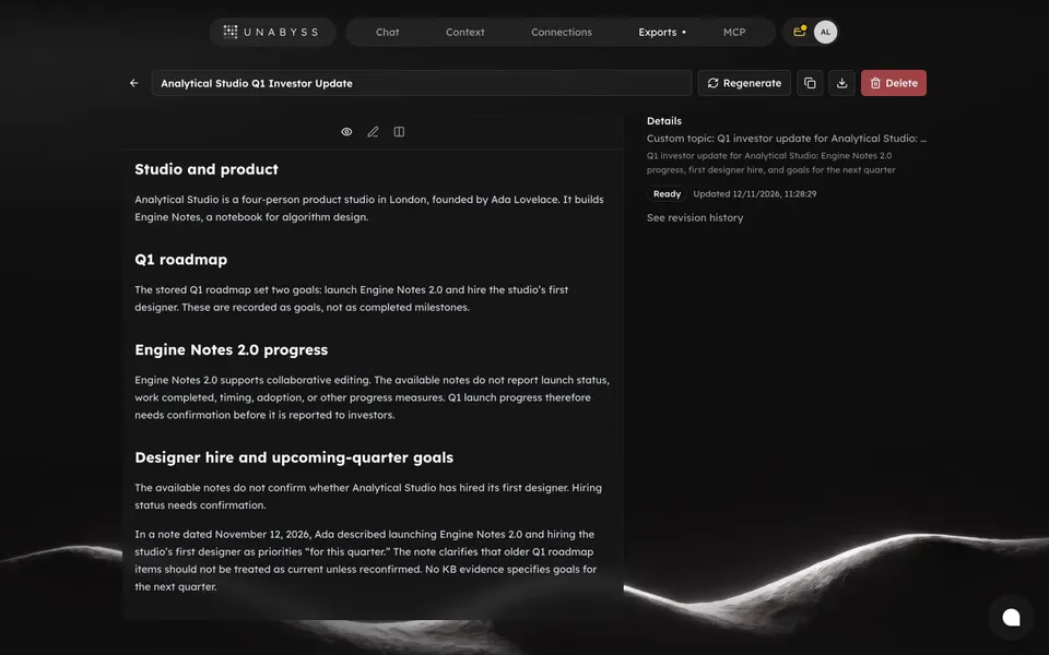
When the output is a document rather than a chat bubble, the feedback actions move to the object's header. Unabyss opens each export as a document with an editable title, then Regenerate, copy and download buttons and a red Delete button. A Details column shows the topic, a Ready status with the update time and a See revision history link.
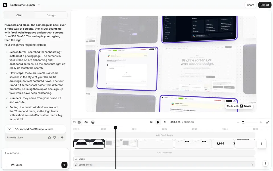
Generated media can be rated per version. Arcade's editor shows a version card in the chat, V1 with the video's title, followed by Rate this video and thumbs icons. Above it, the assistant explains its choices in a list headed Four things you might not expect, which gives people something concrete to react to before they rate.
Keep destructive actions apart
Regenerate and Delete both remove the current output, but people expect regenerate to be recoverable. Give delete a different colour, position or confirmation step, as Unabyss does with its red button at the end of the header. In a chat, a delete or clear action belongs in a menu rather than in the row of quick icons.
Make icon controls accessible
Feedback rows are usually icon-only, so each button needs an accessible name (Copy response, Good response, Bad response, Regenerate) and a tooltip for pointer users. Rating buttons should expose their pressed state. After copying, announce the result with a brief Copied message rather than relying on an icon change alone. Keep the row reachable by keyboard in reading order, right after the response.
If the row only appears on hover, make sure it also appears on focus and remains visible on touch devices, where there is no hover.
How do you measure whether feedback controls work?
Look at usage relative to responses, not raw counts. Track copy rate as a sign that answers are useful, regenerate rate as a sign they are not, and the share of ratings that come with a reason. Read the reasons: they are often more useful than the ratio of thumbs.
AI feedback review checklist
- Is each control attached to one specific response or object?
- Does the row come after sources and other parts of the response?
- Does copy produce clean output in the tools people paste into?
- Does the rating ask a specific question, and can people dismiss it?
- Is reporting a wrong result separate from a quick rating?
- Does a thumbs down lead to an optional reason and a useful next action?
- Are versions and remaining regenerations visible?
- Can people get back to an earlier version?
- Is delete clearly separated from regenerate?
- Do icon buttons have names, tooltips, pressed states and keyboard access?
AI feedback FAQ
Should every AI response have thumbs up and down?
Rating is useful when you will act on the signal. If you show it, attach it to each response and keep it quiet. For judgements such as scores or classifications, add a separate way to report a wrong result.
Where should the regenerate button go?
With the response it replaces. For documents and media, put it in the object header next to a version label so people know which draft they are replacing.
Should feedback controls always be visible?
On the latest response, yes. On older messages they can appear on hover or focus, as long as they stay reachable on touch screens and by keyboard.
What should copy include for answers with sources?
Decide deliberately and test it. Many products copy the text with its formatting and either keep source links at the end or drop inline markers that would be meaningless out of context.
Related patterns
See AI Chat for the conversation these controls live in, Copy to Clipboard for copy feedback, Feedback for broader feedback forms, Citations & Sources for the source lists that often precede the row and AI Generation State for what people see before the response is ready.