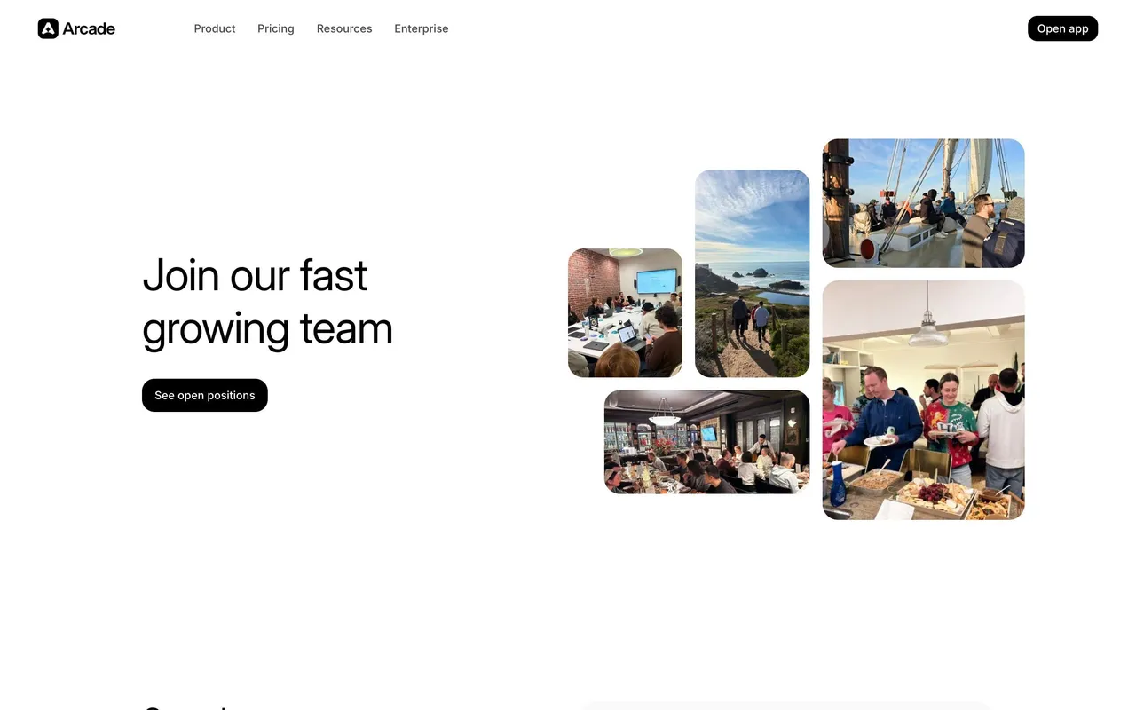
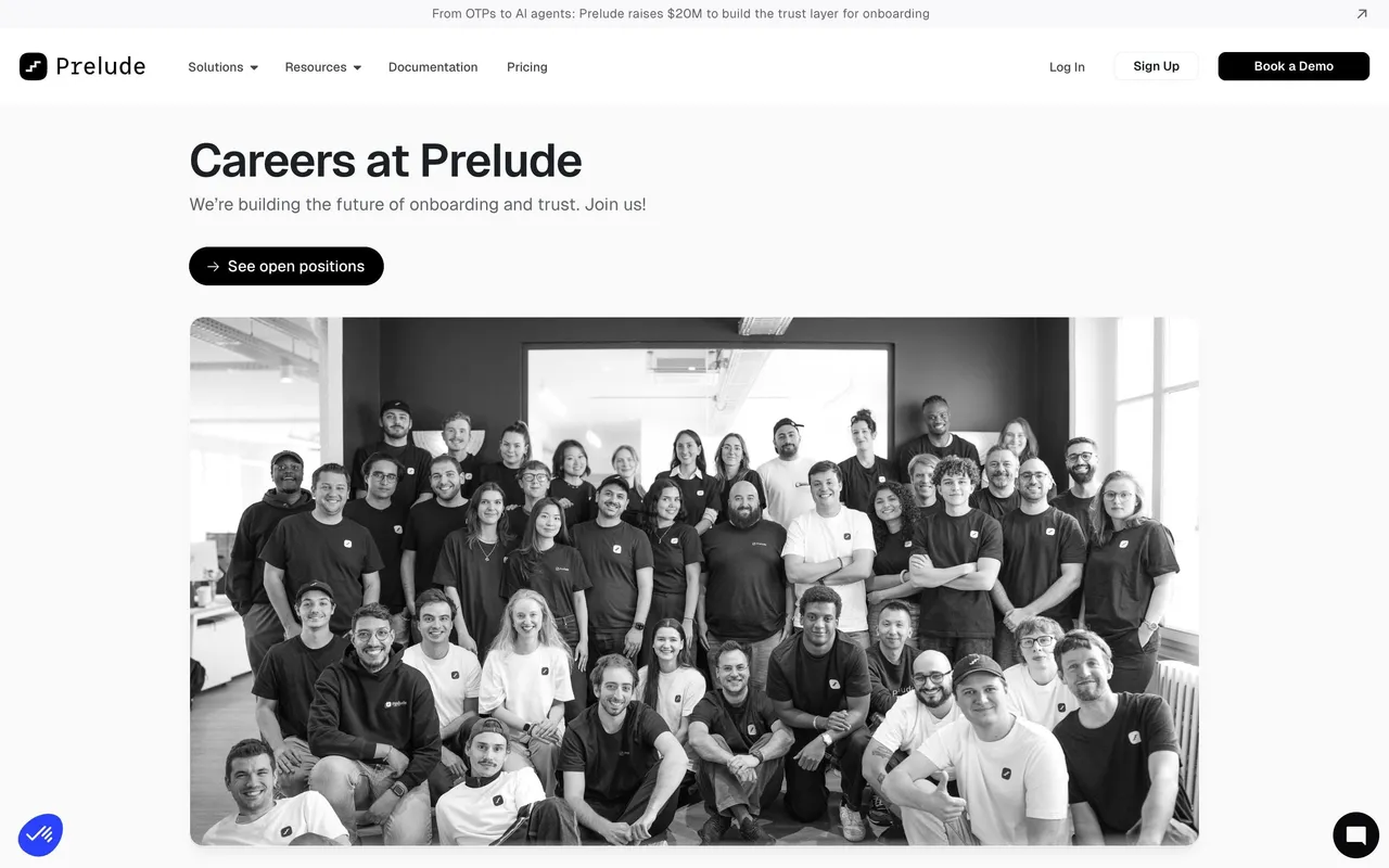
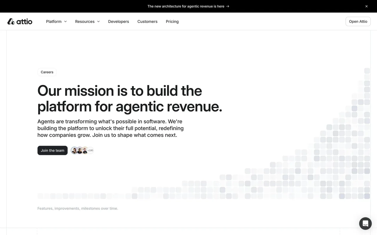
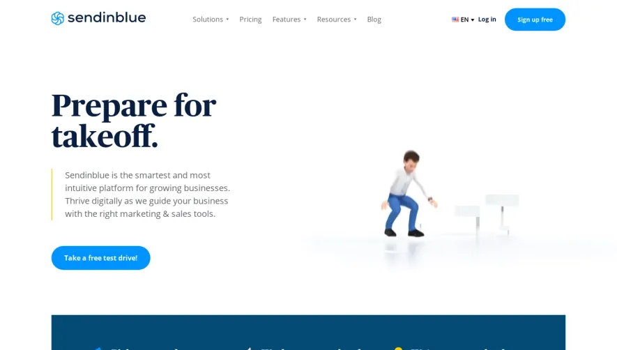
First thing you notice is the 3D floating letters in the hero. They're scattered like wooden blocks, giving a playful, tactile feel to what could've been a boring careers page. The founder photo casually placed next to the "Join our team!" heading adds a human touch right away. Warm peach and navy palette keeps things grounded.
Clean Grid, Zero Confusion
The opportunities section uses a simple card grid with soft borders and muted backgrounds. Each department gets its own box with position counts. Nothing fancy, just functional. The "Meet the People" section below breaks up the corporate feel with real employee photos in a loose mosaic layout. Smart move.
Values Without the Cringe
The values section uses numbered blocks with hand-drawn style connectors between them. It feels intentional without being over-designed. Typography is consistent throughout, likely a geometric sans serif, keeping readability high.
Stats That Stick
Bottom stats row ($163M, 600+, 50+) in bold navy type on a warm background creates a strong visual anchor before the final CTA. The whole page flows like a story, not a job listing.
 SaaSFrame