Prompt 1,136 words Copy
# Design from Reference: Proof Pricing Page

Create an original, high-fidelity visual design inspired by the reference. Prioritize composition, typography, colors, spacing, and component styling over technical implementation.

## Reference

- **Product:** Proof
- **Category:** Pricing Page
- **Screenshot:** attached to this message (also available at https://media.saasframe.io/o/cb445b4a367770754f27.bin)
- **Source:** https://useproof.com/pricing

Analyze the attached screenshot first. If no image is attached, open the screenshot link; if neither is accessible, ask for it rather than guessing.

## Visual Design Context

### Overall aesthetic
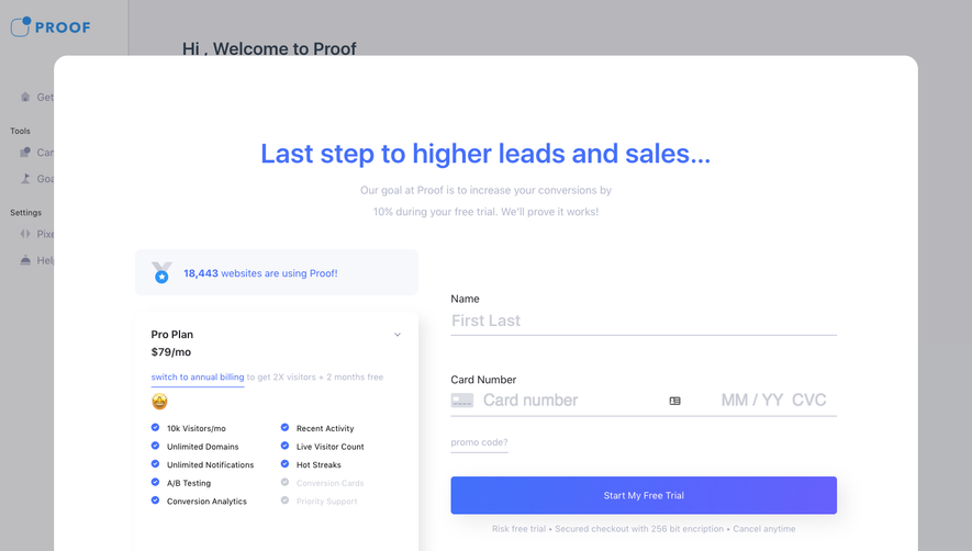
- **Character:** A conversion-oriented pricing page with a deep navy opening, electric-blue actions, hot-pink usage selection and a very long white customer-review section.
- **Trust treatment:** Video testimonials, review-service badges, portraits and repeated star ratings dominate the page after the pricing module.

### Page composition
- **Capture:** The source measures 1440 × 17726 image pixels. All thirteen readable portions were inspected. A 1× CSS scale is plausible but unverified.
- **Opening:** A centered navigation header leads into a trial heading, monthly-visitor slider and a two-column pricing card overlapping the navy hero's lower boundary.
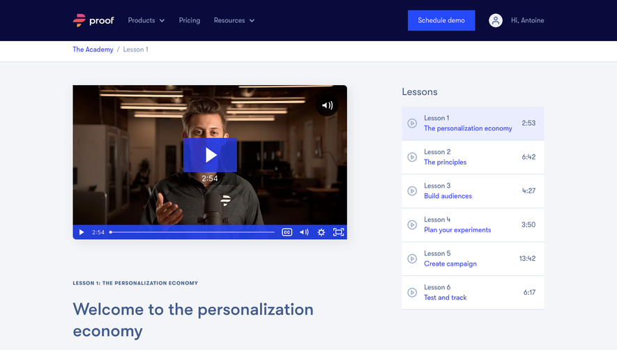
- **Testimonial lead:** A wide centered video and large quotation sit beneath the pricing card on a pale-to-white area.
- **Review region:** A heading and three review-service rating graphics precede a long two-column grid of outlined testimonial cards.
- **Footer:** A deep navy footer contains brand positioning, four link columns, a lower rule, social icons and legal links.

### Information hierarchy
- **Pricing sequence:** Trial proposition, visitor allowance, billing-period toggle, plan title, price and trial action form the decision path.
- **Plan details:** A right-hand checklist summarizes included capabilities while the left side contains the plan and action.
- **Social proof:** The large video quote introduces the review section, followed by service ratings and many individual text/video testimonials.
- **Card hierarchy:** Portrait/name/company information leads each review; a star row, when present, precedes the testimonial text.

### Typography
- **Family:** A rounded geometric sans serif is used; the exact font is unverified.
- **Major headings:** The hero title is around 48 image pixels, semibold; the large quote and review heading are roughly 38–40 pixels with generous line height.
- **Plan roles:** Plan name is around 30 pixels; price is approximately 46 pixels with a much smaller billing suffix.
- **Body and reviews:** Supporting copy, checklist and review text are about 16 pixels with 24-pixel line height. Reviewer names are bold at a similar size; company lines are lighter.

### Colors & surfaces
- **Measured palette:** ICC-aware sRGB sampling yields white #FFFFFF, deep navy #08083E, pale panel gray #F4F5F9 and very light #FAFBFD.
- **Semantic accents:** Electric blue identifies trial actions and star tiles, hot pink identifies the visitor slider and its callouts, and teal circles mark included features.
- **Review surface:** White cards have fine pale blue borders, roughly 12-pixel corner radii and minimal shadow.
- **Pricing elevation:** The white pricing module has a more noticeable diffuse shadow and a slightly tinted right half.

### Components
- **Usage slider:** A wide horizontal track includes a pink thumb, floating current-allowance label, an instructional callout and scale labels beneath.
- **Billing switch:** Annual and Monthly form a compact segmented control, with Monthly visibly selected by a blue-tinted state.
- **Plan card:** Approximately 800 image pixels wide, divided into equal halves, with generous 32-pixel inner padding. The captured price is $79/month at the shown allowance; this is screenshot content, not a verified current offer.
- **Checklist:** Nine teal check-circle rows align beneath a short heading, with consistent vertical spacing.
- **Review cards:** Two roughly 534-pixel columns use around 24 pixels of padding and 32-pixel gaps. Variable-length text determines row height, leaving substantial whitespace in shorter neighboring cards.
- **Media:** Several cards contain landscape video previews with central play overlays and blue control bars; playback is not verified from the image.

### Visual rhythm
- **Opening contrast:** The dark hero and bright slider lead into the white pricing card, then a spacious video/quote interlude.
- **Review repetition:** Repeated portraits, star rows, rounded outlines and paired columns create a long continuous cadence.
- **Spacing:** Review cards use comfortable 24-pixel body line spacing; the page maintains broad side margins around an approximately 1100-pixel review container.
- **Closing:** The final grid ends with an unpaired left card before the full-width navy footer.

### Responsive
- **Recommendation:** Stack plan information above its checklist, and ensure the slider remains keyboard-accessible with readable allowance labels.
- **Recommendation:** Convert reviews to one column, scale videos proportionally and allow long company labels to wrap.
- **Recommendation:** Collapse navigation and footer link groups on phones. Only the desktop capture is evidenced.

### Adaptation guidance
- **Preserve:** Keep the clear usage-to-price relationship, distinct selected billing state and consistent review-card structure.
- **Content integrity:** Treat prices, ratings and testimonial claims as historical captured content rather than current verified facts.
- **Build:** Reuse one review component supporting optional portrait, rating and video; allow natural content height without clipping.
- **Readability:** Maintain contrast for muted blue text, provide numeric equivalents for star ratings and avoid letting an extended review grid obscure the primary pricing decision.

## Content

**Instructions:**

Generate realistic example content that fits the selected design reference.

Create appropriate headlines, descriptions, labels, buttons, and supporting copy based on the type of interface being designed.

If a product or business description is provided, use it to guide the content.

Otherwise, invent a plausible fictional SaaS product appropriate for the reference.

Keep the content concise, coherent, and visually balanced.

Do not present fictional statistics, customer names, or testimonials as verified facts.

## Design Direction

**Instructions:**

Use the reference screenshot as the main source of visual inspiration rather than a strict layout template.

Preserve its most distinctive design characteristics, such as typography, visual rhythm, color relationships, component treatments, and overall aesthetic.

Feel free to modify section arrangements, proportions, spacing, and individual components to better suit my content.

Introduce original design decisions where they improve usability, composition, or brand consistency.

The result should clearly reflect the reference's visual language without looking like a direct reproduction.

Follow the visual identity of the reference design.

Use its typography, color palette, component styling, and overall aesthetic as the primary design direction.

Do not introduce an unrelated visual identity.

## Output

**Instructions:**

Generate a high-fidelity visual mockup of the requested interface.

Present the design as a polished, realistic website or product UI screenshot.

Prioritize visual composition, typography, spacing, colors, alignment, and component details.

Use the available image-generation or visual-design capabilities.

Do not replace the mockup with source code, a written design specification, or a textual description.

If direct visual generation is unavailable, clearly explain the limitation.

## Constraints

- Use the actual screenshot as the primary visual reference.
- Preserve essential messaging and factual accuracy.
- Prioritize visual quality and consistency.
- Do not invent unsupported product claims.
- Adapt structure and copy length for visual balance.
Reference image Attach it to your message: assistants can’t open image links. Open in ChatGPT ↗ Open in Claude ↗
Build it in Lovable ↗ v0 ↗ Figma Make ↗
Opening a tool copies the screenshot so you can paste it with your prompt.
 SaaSFrame