Generate a new design based on this screen, using your own content.
Preview the prompt
# Design from Reference: Alloy Demo Request

Create an original, high-fidelity visual design inspired by the reference. Prioritize composition, typography, colors, spacing and component styling over technical implementation.

## Reference

- **Product:** Alloy
- **Category:** Demo Request
- **Screenshot:** https://media.saasframe.io/v/4775566076c752e32cc3-1600.webp

Analyze the screenshot first. If you can’t access it, ask me for it rather than guessing.

## Content

Write realistic placeholder content for a fictional SaaS product in the same category (no lorem ipsum).

Preserve essential messaging and factual accuracy. Adapt structure and copy length for visual balance; never invent product claims.

## Visual design

Use this context to reproduce the reference’s visual language: layout, typography, colors, spacing, borders, radii and distinctive elements. The screenshot takes priority if descriptions conflict.

### Overall aesthetic
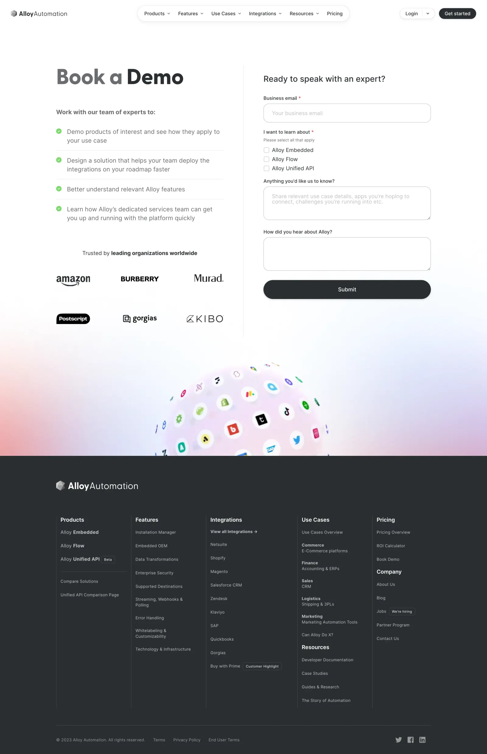
- **Character:** Clean white demo-request page with charcoal typography, subtle floating navigation pills and a dark expansive footer.
- **Visual accent:** Green checks support benefit statements; a pastel globe of integration logos supplies the main decorative color.
- **Scale:** The source measures 2880 × 4456 image px. Dimensions below estimate a 1440 × 2228 CSS layout at 2× scale; device ratio and zoom are unverified.

### Page composition
- **Header:** Brand left, centered rounded navigation capsule and compact login/get-started actions right.
- **Main split:** A two-column layout pairs a large demo heading, four benefits and six customer logos left with a lead form right. A fine vertical divider separates columns.
- **Form:** An expert-conversation heading precedes business email, three product-interest checkboxes, two textareas and a wide submit button.
- **Artwork:** A large integration-logo globe rises from a pastel pink/blue gradient near the bottom of the white section.
- **Footer:** A charcoal region contains the wordmark, five dense link columns with internal subgroups and a lower legal/social row.

### Information hierarchy
- **Proposition:** Book a Demo is the largest text, with the opening words lighter gray than Demo.
- **Benefits:** Four green check-led statements explain the meeting's purpose, separated by thin horizontal rules.
- **Trust:** A small heading and two rows of customer marks sit beneath the benefits.
- **Form scope:** Required email and product-interest labels carry red markers; optional narrative fields follow.
- **Action:** The wide charcoal Submit pill is primary. No submission or booking outcome is visible.

### Typography
- **Family:** Rounded neutral sans-serif; exact identity is unverified.
- **Heading:** Approximately 60–64 CSS px, bold, with tight tracking.
- **Form heading:** About 25–27 px, medium weight.
- **Body:** Approximately 18–19 px with 26 px leading in muted gray.
- **Labels:** Around 14 px; helper text smaller at about 12 px. Footer links are compact, around 12–13 px.
- **Hierarchy:** Bold dark phrases punctuate lighter text without additional colored headings.

### Colors & surfaces
- **Measured base:** ICC-aware sRGB sampling yields #FFFFFF for main content and #2A2E32 for the footer/dark treatment.
- **Measured neutral:** #6B6C6F appears in muted text/details.
- **Accents:** Green check circles and red required markers are localized functional colors.
- **Artwork:** Pale blue, pink and violet gradients surround the integration globe, with multicolor logos inside.
- **Depth:** Navigation capsule and submit button have soft shadows; form controls use fine gray outlines.

### Components
- **Navigation capsule:** A long white rounded pill groups menu labels/chevrons with a faint border and shadow.
- **Benefit rows:** Green circular checks precede short paragraphs, with light rules between entries.
- **Trust grid:** Six dark customer logos form two balanced rows without enclosing cards.
- **Email input:** A wide rounded outlined single-line control has pale placeholder text.
- **Interest group:** Three unchecked square boxes stack under a required label and small multiple-selection helper.
- **Textareas:** Two wide rounded boxes provide narrative context and source attribution.
- **Submit:** Full-width dark pill with white centered caption and subtle shadow.
- **Footer columns:** Thin vertical rules organize dense link groups; small outlined badges mark selected destinations.

### Visual rhythm
- **Container:** Main content sits within roughly 1110 CSS px centered width.
- **Column spacing:** Large inner gutters and a fine divider distinguish benefits from form.
- **Form cadence:** Labels sit close to controls; groups have larger vertical gaps.
- **Transition:** The partial globe and soft gradient bridge white content into the dark footer.
- **Footer density:** Compact text and many rows contrast with the spacious main split.

### Responsive
- **Evidence limit:** Only desktop is shown; recommendations follow.
- **Header:** Collapse the navigation capsule and retain a clear account/demo path.
- **Columns:** Stack benefits/trust above the form, removing the vertical divider.
- **Form:** Keep controls fluid and checkbox labels comfortably touchable.
- **Footer:** Wrap link groups and simplify/crop the decorative globe.

### Adaptation guidance
- **Reusable pattern:** Pair meeting outcomes and trust marks with a concise product-interest form.
- **Visual discipline:** Use neutral controls, one dark primary action and limited functional color.
- **Form clarity:** Keep required markers and multiple-selection guidance explicit, with accessible validation.
- **Accessibility:** Associate labels/groups correctly and provide focus styles and meaningful logo alternatives.

## Direction

Keep the reference’s visual language (type, color, spacing, radii) but adapt the layout freely to the content.

## Output

Produce a high-fidelity static visual mockup of the full screen.

Deliver a polished, cohesive design with precise alignment, hierarchy and spacing. Produce the requested visual artifact, not just a description. If unsupported, explain the limitation.
 SaaSFrame