SaaSFrame
SaaS Onboarding UX: 12 Real Examples and Patterns
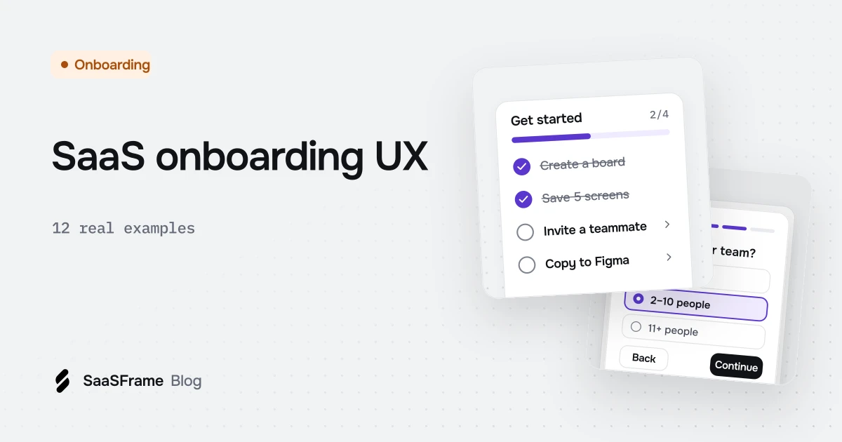
Good SaaS onboarding asks only the questions that change the next screen, splits setup into short named steps, shows a real result built from the user's own data before setup ends and closes with a checklist of concrete actions. Dust, Cal.com, Profound, Hyperline and Dub each show one of these steps done well.
- Ask only the onboarding questions whose answers change what the product shows next.
- Split workspace setup into short, named steps and say how many remain, as Cal.com does with "Step 2 of 5".
- Offer templates or sample data so new users never start from an empty product.
- Show a real result built from the user's own input before onboarding ends.
- Make onboarding checklists actionable: one button per task, required steps marked, and a way to dismiss the list.
Onboarding is the stretch between a new account and the first moment the product does something useful for you. Most SaaS products fill that stretch with the same handful of screens: a question or two, a workspace, a connection, a checklist and a finish line.
As of November 2026, SaaSFrame holds 1,026 onboarding screens (welcome screens, account setup and user onboarding) from 188 SaaS products. The 12 examples below are taken from that set, one per product, in the order a new user meets them.
What does a good SaaS onboarding flow look like?
A good onboarding flow asks only what changes the next screen, gets the user to a real result quickly and shows how much is left. The best flows treat setup as a short path to value, not a form to complete.
Progress is the most common device in the set: 32% of the onboarding screens in the library (332 of 1,026, from 70 products) carry a progress indicator, and 123 screens from 31 products are built as a multi-step wizard. Checklists are rarer than their reputation suggests: only 18 screens from 11 products use an onboarding checklist.
The examples group into five jobs: learn about the user, set up the workspace, deliver value early, explain the product and track what's left.
Which questions should onboarding ask first?
Ask the questions whose answers change what the product shows next, and nothing else. Every question should either remove a later step or tailor the first screen the user lands on.
1. Dust: ask which tools you already use
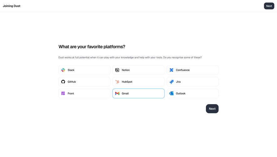
The question is framed around what you already work with, and the copy explains why it matters: Dust "works at full potential when it can play with your knowledge and help with your tools." Recognizable logos make the answer faster than any free-text field.
2. EigenPal: one field, everything else later
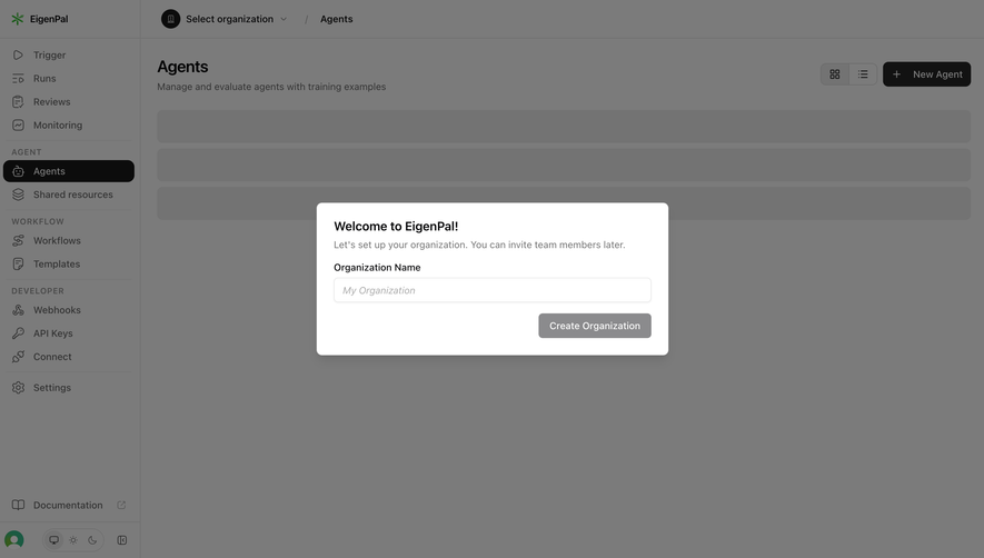
The modal sits over the real Agents page, so the product is visible behind it from the first second. Deferring invitations in plain words removes the most common reason people stall on a workspace step.
How do you set up a workspace without losing people?
Split setup into short, named steps, offer a starting point instead of a blank canvas and make optional steps skippable. Each step should produce something the user will see again.
3. Cal.com: connections as a single list of buttons
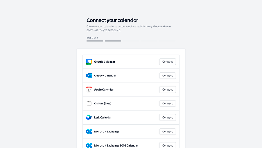
The subtitle states the benefit of connecting (automatic busy-time checks) before showing the providers. A segmented bar labeled "Step 2 of 5" tells you exactly how much setup remains. In the library, 28 onboarding screens from 17 products ask users to connect a third-party tool this way; our integration UX examples cover what happens after the click.
4. Glide: start from a template, not a blank app
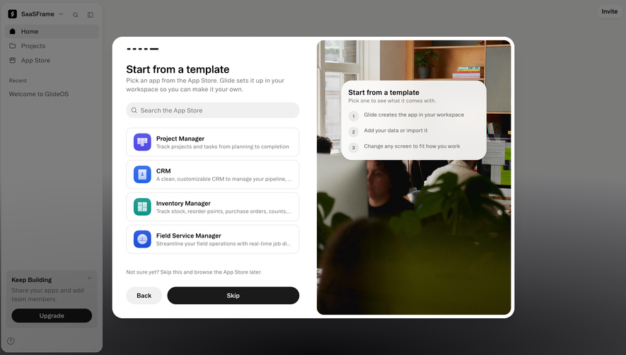
The side card answers "what happens if I pick one?" before you commit: Glide creates the app, you add or import data, then you change any screen. "Not sure yet? Skip this and browse the App Store later" keeps the step optional.
5. Rankfender: let AI fill the setup form
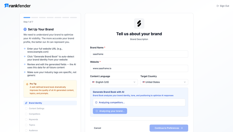
Instead of asking for a long brand description, the product drafts it from a URL and asks you to review it. The left panel lists the stages ahead (Brand Identity, Content Settings, Competitors, Keywords, Topics, Audience) and a "Pro tip" explains why the step matters.
How do you show value before onboarding ends?
Show a real result built from the user's own input as early as possible, even a partial one. A first result is a stronger reason to finish setup than any progress bar.
6. Profound: a ranking before the dashboard
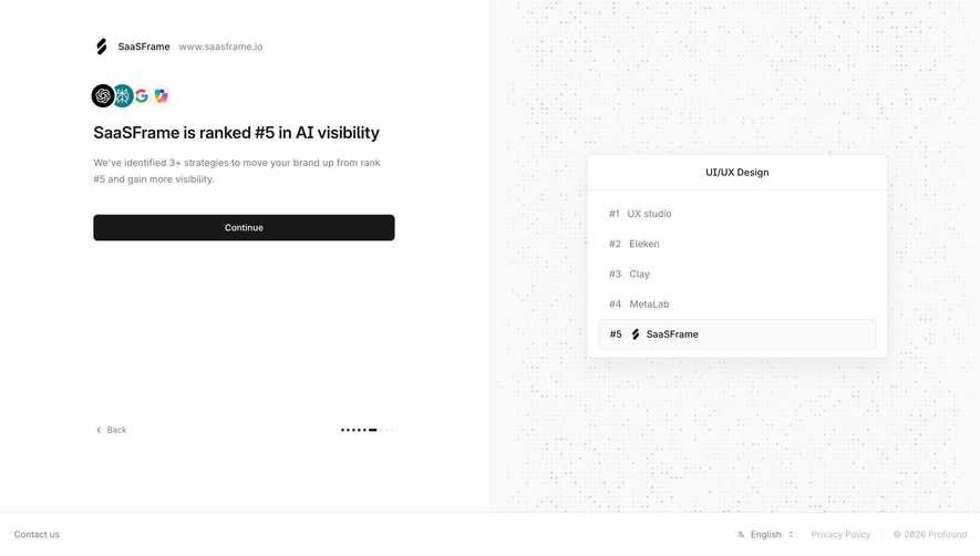
The result is specific to the account and comes with a promise ("We've identified 3+ strategies to move your brand up") that only the finished setup can deliver. The dotted progress marker at the bottom shows this is still onboarding.
7. Intercom: try it with someone else's content
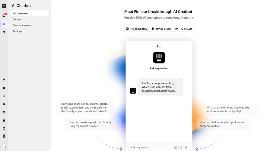
Sample content lets people judge the product before they have connected anything of their own. The suggested questions float around the widget so the first message is one click away.
8. Visitors: make the technical step verifiable
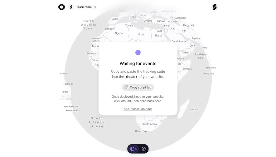
The card tells you exactly what to do next: deploy, click around on your website, then come back. The counter at the bottom of the map starts at 0, so you will see the moment installation works.
When should you use a product tour?
Use a tour to explain a concept users cannot guess from the interface, and keep it short. A few cards with a clear end beat a long sequence of tooltips; in the library only 20 screens from 5 products are tagged product tour.
9. Sandhill Markets: explain the rule, not the buttons
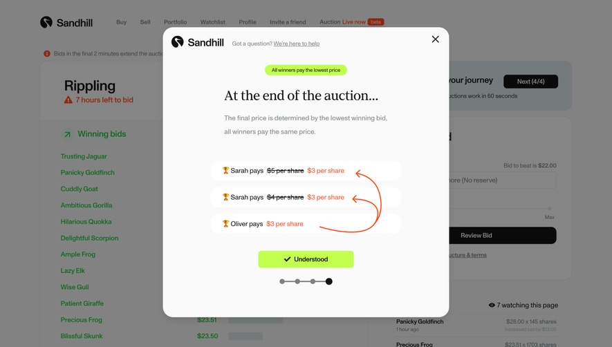
The modal teaches the one rule that makes the auction understandable, using three bidders and arrows instead of a paragraph. Four progress dots and an "Understood" button make the end obvious. Our guide to interactive product tours goes further.
Do onboarding checklists work?
Checklists work when each item is a real task with a direct action and the list shows what is required. They fail when they become a to-do list of features to explore.
10. Hyperline: mandatory steps and a time estimate
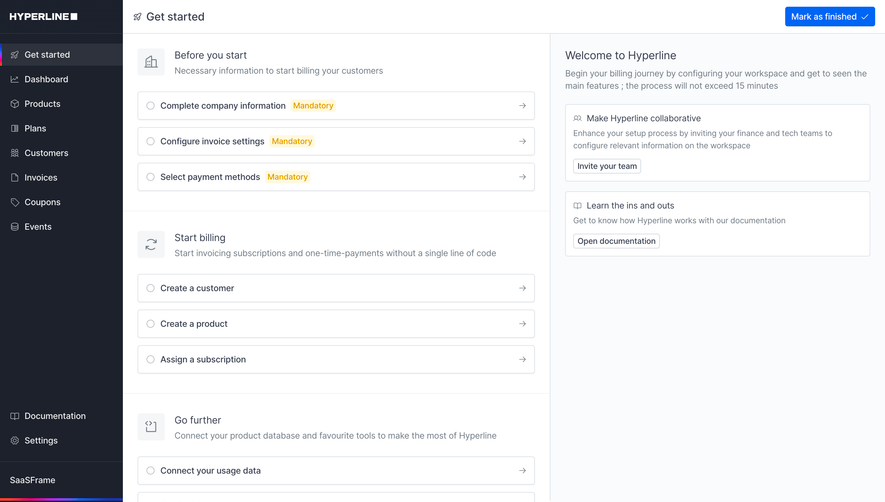
The welcome panel says the process "will not exceed 15 minutes", and a "Mark as finished" button lets experienced users dismiss the page. Grouping by outcome (billing customers) is clearer than a flat list of features.
11. Dub: celebrate, then hand over the checklist
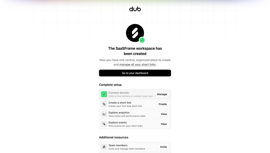
Each row has its own button (Manage, Create, View), so the checklist doubles as navigation. Starting with one item already done gives the list momentum, and team invitations sit apart under "Additional resources".
12. Context.dev: a finish line with the next step attached
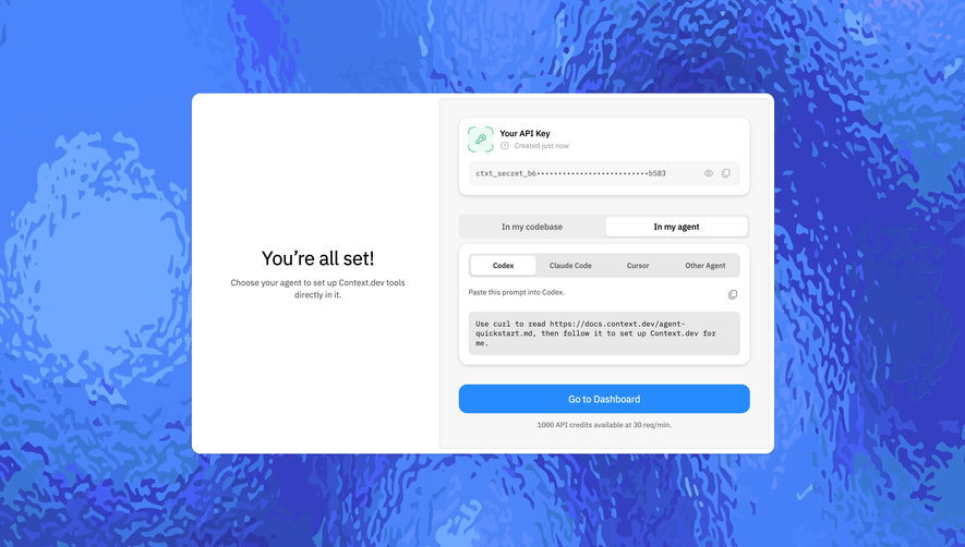
The completion screen does not just congratulate: it hands over the key and the exact instruction to use it. A note under "Go to Dashboard" states the free allowance (1,000 API credits at 30 requests per minute).
Which onboarding patterns come up most often?
Across the 12 examples, the same decisions repeat regardless of product category.
| Pattern | When to use it | Seen in |
|---|---|---|
| Tile or card choices | The answer changes the next screens | Dust, Glide |
| Named step counter | Setup has more than two steps | Cal.com, Rankfender |
| Sample data or templates | The product is empty until configured | Glide, Intercom |
| Early personal result | Value depends on the user's own data | Profound, Visitors |
| Short concept tour | One rule is not obvious from the UI | Sandhill Markets |
| Checklist with actions | Setup continues after the first session | Hyperline, Dub |
Rule of thumb If a question does not change the next screen, move it after the first result.
Signup is a separate problem with its own patterns: see our SaaS signup flow examples. For regulated products, fintech onboarding adds verification and security steps, and our empty state examples show what to put on the screens users land on next.
Frequently asked questions
What is SaaS onboarding?
SaaS onboarding is the sequence of screens between account creation and the first useful result: questions about the user, workspace setup, connections, first actions and guidance. It ends when the user has done the thing they signed up for, not when the forms are filled.
How many steps should a SaaS onboarding flow have?
As few as the product needs to produce a first result, often three to five. Cal.com uses five named steps and Unkey three; whatever the number, show it and let users skip optional steps.
What questions should you ask during onboarding?
Ask questions that change the next screens, such as the tools a user already works with or their role. Move everything else, like company size for analytics, after the first result or into settings.
Are product tours still worth building?
Short tours are worth it when one concept is not obvious from the interface, like Sandhill Markets explaining its auction pricing in four cards. Long tooltip sequences that point at buttons are usually skipped.
What should an onboarding checklist include?
Three to six real tasks, each with a direct action button, required tasks marked as such and at least one item already completed. Hyperline adds a time estimate and a way to mark the whole list as finished.
How do you measure onboarding success?
Track the share of new accounts that reach the first meaningful result and how long it takes, rather than the share that completes every setup step. Look at where users stop in the flow to find the step to shorten or defer.
 Onboarding Checklist19 examples
 Wizard143 examples
 Progress Indicator500 examples
 Product Tour20 examples