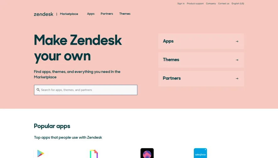
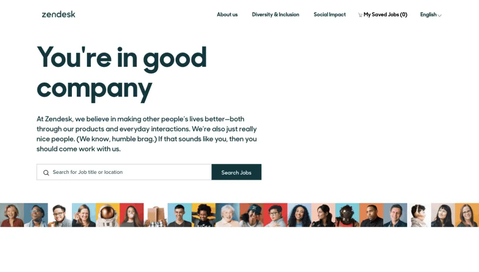
Generate a new design based on this screen, using your own content.
Preview the prompt
# Design from Reference: Zendesk Webinars Page

Create an original, high-fidelity visual design inspired by the reference. Prioritize composition, typography, colors, spacing and component styling over technical implementation.

## Reference

- **Product:** Zendesk
- **Category:** Webinars Page
- **Screenshot:** https://media.saasframe.io/o/9f7b30f838164b998e85.webp

Analyze the screenshot first. If you can’t access it, ask me for it rather than guessing.

## Content

**Instructions:**

Generate realistic example content that fits the selected design reference.

Create appropriate headlines, descriptions, labels, buttons, and supporting copy based on the type of interface being designed.

If a product or business description is provided, use it to guide the content.

Otherwise, invent a plausible fictional SaaS product appropriate for the reference.

Keep the content concise, coherent, and visually balanced.

Do not present fictional statistics, customer names, or testimonials as verified facts.

Preserve essential messaging and factual accuracy. Adapt structure and copy length for visual balance; never invent product claims.

## Visual design

Use this context to reproduce the reference’s visual language: layout, typography, colors, spacing, borders, radii and distinctive elements. The screenshot takes priority if descriptions conflict.

### Overall aesthetic

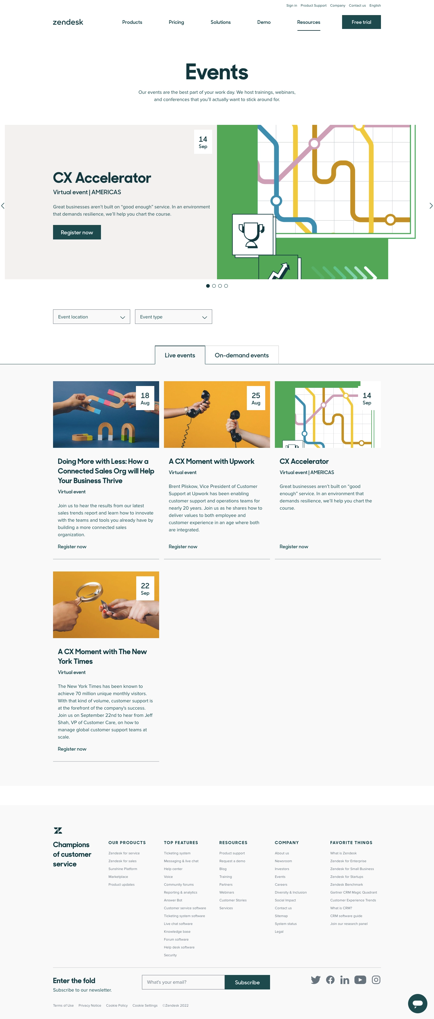
- **Style:** A clean events directory with dark-teal type, a large illustrated featured-event carousel, simple filters, and an unboxed card grid.
- **Character:** Editorial and approachable, using colorful event artwork to enliven a restrained white/near-white framework.

### Page composition

- **Capture and scale:** The screenshot is 1440 × 3379 pixels. Following dimensions are approximate screenshot pixels; CSS scale is unverified.
- **Header and intro:** A centered global navigation header includes a small utility row and dark-teal trial button. A large centered Events title and two-line introduction lead into the featured area.
- **Featured event:** A near-full-width split banner pairs warm-gray text/date/action content left with colorful graphic artwork right. Side arrows and four pagination dots indicate carousel controls.
- **Directory:** Two outlined dropdowns for location and event type precede centered Live events/On-demand events tabs. A pale listing region holds three cards across the first row and one card on the next.
- **Footer:** A broad pale footer contains a brand statement, five link columns, newsletter input/action, social icons, legal links, and a circular chat control.

### Information hierarchy

- **Primary focus:** The centered page title introduces the collection, while the featured event gets a large title, short description, date badge, and filled registration action.
- **Browsing:** Filters and tabs provide two levels of browsing before the event grid.
- **Card order:** Each event stacks landscape artwork/date badge, title, event format, description, and a registration text link.

### Typography

- **Family:** A rounded geometric sans serif is visible in headings, with a readable sans serif body; exact families are unverified.
- **Headings:** The page title is approximately 68–72 px bold; featured title around 46–48 px; card titles approximately 24 px bold with 31 px line-height.
- **Body:** Descriptions and controls are about 16 px with 24 px line-height. Event format labels use medium weight.
- **Footer:** Uppercase group labels are around 13 px with positive tracking; link text is smaller, approximately 11–12 px.

### Colors & surfaces

- **Foundation:** Sampled sRGB #FFFFFF, #F9F9F9, and warm pale gray #F3F1EF define the header, listing/footer areas, and featured copy panel.
- **Artwork accent:** Sampled green #53A756 and #53A758 form the featured illustration's green field. Yellow, muted pink, and blue linework are localized to event images.
- **Brand ink:** Dark teal anchors headings, text, registration controls, and selected tab borders. Exact teal hex value is unverified.
- **Boundaries:** Fine gray lines distinguish dropdowns, tab edges, card bottoms, and the footer newsletter row.

### Components

- **Featured banner:** A roughly 510 px-tall split composition uses square corners. The date is a small white rectangle near the split; the image depicts colored route-like lines and trophy/growth motifs.
- **Filters and tabs:** Dropdowns are approximately 255 × 48 px with thin borders and right chevrons. Tabs have outlined rectangular edges, with the active tab visually connected to the listing region.
- **Event cards:** Three approximately 350 px-wide unboxed cards use equal-ratio landscape images and white date badges at top right. Thin bottom rules close each card; no heavy shadow or enclosing border is visible.
- **Footer utilities:** The newsletter input and filled Subscribe action share a single horizontal row, with social icons beside them. A dark-teal circular chat button sits at lower right.

### Visual rhythm

- **Spacing:** Allow roughly 70–90 px around the intro/featured area and 70 px before filters. Grid gutters are compact, around 16–20 px.
- **Card rhythm:** Use approximately 26–32 px from image to title and 20–24 px between description and registration link. Keep first-row bottom rules aligned where possible.
- **Asymmetry:** The second row contains only one event, leaving open space rather than stretching it across the grid.

### Responsive

- **Observed state:** Only desktop is shown; alternate carousel slides and tab contents are not visible.
- **Recommended reflow:** Stack featured artwork and copy, wrap the two filters, and reduce the event grid to two then one column.
- **Navigation:** Keep carousel arrows/dots accessible and allow long titles to wrap naturally. Stack footer groups and newsletter controls on narrow screens.

### Adaptation guidance

- **Preserve:** Retain the featured-event split, visible dates, filter/tab sequence, artwork-led event grid, and dark-teal typography.
- **Adapt:** Use real event titles, dates, formats, descriptions, and registration destinations. Keep imagery specific to each event.
- **Avoid:** Do not infer unseen on-demand content or use reference event claims. The record title mentions webinars, but the visible page is a broader events directory.

## Direction

**Instructions:**

Use the reference screenshot as the main source of visual inspiration rather than a strict layout template.

Preserve its most distinctive design characteristics, such as typography, visual rhythm, color relationships, component treatments, and overall aesthetic.

Feel free to modify section arrangements, proportions, spacing, and individual components to better suit my content.

Introduce original design decisions where they improve usability, composition, or brand consistency.

The result should clearly reflect the reference's visual language without looking like a direct reproduction.

## Output

**Instructions:**

Generate a high-fidelity visual mockup of the requested interface.

Present the design as a polished, realistic website or product UI screenshot.

Prioritize visual composition, typography, spacing, colors, alignment, and component details.

Use the available image-generation or visual-design capabilities.

Do not replace the mockup with source code, a written design specification, or a textual description.

If direct visual generation is unavailable, clearly explain the limitation.

Deliver a polished, cohesive design with precise alignment, hierarchy and spacing. Produce the requested visual artifact, not just a description. If unsupported, explain the limitation.
 SaaSFrame