Prompt 1,110 words Copy
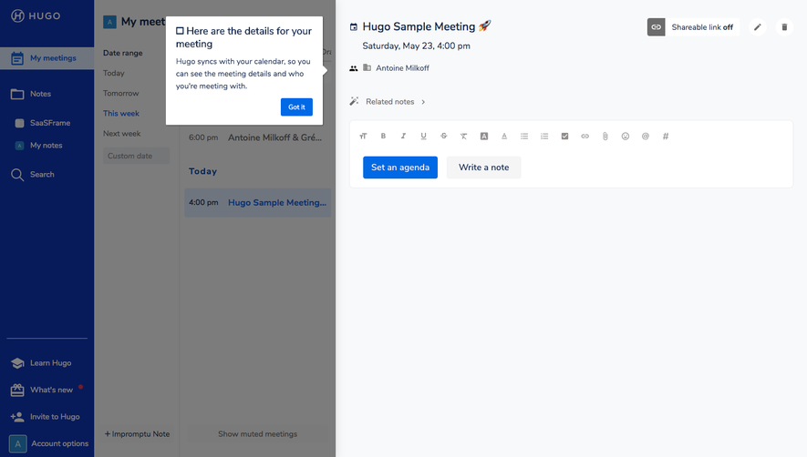
# Design from Reference: Hugo Meeting Agenda Templates

Create an original, high-fidelity visual design inspired by the reference. Prioritize composition, typography, colors, spacing, and component styling over technical implementation.

## Reference

- **Product:** Hugo
- **Category:** Templates Library
- **Screenshot:** attached to this message (also available at https://media.saasframe.io/o/c092693c5641a02202fd.webp)
- **Source:** https://www.hugo.team/meeting-templates

Analyze the attached screenshot first. If no image is attached, open the screenshot link; if neither is accessible, ask for it rather than guessing.

## Visual Design Context

### Overall aesthetic

- **Style:** A bright, editorial template directory with a developer-friendly SaaS structure, navy text, restrained blue calls to action, and colorful category icons.
- **Character:** The opening science-fiction portrait and small orbital decorations add personality; the long catalog remains largely unboxed and typographic.

### Page composition

- **Capture and scale:** The screenshot measures 1440 × 12759 pixels. Sizes below are approximate screenshot-pixel measurements; browser scale is unverified.
- **Header and hero:** A white horizontal header places the Hugo logo left and navigation, outlined login, and filled signup right. Below, a split hero pairs a large left-aligned title and subtitle with an irregular portrait cutout on the right.
- **Directory:** A narrow category column occupies roughly 240 px on the left; the wider right region uses three approximately 240 px columns with generous gutters. Ten successive category sections extend down the page.
- **Closing regions:** Two parallel conversion panels precede a centered FAQ, a pale curved video-demo section, paired pricing/signup actions, and a dark multicolumn footer.

### Information hierarchy

- **Primary focus:** The large free-template heading introduces the resource, followed by category navigation and repeated template titles.
- **Item hierarchy:** Each item progresses from a colored icon tile to a navy title, a compact description, and a green uppercase template link.
- **Secondary conversion:** The bottom download/custom-template choices and product demonstration shift the reader from browsing resources toward product adoption.

### Typography

- **Family:** A neutral sans serif with clear, rounded forms; the exact font is unverified.
- **Display and headings:** Estimate the hero at 48–52 px, weight 700, tight 1.1–1.2 line-height. Category and conversion headings are approximately 32–36 px; template titles approximately 20–22 px with 1.25 line-height.
- **Body and labels:** Descriptions are around 16 px with 24 px line-height. Navigation and uppercase action labels are about 14 px; action labels use modest positive tracking.
- **Alignment:** Text remains left aligned within directory items; FAQ and video introductions use centered headings.

### Colors & surfaces

- **Foundation:** Sampled sRGB colors include white #FFFFFF, deep navy #172B4D, and pale blue-gray surfaces #EDF1F4, #F8FAFB, and #F6F8FA.
- **Actions and footer:** Strong blue #0039B5 anchors the primary actions. The footer uses a dark navy treatment with white text.
- **Category accents:** Green, violet, orange, and cyan icon tiles distinguish template groups. Preserve their varied hues rather than applying one uniform accent; exact individual accent values are not verified.

### Components

- **Template items:** Use an approximately 80 × 80 px colored icon square with an estimated 8 px radius, white line icon, and vertically stacked copy. Items have no enclosing border or heavy shadow.
- **Buttons:** Primary and secondary actions are approximately 50–56 px tall with small, roughly 4 px corner radii, balanced horizontal padding, and filled-blue or outlined-blue treatments.
- **FAQ rows:** Seven collapsed rows use thin separators, bold navy questions, and a plus symbol aligned at the left. Expanded content is not shown.
- **Demo and footer:** A large product-window preview carries a circular blue play control. The footer combines brand copy, three link columns, an award badge, and a lower social/legal row.

### Visual rhythm

- **Grid cadence:** Repeated icon-title-description-link stacks create the main rhythm. Keep consistent column starts even where final rows contain empty cells.
- **Spacing:** Estimate 16–24 px between elements within an item, 40–60 px column gaps, and 80–110 px between major categories. Taller descriptions should not crowd adjacent rows.
- **Pacing:** The dense directory opens into broader conversion and video regions, then closes with the compact dark footer.

### Responsive

- **Observed state:** Only a desktop layout is visible; mobile behavior is not established by the capture.
- **Recommended reflow:** Collapse the three-column directory to two and then one column. Move category navigation above the results as a compact selector or wrapping link list.
- **Small-screen treatment:** Stack hero text and portrait, stack the two conversion panels, allow FAQ text to wrap, and use 20–24 px side padding. Keep action controls comfortably tappable.

### Adaptation guidance

- **Preserve:** Retain the category rail, unboxed icon-led directory, strong navy hierarchy, restrained blue conversion controls, and the distinct closing demo region.
- **Replace:** Use the new content's categories and authentic iconography. Vary catalog length and row count naturally without copying the reference's claims or template names.
- **Avoid:** Do not turn every item into a shadowed card or repeat the decorative portrait throughout the catalog; its prominence belongs to the opening hero.

## Content

**Instructions:**

Generate realistic example content that fits the selected design reference.

Create appropriate headlines, descriptions, labels, buttons, and supporting copy based on the type of interface being designed.

If a product or business description is provided, use it to guide the content.

Otherwise, invent a plausible fictional SaaS product appropriate for the reference.

Keep the content concise, coherent, and visually balanced.

Do not present fictional statistics, customer names, or testimonials as verified facts.

## Design Direction

**Instructions:**

Use the reference screenshot as the main source of visual inspiration rather than a strict layout template.

Preserve its most distinctive design characteristics, such as typography, visual rhythm, color relationships, component treatments, and overall aesthetic.

Feel free to modify section arrangements, proportions, spacing, and individual components to better suit my content.

Introduce original design decisions where they improve usability, composition, or brand consistency.

The result should clearly reflect the reference's visual language without looking like a direct reproduction.

Follow the visual identity of the reference design.

Use its typography, color palette, component styling, and overall aesthetic as the primary design direction.

Do not introduce an unrelated visual identity.

## Output

**Instructions:**

Generate a high-fidelity visual mockup of the requested interface.

Present the design as a polished, realistic website or product UI screenshot.

Prioritize visual composition, typography, spacing, colors, alignment, and component details.

Use the available image-generation or visual-design capabilities.

Do not replace the mockup with source code, a written design specification, or a textual description.

If direct visual generation is unavailable, clearly explain the limitation.

## Constraints

- Use the actual screenshot as the primary visual reference.
- Preserve essential messaging and factual accuracy.
- Prioritize visual quality and consistency.
- Do not invent unsupported product claims.
- Adapt structure and copy length for visual balance.
Reference image Attach it to your message: assistants can’t open image links. Open in ChatGPT ↗ Open in Claude ↗
Build it in Lovable ↗ v0 ↗ Figma Make ↗
Opening a tool copies the screenshot so you can paste it with your prompt.
 SaaSFrame