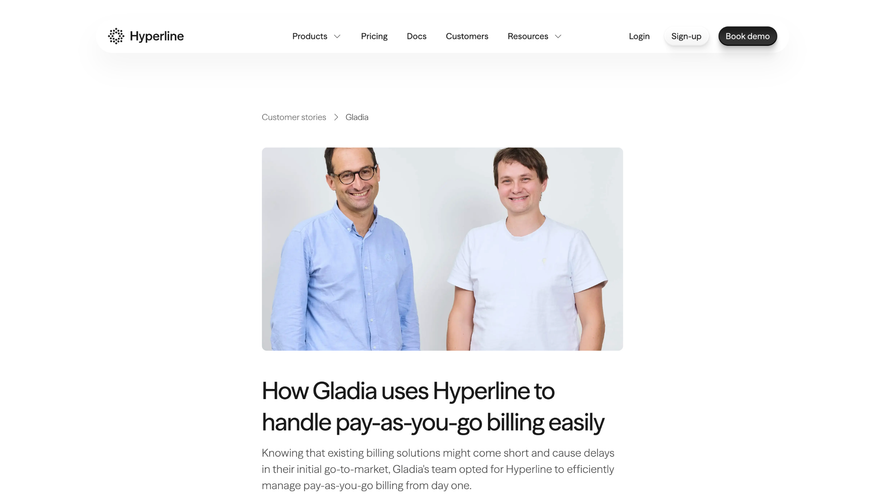
Overall Style and Aesthetic
Clearbit’s customers page delivers a polished, modern, and professional vibe, championing a minimalist approach that foregrounds content while subtly infusing color and brand identity. Wide margins, ample white space, and crisp lines keep the layout airy and approachable, putting focus on clarity and credibility. Layout and Structure
The page opens with a concise hero section that sets expectations with understated confidence. Below, customer stories are presented in a modular, grid-like system—each spotlighting a real company, logo, and succinct headline. Deeper dives into select case studies are interspersed, while a clearly defined footer anchors navigation, trust signals, and CTAs. Visual Elements
Photography of logos and customers adds authenticity and immediate recognition, while subtle motion effects (like hover states and gentle fades) enhance interactivity. There’s an intentional scarcity of playful illustrations—visuals instead remain practical and reputation-driven, emphasizing client trust and tangible results. Color Palette and Typography
The design leverages Clearbit’s signature blue for buttons and accents, complimented by monochrome backgrounds that spotlight client brands. Typography is sharp and readable, with large, bold headlines creating visual hierarchy above smaller, neutral body text. This clarity guides viewers naturally through stories and quotes. User Experience Patterns & Unique Choices
Streamlined navigation ensures users can access stories by industry or logo recognition. Prominent CTAs (“See the Impact”, “Get Started”) are impossible to miss but never intrusive. Notably, the selective use of recognizable customer logos and real outcomes, paired with restrained animation, invokes trust and authority—an exemplar of customer-focused design that balances engagement with professionalism.