SaaSFrame
How Intercom Designs Its Product UI: 46 Screens Studied
Intercom keeps its product consistent with two navigation levels: a fixed icon rail for modules and a grey sidebar for views. Black buttons mark primary actions, green is reserved for Set live, ⌘K opens every inbox action, workflow cards preview real messages, and dismissible education cards teach each module in place.
- Intercom separates modules and views: a fixed icon rail switches modules, and a grey sidebar lists the views inside each one.
- As of November 2026, 23 of the 46 Intercom product screens in SaaSFrame use sidebar navigation; full-screen tasks such as onboarding and canvas editors drop it.
- Intercom reserves green for the Set live action and uses black for every other primary button, so publishing never looks like a routine save.
- The inbox composer shows a single hint, Use ⌘K for shortcuts, and the command palette lists each action with its keyboard key.
- Workflow step cards preview the exact messages and form fields a customer will see, so the automation editor doubles as a preview.
Intercom packs a help desk, an AI agent, workflow automation, a help center, reports and a contact database into one product. This teardown looks at how its interface keeps those modules consistent, using the 46 Intercom product screens in SaaSFrame, captured in November 2023.
What we studied As of November 2026, SaaSFrame holds 58 Intercom screens: 46 product screens, 12 website pages and 5 recorded flows totalling 36 steps. Every caption below describes what the screenshot shows, not features we could not see.
How is Intercom's product UI organized?
Intercom uses two navigation levels: a narrow icon rail for the modules and a grey secondary sidebar for the views inside each module. The rail stays the same across modules, while the grey column changes title and content: Help Desk, AI Chatbot, Automation, Articles, Reports, Contacts or Settings.
The pattern is everywhere in the sample: 23 of the 46 product screens are tagged with sidebar navigation in SaaSFrame. The rest are full-screen steps such as onboarding, account setup and canvas editors, which drop the sidebar to give the task the whole width.
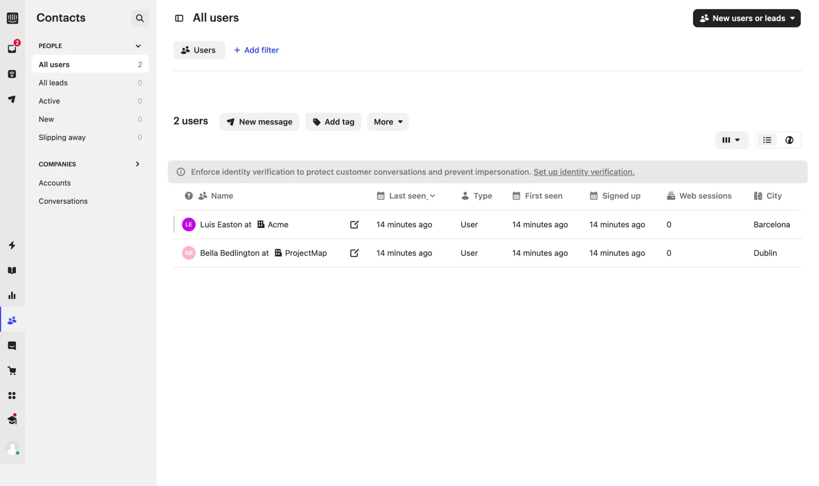
The colour rules are just as stable. Primary actions are black buttons ("New article", "New workflow", "New users or leads"), going live is a green "Set live" button, and secondary actions such as "+ Add filter" are blue text links. Anyone working on a SaaS navigation design can copy that split: one neutral sidebar colour, one primary button colour, and a separate colour reserved for the irreversible "publish" action.
What does Intercom's help desk inbox look like?
The inbox is a four-column layout: views, conversation list, conversation, and a details panel. The left column groups views into Your inbox, Mentions, All, Unassigned, then Teams, Teammates and Views, each with a count.
The details panel on the right carries the assignee, the team, linked items (tracker ticket, back-office tickets, side conversations) and conversation attributes such as ID, brand and language. The composer below the conversation shows a single hint, "Use ⌘K for shortcuts", which opens a command palette listing Compose reply (R), Compose note (N), Use macro (\) and Fin AI assist (⌘J).
Fin AI assist opens a second list: summarize the conversation, or rewrite a draft as more friendly, more formal, rephrased or expanded. The rewrite options stay greyed out with a "Needs text in composer" badge until the agent has typed something, so the menu explains its own preconditions. The full sequence is in the Answer ticket using AI flow; for more support layouts, see our SaaS inbox design examples.
Rule of thumb Show one keyboard hint in the composer and put everything else behind it. Intercom's composer stays empty apart from "Use ⌘K for shortcuts".
How does Intercom design workflow automation?
Automations are built on a canvas: a trigger card on the left, step cards connected by arrows, and a toolbar along the bottom. Each workflow opens in Draft, with Preview, a green Set live button and a black Edit button in the header.
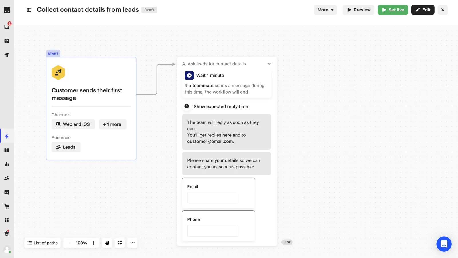
The step cards show the content itself rather than a label: the bot messages appear as chat bubbles and the form fields as empty inputs. Someone reading the canvas sees what the customer will see, which is the main argument for a flowchart editor over a list of rules.
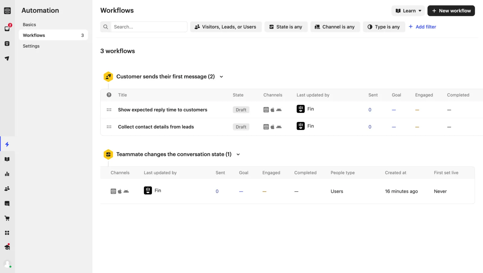
Back in the list, workflows are grouped by the trigger that starts them rather than sorted alphabetically.
How does Intercom teach new users the product?
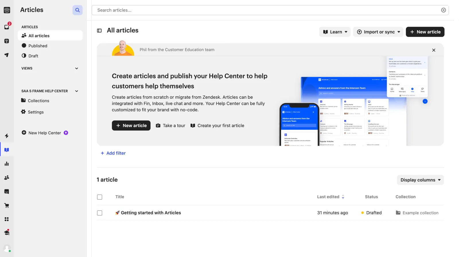
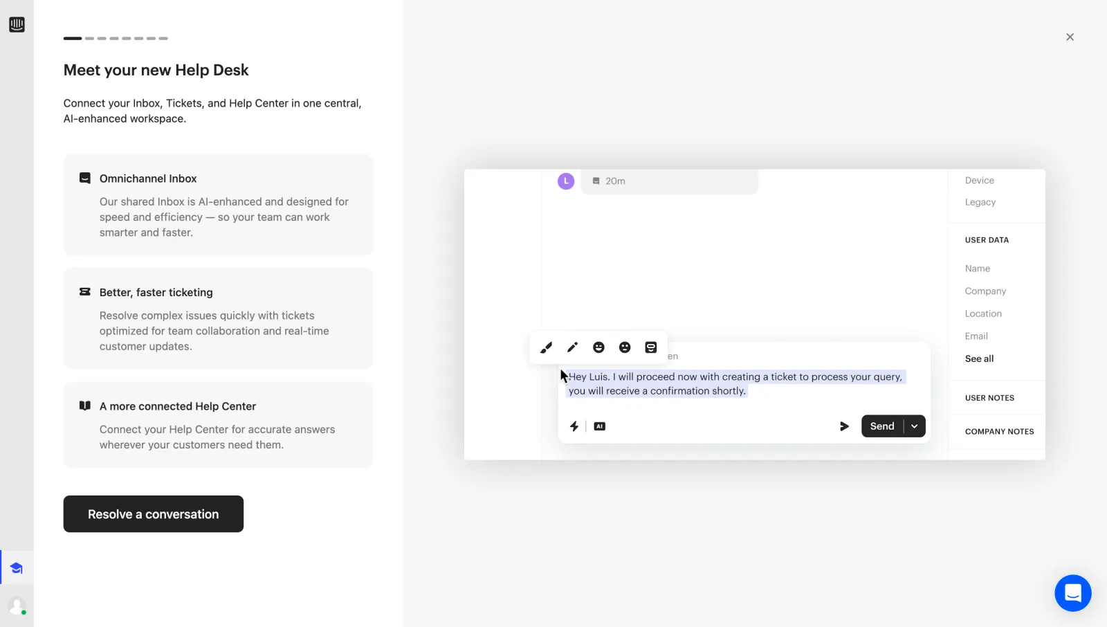
Intercom teaches inside the product: each module opens with a dismissible education card, and the help desk has a hands-on tutorial built from the real interface. The cards are signed "Phil from the Customer Education team" with a photo, the same voice on the Articles, Fin and installation screens.
The help desk tutorial starts with a full-screen intro, then moves into a dimmed copy of the inbox where the user resolves a sample conversation. The recorded help desk onboarding flow has 8 steps, and the tutorial steps carry a "Skip all" link.
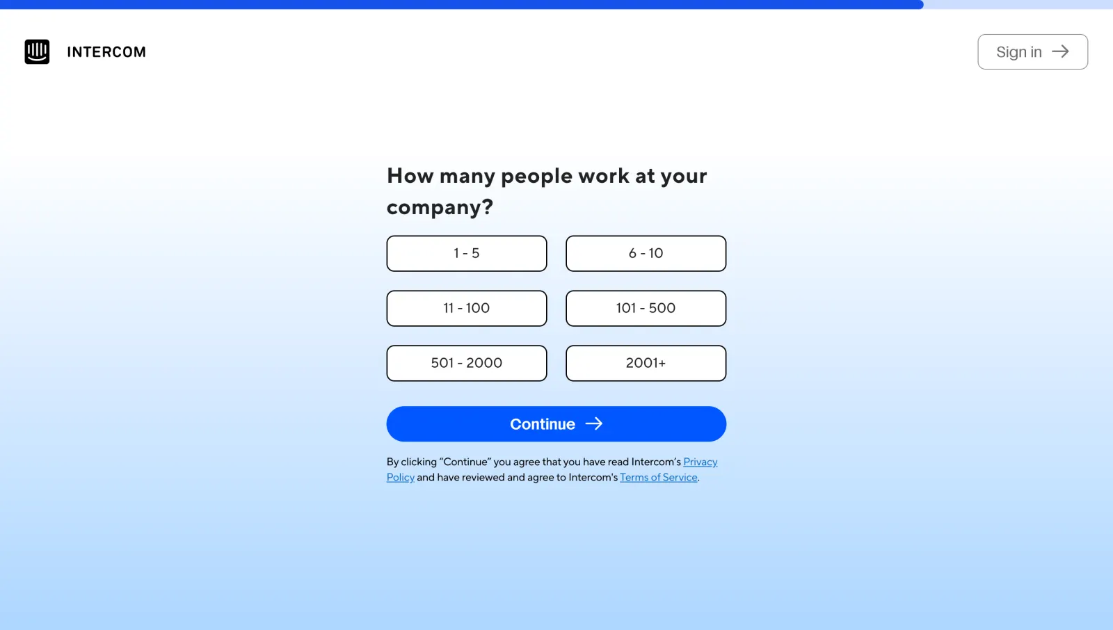
Account creation follows a different visual system: a centred question on a blue gradient, large choice buttons and a progress bar across the top. It asks mostly one question per screen across the 9-step Create an account flow.
Compare it with the patterns in our SaaS onboarding examples and the user onboarding category.
How does Intercom present Fin, its AI agent, in the interface?
Fin gets its own module in the rail, and its setup starts with a live demo rather than a form. The empty AI Chatbot page shows a Messenger preview that answers from a well-known company's help center, with tabs to switch between three of them.
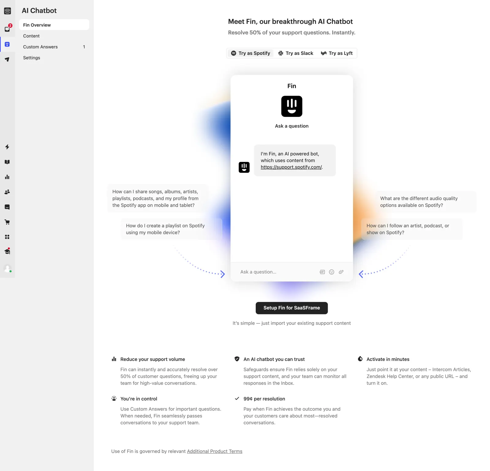
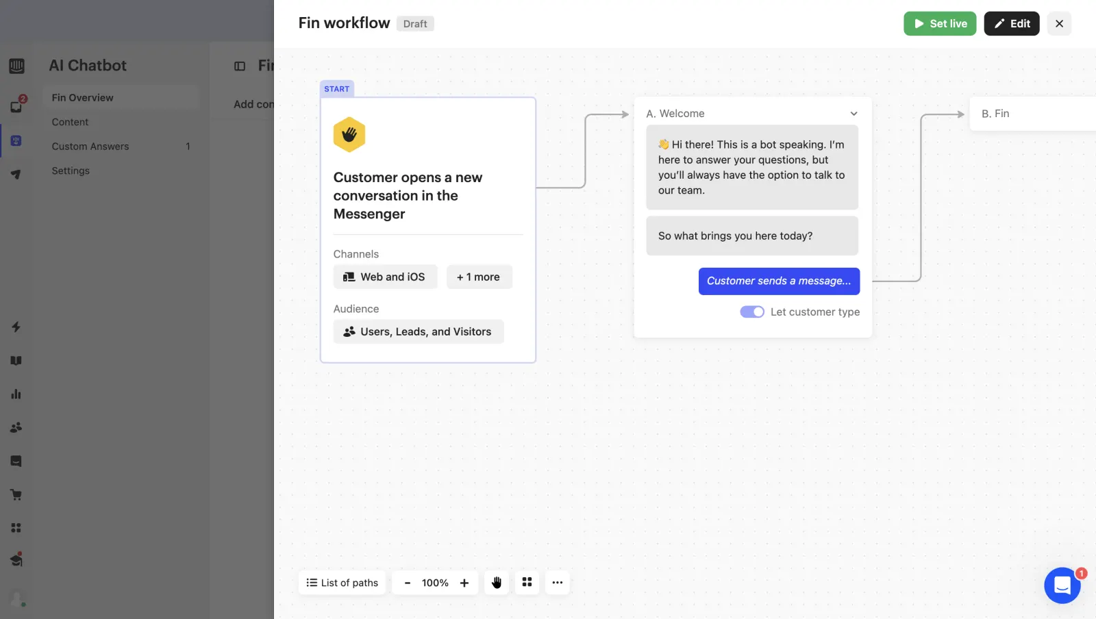
The same AI shows up in three places with three entry points: the canvas (Fin as a workflow step), the composer (⌘J for Fin AI assist) and the workflows list, where Fin appears in the "Last updated by" column. In the sample, 6 of the 46 product screens carry the prompt input pattern, all of them in the Fin setup.
How do reports, settings and integrations follow the same system?
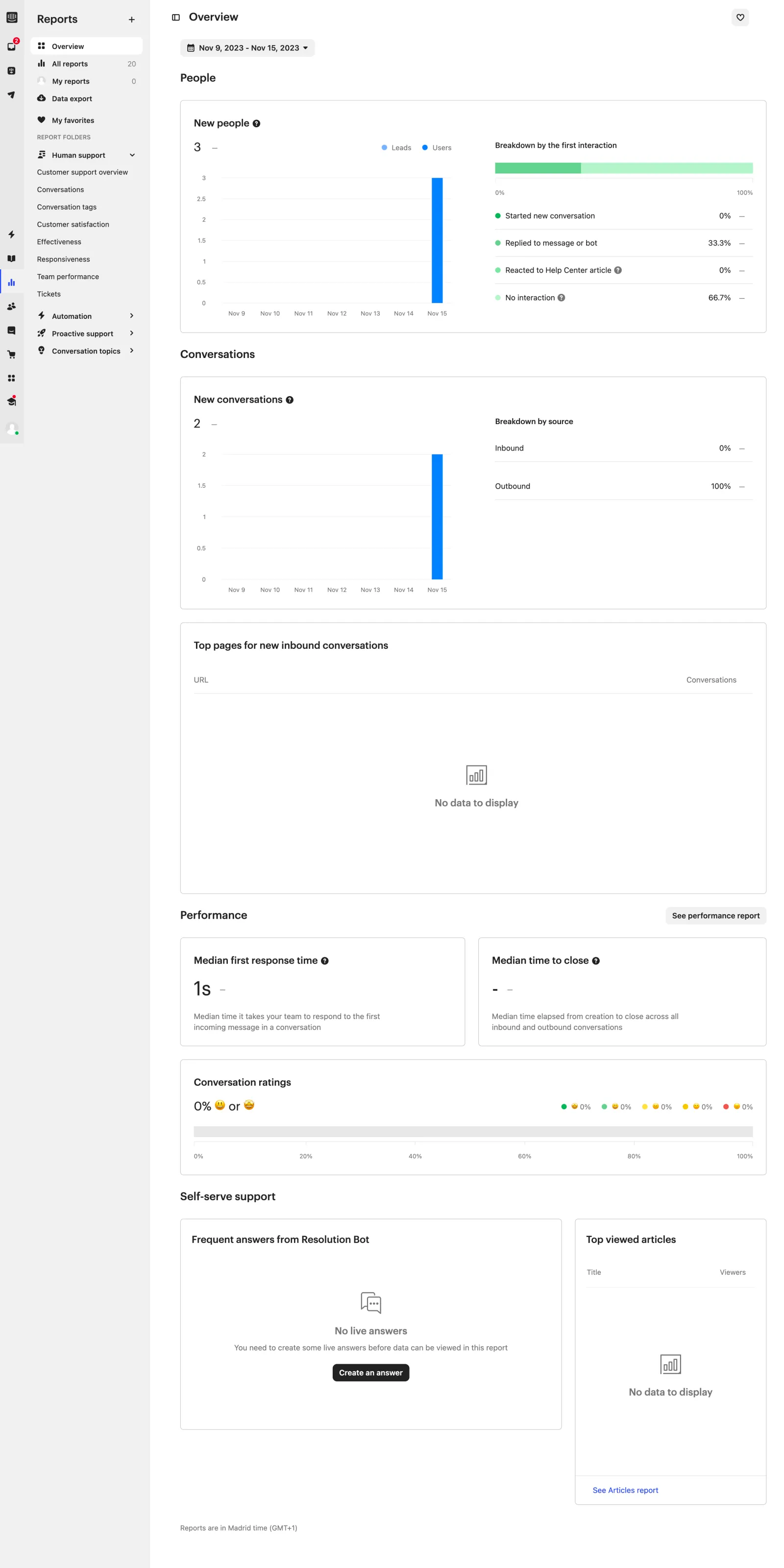
They reuse the rail, the grey sidebar and the white canvas, and change only the content blocks. Reports are a long page of cards grouped under headings, each pairing a chart with a breakdown list.
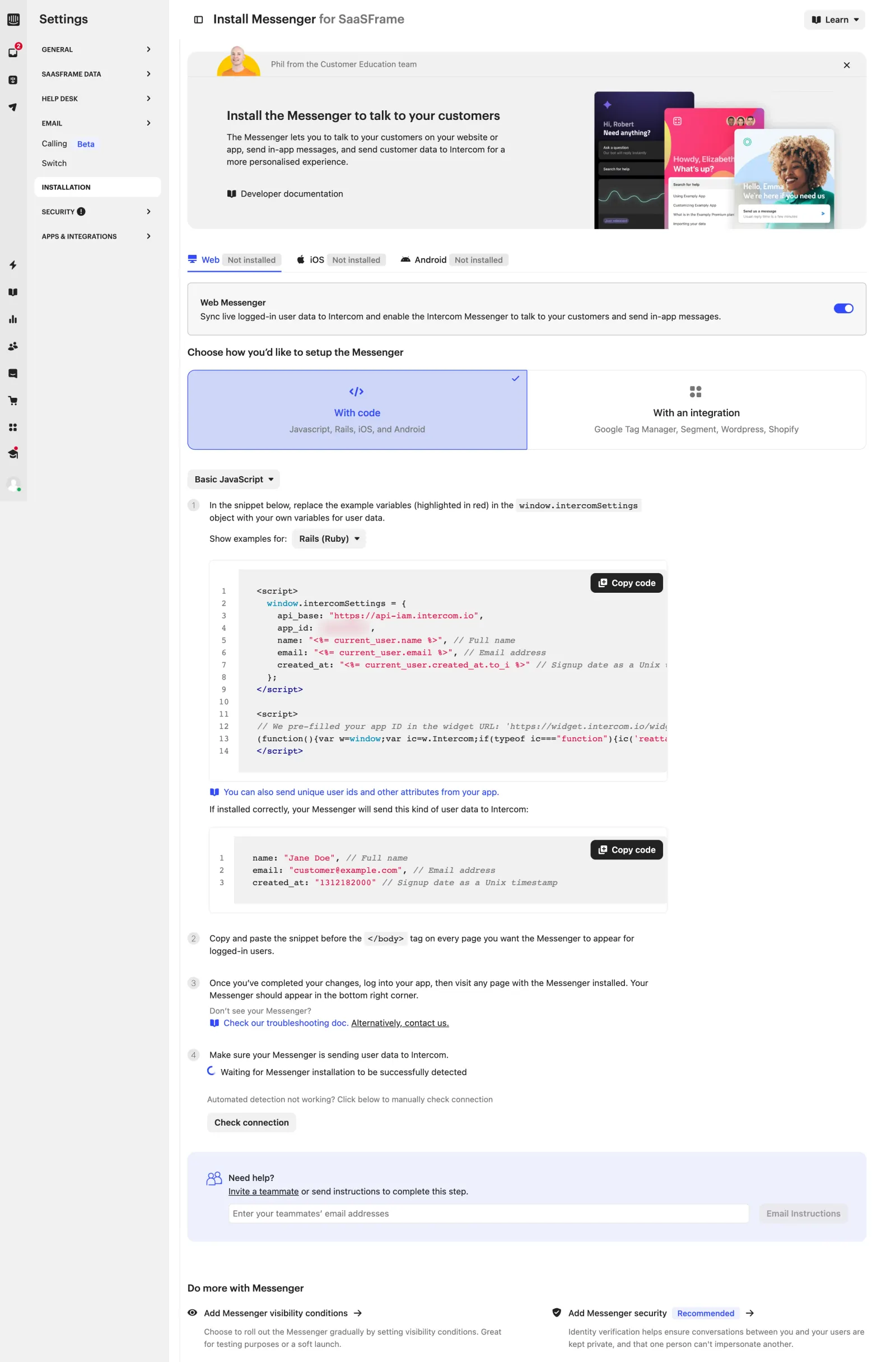
Installation is written as a numbered checklist that ends by waiting for proof. The last step reads "Waiting for Messenger installation to be successfully detected" with a "Check connection" button, and a "Need help?" box lets the user email the instructions to a teammate.
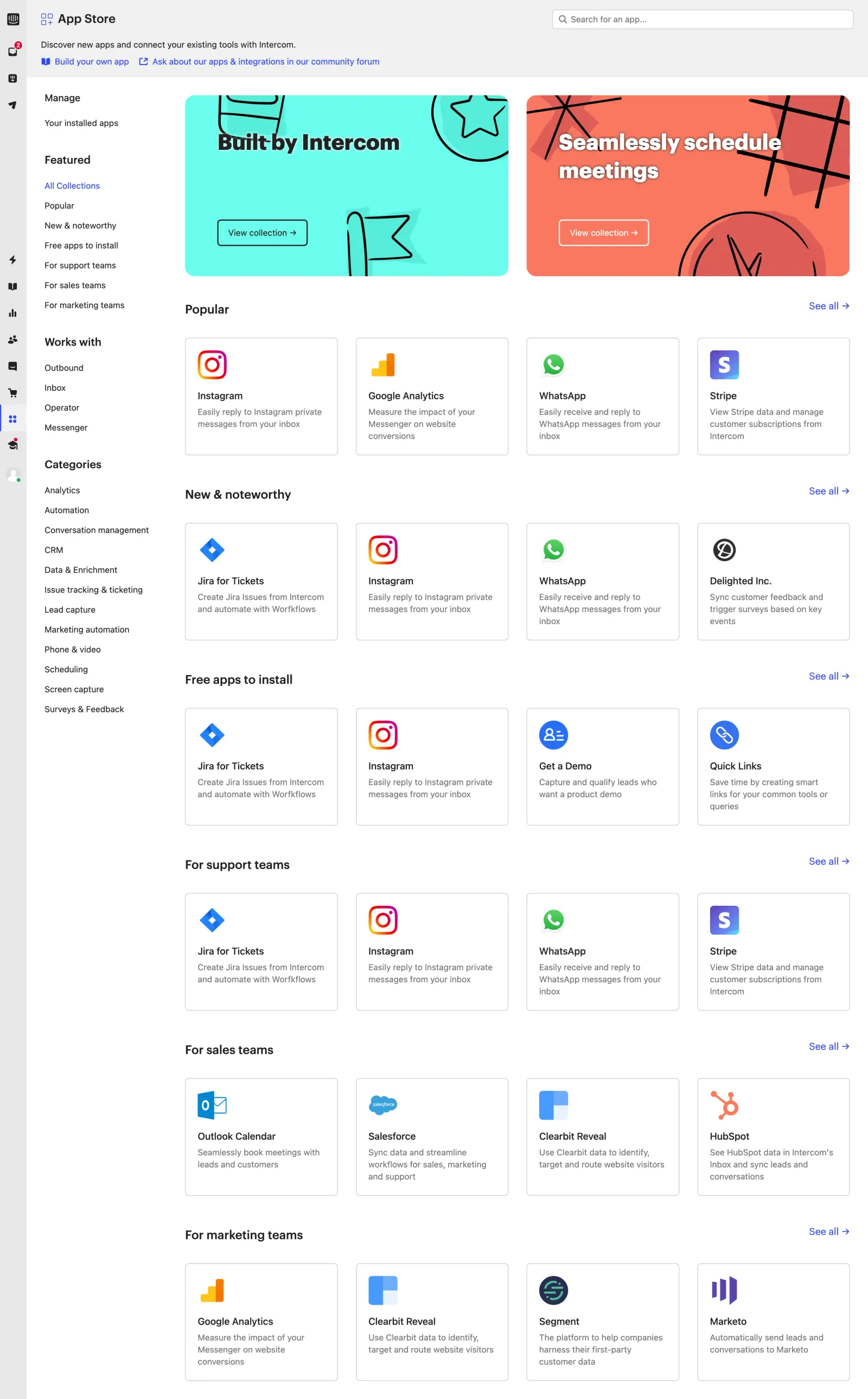
The App Store borrows the layout of a consumer store: two collection banners, then rows of four app cards under Popular, New & noteworthy, Free apps to install and one row per team.
More connection screens are in our SaaS integration UX examples.
What can you reuse from Intercom's UI?
The transferable part is the system, not the visual style. Five decisions carry most of the consistency:
- Two navigation levels. A fixed icon rail for modules and a contextual sidebar for views lets a product grow modules without crowding one menu.
- A reserved colour for going live. Black for primary actions, green only for Set live, so publishing never looks like a routine save.
- One shortcut hint. "Use ⌘K for shortcuts" in the composer, everything else in the palette with its key shown.
- Content on the canvas. Workflow cards preview the real messages and fields, so the editor doubles as a preview.
- Teaching in place. Education cards at the top of empty modules and a tutorial inside a copy of the real inbox, each one skippable.
For more product screens built on the same ideas, browse the inbox category or the SaaS dashboard design examples.
Frequently asked questions
What navigation pattern does Intercom use?
Intercom uses a narrow icon rail on the far left to switch between modules such as Help Desk, AI Chatbot, Automation, Articles, Reports and Contacts. Each module then has a grey secondary sidebar listing its views, with the content in a white area on the right.
How is the Intercom inbox laid out?
The inbox has four columns: views (Your inbox, Mentions, All, Unassigned, teams), the conversation list, the conversation with its composer, and a details panel with assignee, team, linked tickets and attributes. Actions such as replies, notes, macros and Fin AI assist are reachable from a ⌘K command palette.
How does Intercom design its workflow builder?
Workflows are built on a canvas with a trigger card that states the event, channels and audience, connected to step cards. The cards show the actual bot messages and form fields, and each workflow starts as a draft with Preview, Set live and Edit buttons in the header.
How does Intercom onboard new users inside the product?
Each module opens with a dismissible education card offering a first action and a tour. The help desk also has an 8-step tutorial that runs inside a dimmed copy of the real inbox, with a Skip all link on the tutorial steps.
Where does Fin, Intercom's AI agent, appear in the interface?
Fin has its own AI Chatbot module, whose setup opens with a Messenger preview you can try as Spotify, Slack or Lyft. It also appears as a step in workflows and as Fin AI assist in the inbox composer, opened with ⌘J.
How recent are the Intercom screens in this teardown?
The 46 product screens were captured in November 2023 and are part of SaaSFrame's 58 Intercom screens as of November 2026. Intercom may have changed parts of its interface since then, so treat the screens as a dated reference.
 Inbox26 examples
 Sidebar Navigation531 examples
 Workflow Builder53 examples
 Command Palette10 examples